Amazon KDP guide, KDP book publishing
KDP Template for Paperback: Interior Formatting

Mar
Okay so the KDP paperback template thing is actually way simpler than people make it out to be, but there’s like three gotchas that’ll mess you up if you don’t know them upfront.
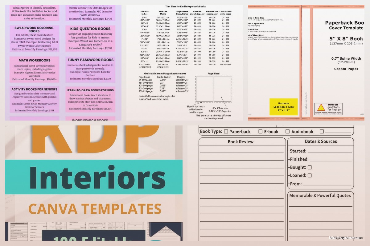
First thing – you gotta download the actual template from KDP before you start formatting anything. I know that sounds obvious but I’ve had people message me after they formatted their entire book in random Word settings and then wondered why it looked like garbage when they uploaded it. Go to your KDP dashboard, start setting up your paperback, pick your trim size and you’ll see the template download option. Amazon gives you both Word and InDesign templates but honestly unless you’re doing something super design-heavy, just use Word.
Trim Size Actually Matters More Than You Think
The most common sizes are 6×9 (standard for most nonfiction and novels), 8.5×11 (workbooks, journals, activity books), and 5×5 or 8×8 for square books. I do a ton of 6×9 because it just looks… professional? Like pick up any book at a bookstore and it’s probably 6×9.
But here’s where people screw up – they pick their trim size, download the template, then halfway through decide they want a different size. Don’t do that. You’ll have to reformat everything because margins and bleed settings are specific to each trim size. I learned this the hard way on a journal project last year where I switched from 8.5×11 to 8×8 after already setting up 40 pages and yeah… had to start over.
The Margin Situation
So Amazon’s templates come with margins already set up and this is where you just trust the template. The inside margin (the gutter) gets bigger as your page count goes up because of how the spine works. A 100-page book needs less gutter space than a 400-page book.
The template calculates this automatically based on what you told KDP your page count would be. But – and this is important – if your final page count ends up being way different than what you estimated, you might need to download a new template with the correct page count range.
I usually overestimate by like 20 pages just to be safe. Better to have slightly bigger gutters than have text disappearing into the spine.
Bleed vs No Bleed
Bleed is basically when your content extends to the edge of the page. For most text-based books you don’t need bleed. Novels, nonfiction, workbooks with just text and simple graphics – no bleed is fine and actually saves you some headache.
But if you’ve got full-page images, colored backgrounds, or design elements that go to the edge, you need bleed. The bleed area is an extra 0.125 inches on all sides that gets trimmed off. So anything important needs to stay inside the “safety zone” which is basically the bleed margin plus a bit more.
I was watching The Last of Us while setting up a coloring book template last month and completely forgot to extend the designs into the bleed area on like 15 pages. Had to go back and fix all of them because the previewer showed white edges everywhere.
Actually Formatting Your Interior
Open that template file and you’ll see it’s pretty bare bones. There’s usually some instructions at the beginning that you’ll delete later.
Fonts and Readability
Stick with standard fonts – Times New Roman, Garamond, Palatino for serif, or Calibri, Arial, Helvetica for sans-serif. I use Garamond for most of my books because it’s easy to read and looks professional without being boring.
Font size matters more than people think. For 6×9 trim:
- Body text: 10-12pt (I usually do 11pt)
- Chapter titles: 16-20pt
- Headers/footers: 9-10pt
For 8.5×11 you can go slightly bigger, maybe 12pt for body text. The goal is readability – nobody wants to squint at tiny text.
Line Spacing and Paragraph Formatting
This is where it gets specific. For fiction and most nonfiction, use 1.15 to 1.5 line spacing. Single spacing looks cramped, double spacing wastes paper and makes your book unnecessarily thick (which increases printing costs).
Paragraphs – you’ve got two options:
- First line indent (0.3 to 0.5 inches) with no space between paragraphs
- Block style with no indent but space between paragraphs
Don’t do both. That’s amateur hour. I prefer first line indent for fiction and block style for nonfiction or workbooks.
Oh and set your alignment to justified (both left and right edges align) for a professional look. Left-aligned works too but justified is more traditional for print books.
Headers and Footers
Headers usually have the book title on left pages and chapter title or author name on right pages. Footers have page numbers, either centered or on the outside edges.
You don’t put headers/footers on chapter start pages or the title page – those should be blank at the top. In Word, you can set “Different First Page” and “Different Odd & Even Pages” under the header/footer options to make this work.
I spent like two hours once trying to figure out why my page numbers were showing up on my title page before I realized I hadn’t checked that box. My cat knocked over my coffee during that struggle session which didn’t help.
Page Numbers Start Where?
Technically page 1 should be the first page of actual content (after title page, copyright, table of contents, etc.). Those front matter pages either have no numbers or use Roman numerals (i, ii, iii).
But honestly for simpler books I just start numbering from the first page of Chapter 1 and nobody’s ever complained. Unless you’re doing something really formal, don’t overthink it.
Front Matter and Back Matter
Front matter is everything before your main content:
- Title page (right-side page)
- Copyright page (back of title page)
- Table of contents (if needed)
- Dedication or acknowledgments (optional)
Back matter comes after your content:
- About the author
- Other books by you
- Sneak peek of another book
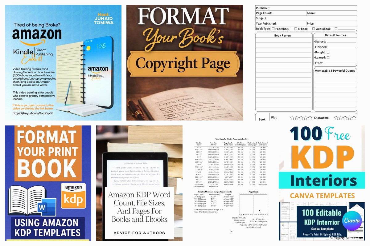
The copyright page needs to be there – just put your copyright year, your name, and “All rights reserved.” You can add your ISBN if you’re using one (not required for KDP but looks more professional). And the obligatory “This is a work of fiction” disclaimer if it’s fiction.
Chapter Breaks
Each chapter should start on a right-side page (odd-numbered). If your previous chapter ended on a right page, insert a blank left page. You do this with page breaks, not by hitting Enter a bunch of times.
In Word: Insert > Page Break. Do NOT just press Enter 20 times to get to a new page because if you edit anything earlier, everything shifts and you’ll have random blank spaces everywhere.
Images and Graphics
If you’re including images, they need to be at least 300 DPI for print. Lower resolution looks fine on screen but will print blurry.
Insert images as “In Line with Text” or use text wrapping if you want text to flow around them. Make sure images aren’t so close to the margins that they might get cut off during trimming – keep everything at least 0.25 inches from the edge if you’re not using bleed.
For full-page images with bleed, the image needs to extend into that 0.125 inch bleed zone on all sides.
Interior Color vs Black and White
This is a cost thing. Black and white interior is way cheaper to print. Color adds like $1-3+ per book depending on page count, which eats into your royalty.
I only use color for books where it’s absolutely necessary – coloring books, children’s books, photography books. For everything else, black and white keeps your prices competitive.
Amazon’s previewer will show you what your interior looks like in both color and black/white so you can see if grayscale versions of your images look okay.
The Actual Upload Process
Once your interior is formatted, save it as a PDF. In Word: File > Save As > PDF. Make sure you select “Standard” quality, not “Minimum size” because that compresses it too much.
Then upload to KDP and use their previewer tool. This is crucial – don’t skip this. The previewer shows you exactly what your book will look like including:
- How text sits relative to margins
- Whether anything’s getting cut off
- How images look
- Page alignment
I always find at least one thing to fix in the previewer. Usually it’s a page number that’s too close to the edge or a chapter title that got weird spacing.
Common Screw-ups I See All the Time
Inconsistent formatting – Like suddenly switching fonts halfway through or having different paragraph spacing in different chapters. Use styles in Word to keep everything consistent.
Widows and orphans – That’s when you have a single line of a paragraph alone at the top or bottom of a page. Looks unprofessional. You can adjust paragraph settings to control this or manually adjust spacing.
Too much white space – Don’t start every chapter halfway down the page unless that’s your specific design choice. It just makes your book longer and more expensive to print.
Ignoring the gutter – Text too close to the spine is gonna be hard to read. Trust the template margins.
Wrong page size in PDF – Sometimes Word export settings default to 8.5×11 even if your document is 6×9. Double-check your PDF dimensions match your trim size before uploading.
Testing Before You Publish
Order a proof copy. It’s like $5-10 depending on your book size and totally worth it. What looks good on screen doesn’t always translate to physical print.
I’ve caught typos, formatting issues, and even entire missing pages by checking the physical proof. Plus you get to hold your actual book which is kinda cool not gonna lie.
Wait I forgot to mention – if you’re doing a series or multiple books, save your template with all your style settings. That way you can just drop new content into the same formatting structure and everything matches. I have like 6 different templates saved for different types of books I do regularly.
The whole process seems complicated at first but after you do it once or twice it becomes pretty automatic. Most of my books now take maybe an hour to format because I’m just copying my previous setup and changing the content.
DISCOVER OUR FREE BEST SELLING PRODUCTS
Editable Canva Lined Journal: Express Your Thoughts – KDP Template
Lined Pages Journal 120 pages Ready to Upload PDF Commercial Use KDP Template 6×9 8.5×11 5×8 for Notebooks, Diaries, Low Content
Lined Pages Journal 120 pages Ready to Upload PDF Commercial Use KDP Template 6×9 8.5×11 5×8 for Notebooks, Diaries, Low Content
Cute Dogs Coloring Book for Kids | Activity Book | KDP Ready-To-Upload
Daily Planner Diary : Diary Planners for Everyday Productivity, 120 pages, 6×9 Size | Amazon KDP Interior
Wolf Coloring KDP interior For Adults, Used as Low Content Book, PDF Template Ready To Upload COMMERCIAL Use 8.5×11"
Coloring Animals Head Book for Kids, Perfect for ages 2-4, 4-8 | 8.5×11 PDF
Printable Blank Comic Book Pages PDF : Create Your Own Comics – 3 Available Sizes
Notes KDP interior Ready To Upload, Sizes 8.5×11 6×9 5×8 inch PDF FILE Used as Amazon KDP Paperback Low Content Book, journal, Notebook, Planner, COMMERCIAL Use
Black Lined Journal: 120 Pages of Black Lined Paper Perfect for Journaling, KDP Notebook Template – 6×9
Student Planner Journal 120 pages Ready to Upload PDF Commercial Use KDP Template 6×9" 8.5×11" for Low Content book
Recipe Journal Template – Editable Recipe Book Template, 120 Pages – Amazon KDP Interior