-
×
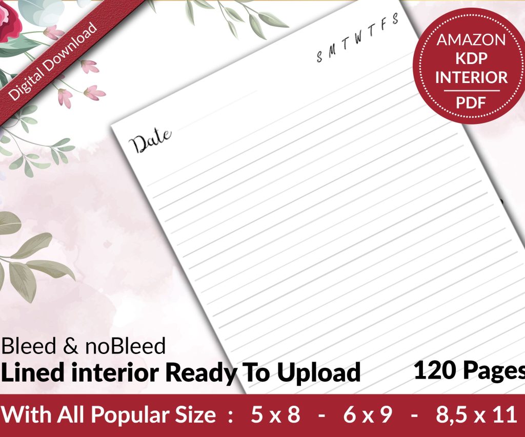 Lined Pages Journal 120 pages Ready to Upload PDF Commercial Use KDP Template 6x9 8.5x11 5x8 for Notebooks, Diaries, Low Content
1 × $0.00
Lined Pages Journal 120 pages Ready to Upload PDF Commercial Use KDP Template 6x9 8.5x11 5x8 for Notebooks, Diaries, Low Content
1 × $0.00
Subtotal: $0.00

Okay so I just spent like three hours yesterday fixing someone’s Word template mess and honestly the whole thing could’ve been avoided if they’d just set it up right from the start. Let me walk you through this because KDP’s finicky about Word formatting and you don’t want your book looking janky inside.
So here’s the thing – you gotta set your page size before you do anything else. Like anything. I made this mistake on my first twenty books probably and had to reformat everything later which was… yeah not fun.
Go to Layout tab, click Size, then More Paper Sizes at the bottom. KDP’s most common trim sizes are 6×9 for books, 8.5×11 for planners and journals, and 5×8 for smaller novels. Type those exact dimensions in. Don’t use the preset “Letter” or whatever because that’s 8.5×11 and only works if that’s actually your trim size.
Oh and another thing – set this as default for new documents based on this template. There’s a little button at the bottom of that dialog box that says “Set As Default” and you want to click that, choose “All documents based on Normal template” if you’re gonna use this setup repeatedly.
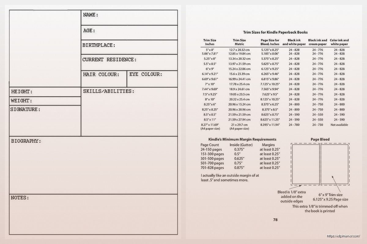
KDP needs different margins depending on your page count. This is gonna sound weird but they actually have a formula for the gutter margin (that’s the inside margin near the binding). For books under 150 pages you can get away with 0.5 inches, but once you’re over 400 pages you need closer to 0.875 or even 1 inch.
I usually do:
– Top: 0.75 inches
– Bottom: 0.75 inches
– Outside: 0.75 inches
– Inside (gutter): 0.5-1 inch depending on page count
Go to Layout > Margins > Custom Margins. Under “Multiple pages” dropdown, select “Mirror margins” – this is crucial because it makes your left and right pages mirror each other like an actual book. When you do this, “Left” and “Right” change to “Inside” and “Outside” which is what you want.
Set your gutter to 0 if you’re using mirror margins because you already set your inside margin. I see people add gutter ON TOP of the inside margin and then their text is like weirdly far from the spine. Don’t do that.
Okay so this part trips people up constantly. Double-click in the header area of any page. You’ll see the Header & Footer Tools Design tab appear.
Check these boxes:
– Different First Page (your title page shouldn’t have a header/footer)
– Different Odd & Even Pages (so you can put book title on left pages, chapter name on right pages, or whatever)
For page numbers, I usually put them in the footer, outside corner. So on odd pages (right side of book) the number goes on the right, even pages (left side) it goes on the left. Click Page Number > Bottom of Page > Plain Number 1 or Plain Number 3 depending on which side you’re on.
Wait I forgot to mention – before you add page numbers, make sure your cursor is actually in the correct header/footer. Like click in the odd page footer first, then add the page number formatted right. Then go to an even page footer and add it formatted left.
If you want your page numbering to start at 1 on Chapter 1 instead of the title page, you need section breaks. Put your cursor at the end of your front matter (copyright page, dedication, whatever). Go to Layout > Breaks > Next Page (under Section Breaks).
Now double-click in the footer of your first chapter page. You’ll see “Link to Previous” highlighted in the Header & Footer Tools. Click that to UNLINK it. Now you can format this section differently.
Click Page Number > Format Page Numbers > Start at 1. Boom. Your chapters start at page 1 and your front matter can have roman numerals if you want (i, ii, iii) or no numbers at all.
Don’t use the space bar to indent paragraphs. Just don’t. I know it’s tempting but KDP’s converter will mess it up.
Select all your body text (Ctrl+A), then right-click > Paragraph. Under Indentation, set “Special” to “First line” and set it to 0.3 inches. This auto-indents every paragraph correctly.
For spacing, set:
– Before: 0 pt
– After: 0 pt
– Line spacing: 1.15 or 1.5 (I prefer 1.15 for most books)
The reason you don’t want space before/after is because it creates weird gaps between paragraphs. Books traditionally have no space between paragraphs, just the first-line indent. Unless you’re doing a business book or non-fiction where space between paragraphs is the style, then flip it – remove first-line indent and add 6pt or 12pt after each paragraph.
I resisted using Styles for like two years because I thought they were complicated. They’re not, and they’ll save you hours.
Create a style for your body text: select formatted paragraph, click the Styles gallery (Home tab), click “Create a Style” at the bottom. Name it “Body Text” or whatever. Now every time you need body text formatting, just click that style. If you need to change the font later, you change the style once and it updates everywhere.
Do the same for chapter headings. Format one chapter title how you want it (font, size, spacing, alignment), then create a style called “Chapter Heading.”
Oh and make sure your chapter headings have “Page break before” checked in the Paragraph settings. This forces each chapter to start on a new page automatically. My cat just knocked over my coffee while I was typing this which… perfect timing.
KDP wants embedded fonts. Stick with standard fonts that come with Word:
– Garamond (my go-to for fiction)
– Times New Roman (classic, bit boring)
– Palatino Linotype
– Georgia (good for non-fiction)
– Calibri (if you hate yourself)
I’m kidding about Calibri but seriously it’s too modern-looking for most books. For body text use 11pt or 12pt. Chapter headings can be 16pt to 24pt depending on your style.
Don’t use more than two fonts in your entire book. One for body, one for headings max. I usually just use different sizes of the same font honestly.
Your title page should be centered, using that “Different First Page” header/footer option so there’s no page number. I usually do:
Title in 24pt or bigger
Subtitle if there is one in 16pt
Author name in 14pt
All centered, decent spacing between elements. Use Enter to add space, not the paragraph spacing settings, because this is a display page not body text.
Copyright page is next – left-aligned, small font like 9pt or 10pt. Include copyright year, your name, “All rights reserved,” and ISBN if you have one. KDP assigns a free ISBN but it lists them as publisher, or you can buy your own from Bowker if you want your own imprint listed.
If you want a clickable TOC for the ebook version (you should), use Word’s built-in TOC feature. This only works if you used Heading styles for your chapters.
Select your chapter title, apply “Heading 1” style from the Styles gallery. Do this for every chapter. Then on your TOC page, go to References > Table of Contents > pick a style. It generates automatically.
The links will work in the Kindle ebook. For the paperback it doesn’t matter because obviously paper isn’t clickable but having the TOC page still looks professional.
When you’re done, Save As > PDF. In the options, make sure “ISO 19005-1 compliant (PDF/A)” is NOT checked – I learned this the hard way when my PDFs kept getting rejected. Also uncheck “Document structure tags for accessibility” because it can cause weird conversion issues.
Upload that PDF to KDP. Do not upload the Word file directly unless you absolutely have to – PDFs give you way more control over how things look.
Wait for the previewer to load and check every single page. I usually flip through looking for:
– Weird page breaks mid-paragraph
– Headers/footers showing up where they shouldn’t
– Images or text running into margins
– Page numbers starting on wrong page
If your book has images that go to edge of page, you need to account for bleed. KDP wants 0.125 inch bleed on all sides. So your page size needs to be bigger – like if your trim is 6×9, your PDF should be 6.125 x 9.125 with content staying within the safe zone.
Honestly for interiors with just text I don’t bother with bleed. It’s mainly a cover thing and for workbooks with full-page designs.
Oh and if you’re doing journals or planners, the formatting is totally different. You’re usually working with tables or text boxes, not flowing text. I create one page as a template, then copy-paste it 100 times or whatever. Make sure your page size is exact and your margins account for the binding.
For lined journals, I use a table with no borders except horizontal lines. Set row height to exactly what you want (0.3 inches gives nice writing space). Copy that table down the page, then copy that page.
Once you’ve got everything set up perfect, Save As > Word Template (.dotx file). Put it somewhere you’ll remember. Now when you start a new book, File > New > Personal, and your template is right there. All your margins, styles, headers, everything already done.
I’ve got like five different templates – one for 6×9 fiction, one for 8.5×11 workbooks, one for 5×8 novellas. Saves me probably thirty minutes per book at this point.
The biggest thing is just taking time to set it up right once, then you’re basically copying homework for every book after that. My first few books took forever to format and still looked kinda off. Now it’s like twenty minutes of work because the template handles everything.
DISCOVER OUR FREE BEST SELLING PRODUCTS
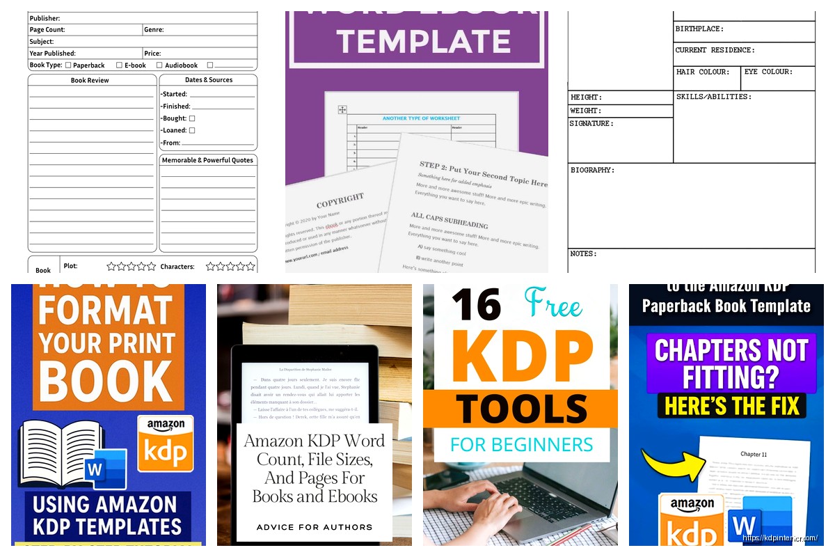
Editable Canva Lined Journal: Express Your Thoughts – KDP Template
Lined Pages Journal 120 pages Ready to Upload PDF Commercial Use KDP Template 6×9 8.5×11 5×8 for Notebooks, Diaries, Low Content
Lined Pages Journal 120 pages Ready to Upload PDF Commercial Use KDP Template 6×9 8.5×11 5×8 for Notebooks, Diaries, Low Content
Cute Dogs Coloring Book for Kids | Activity Book | KDP Ready-To-Upload
Daily Planner Diary : Diary Planners for Everyday Productivity, 120 pages, 6×9 Size | Amazon KDP Interior
Wolf Coloring KDP interior For Adults, Used as Low Content Book, PDF Template Ready To Upload COMMERCIAL Use 8.5×11"
Coloring Animals Head Book for Kids, Perfect for ages 2-4, 4-8 | 8.5×11 PDF
Printable Blank Comic Book Pages PDF : Create Your Own Comics – 3 Available Sizes
Notes KDP interior Ready To Upload, Sizes 8.5×11 6×9 5×8 inch PDF FILE Used as Amazon KDP Paperback Low Content Book, journal, Notebook, Planner, COMMERCIAL Use
Black Lined Journal: 120 Pages of Black Lined Paper Perfect for Journaling, KDP Notebook Template – 6×9
Student Planner Journal 120 pages Ready to Upload PDF Commercial Use KDP Template 6×9" 8.5×11" for Low Content book
Recipe Journal Template – Editable Recipe Book Template, 120 Pages – Amazon KDP Interior