Okay so here’s the deal with Kindle cover templates – I spent like three hours last Tuesday setting up a whole batch for a client and honestly the workflow is way simpler than most people think but there are some weird gotchas.
The Actual Dimensions You Need
Amazon wants your ebook covers at 2560 x 1600 pixels minimum. That’s the magic number. I see people all the time using like 1600 x 2400 or random sizes and yeah it’ll upload but it looks compressed and weird on certain devices. The 2560 width is what matters most because that’s what shows up in search results and on product pages.
Here’s what I actually use though – I design everything at 3200 x 2000 pixels. Gives you wiggle room and scales down better than scaling up ever will. My cat literally walked across my keyboard while I was explaining this to someone last week and somehow selected all my template files… anyway.
The aspect ratio is technically 1.6:1 which Amazon says is “ideal” but really you just need to be between 1:1.33 and 1:1.67 or something like that. Don’t overthink it. Stick with 2560 x 1600 or go bigger proportionally.
File Formats That Actually Work
JPEG or TIFF. That’s it. I always use JPEG because the file size is manageable and Amazon’s gonna compress it anyway. Save it at like 80-90% quality – you won’t see the difference but your upload time drops significantly.
PNG technically works but I’ve had weird issues with transparency layers causing problems even when flattened. Just not worth it. Export as JPEG, RGB color mode, and you’re good.
Oh and keep the file under 50MB which like… unless you’re doing something really weird with layers you’ll never hit that limit anyway.
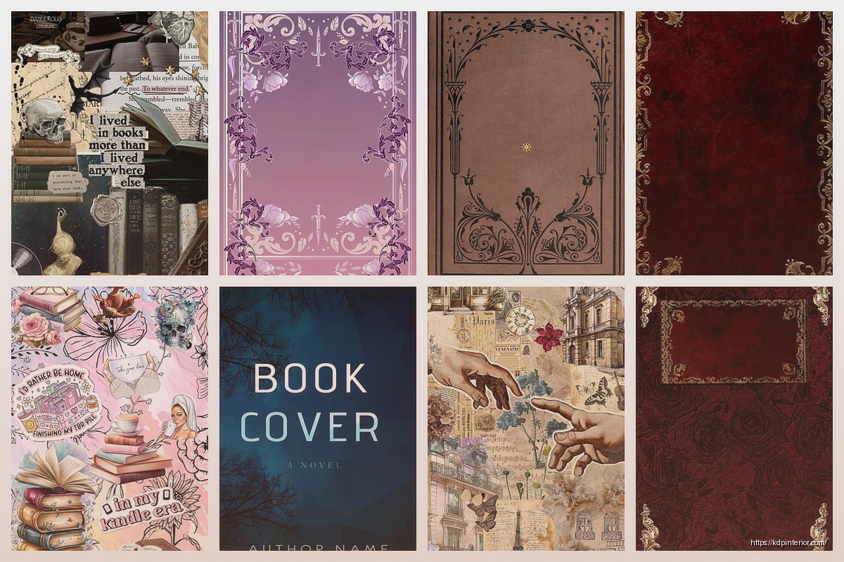
Where to Actually Get Templates
So you’ve got a few options and honestly it depends on whether you wanna pay or not.
Canva is where most people start. They’ve got pre-made Kindle cover templates already sized correctly. The free version works fine but you’re limited on fonts and stock photos. Pro version is like $13/month and worth it if you’re doing more than 2-3 covers. I use it for quick projects or when I need something done in 20 minutes.
The thing about Canva templates though – everyone uses the same ones. So you’ll see the same layout on like fifteen different books in your niche. You gotta customize enough that it doesn’t look cookie-cutter.
Creative Fabrica has bundles of Photoshop and Canva templates. I bought this massive pack last year for maybe $30 during a sale – came with like 200 templates. Most were trash but maybe 40 were actually usable. The Photoshop ones are way more customizable if you know what you’re doing.
Book Brush is specifically for book covers and it’s pretty solid. They have a 3D mockup generator built in which is nice for marketing images. Monthly subscription is around $10 I think? I used it for about six months then switched back to doing everything in Photoshop because I’m stubborn.
Wait I forgot to mention – Placeit also does book cover templates and mockups. It’s part of Envato now. Similar pricing to Book Brush. Good if you need variety and don’t wanna design from scratch.
Making Your Own Template System
This is what I actually do now and it’s saved me probably 30 hours over the past year.
Open Photoshop or GIMP if you’re going the free route. Create a new document at 3200 x 2000 pixels, 300 DPI, RGB color. This is your master template.
Set up guides at the edges – like 100 pixels in from each side. This is your safe zone for text. Amazon doesn’t crop anything but some devices display the edges differently and you don’t want your title cut off on someone’s old Kindle Fire.
I create separate layers for:
- Background (solid color or image)
- Texture overlay (optional but adds depth)
- Title text
- Subtitle text
- Author name
- Graphics/icons/illustrations
- Border or frame elements
Save this as a PSD file. Now every time you need a new cover you just open this template, swap out the text and background, and export. Takes like 15 minutes once you’ve got the system down.
Fonts That Don’t Suck
Okay so this is gonna sound weird but font choice matters way more than people think. I see so many covers with like 4 different fonts and it looks chaotic.
Stick to two fonts max. One for the title – usually something bold and attention-grabbing. One for the author name and subtitle – something cleaner and easier to read.
Google Fonts is free and has solid options. My go-to combinations:
- Oswald (title) + Open Sans (subtitle)
- Bebas Neue (title) + Lato (subtitle)
- Montserrat Bold (title) + Montserrat Regular (subtitle)
For fiction especially romance or thriller you want something with personality. For non-fiction keep it clean and professional. I learned this the hard way when I used this decorative script font on a productivity book and it looked completely wrong for the niche.
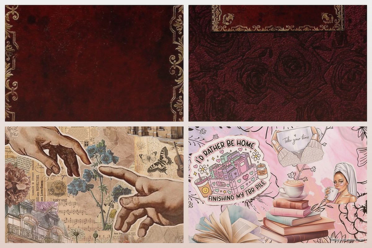
Design Elements and Where to Find Them
You need images and graphics unless you’re doing pure typography which honestly can work but it’s harder to pull off.
Unsplash and Pexels – free stock photos. Quality is hit or miss but there’s enough volume that you’ll find something usable. Just make sure you’re not using the same photo everyone else is using. I do a reverse image search sometimes to check.
Depositphotos – this is what I actually pay for. Like $30/month for 50 images. Way better selection than the free sites and less chance of overlap with other covers.
Creative Fabrica again – they have graphics bundles. Illustrations, textures, design elements. I probably use their stuff on 60% of my covers now.
For icons and simple graphics Flaticon works. Most are free with attribution but you can pay like $10/month to use without crediting.
The Color Psychology Thing Everyone Talks About
Look I’m not gonna pretend I’m a color theory expert but here’s what actually matters – your cover needs to stand out in a sea of thumbnails that are like 120 pixels tall.
High contrast is your friend. Dark background with light text or vice versa. If you’re using a photo as your background make sure there’s enough contrast that your title is readable when the thumbnail is tiny.
I test this by shrinking my cover down in Photoshop to like 200 x 125 pixels and seeing if I can still read the title. If not the design doesn’t work.
Different genres have color expectations. Romance is lots of reds pinks purples. Thriller and mystery are darker – blacks blues greys. Non-fiction business books tend to be blues oranges whites – clean and corporate looking.
You don’t have to follow these rules exactly but if your cover looks nothing like other books in your category readers might scroll past it thinking it’s not what they want.
Common Mistakes I See Constantly
Too much text. Your cover is not the place for a whole paragraph. Title, subtitle if needed, author name. That’s it. I’ve seen covers with like 50 words on them and it just looks cluttered.
Low resolution images. If you’re pulling something from Google Images and it’s 800 pixels wide it’s gonna look pixelated and unprofessional. Always check your source image dimensions.
Centered everything. This isn’t a PowerPoint slide. Play with alignment and positioning. Rule of thirds applies to book covers too.
Using trendy design styles that’ll look dated. Remember when everything had that long shadow flat design look? Yeah those covers look old now. Stick with cleaner timeless design unless you’re in a genre where trendy is expected.
Oh and another thing – ignoring genre conventions. If every book in your category has an illustrated cover and you use a photo or vice versa you’re gonna stand out but not in a good way. Study bestsellers in your niche and match the overall vibe while still being unique enough.
The 3D Mockup Situation
You don’t technically need 3D mockups for your actual Amazon listing but they’re useful for marketing – social media, ads, email lists, your author website.
Smartmockups is free for basic stuff. Upload your flat cover design and it’ll wrap it onto a 3D book render. Takes like 30 seconds.
Book Brush I mentioned earlier does this too with more customization options.
Or you can find PSD mockup templates on Creative Market or Etsy and drop your design into the smart object layer. That’s what I do for client presentations because it looks more polished.
Workflow That Actually Saves Time
Here’s my process now after figuring out what works:
Start with research. Pull up Amazon and look at the top 20 books in your category. Screenshot 10-15 covers. What colors are they using? What’s the typography like? Photos or illustrations? This takes maybe 10 minutes but saves you from designing something that doesn’t fit the market.
Open your template file. Swap in a background color or image that fits the genre but isn’t identical to what you just saw.
Add your title. Make it big enough to read at thumbnail size. Play with positioning – top third, middle, bottom third. See what works with your background.
Add subtitle if you have one. Smaller font, different weight or style from the title.
Author name goes at the bottom usually. Keep it visible but not competing with the title.
Export as JPEG. Upload to Amazon. Check how it looks on the product page. I always do this before finalizing because sometimes what looks good in Photoshop looks different on the actual listing.
Quick Photoshop Tips
If you’re using Photoshop here are some shortcuts that speed things up:
Layer styles are your friend. Drop shadow on text makes it readable over busy backgrounds. I usually do black shadow at like 30% opacity, distance 5, size 10. Adjust to taste.
Adjustment layers for color grading. Slap a Curves or Color Balance adjustment layer on top and you can shift the whole mood of the cover without redoing everything.
Smart objects for images. Convert your photo layer to a smart object before resizing or adding filters. Keeps the quality intact if you need to make changes later.
Actions for repetitive tasks. If you’re doing the same export process every time record an action. One click and it saves your file at the right dimensions and quality settings.
I was watching this true crime documentary while setting up my action library and completely zoned out… came back and had somehow recorded like 47 steps that made no sense. Had to start over.
Hiring a Designer vs DIY
Real talk – if design isn’t your thing and you’ve got the budget just hire someone. Fiverr has designers starting at like $20 for an ebook cover. Quality varies wildly but read reviews and look at portfolios.
I use a designer for maybe 30% of my covers now. The ones where I need something really specific or when I’m launching something in a genre I don’t usually work in. Costs me around $50-100 per cover but it’s worth it to get something professional.
For my low-content books and quick projects I still DIY with templates because the volume is too high to justify hiring out every single one.
File Organization Because You’ll Thank Me Later
Create a folder system. Seriously. I didn’t do this for the first two years and finding old cover files was a nightmare.
My structure now:
- Master Templates folder
- Individual project folders with the book title
- Inside each project folder: PSD file, exported JPEG, source images, mockups
Name your files logically. “BookTitle_Cover_Final_v3.jpg” not “untitled-12-copy.jpg” because you will forget which version you actually uploaded to Amazon.
Okay I think that covers most of it. The main thing is just start with a properly sized template, keep the design clean and readable at thumbnail size, and match your genre enough that readers recognize what type of book it is. Everything else is honestly just details you figure out as you go.
 Sloth Animal Slow Coloring book KDP interior For Kids aged 2-4 4-8, 8.5x11 PDF FILE Used as Low Content Book, Ready To Upload COMMERCIAL Use
1 × $2.99
Sloth Animal Slow Coloring book KDP interior For Kids aged 2-4 4-8, 8.5x11 PDF FILE Used as Low Content Book, Ready To Upload COMMERCIAL Use
1 × $2.99  Notes KDP interior Ready To Upload, Sizes 8.5x11 6x9 5x8 inch PDF FILE Used as Amazon KDP Paperback Low Content Book, journal, Notebook, Planner, COMMERCIAL Use
1 × $0.00
Notes KDP interior Ready To Upload, Sizes 8.5x11 6x9 5x8 inch PDF FILE Used as Amazon KDP Paperback Low Content Book, journal, Notebook, Planner, COMMERCIAL Use
1 × $0.00 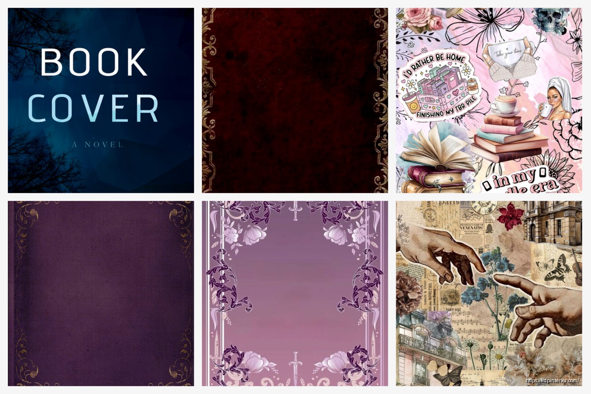
DISCOVER OUR FREE BEST SELLING PRODUCTS
Editable Canva Lined Journal: Express Your Thoughts – KDP Template
Lined Pages Journal 120 pages Ready to Upload PDF Commercial Use KDP Template 6×9 8.5×11 5×8 for Notebooks, Diaries, Low Content
Lined Pages Journal 120 pages Ready to Upload PDF Commercial Use KDP Template 6×9 8.5×11 5×8 for Notebooks, Diaries, Low Content
Cute Dogs Coloring Book for Kids | Activity Book | KDP Ready-To-Upload
Daily Planner Diary : Diary Planners for Everyday Productivity, 120 pages, 6×9 Size | Amazon KDP Interior
Wolf Coloring KDP interior For Adults, Used as Low Content Book, PDF Template Ready To Upload COMMERCIAL Use 8.5×11"
Coloring Animals Head Book for Kids, Perfect for ages 2-4, 4-8 | 8.5×11 PDF
Printable Blank Comic Book Pages PDF : Create Your Own Comics – 3 Available Sizes
Notes KDP interior Ready To Upload, Sizes 8.5×11 6×9 5×8 inch PDF FILE Used as Amazon KDP Paperback Low Content Book, journal, Notebook, Planner, COMMERCIAL Use
Black Lined Journal: 120 Pages of Black Lined Paper Perfect for Journaling, KDP Notebook Template – 6×9
Student Planner Journal 120 pages Ready to Upload PDF Commercial Use KDP Template 6×9" 8.5×11" for Low Content book
Recipe Journal Template – Editable Recipe Book Template, 120 Pages – Amazon KDP Interior