Okay so here’s the thing about Kindle cover templates – the dimensions are gonna mess you up if you don’t get them right from the start. I spent like three days last month redoing covers because I didn’t account for the thumbnail view and honestly my dog kept barking at the mailman while I was trying to export them which didn’t help.
The Actual Dimensions You Need
Amazon wants 2560 x 1600 pixels minimum for eBooks. That’s your baseline. But here’s what nobody tells you – design at 2700 x 1800 pixels instead because you get better quality on HD devices and the file size is still manageable. I always work at 300 DPI even though Amazon says 72 DPI is fine because when you scale down, it looks crisper.
The ratio is 1.6:1 which means height is always 1.6 times the width. Don’t mess with this ratio or Amazon’s uploader will reject it or worse, it’ll look stretched and weird in the store.
File Format Stuff That Actually Matters
Save as JPEG or TIFF. I use JPEG 99% of the time because the file size stays under 50MB easy. Amazon’s max is 50MB but honestly if your cover is more than 5MB you’re probably doing something wrong. PNG works too but the files get massive for no real benefit.
Oh and another thing – RGB color mode, not CMYK. This tripped me up when I first started because I was used to print design. Digital displays use RGB so if you upload CMYK it’ll look dull and the colors will shift.
Design Tools I Actually Use
You got options here depending on budget. Canva Pro is like $13/month and honestly it’s worth it just for the background remover and the templates. They have Kindle cover templates built in but – and this is important – double check the dimensions because some of their “Kindle” templates are actually for paperbacks.
Photoshop if you already have it, obviously. I use it for about 60% of my covers. The learning curve is steep though so if you’re just starting don’t torture yourself.
Affinity Designer is $70 one-time payment and it’s basically Photoshop without the subscription. I switched to this for a lot of stuff last year and it handles cover design really well.
GIMP is free but the interface makes me want to throw my laptop out the window. Some people love it though so maybe you’ll have better patience than me.
Template Structure – The Layers Thing
Okay so when you’re setting up your template you want layers. Like multiple layers. This is gonna sound obvious but I see people flattening everything and then they can’t edit the title without starting over.
My basic layer structure looks like:
- Background (solid color or image)
- Background effects (textures, gradients, whatever)
- Main graphic or photo
- Graphic effects (shadows, glows)
- Subtitle text (if you have one)
- Title text
- Author name
- Design elements (borders, shapes, icons)
Keep text on separate layers from everything else. You’ll thank yourself later when you need to tweak the font size or color.
The Thumbnail Test You’re Probably Skipping
Here’s where most people mess up – they design this gorgeous cover at full size and then it looks like a blurry mess at thumbnail size. Amazon shows your cover at like 160 pixels wide in search results. That’s tiny.
What I do is keep a second window open that shows the cover at 160 x 256 pixels while I’m designing. If I can’t read the title at that size, the font’s too small or too fancy. Wait I forgot to mention – sans serif fonts work better for thumbnails. All those decorative script fonts look elegant at full size but turn into illegible squiggles when scaled down.
Test your cover by:
- Saving it and opening it on your phone
- Texting it to yourself and viewing it in your messages
- Putting it in a mock Amazon search results page
I use a tool called Kindle Cover Mockup Generator – you can find it free online – that shows your cover in actual Amazon store context. Game changer.
Color Choices That Actually Convert
This is gonna sound weird but bright colors perform better for most genres. I tested this with like 15 different covers in the self-help niche last year. The bright blue and orange versions got 30% more clicks than the muted earth tones.
Romance wants deep reds, purples, or hot pink. Thriller needs dark blues and blacks with maybe red accent. Non-fiction does well with bold primary colors – blue, red, yellow.
But here’s the thing – look at the top 20 books in your category on Amazon right now. What colors are they using? Don’t try to be too different. You want to fit in enough that people recognize it as the right genre but stand out enough to get noticed.
I keep a swipe file of bestseller covers in a folder and I literally color pick from them sometimes. Not copying the design, just getting the hex codes for colors that are working.
Typography Without Making Your Eyes Bleed
Two fonts max on a cover. Three if one of them is just for a small subtitle or series name. More than that and it looks like a ransom note.
Font pairing matters – there are websites for this, I use FontPair or sometimes just Google “fonts that go with [whatever font]” because I’m lazy. Generally you want one display font for the title and one simple font for the author name.
Font size hierarchy: Title should be the biggest thing on the cover. Author name smaller unless you’re famous, then flip it. Subtitle even smaller if you have one.
Make sure there’s enough contrast between text and background. White text needs a dark background or a dark shadow/outline. Dark text needs a light background. I see so many covers where the title is barely visible because someone put gray text on a gray background.
The Free Font Trap
Free fonts from random websites can have licensing issues. I got burned on this once – used a font I thought was free for commercial use and got a cease and desist letter. Not fun.
Stick to:
- Google Fonts (all free for commercial use)
- Adobe Fonts if you have Creative Cloud
- Font Bundles or Creative Market (cheap and properly licensed)
- DaFont but READ the license – some are free, some aren’t
Stock Images and Graphics
You need proper licensing for any image you use. Amazon can pull your book if you’re using stolen images. I use:
Depositphotos – cheapest option, like $1 per image on their plans
Shutterstock – more expensive but huge selection
Unsplash and Pixabay – free but everyone uses the same images so your cover might look like someone else’s
For graphics and design elements I’m obsessed with Creative Fabrica right now. It’s like $5/month and you get unlimited downloads of vectors, patterns, fonts, everything.
Oh and another thing – if you’re doing niche books like adult coloring or journals, you can often get away with simpler designs. Text-heavy covers with minimal graphics. Saves time and honestly performs just as well in those categories.
The Save Settings Nobody Tells You
When you export your final cover:
– JPEG quality at 10 or 11 out of 12 (Photoshop scale)
– Don’t use progressive or optimized encoding
– Embed the color profile (sRGB)
– Resolution 300 PPI
I keep a template PSD file for each genre I work in with all these settings saved and the dimensions already set up. Just swap out the text and images for each new book. Speeds up the process so much.
Series Branding Template Approach
If you’re doing a series you want consistent branding. Same fonts, same layout, just change the colors or the main image. I have a series template where everything stays in the same position – title at top third, image in center, author name at bottom. Just change the content.
People should be able to look at your covers and immediately know they’re part of the same series. Think about how James Patterson’s books all have that similar look or how romance series often just change the model but keep everything else identical.
The Subtitle Debate
Subtitles work great for non-fiction. “Kindle Cover Template: The Complete Guide to Digital Design” or whatever. Helps with keywords and clarity.
Fiction usually doesn’t need them unless it’s the series name. “Book One in the Whatever Series” type thing.
I was watching this show about designers last week and they talked about negative space and it really applies here – don’t fill every inch of your cover with stuff. White space (or empty space) makes your cover easier to read and less chaotic.
Common Mistakes I Still See
Too much text. Your cover isn’t a poster, it’s a billboard. Keep it simple.
Images that are too busy. If there’s a lot happening in your background image, the text gets lost. Use a solid overlay or blur the background.
Wrong genre signals. A literary fiction cover that looks like a thriller confuses people and they won’t click.
Author name too small. Unless you’re unknown, make it readable. I know I said title first but author name matters too especially if you have multiple books.
Not checking on actual devices. What looks good on your 27-inch monitor might look terrible on a phone screen.
Quick Template Workflow
This is my actual process start to finish:
- Research top 20 books in category, save covers to swipe file
- Open template at 2700 x 1800, 300 DPI, RGB
- Add background (solid color or image)
- Add main graphic if needed
- Add title text – test readability at thumbnail size
- Add author name
- Add any design elements (borders, shapes, icons)
- Apply effects (shadows, glows, textures)
- Export as JPEG, check file size under 5MB
- View on phone before uploading
Takes me about 30-45 minutes per cover now but when I started it was like 4 hours. You get faster.
The key thing is having your templates set up so you’re not starting from scratch every time. I probably have 20 different base templates for different genres and I just customize from there. Way more efficient than designing fresh every single time.
Also gonna mention – A/B test your covers if you can. Upload one version, see how it performs for a month, then change it and compare. I’ve had covers that I thought were amazing flop and simple ones I threw together in 20 minutes become my best converters. You never really know until you test.
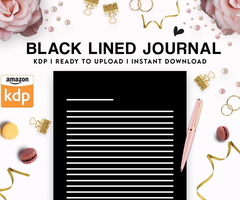 Black Lined Journal: 120 Pages of Black Lined Paper Perfect for Journaling, KDP Notebook Template - 6×9
1 × $0.00
Black Lined Journal: 120 Pages of Black Lined Paper Perfect for Journaling, KDP Notebook Template - 6×9
1 × $0.00 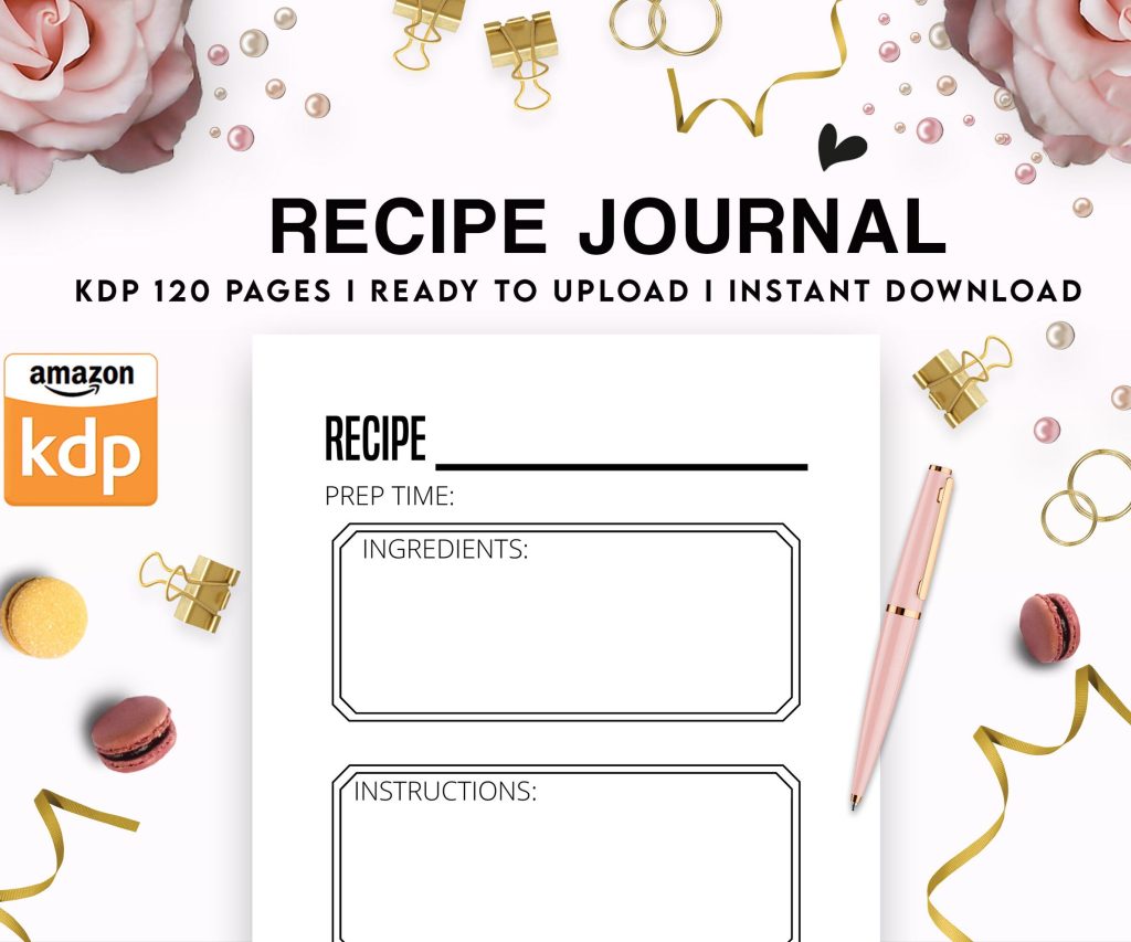 Recipe Journal Template - Editable Recipe Book Template, 120 Pages - Amazon KDP Interior
1 × $0.00
Recipe Journal Template - Editable Recipe Book Template, 120 Pages - Amazon KDP Interior
1 × $0.00 
DISCOVER OUR FREE BEST SELLING PRODUCTS
Editable Canva Lined Journal: Express Your Thoughts – KDP Template
Lined Pages Journal 120 pages Ready to Upload PDF Commercial Use KDP Template 6×9 8.5×11 5×8 for Notebooks, Diaries, Low Content
Lined Pages Journal 120 pages Ready to Upload PDF Commercial Use KDP Template 6×9 8.5×11 5×8 for Notebooks, Diaries, Low Content
Cute Dogs Coloring Book for Kids | Activity Book | KDP Ready-To-Upload
Daily Planner Diary : Diary Planners for Everyday Productivity, 120 pages, 6×9 Size | Amazon KDP Interior
Wolf Coloring KDP interior For Adults, Used as Low Content Book, PDF Template Ready To Upload COMMERCIAL Use 8.5×11"
Coloring Animals Head Book for Kids, Perfect for ages 2-4, 4-8 | 8.5×11 PDF
Printable Blank Comic Book Pages PDF : Create Your Own Comics – 3 Available Sizes
Notes KDP interior Ready To Upload, Sizes 8.5×11 6×9 5×8 inch PDF FILE Used as Amazon KDP Paperback Low Content Book, journal, Notebook, Planner, COMMERCIAL Use
Black Lined Journal: 120 Pages of Black Lined Paper Perfect for Journaling, KDP Notebook Template – 6×9
Student Planner Journal 120 pages Ready to Upload PDF Commercial Use KDP Template 6×9" 8.5×11" for Low Content book
Recipe Journal Template – Editable Recipe Book Template, 120 Pages – Amazon KDP Interior