Okay so LaTeX textbook templates are honestly one of those things I wish I’d figured out properly like three years ago because I wasted SO much time formatting academic books manually. Here’s what actually works after publishing a bunch of technical guides on KDP.
The Basic Setup You Actually Need
First thing – don’t overthink the LaTeX distribution. I use TeX Live on my Mac and MiKTeX on my Windows machine and both work fine. You’re gonna need a decent editor though. I switched to TeXstudio after VS Code kept giving me weird compilation errors and honestly haven’t looked back. Overleaf is great if you’re collaborating with someone or just want to test stuff without installing anything locally.
The document class is where people get confused right away. For textbooks you want either book or memoir class. Book class is simpler, memoir gives you way more control but the learning curve is steeper. I usually start with:
\documentclass[11pt,letterpaper,twoside,openright]{book}
The twoside option is crucial if you’re doing print because it handles margins differently for left and right pages. OpenRight makes chapters start on right-hand pages which looks more professional but wastes some paper… your call there.
Packages That Actually Matter
Oh and another thing – the package selection is where I see most people either go crazy installing everything or miss critical ones. Here’s my standard setup that I literally copy-paste into every textbook project:
- geometry – for page margins and layout
- fancyhdr – custom headers and footers
- graphicx – images obviously
- amsmath, amssymb, amsthm – if you have any math at all
- hyperref – clickable TOC and links in PDF
- cleveref – automatic reference formatting
- tcolorbox – for those nice boxed examples and theorems
- listings or minted – code blocks if needed
The order matters with some of these. Hyperref should go near the end, cleveref goes after hyperref. I learned that one the hard way after spending two hours debugging why my references weren’t working.
Page Layout That Doesn’t Look Amateur
So geometry package setup… this is gonna sound weird but I literally measure published textbooks with a ruler sometimes. For a 6×9 inch KDP book (which is super common for textbooks), I use:
\usepackage[paperwidth=6in, paperheight=9in, margin=0.75in, top=0.85in, bottom=0.85in]{geometry}
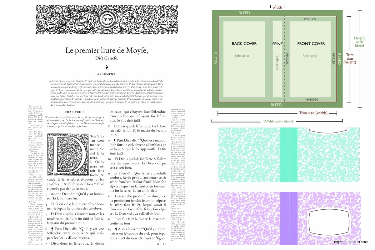
KDP needs those margins for binding. If you go smaller than 0.75in on the inside margin, the text disappears into the spine. Been there, had to reupload.
Headers and footers – fancyhdr makes this easy but the syntax is weird at first:
\pagestyle{fancy}
\fancyhead[LE,RO]{\thepage}
\fancyhead[LO]{\rightmark}
\fancyhead[RE]{\leftmark}
That puts page numbers on the outside corners and chapter/section names on the inside. Looks clean.
Chapter Formatting Without Going Insane
Default LaTeX chapter headings are kinda ugly for textbooks. The titlesec package fixes this but wow the documentation is dense. Here’s what works:
\usepackage{titlesec}
\titleformat{\chapter}[display]
{\normalfont\huge\bfseries}{\chaptertitlename\ \thechapter}{20pt}{\Huge}
You can customize the spacing and fonts from there. I usually make chapter titles a bit smaller than default because they can overwhelm the page in a 6×9 format.
Wait I forgot to mention – if you want those fancy chapter opening pages with quotes or objectives, you gotta use the epigraph package or just manually add stuff after the \chapter command. I do it manually usually because it’s more flexible.
Figures and Tables That Don’t Make You Want To Quit
Okay so funny story – I once spent an entire afternoon fighting with figure placement before realizing I just needed to understand the placement specifiers better. LaTeX’s float system is both amazing and infuriating.
\begin{figure}[htbp]
\centering
\includegraphics[width=0.8\textwidth]{image.png}
\caption{Your caption here}
\label{fig:whatever}
\end{figure}
The [htbp] means “try here, then top, then bottom, then a separate page” – in that order. For textbooks I usually use [tb] to keep figures at top or bottom of pages because inline figures can break up the reading flow too much.
Pro tip that saved me hours – use \FloatBarrier from the placeins package between major sections to prevent figures from drifting too far from where you reference them. Nothing worse than “see Figure 2.3” when that figure ended up three pages later.
Tables… ugh tables in LaTeX can be painful. The booktabs package makes them look way better though:
\begin{table}[tb]
\centering
\begin{tabular}{lcc}
\toprule
Header 1 & Header 2 & Header 3 \\
\midrule
Data & More data & Even more \\
\bottomrule
\end{tabular}
\caption{Table caption}
\end{table}
Those rules from booktabs (toprule, midrule, bottomrule) make tables look professional instead of like a 1990s spreadsheet.
Cross-References That Actually Work
This is where cleveref becomes your best friend. Instead of writing “see equation (\ref{eq:whatever})” every single time, you just write \cref{eq:whatever} and it automatically adds “Equation” or “Figure” or whatever. My dog literally interrupted me right as I was testing this feature last week and I lost like 30 minutes of work because I hadn’t saved, so remember to save often lol.
You gotta label things consistently though:
- Chapters: \label{ch:name}
- Sections: \label{sec:name}
- Figures: \label{fig:name}
- Tables: \label{tab:name}
- Equations: \label{eq:name}
Makes finding stuff later way easier when you’re editing.
Theorem Environments and Boxes
For math or computer science textbooks you need theorem environments. The amsthm package handles this:
\newtheorem{theorem}{Theorem}[chapter]
\newtheorem{lemma}[theorem]{Lemma}
\newtheorem{definition}{Definition}[chapter]
But honestly tcolorbox makes everything look better. You can create custom colored boxes for different types of content:
\newtcolorbox{example}{colback=blue!5!white,colframe=blue!75!black,title=Example}
Then just use \begin{example}…\end{example} and it creates a nice boxed example. I use different colors for examples (blue), warnings (red), tips (green), etc. Makes the textbook way more scannable.
Bibliography Setup Without the Drama
BibTeX vs BibLaTeX – I use BibLaTeX with biber backend now because it handles more citation styles and international characters better. Setup:
\usepackage[backend=biber,style=authoryear,sorting=nyt]{biblatex}
\addbibresource{references.bib}
Then just \cite{key} wherever you need citations and \printbibliography at the end. Way cleaner than old-school BibTeX.
Your references.bib file is just a text file with entries like:
@book{knuth1984,
author = {Donald Knuth},
title = {The TeXbook},
year = {1984},
publisher = {Addison-Wesley}
}
Google Scholar has a “cite” button that gives you BibTeX format which saves tons of time.
Index Creation Because Textbooks Need Them
Wait I forgot to mention indexes earlier. The makeidx package does this:
\usepackage{makeidx}
\makeindex
Then throughout your text you add \index{term} wherever you want something indexed. At the end of the document use \printindex. You gotta run makeindex as a separate command though which is annoying. Most editors have a button for it.
For better control use imakeidx which lets you create multiple indexes (subject index, author index, etc.) and doesn’t require the separate compilation step.
Actual File Structure That Scales
Don’t put everything in one giant .tex file. I learned this after my first textbook hit 300 pages and became impossible to navigate. Use \include or \input:
Main file structure:
– main.tex (just preamble and includes)
– chapters/chapter1.tex
– chapters/chapter2.tex
– images/ (all figures)
– references.bib
In main.tex:
\include{chapters/chapter1}
\include{chapters/chapter2}
The \include command starts each chapter on a new page and lets you selectively compile chapters during editing which speeds things up massively. Use \includeonly{chapters/chapter3} while working on just chapter 3.
Fonts That Don’t Scream Default LaTeX
Computer Modern is fine but kinda screams “I used LaTeX” – if you want something different for KDP:
\usepackage{mathpazo} % Palatino font
Or:
\usepackage{tgtermes} % Times-like font
For sans-serif headings:
\usepackage{helvet}
\renewcommand{\familydefault}{\sfdefault}
Actually don’t do that last line, it makes everything sans-serif. Just use it selectively in your title formatting.
PDF Settings for KDP Upload
This is crucial – your PDF needs to be formatted right for KDP. In your preamble:
\usepackage[pdftex,
pdfauthor={Your Name},
pdftitle={Book Title},
pdfsubject={Subject},
pdfkeywords={keyword1, keyword2},
bookmarks=true,
colorlinks=true,
linkcolor=black,
citecolor=black,
urlcolor=black]{hyperref}
The colorlinks=true with black colors makes links clickable but not visible when printed. Perfect for KDP because the ebook version gets clickable TOC but print version looks normal.
Also make sure you’re compiling with pdflatex or xelatex to get PDF output directly. Don’t go through DVI anymore, it’s 2025.
Common Problems I Keep Running Into
Overfull hbox warnings – these happen when LaTeX can’t break lines properly. Usually means you have long URLs or unbreakable text. Use \url{} for URLs and \allowbreak for manual break points.
Figures disappearing – probably a path issue or you forgot \graphicspath{{images/}} in your preamble.
Bibliography not showing – gotta compile multiple times: pdflatex, biber, pdflatex, pdflatex. Yeah, four times. LaTeX needs multiple passes to resolve all references.
Weird spacing after periods – LaTeX thinks periods after capital letters are abbreviations. Use \@ before the period if it’s actually end of sentence: “written by NASA\@. The next sentence…”
Testing Before You Upload to KDP
Print out a few pages on actual paper before uploading. Screen looks different than print, always. Check margins especially – I once uploaded a book where the inner margins were too tight and half the text was in the binding. Amazon rejected it obviously.
Use KDP’s previewer tool but don’t trust it completely. Order a proof copy. Yes it costs like $5-10 but way better than having customers complain about formatting issues.
For ebooks you’ll need to convert LaTeX to EPUB or just upload the PDF. PDF works okay for technical textbooks on Kindle since they’re usually read on tablets anyway. The formatting stays intact unlike EPUB conversions which can get messy with equations.
Version Control Because You’ll Thank Me Later
Use git or at least Dropbox with version history. I lost an entire chapter once because I overwrote the wrong file and had no backup. Now I commit to git after every writing session. GitHub even renders LaTeX somewhat decently if you need to check something on your phone.
Oh and another thing – use \today in your document so you always know which version you’re looking at during editing. Remove it before final compilation obviously.
 Editable Canva Lined Journal: Express Your Thoughts - KDP Template
1 × $0.00
Editable Canva Lined Journal: Express Your Thoughts - KDP Template
1 × $0.00  Printable Blank Comic Book Pages PDF : Create Your Own Comics - 3 Available Sizes
1 × $0.00
Printable Blank Comic Book Pages PDF : Create Your Own Comics - 3 Available Sizes
1 × $0.00  Coloring Animals Head Book for Kids, Perfect for ages 2-4, 4-8 | 8.5x11 PDF
1 × $0.00
Coloring Animals Head Book for Kids, Perfect for ages 2-4, 4-8 | 8.5x11 PDF
1 × $0.00 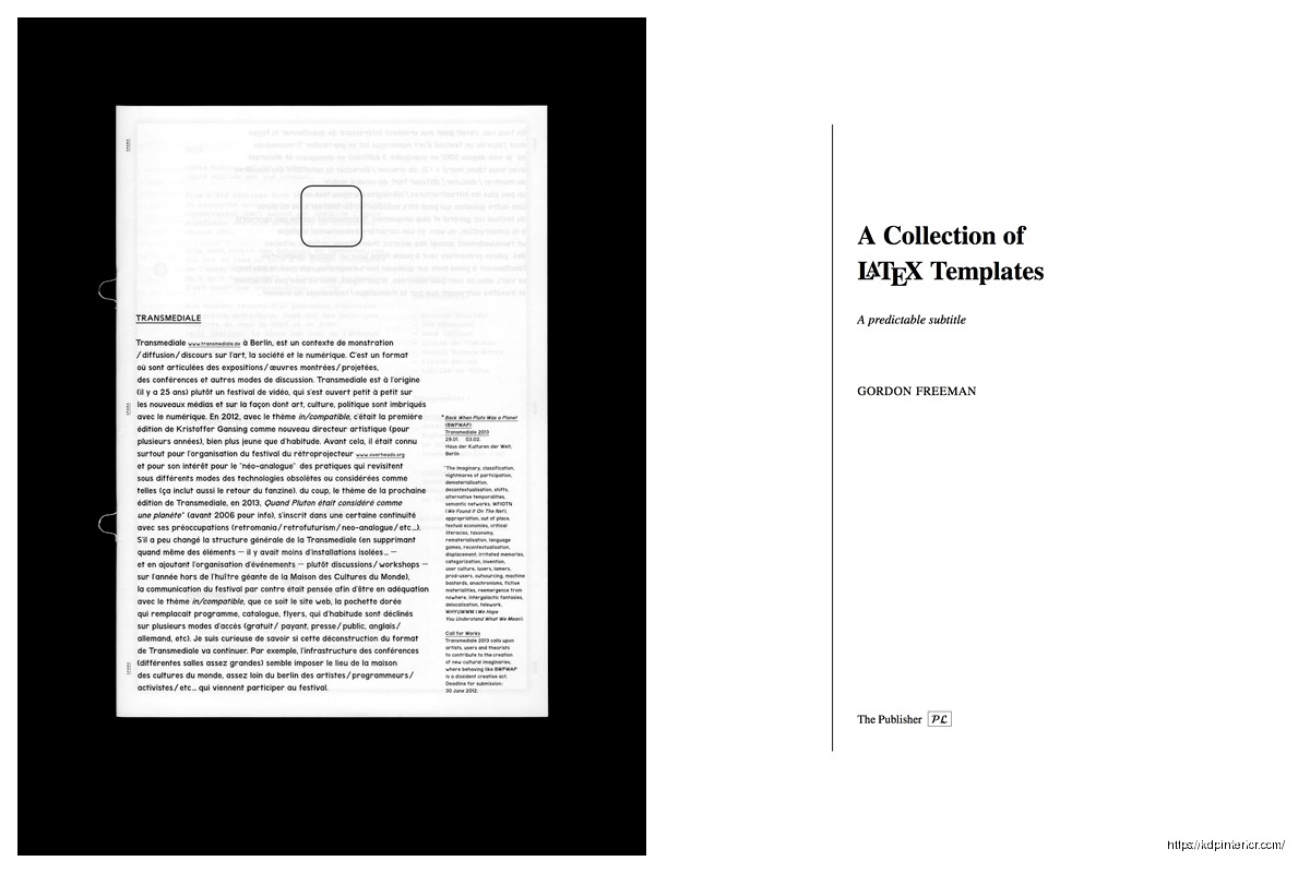
DISCOVER OUR FREE BEST SELLING PRODUCTS
Editable Canva Lined Journal: Express Your Thoughts – KDP Template
Lined Pages Journal 120 pages Ready to Upload PDF Commercial Use KDP Template 6×9 8.5×11 5×8 for Notebooks, Diaries, Low Content
Lined Pages Journal 120 pages Ready to Upload PDF Commercial Use KDP Template 6×9 8.5×11 5×8 for Notebooks, Diaries, Low Content
Cute Dogs Coloring Book for Kids | Activity Book | KDP Ready-To-Upload
Daily Planner Diary : Diary Planners for Everyday Productivity, 120 pages, 6×9 Size | Amazon KDP Interior
Wolf Coloring KDP interior For Adults, Used as Low Content Book, PDF Template Ready To Upload COMMERCIAL Use 8.5×11"
Coloring Animals Head Book for Kids, Perfect for ages 2-4, 4-8 | 8.5×11 PDF
Printable Blank Comic Book Pages PDF : Create Your Own Comics – 3 Available Sizes
Notes KDP interior Ready To Upload, Sizes 8.5×11 6×9 5×8 inch PDF FILE Used as Amazon KDP Paperback Low Content Book, journal, Notebook, Planner, COMMERCIAL Use
Black Lined Journal: 120 Pages of Black Lined Paper Perfect for Journaling, KDP Notebook Template – 6×9
Student Planner Journal 120 pages Ready to Upload PDF Commercial Use KDP Template 6×9" 8.5×11" for Low Content book
Recipe Journal Template – Editable Recipe Book Template, 120 Pages – Amazon KDP Interior