
-
×
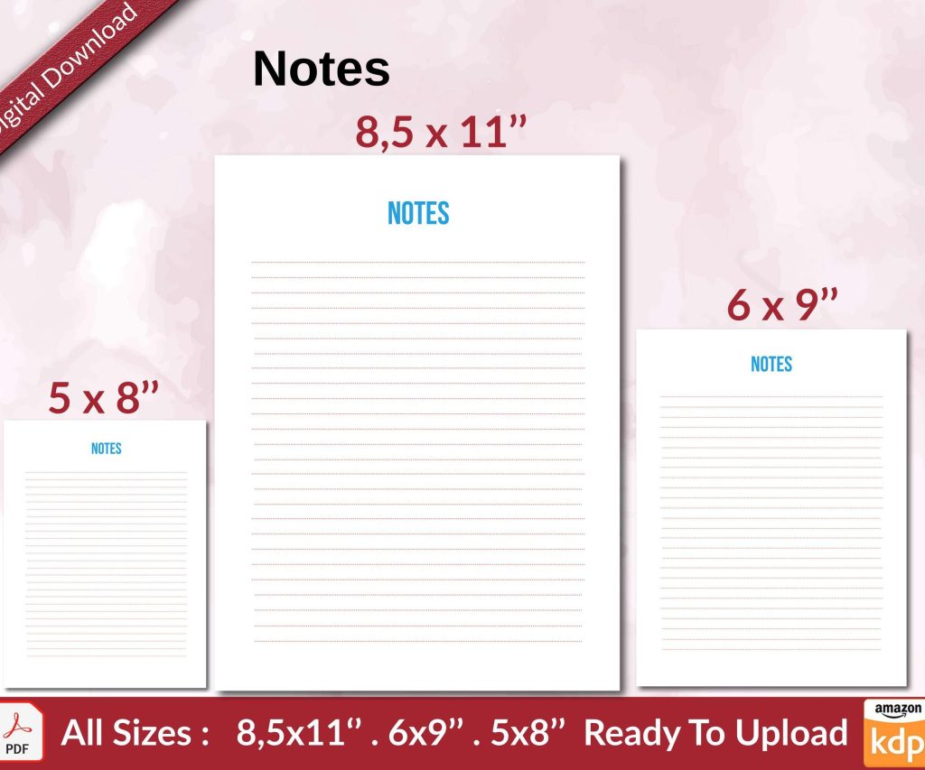 Notes KDP interior Ready To Upload, Sizes 8.5x11 6x9 5x8 inch PDF FILE Used as Amazon KDP Paperback Low Content Book, journal, Notebook, Planner, COMMERCIAL Use
1 × $0.00
Notes KDP interior Ready To Upload, Sizes 8.5x11 6x9 5x8 inch PDF FILE Used as Amazon KDP Paperback Low Content Book, journal, Notebook, Planner, COMMERCIAL Use
1 × $0.00
Subtotal: $0.00
Okay so I was literally uploading a cover to both platforms last Tuesday and my cat knocked over my coffee right in the middle of it, but anyway—the specs are actually pretty different and it’s kinda annoying because you’d think they’d standardize this stuff but nope.
Right off the bat, KDP is way more flexible with their cover dimensions. Like you can basically upload whatever ratio you want for ebooks and they’ll just crop it, but Lulu is much stricter about this. For KDP ebooks, I always go with 2560 x 1600 pixels minimum because that’s their recommended size and it looks good on all devices. You can honestly go bigger—I’ve done 3000 x 4800 for some of my premium titles and they look crisp.
But here’s where it gets messy… Lulu wants you to use their exact calculator tool for print books. You can’t just wing it like you sometimes can with KDP. They’ve got this cover calculator thing on their site and you gotta input your page count, paper type, all that stuff. KDP has a calculator too but I’ve found you can fudge the numbers a tiny bit and still be fine, whereas Lulu will reject your cover if you’re even like 0.1 inches off.
So for print covers on KDP, the template depends entirely on your trim size and page count. Most of my books are 6 x 9 inches because that’s the sweet spot for nonfiction and it looks professional. The spine width changes based on how many pages you have—like a 120-page book has a way thinner spine than a 300-page book obviously.
KDP’s template generator is pretty straightforward though. You go to their cover calculator, punch in your specs, and it spits out a template with the bleed areas marked. They require 0.125 inch bleed on all sides which is pretty standard in the industry. The template shows you exactly where your spine should be, where the safe zones are for text and important images.
Lulu does something similar but their interface is… look I’m gonna be honest, it’s not as intuitive. You download their template and it comes as a PDF or sometimes a PNG depending on what you select, and the quality isn’t always consistent. I’ve had templates download at weird resolutions before and had to email their support.
Both platforms want 300 DPI for print which is non-negotiable. I learned this the hard way back in 2017 when I uploaded a 150 DPI cover to KDP and it looked blurry as hell when the proof arrived. Never made that mistake again.
For file formats, KDP accepts PDF, TIFF, and JPG for print covers. I always use PDF because it preserves the quality better and you don’t get compression artifacts. Lulu also takes PDF and JPG but they’re pickier about the PDF version—they want PDF/X-1a or PDF/X-3 format which is like the print-ready standard. Sometimes regular PDFs get rejected.
Oh and another thing, color profiles matter more than you’d think. KDP wants RGB for ebooks but CMYK for print. Lulu is the same. I use Adobe RGB for ebooks and convert to CMYK for print, but if you’re not careful with the conversion you can get color shifts. Like reds can turn muddy or blues can look washed out.
For ebooks, both platforms are pretty chill comparatively. KDP recommends 2560 x 1600 pixels like I mentioned, but they’ll accept anything with a 1.6:1 ratio basically. The minimum is like 1000 pixels on the longest side but don’t go that low because it’ll look pixelated on newer devices.
Lulu’s ebook covers are similar—they want at least 1600 pixels on the longest side. I usually just make one cover at 2560 x 1600 and use it for both platforms. Saves time and they both look good.
The file size limit on KDP is 50 MB which you’ll basically never hit unless you’re doing something really weird with layers. Lulu’s limit is 10 MB for ebooks which is still plenty. I keep my ebook covers under 2 MB anyway because larger files take longer for customers to download and nobody wants that.
This is where people mess up constantly and then wonder why their covers look wrong when printed. The bleed zone is the area that extends beyond the actual trim size, and it’s there because when books get cut, the blade can shift slightly. If you don’t have bleed, you might end up with white edges on your cover.
KDP requires 0.125 inch bleed on all sides for print books. So if you’re making a 6 x 9 book, your actual cover dimensions are gonna be larger once you add the bleed. The template calculator does this math for you thank god.
Lulu also uses 0.125 inch bleed typically, but I’ve seen some of their templates call for different amounts depending on the binding type. Case laminate covers sometimes need more bleed than perfect bound. It’s inconsistent and kinda frustrating.
The safe zone is different from bleed—it’s the interior area where you should keep all your important text and images. On KDP, they recommend keeping everything at least 0.125 inches away from the trim line and 0.0625 inches away from the spine edges. I usually go even more conservative, like 0.25 inches, because I’ve had covers where text got too close to the edge and it looked cramped.
Wait I forgot to mention—the spine is its own nightmare. If your book is under 100 pages or so, KDP won’t let you put text on the spine because it’s too narrow. Lulu has similar restrictions. But the calculators will tell you the spine width and you can decide if there’s enough room for text.
Okay so funny story, I designed this gorgeous cover with this vibrant coral color that looked amazing on my monitor. Uploaded it to both KDP and Lulu, ordered proofs, and when they arrived the colors were completely different between the two. KDP’s version was more muted, Lulu’s was slightly more saturated but darker overall.
This happens because they use different printers and paper types. KDP uses cream and white paper options, and the cream paper makes colors look warmer and less vibrant. Lulu has similar paper choices but their cream is a different shade than KDP’s cream. It’s maddening.
My solution now is to always order proofs from both if I’m publishing on both platforms, and I sometimes create slightly different versions of the cover to compensate for the color differences. Like I’ll make the KDP version slightly more saturated knowing it’ll print duller.
Spine width calculations are where the templates really matter. KDP’s calculator is accurate in my experience—I’ve probably used it for 150+ books and never had a spine issue. You input your page count and paper type and it tells you the exact spine width.
Lulu’s calculator is also accurate but you gotta be more careful about your page count. If you’re off by even 5 pages, the spine width can change enough to mess up your cover layout. I always finalize my interior completely before I even start the cover now because I got burned by this early on.
The formula they use accounts for paper thickness—cream paper is thicker than white, so the spine is wider for the same page count. This is true on both platforms.
For print books, both platforms need a full wrap-around cover that includes the front, spine, and back. You can’t just upload a front cover. The templates show you exactly where each section goes.
For ebooks obviously you only need the front cover. But here’s a tip—I always design the full print cover first, then crop out the front for the ebook version. This way everything matches if someone buys both formats.
The back cover is where you put your book description, author bio, barcode area, all that stuff. KDP automatically places the barcode in the lower right corner of the back cover, and you need to leave that space blank. Lulu does the same thing but their barcode is slightly larger so you need more white space.
Low resolution is the number one rejection reason for both platforms. If any part of your cover is under 300 DPI for print, it’ll get flagged. I use Photoshop and always check my image resolution before exporting.
Text too close to the trim line is another big one. Like I mentioned earlier, keep everything in the safe zone. KDP is pretty forgiving about this but Lulu has rejected covers where text was too close even though it technically wasn’t in the bleed area.
Wrong dimensions will get you rejected immediately. The templates exist for a reason—use them. Don’t try to eyeball the measurements.
Bleed issues happen when people don’t extend their background images or colors all the way into the bleed zone. You’ll end up with white edges when the book gets trimmed. Extend everything that touches an edge into the bleed area.
This is gonna sound weird but file naming matters more on Lulu than KDP. Lulu’s system sometimes has issues with special characters or really long file names. I keep my cover files named simple like “BookTitle_Cover_Final.pdf” with no weird characters.
KDP doesn’t care as much about file names in my experience. I’ve uploaded files with spaces, numbers, all kinds of stuff and never had a problem.
The actual upload process is smoother on KDP. You just drag and drop your cover file and it processes pretty quickly. Lulu’s uploader is slower and sometimes times out if your file is large or your internet hiccups. I’ve had to re-upload covers multiple times on Lulu because of timeout errors.
If you’re doing hardcovers, the specs change again. KDP only offers hardcover through their expanded distribution I think, or maybe it’s available for everyone now—honestly they keep changing this.
Lulu has better hardcover options in general. They offer different types like case laminate and dust jacket, and each has its own template. The dust jacket template is wild because you have to account for the flaps that fold inside the cover. The template shows you where the flaps are but it takes some getting used to.
Hardcover spines are also calculated differently because the cover material is thicker. The calculator tools account for this but again, you gotta be precise with your page count.
One thing I learned after seeing my covers as thumbnails—what looks good at full size doesn’t always work at thumbnail size. Amazon shows your cover at like 150 pixels tall in search results, so your title needs to be readable at that size.
I always test my covers by shrinking them down to thumbnail size before finalizing. If I can’t read the title easily, I make the text bigger or change the font. Lulu’s storefront also shows small thumbnails so this applies to both.
Sans serif fonts generally work better for titles at small sizes. I use fonts like Montserrat, Bebas Neue, or Futura for titles because they’re clean and readable. Script fonts look pretty but they get muddy at small sizes.
Okay I think that covers most of the important differences between the two platforms. The main thing is just use their template calculators, don’t try to guess the dimensions, and always order a proof before you publish because what looks good on screen doesn’t always translate to print. Both platforms are workable once you get used to their quirks, but KDP is definitely more user-friendly overall.
DISCOVER OUR FREE BEST SELLING PRODUCTS
Editable Canva Lined Journal: Express Your Thoughts – KDP Template
Lined Pages Journal 120 pages Ready to Upload PDF Commercial Use KDP Template 6×9 8.5×11 5×8 for Notebooks, Diaries, Low Content
Lined Pages Journal 120 pages Ready to Upload PDF Commercial Use KDP Template 6×9 8.5×11 5×8 for Notebooks, Diaries, Low Content
Cute Dogs Coloring Book for Kids | Activity Book | KDP Ready-To-Upload
Daily Planner Diary : Diary Planners for Everyday Productivity, 120 pages, 6×9 Size | Amazon KDP Interior
Wolf Coloring KDP interior For Adults, Used as Low Content Book, PDF Template Ready To Upload COMMERCIAL Use 8.5×11"
Coloring Animals Head Book for Kids, Perfect for ages 2-4, 4-8 | 8.5×11 PDF
Printable Blank Comic Book Pages PDF : Create Your Own Comics – 3 Available Sizes
Notes KDP interior Ready To Upload, Sizes 8.5×11 6×9 5×8 inch PDF FILE Used as Amazon KDP Paperback Low Content Book, journal, Notebook, Planner, COMMERCIAL Use
Black Lined Journal: 120 Pages of Black Lined Paper Perfect for Journaling, KDP Notebook Template – 6×9
Student Planner Journal 120 pages Ready to Upload PDF Commercial Use KDP Template 6×9" 8.5×11" for Low Content book
Recipe Journal Template – Editable Recipe Book Template, 120 Pages – Amazon KDP Interior