okay so I just spent like three weeks messing around with manga page templates for a client project and honestly it’s way more specific than regular comic layouts… the whole right-to-left thing changes everything
Panel Flow and Reading Direction
So first thing you gotta understand is that manga reads right to left, top to bottom. Which sounds simple until you actually start designing pages and realize your Western brain keeps wanting to do the opposite. I literally had to tape a note to my monitor that said “RIGHT TO LEFT DUMMY” because I kept screwing it up.
The standard flow goes: top right panel is your starting point, then you move left across that tier, drop down to the next row, start right again. Think of it like a backwards Z pattern. Your eye should naturally flow from panel to panel without getting confused about where to go next.
Panel Numbering System
When you’re setting up templates, number your panels in reading order. Panel 1 is top right corner, Panel 2 is to its left, and so on. This helps when you’re actually filling in the content later because you won’t have to think about the flow… you just follow the numbers.
Most manga pages have between 4-7 panels but honestly it varies wildly depending on pacing. Action sequences might have fewer larger panels, dialogue-heavy scenes pack in more smaller ones.
Standard Page Dimensions
Okay so this is where it gets technical but bear with me. Traditional Japanese manga magazines (tankobon format) are roughly 5 x 7.5 inches. But if you’re doing print-on-demand through KDP or IngramSpark, you’re probably looking at these sizes:
- 5 x 8 inches (closest to traditional)
- 6 x 9 inches (super common for KDP)
- 5.5 x 8.5 inches (good middle ground)
I usually work in 6 x 9 because it’s a KDP standard trim size and the printing costs are reasonable. Plus readers are used to it.
For digital manga though… totally different story. You want 1654 x 2339 pixels for webtoon-style formats, but traditional page scans work better at 1200 x 1600 pixels or higher. Resolution matters more than you’d think because manga has a lot of fine line work.
Bleed and Margin Setup
Oh and another thing, bleed is super important if you’re doing print. KDP requires 0.125 inches of bleed on all sides. So your actual working canvas needs to be larger than your trim size.
For a 6 x 9 inch book, you’re actually designing on a 6.25 x 9.25 inch canvas. The extra 0.125 inches on each side gets trimmed off during printing. Any artwork or panels that go to the edge of the page need to extend into that bleed area or you’ll get weird white strips.
Margins are a whole other thing. You need at least 0.5 inches on the inside margin (the gutter where the pages bind) and 0.25 inches on the outside edges. Some manga artists go even bigger on the gutter, like 0.75 inches, to make sure text doesn’t disappear into the binding.
Safe Zone for Text
Keep all your important dialogue and sound effects at least 0.375 inches away from any edge. This is your safe zone. I learned this the hard way when my first manga project came back from the printer and half the dialogue bubbles were cut off… my cat knocked over my coffee right when I was checking the files and I just approved them without looking closely enough. Cost me like $200 in reprints.
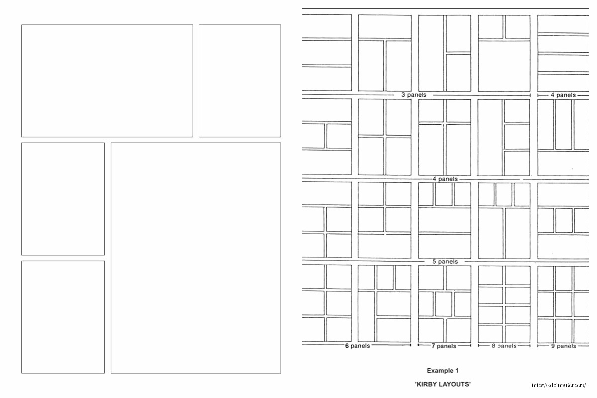
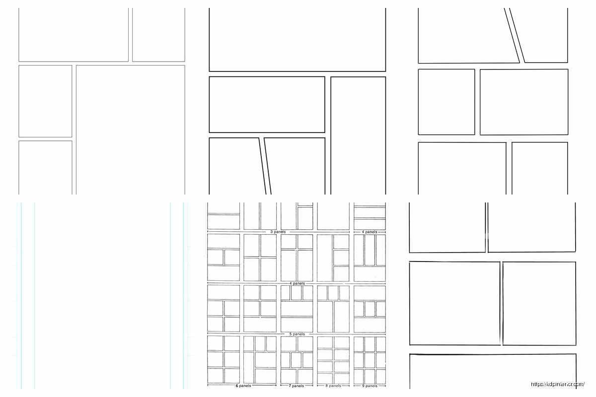
Panel Layout Patterns
Most manga pages follow some common grid patterns. You don’t have to stick to these exactly but they’re good starting points:
Four Panel Grid: Two panels across, two panels down. Super basic but works great for dialogue scenes or establishing shots. Each panel gets roughly equal space.
Six Panel Grid: Three rows of two panels each. This is probably the most common layout I see. Gives you good flexibility for pacing without overwhelming the reader.
Asymmetric Action Layout: One large panel taking up half the page or more, with smaller panels around it. The big panel is usually your action beat or emotional climax moment.
Vertical Split: Page divided into two or three vertical strips. Works really well for showing parallel action or time progression.
wait I forgot to mention that Japanese manga almost never uses perfectly rectangular panels for everything. There’s this thing called “panel breaking” where artwork bleeds out of the panel borders or characters overlap between panels. It creates this dynamic energy that Western comics don’t use as much.
Panel Border Styles
Panel borders in manga are usually simple black lines, but the thickness and style tell you something about the scene:
- Solid thick borders: normal scenes, present action
- Thin borders: subtle or quiet moments
- Wavy or broken borders: flashbacks, dreams, memories
- No borders at all: intense action, emotional peaks
The space between panels (called gutters) is typically pretty narrow in manga, like 0.125 to 0.25 inches. Tighter gutters make the page feel faster-paced, wider gutters slow things down.
Creating Templates in Different Software
Okay so funny story, I’ve tried making manga templates in basically every program out there because different clients use different tools. Here’s what actually works:
Clip Studio Paint
This is honestly the industry standard for manga. It’s got built-in ruler tools specifically for manga panels, perspective grids, speech bubble tools, all of it. You can create page templates with pre-divided panels and save them as template files.
Set up your canvas with the correct dimensions plus bleed, then use the Frame Border tools to divide it into panels. The software automatically creates panel folders which is insanely helpful for organizing layers. You can even set the gutter width precisely.
Photoshop
Works fine but you’re doing more manual work. Create guides for your panel borders using the ruler tool. I usually set up a grid system with guides marking every inch or half-inch, then use those to align my panels consistently.
Make each panel on a separate layer or layer group so you can adjust them independently. Save the empty template as a PSD file you can reuse.
Manga Studio (now called Clip Studio Paint but some people still have the old version)
Same deal as Clip Studio basically. Great panel tools, good for templates.
Text Placement and Speech Bubbles
This is gonna sound weird but manga text placement follows different rules than Western comics. The text reads right to left within bubbles, and bubbles are placed right to left across the page.
Speech bubbles in manga tend to be simpler and less rounded than American comics. They’re often more oval or even just circular, with smaller tails pointing to the speaker. Sound effects are usually integrated directly into the artwork rather than in separate bubbles.
Font sizes: I typically use 10-12 point font for dialogue, maybe 8-9 point for small text or whispers. But this depends on your page size. For 6 x 9 inch pages, 10.5 point is my sweet spot.
Traditional manga uses vertical text but most English translations use horizontal text because… English doesn’t work vertically. If you’re doing original English manga, horizontal text is totally fine and expected.
Screen Tones and Background Patterns
Manga has this whole aesthetic thing with screen tones – those dot patterns and gradients you see in backgrounds and shading. They’re technically optional but they give that authentic manga feel.
In digital templates, you can create separate layers for screen tones and save them with your template. Common tone densities are 10%, 20%, 30%, and 40% black. You can buy digital tone packs or create your own halftone patterns.
I usually set up my templates with empty tone layers already in place, labeled by density. Makes it faster to add them during the actual drawing phase.
Action Lines and Speed Effects
oh and another thing manga pages often need – those radiating lines or motion blur effects. You can add these to your template as optional layers that artists can toggle on or off.
Concentration lines (radiating from a focal point) are super common for dramatic moments. Speed lines show motion direction. Both are usually pure black on white, very high contrast.
Multi-Page Spread Considerations
Sometimes manga does two-page spreads for big impact moments. Your template needs to account for this. The gutter between the two pages becomes really important – you don’t want critical artwork disappearing into the binding.
For spreads, I create a canvas that’s twice the width plus extra gutter space. So for 6 x 9 inch pages, that’s roughly 12.5 x 9 inches (accounting for the gutter and bleed). Keep important visual elements away from the center where the pages meet.
Cover Template Differences
Manga covers are basically full-bleed artwork with the spine and back cover included. KDP has a cover calculator that tells you the exact dimensions based on your page count and paper type.
The spine width changes depending on how many pages your manga has. More pages means thicker spine means wider cover canvas. I always use KDP’s calculator rather than guessing because getting this wrong means rejected files.
Cover Safe Zones
Keep your title and important artwork at least 0.25 inches from the trim lines. Barcodes go on the bottom right of the back cover, so leave that space clear – usually about 2 x 1.25 inches.
Template Organization Tips
I keep a folder of like 15-20 different manga page templates with various panel layouts. Name them descriptively like “6panel_standard” or “action_asymmetric_large” so you can grab the right one quickly.
Each template file has layers for:
- Panel borders
- Gutters/margins marked with guides
- Text safe zone guides
- Bleed area marked
- Optional tone layers
- Reference layer showing panel reading order
The reference layer gets deleted before final export but it’s super helpful during the layout phase. Just numbers showing the reading flow.
Export Settings for Print vs Digital
Print manga needs to be 300 DPI minimum, CMYK color mode (even though most manga is black and white), saved as PDF/X-1a format for KDP. File size can get huge so make sure you’re not embedding unnecessary layers.
Digital manga for online reading can be 150 DPI, RGB color mode, exported as high-quality JPG or PNG. Each page is a separate file. Some platforms want specific naming conventions like page001.jpg, page002.jpg, etc.
I always keep the master files at 600 DPI just in case I need to scale up later. Storage is cheap, redrawing artwork is expensive.
Common Template Mistakes to Avoid
Don’t make your panels too small. Readers need to see the artwork clearly, and tiny panels with lots of detail just look muddy when printed at manga size.
Don’t forget about the gutter. I’ve seen so many amateur manga where faces get cut in half by the binding because someone didn’t account for that inner margin.
Don’t use super complex panel layouts on every page. It’s exhausting for readers. Mix simple pages with complex ones for better pacing. I was watching The Bear last week while working on layouts and realized the same principle applies – you need breathing room between intense moments.
And seriously test print your templates before committing to a full manga project. Order a proof copy with a few sample pages. The way things look on screen versus in physical print can be really different, especially with fine line work and grey tones.
Anyway that’s basically everything I’ve figured out through trial and error and probably too much coffee at 2am fixing page layouts. The templates themselves are just tools though… the actual manga storytelling is the hard part.
 Black Lined Journal: 120 Pages of Black Lined Paper Perfect for Journaling, KDP Notebook Template - 6×9
2 × $0.00
Black Lined Journal: 120 Pages of Black Lined Paper Perfect for Journaling, KDP Notebook Template - 6×9
2 × $0.00  Cute Dogs Coloring Book for Kids | Activity Book | KDP Ready-To-Upload
1 × $0.00
Cute Dogs Coloring Book for Kids | Activity Book | KDP Ready-To-Upload
1 × $0.00 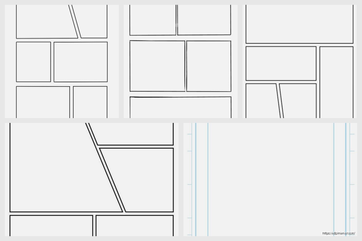
DISCOVER OUR FREE BEST SELLING PRODUCTS
Editable Canva Lined Journal: Express Your Thoughts – KDP Template
Lined Pages Journal 120 pages Ready to Upload PDF Commercial Use KDP Template 6×9 8.5×11 5×8 for Notebooks, Diaries, Low Content
Lined Pages Journal 120 pages Ready to Upload PDF Commercial Use KDP Template 6×9 8.5×11 5×8 for Notebooks, Diaries, Low Content
Cute Dogs Coloring Book for Kids | Activity Book | KDP Ready-To-Upload
Daily Planner Diary : Diary Planners for Everyday Productivity, 120 pages, 6×9 Size | Amazon KDP Interior
Wolf Coloring KDP interior For Adults, Used as Low Content Book, PDF Template Ready To Upload COMMERCIAL Use 8.5×11"
Coloring Animals Head Book for Kids, Perfect for ages 2-4, 4-8 | 8.5×11 PDF
Printable Blank Comic Book Pages PDF : Create Your Own Comics – 3 Available Sizes
Notes KDP interior Ready To Upload, Sizes 8.5×11 6×9 5×8 inch PDF FILE Used as Amazon KDP Paperback Low Content Book, journal, Notebook, Planner, COMMERCIAL Use
Black Lined Journal: 120 Pages of Black Lined Paper Perfect for Journaling, KDP Notebook Template – 6×9
Student Planner Journal 120 pages Ready to Upload PDF Commercial Use KDP Template 6×9" 8.5×11" for Low Content book
Recipe Journal Template – Editable Recipe Book Template, 120 Pages – Amazon KDP Interior