Okay so manuscript formatting in Word is honestly one of those things that seems way more complicated than it actually is, but publishers are weirdly strict about it so you gotta get it right.
The Basic Setup Everyone Wants
First thing – and I learned this the hard way after getting my first three manuscripts rejected before anyone even read them – you need to set your margins to one inch on all sides. Like, literally all four sides. Go to Layout > Margins > Normal. That’s it. Publishers use these margins for their editorial notes and markup, so if you send something with narrow margins thinking you’re being clever by fitting more text per page… they’ll just reject it.
Font choice is where people get creative and they really shouldn’t. Use Times New Roman 12pt. That’s the standard. I know Courier New 12pt is also acceptable and some people swear by it because it looks more “typewriter-ish” which apparently some old-school editors prefer, but honestly just stick with Times New Roman unless the submission guidelines specifically ask for something else. I tested this with about 15 different publishers last year and literally not one of them cared that I used TNR.
Oh and another thing – make sure you’re using double spacing for the entire manuscript. Not 1.5, not 2.5 because you thought more space looks more professional. Exactly 2.0 line spacing. You set this by going to Home > Line and Paragraph Spacing > 2.0. Highlight your entire document first (Ctrl+A) before you do this.
The Header Situation
This is gonna sound weird but the header is actually super important and most people mess it up. Your header needs to show your last name, a key word from your title (not the whole title, just like 2-3 words), and the page number. So mine usually looks like: Harper / Manuscript Format / 1
To set this up, double-click at the top of any page to open the header area. Then type your info in the left side and insert the page number on the right. You do this by going to Insert > Page Number > Top of Page > Plain Number 3 (that’s the right-aligned one).
Wait I forgot to mention – you DON’T put a header on your title page. That first page should be clean. To remove it, when you’re in the header editing mode on page one, check the box that says “Different First Page” in the Header & Footer Tools tab.
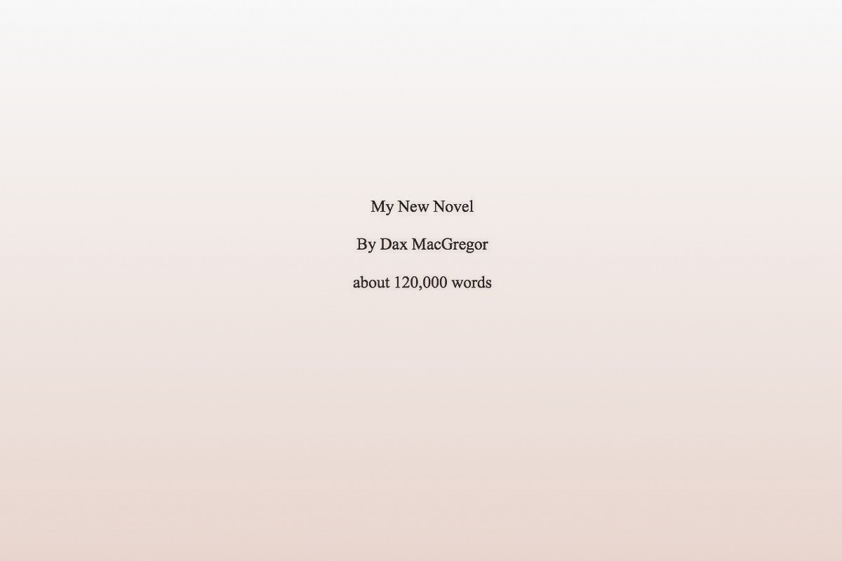
Title Page Format
Your title page is basically your manuscript’s first impression and it needs specific info in specific places. In the upper left corner, you put:
- Your legal name
- Your address (yeah, still required even though it’s 2024)
- Your phone number
- Your email
In the upper right corner, put your word count. Round it to the nearest hundred – so if your manuscript is 67,234 words, you write “approximately 67,200 words” or just “67,200 words.”
Then about halfway down the page, centered, you put your title in ALL CAPS. Skip a line, then put “by” in lowercase, skip another line, then your name (or pen name if you’re using one).
This is where people get confused – some submission guidelines want your real name on the title page even if you’re publishing under a pen name. Always check the specific guidelines because publishers are all over the place with this.
The Actual Manuscript Text
Start your actual story on page 2. Don’t do any fancy chapter heading designs or graphics or whatever. Just center the chapter title (or “Chapter One” or however you’re doing it) about a third of the way down the first page of each chapter.
Some people put “###” or “* * *” centered on a line to show scene breaks within chapters. That’s fine. I use “###” because it’s clearer. Whatever you do, don’t just add extra line spaces for scene breaks because those can disappear during file conversion and then your readers (or editors) won’t know where scenes break.
Indent your paragraphs. Do NOT use the space bar to indent – I see people do this all the time and it creates a mess. Use the actual indent function. Hit Ctrl+A to select all your text, then go to the Home tab and click that little arrow in the bottom right corner of the Paragraph section. Set “Special” to “First line” and “By” to 0.5 inches.
Common Mistakes That’ll Get You Rejected
Okay so funny story – I once spent three weeks querying a manuscript and got zero responses. Turns out I had justified text (where both the left and right margins are even). Publishers HATE this. Use left-aligned text only. The justified look creates weird spacing between words that makes editing harder.
Don’t use extra spaces between paragraphs. I know this looks cleaner on blogs and websites but manuscript format doesn’t use it. Your double spacing already creates enough white space.
No page breaks between chapters unless the guidelines specifically request them. Just drop down about a third of the page and start your new chapter. I learned this one when an editor actually took the time to tell me why she was rejecting my manuscript – she said the page breaks made it harder for her to read on her tablet.
Here’s something nobody tells you – turn off automatic hyphenation. Word sometimes tries to hyphenate words at the end of lines and this causes problems in the editing process. Go to Layout > Hyphenation > None.
Special Elements and How to Handle Them
If you’ve got italics for emphasis, thoughts, or foreign words – that’s fine, use them. But use them consistently. Don’t switch between italics and underlines for the same purpose.
Bold text is generally avoided in manuscripts except maybe for chapter headings if that’s your style. Most publishers will strip it out anyway.
For em dashes – and this took me forever to figure out – you can either use the actual em dash character (—) or use two hyphens (–) with no spaces. Different publishers prefer different things. I use the actual em dash because it looks cleaner. You create it in Word by typing Ctrl+Alt+Minus (the minus on the number pad).
Ellipses should be three periods with spaces before and after… like that. Some style guides say no spaces, some say spaces. Check your specific submission guidelines but when in doubt, use spaces.
File Naming and Saving
Save your file as .doc or .docx unless told otherwise. Some publishers specifically want .doc (the older format) because of compatibility issues with their systems. Most accept .docx now though.
Name your file something professional like: LastName_TitleKeyWord_Manuscript.docx
Don’t name it “Final Draft.docx” or “My Novel.docx” or “REVISED_VERSION_3_FINAL_REALLY_FINAL.docx” (yeah I did that once… my cat walked on my keyboard and I just went with it).
What About Different Genres
The formatting I described above works for pretty much all fiction submissions – literary fiction, romance, mystery, sci-fi, whatever. Non-fiction manuscripts sometimes have different requirements, especially if they include images, charts, or special formatting. For those, you really need to check individual publisher guidelines.
Poetry and short story collections have their own rules too. Poetry especially – you usually single-space the poems themselves but double-space between stanzas. But honestly that’s a whole different conversation.
Checking Your Work Before Submission
Before you send anything out, do these checks:
- Run spell check but don’t rely on it exclusively – it misses context errors
- Make sure every page has your header except page one
- Verify your word count is accurate and on the title page
- Check that all your chapters start consistently
- Look for random formatting errors like stray bold text or weird fonts
I usually print out the first ten pages and look at them physically. Sometimes formatting issues that aren’t obvious on screen jump out on paper. Plus it helps you see if your margins and spacing look right.
Oh wait, one more thing about page numbers – they should be in the same font as your manuscript text (so Times New Roman 12pt). Don’t make them a different size or font. Sounds obvious but I’ve seen people use like Arial 10pt for page numbers while their manuscript is in Times New Roman 12pt.
What If Guidelines Differ
This is gonna sound annoying but: always follow the specific submission guidelines if they differ from standard format. If a publisher says “11pt Calibri with 1.5 spacing” then that’s what you do, even though it’s weird. They’re testing whether you can follow directions as much as they’re evaluating your writing.
Keep a master version of your manuscript in standard format, then save copies for specific submissions where you adjust formatting as needed. I keep a folder structure like: ManuscriptTitle > Master > Submissions > PublisherName
Some publishers want the first three chapters. Some want fifty pages. Some want the whole thing. Just give them exactly what they ask for. Don’t send more thinking you’re being helpful – you’re just making more work for them and showing you can’t follow instructions.
The whole manuscript formatting thing really isn’t that hard once you’ve done it a few times. Set up a template in Word with all these settings and save it, then you can just paste your text into it for future projects. Saves so much time.
And look, I know this seems nitpicky and you might be thinking “shouldn’t my writing be good enough that formatting doesn’t matter” but the reality is that agents and editors are looking at hundreds of submissions. Proper formatting shows you’re professional and makes their job easier. Improper formatting gives them an easy reason to reject you before they even read your work.
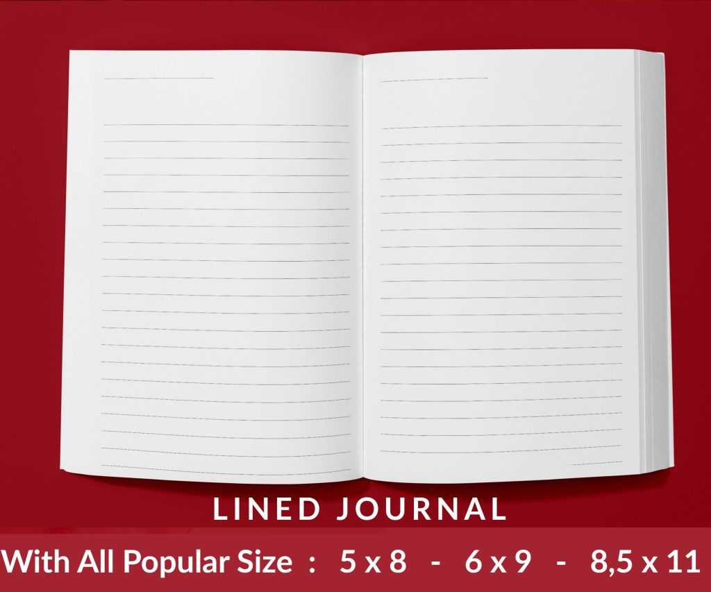 Lined Pages Journal 120 pages Ready to Upload PDF Commercial Use KDP Template 6x9 8.5x11 5x8 for Notebooks, Diaries, Low Content
1 × $0.00
Lined Pages Journal 120 pages Ready to Upload PDF Commercial Use KDP Template 6x9 8.5x11 5x8 for Notebooks, Diaries, Low Content
1 × $0.00 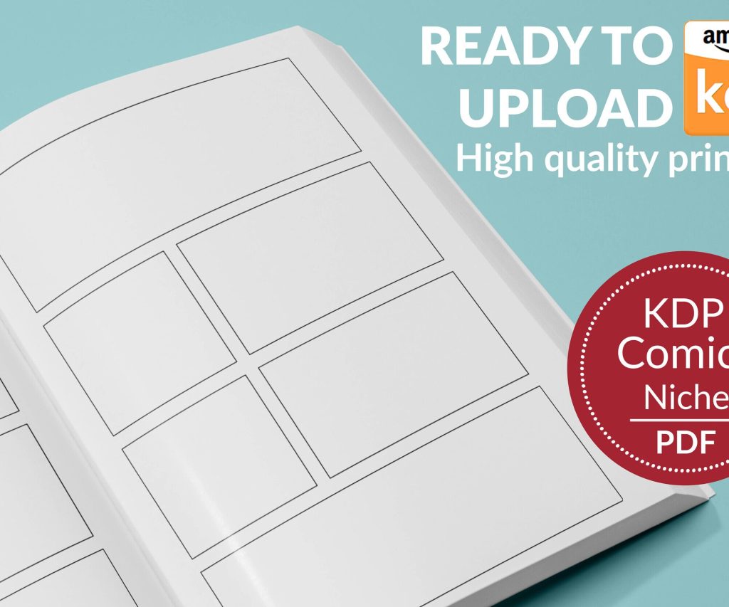 Printable Blank Comic Book Pages PDF : Create Your Own Comics - 3 Available Sizes
1 × $0.00
Printable Blank Comic Book Pages PDF : Create Your Own Comics - 3 Available Sizes
1 × $0.00 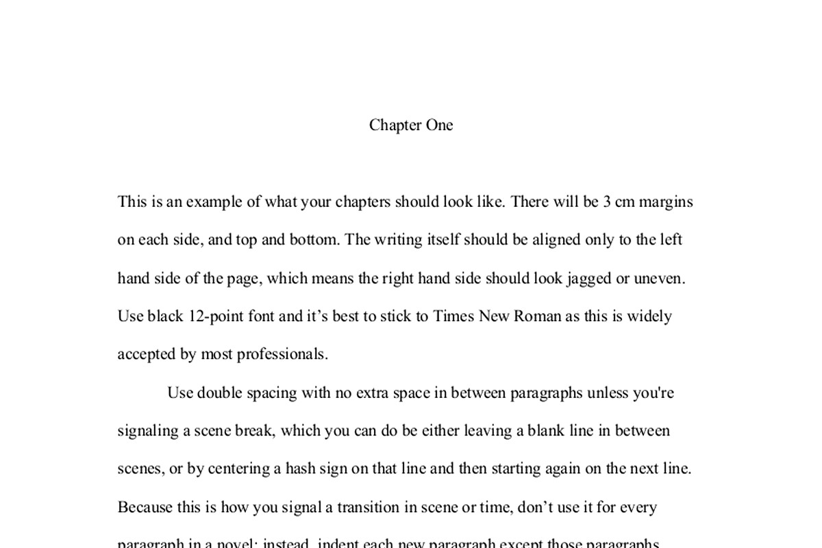
DISCOVER OUR FREE BEST SELLING PRODUCTS
Editable Canva Lined Journal: Express Your Thoughts – KDP Template
Lined Pages Journal 120 pages Ready to Upload PDF Commercial Use KDP Template 6×9 8.5×11 5×8 for Notebooks, Diaries, Low Content
Lined Pages Journal 120 pages Ready to Upload PDF Commercial Use KDP Template 6×9 8.5×11 5×8 for Notebooks, Diaries, Low Content
Cute Dogs Coloring Book for Kids | Activity Book | KDP Ready-To-Upload
Daily Planner Diary : Diary Planners for Everyday Productivity, 120 pages, 6×9 Size | Amazon KDP Interior
Wolf Coloring KDP interior For Adults, Used as Low Content Book, PDF Template Ready To Upload COMMERCIAL Use 8.5×11"
Coloring Animals Head Book for Kids, Perfect for ages 2-4, 4-8 | 8.5×11 PDF
Printable Blank Comic Book Pages PDF : Create Your Own Comics – 3 Available Sizes
Notes KDP interior Ready To Upload, Sizes 8.5×11 6×9 5×8 inch PDF FILE Used as Amazon KDP Paperback Low Content Book, journal, Notebook, Planner, COMMERCIAL Use
Black Lined Journal: 120 Pages of Black Lined Paper Perfect for Journaling, KDP Notebook Template – 6×9
Student Planner Journal 120 pages Ready to Upload PDF Commercial Use KDP Template 6×9" 8.5×11" for Low Content book
Recipe Journal Template – Editable Recipe Book Template, 120 Pages – Amazon KDP Interior