Okay so here’s the deal with manuscript formatting
I just walked a client through this whole submission process last week and honestly the formatting part is where like 90% of people screw up their chances before an agent even reads page one. It’s not complicated but you gotta get it right.
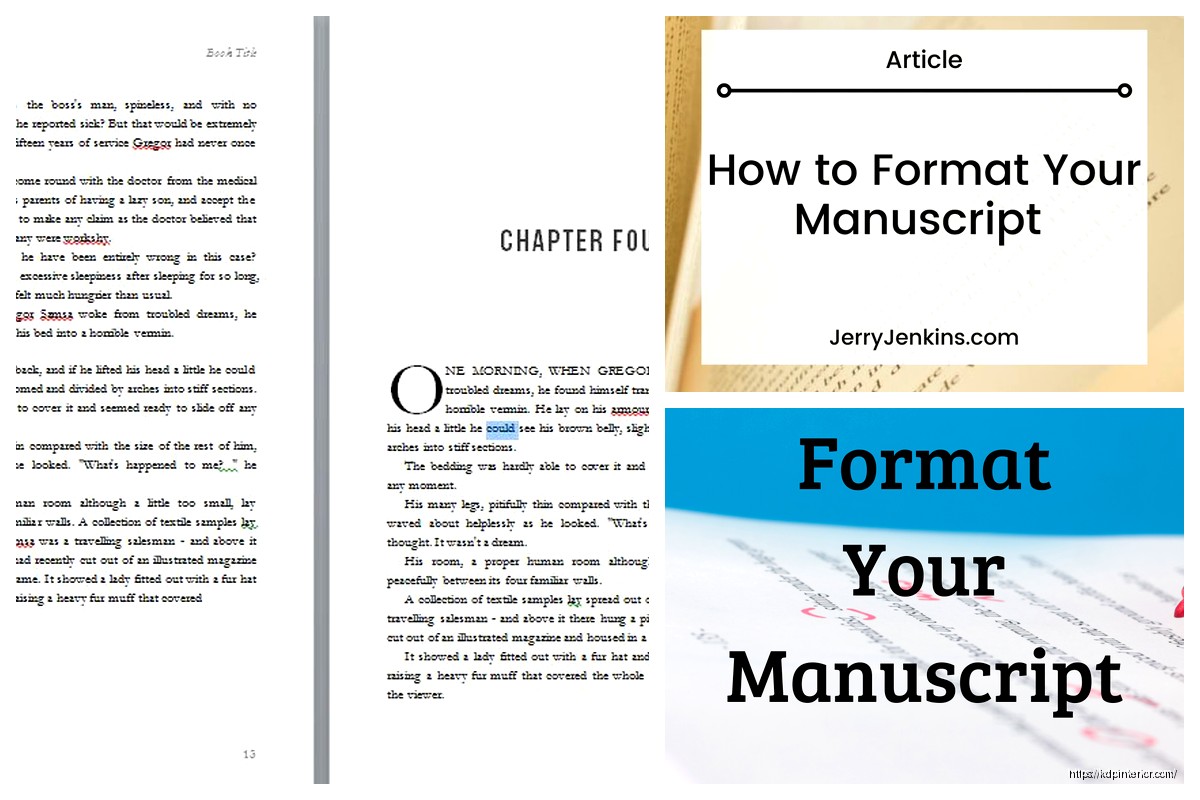
First thing – and I know this sounds basic but I’ve seen it mess people up – you need to use a standard font. Times New Roman 12pt or Courier 12pt. That’s it. I don’t care how pretty your manuscript looks in Garamond or whatever trendy font you found. Agents and editors have been reading TNR for decades and their eyes are trained for it. Courier if you’re going old school but honestly Times New Roman is the safe bet.
Margins and spacing
One inch margins all around. Top, bottom, left, right. And everything – and I mean everything – needs to be double-spaced. Not 1.5, not single with space between paragraphs. Double-spaced throughout the entire manuscript.
Left-align your text, not justified. Justified text creates weird spacing issues and it’s just not standard. Left-align with a ragged right edge.
The header situation
Oh and another thing that trips people up – your header. In the top right corner of every page except the first, you need: Your Last Name / KEY WORD FROM TITLE / Page Number
So mine would look like: Harper / SUBMISSION / 24
Don’t use “Title” as the key word, use an actual short version of your title. If your book is called “The Wandering Moon” just put MOON or WANDERING. Keep it to one or two words max.
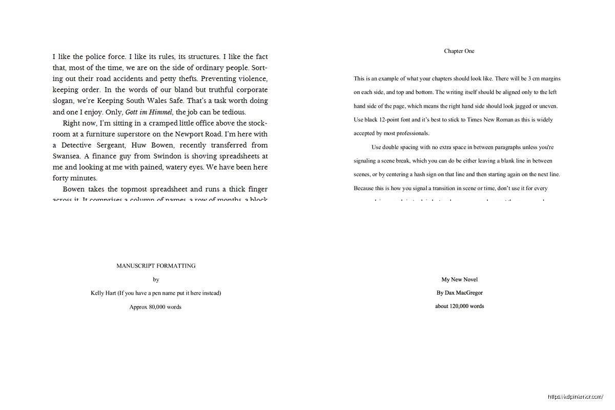
The title page setup
Your first page is your title page and it needs specific info in specific places. Top left corner goes your contact info:
- Your real name (not pen name unless you’re already published under it)
- Street address
- City, state, zip
- Phone number
- Email address
Some people freak out about putting their address but yeah, that’s standard. If you’re really privacy-concerned you can use a PO box.
Top right corner – this is where you put your word count rounded to the nearest thousand. So if your manuscript is 87,432 words, you write “approximately 87,000 words” or just “87,000 words”.
Then drop down to the center of the page and center-align your title in ALL CAPS or Title Case (I prefer ALL CAPS personally). Skip a line, put “by” in lowercase, skip another line, put your name (or pen name if that’s what you’re publishing under).
First chapter formatting
Page two is where Chapter One starts. Drop down about a third of the page – like hit enter maybe 8-10 times – then type your chapter heading. Could be “Chapter One” or “Chapter 1” or just “One” depending on your style. Be consistent throughout.
Skip three or four lines after your chapter heading, then start your first paragraph.
Wait I forgot to mention – do NOT indent the first paragraph of each chapter or after a scene break. Every other paragraph gets indented by 0.5 inches (one tab), but not those first ones.
Scene breaks and chapter breaks
For scene breaks within a chapter, drop down four lines, put a centered # symbol or three asterisks (* * *), then drop down four more lines before starting the next scene. Don’t indent that first paragraph after the break.
Each new chapter starts on a new page. Always. Even if the previous chapter ended halfway down a page.
My cat just knocked over my coffee while I’m writing this but anyway…
Dialogue and punctuation stuff
This isn’t strictly formatting but since I’m on a roll – use straight quotes, not curly quotes. Actually wait, that’s backwards. You DO want curly/smart quotes for fiction manuscripts, not the straight ones. Straight quotes are for… honestly I can’t remember when you use those. But for fiction you want the curly ones that curve toward the text.
Em dashes (—) not hyphens (-) for interrupted dialogue. Most word processors will auto-create an em dash if you type two hyphens together. Don’t put spaces around em dashes in fiction.
Page numbering specifics
Start numbering on page 1 of your actual manuscript (after the title page). The title page doesn’t get a number. Your header with the page number goes in the top right, about 0.5 inches from the top of the page.
Don’t use fancy numbering like “Page 1 of 324” – just the number with your name and title keyword like I mentioned earlier.
File naming and submission format
Okay so funny story – I had a client who named her file “FINAL FINAL version 3 REALLY FINAL.docx” and wondered why she wasn’t getting responses. Your file name should be professional: TITLE_AuthorLastName.docx
So: WANDERINGMOON_Harper.docx
Submit as a .docx file unless the agent specifically requests .doc or .rtf or .pdf. Most want .docx these days. Don’t send a PDF unless they ask for it specifically because PDFs are harder for agents to make notes on.
Things that make you look amateur
No extra line spaces between paragraphs. I see this ALL THE TIME from people who learned to write online or in blog format. Fiction manuscripts don’t have blank lines between paragraphs – that’s what the indent is for.
Don’t use a space to indent. Use the actual indent function in your word processor. Set it to 0.5 inches and use that. Spaces create formatting issues when the file gets opened on different devices.
No page breaks except between chapters. Let pages break naturally. The only time you manually insert a page break is at the end of a chapter to start the next one on a fresh page.
Don’t center-align your chapter headings and then forget to left-align the text again. I’ve seen manuscripts where every other chapter is centered by accident.
Special formatting for emphasis
Italics for emphasis, internal thoughts, or foreign words. Don’t underline – that’s old typewriter style. Just use actual italics.
If you’re doing something weird like letters within your story or text messages or emails, you can use italics or a slight indent to set them apart. Be consistent with whatever you choose.
Bold is almost never used in fiction manuscripts. Like, pretty much never. Even for chapter headings I usually just use regular text.
The query letter vs manuscript format
This is gonna sound weird but your query letter uses totally different formatting. Single-spaced, block format like a business letter, blank line between paragraphs. Don’t mix up query formatting with manuscript formatting – they’re separate documents with separate rules.
My client canceled yesterday so I spent like three hours comparing different agents’ submission guidelines and honestly 95% want the exact same thing. The variations are tiny – like some want the word count rounded to nearest 5,000 instead of 1,000, or some want three chapters instead of 50 pages, but the core formatting stays the same.
Submission package components
When you’re submitting, you typically need:
- Query letter (in the body of the email, not as an attachment)
- Synopsis if requested (usually single-spaced, separate document)
- First 3 chapters or first 50 pages (formatted as described above)
- Sometimes a one-page author bio
Read the specific agent’s guidelines because they’re all slightly different on what they want and how they want it sent.
Word count considerations
While we’re talking about this – your word count matters for formatting too. Adult fiction should generally be:
- Literary fiction: 80,000-100,000 words
- Mystery/thriller: 70,000-90,000 words
- Romance: 70,000-100,000 words
- Fantasy/sci-fi: 90,000-120,000 words (can go longer if it’s epic fantasy)
- Historical fiction: 80,000-100,000 words
If you’re way outside these ranges, you might have a problem before anyone even looks at your formatting. Just saying.
Common Microsoft Word setup
Since most people use Word, here’s the quick setup. Open a new document and:
Font: Times New Roman, 12pt
Paragraph settings: Double-space (2.0), left-align, 0.5 inch first line indent, 0pt space before and after paragraphs
Margins: 1 inch all sides (this is usually default)
Header: Insert page number top right, add your last name and title keyword before the number
Save this as a template so you don’t have to redo it every time.
What about Scrivener or other writing software
Oh and another thing – if you’re writing in Scrivener or Vellum or whatever, you still need to export to standard manuscript format. These programs usually have compile settings that’ll do it for you, but double-check the output. I’ve seen Scrivener exports with weird spacing issues.
Scrivener actually has a “Standard Manuscript Format” compile option that gets you like 90% of the way there. You might need to tweak headers and the title page but it’s pretty solid.
The synopsis format sidebar
Real quick on synopsis formatting since it often goes with your manuscript – single-spaced, same 1-inch margins, same font. Your name and contact info in the top left corner, word count of the synopsis in top right (or sometimes they want the novel’s word count there, check guidelines).
Title centered at the top, then skip a couple lines and start your synopsis text. Everything in present tense even if your book is past tense. Full paragraphs, not bullet points. Include the ending – don’t tease it. They need to know how your story ends.
Print vs digital submission differences
If you’re printing and mailing (rare these days but some agents still want it), use white 8.5 x 11 paper, printed on one side only. Use a binder clip or rubber band to hold it together – no fancy binding or folders. Include a SASE (self-addressed stamped envelope) if you want materials returned, though most people just say to recycle it if they pass.
For email submissions, attach your manuscript as one file (don’t send chapter-by-chapter). Name it professionally like I mentioned. Some agents want everything pasted into the email body instead of attachments – follow their specific guidelines on this.
Track changes and comments
Make sure track changes is turned OFF before you submit. Don’t send a manuscript with your critique partner’s comments still visible. Sounds obvious but I’ve seen it happen.
Clean up all comments, highlights, and revision marks. Send a clean copy.
Special elements formatting
If your book has letters, diary entries, newspaper articles, or other special text, set them apart with italics or a slightly wider indent (like 0.75 inches from both margins). Be consistent with whatever method you choose.
For text messages or emails in your story, I usually see them italicized with maybe a slightly different indent. Some people use a line space before and after. Whatever you pick, stay consistent throughout.
Prologues and epilogues follow the same formatting as regular chapters. They can be labeled “Prologue” or “Chapter One” depending on your preference, but format them the same way.
Multiple POV formatting
If you’re writing multiple POVs, you don’t need special formatting for different characters. Just use scene breaks (the # or * * * thing) between POV switches. Some people put the character name under the scene break marker, which is fine, but not required.
Don’t change fonts or formatting for different POV characters. Keep everything standard.
The revision pass for formatting
Before you submit, do a formatting-only pass. Seriously, just scroll through and check:
- All chapters start on new pages
- Headers are on every page except title page
- Page numbers are consecutive
- No weird spacing issues
- Indents are consistent
- Scene breaks are properly marked
I usually print out the first 20 pages or so to see how it looks on paper. Formatting issues jump out more in print than on screen.
What agents actually care about
Here’s the thing – perfect formatting won’t make an agent love a bad book, but bad formatting can make them reject a good book without reading it. It’s a signal that you’re professional and you’ve done your homework.
Agents see hundreds of submissions. Standard formatting makes their job easier. Weird formatting makes them tired before they even start reading.
That said, don’t obsess over whether your scene break has three or four lines around it. The basics I outlined are what matter – readable font, double-spaced, proper margins, clean headers, professional title page. Get those right and you’re fine.
 Lined Pages Journal 120 pages Ready to Upload PDF Commercial Use KDP Template 6x9 8.5x11 5x8 for Notebooks, Diaries, Low Content
1 × $0.00
Lined Pages Journal 120 pages Ready to Upload PDF Commercial Use KDP Template 6x9 8.5x11 5x8 for Notebooks, Diaries, Low Content
1 × $0.00  Recipe Journal Template - Editable Recipe Book Template, 120 Pages - Amazon KDP Interior
1 × $0.00
Recipe Journal Template - Editable Recipe Book Template, 120 Pages - Amazon KDP Interior
1 × $0.00 
DISCOVER OUR FREE BEST SELLING PRODUCTS
Editable Canva Lined Journal: Express Your Thoughts – KDP Template
Lined Pages Journal 120 pages Ready to Upload PDF Commercial Use KDP Template 6×9 8.5×11 5×8 for Notebooks, Diaries, Low Content
Lined Pages Journal 120 pages Ready to Upload PDF Commercial Use KDP Template 6×9 8.5×11 5×8 for Notebooks, Diaries, Low Content
Cute Dogs Coloring Book for Kids | Activity Book | KDP Ready-To-Upload
Daily Planner Diary : Diary Planners for Everyday Productivity, 120 pages, 6×9 Size | Amazon KDP Interior
Wolf Coloring KDP interior For Adults, Used as Low Content Book, PDF Template Ready To Upload COMMERCIAL Use 8.5×11"
Coloring Animals Head Book for Kids, Perfect for ages 2-4, 4-8 | 8.5×11 PDF
Printable Blank Comic Book Pages PDF : Create Your Own Comics – 3 Available Sizes
Notes KDP interior Ready To Upload, Sizes 8.5×11 6×9 5×8 inch PDF FILE Used as Amazon KDP Paperback Low Content Book, journal, Notebook, Planner, COMMERCIAL Use
Black Lined Journal: 120 Pages of Black Lined Paper Perfect for Journaling, KDP Notebook Template – 6×9
Student Planner Journal 120 pages Ready to Upload PDF Commercial Use KDP Template 6×9" 8.5×11" for Low Content book
Recipe Journal Template – Editable Recipe Book Template, 120 Pages – Amazon KDP Interior