-
×
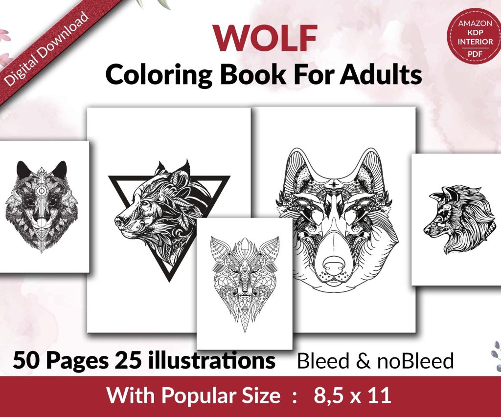 Wolf Coloring KDP interior For Adults, Used as Low Content Book, PDF Template Ready To Upload COMMERCIAL Use 8.5x11"
1 × $0.00
Wolf Coloring KDP interior For Adults, Used as Low Content Book, PDF Template Ready To Upload COMMERCIAL Use 8.5x11"
1 × $0.00
Subtotal: $0.00
Okay so I just spent like three hours yesterday setting up a novel template in Word and honestly it’s way easier than people make it out to be but there are some tricks you gotta know.
Look, I know everyone’s gonna tell you to use Scrivener or Atticus or whatever, but Word is already on your computer and it actually works really well for fiction if you set it up right. I’ve formatted probably 150+ novels in Word for KDP and once you have a solid template, you’re basically just writing and the formatting handles itself.
The main thing is you need to think about styles from the beginning. Not like writing style but Word styles – the formatting presets that control how everything looks. This is gonna sound boring but trust me, if you don’t set these up first you’ll be manually formatting every chapter heading and that’s absolute hell.
Open a blank Word doc and immediately go to Layout tab. Set your margins to 0.5 inches on all sides – this is pretty standard for print books and works fine for ebooks too. Some people do 0.75 but I find that wastes too much space.
Now here’s where it gets important. Go to the Home tab and look at that styles gallery thing. You’ll see Normal, Heading 1, Heading 2, etc. Right-click on Normal and hit Modify.
Change the font to something readable. I usually go with Garamond 11pt or Times New Roman 12pt. Yeah I know everyone says Times is basic but readers actually like it because it’s familiar. Set line spacing to 1.15 or 1.5 – this is personal preference but single spacing looks cramped in fiction.
Oh and make sure you check the box that says “Automatically update” – no wait, actually DON’T check that box. I learned that the hard way when my entire manuscript changed formatting randomly one day. My cat walked across the keyboard and somehow… anyway, don’t check it.
Set paragraph spacing to like 6pt after each paragraph. No space before. And here’s the thing nobody tells you – set First Line indent to 0.3 inches. This makes your paragraphs look professional without you having to hit tab every single time.
Right-click on Heading 1 style and modify it. This is what you’ll use for chapter titles. I set mine to:
The page break thing is magic. You just type your chapter heading, apply Heading 1 style, and boom – new page. No more manual page breaks that mess everything up when you edit.
I usually format my chapters as “Chapter One” or “Chapter 1” or just “1” depending on the genre. Romance and thriller readers seem to prefer “Chapter One” spelled out, but fantasy readers don’t care as much.
Okay so funny story – the first paragraph of each chapter shouldn’t be indented. That’s just how traditional publishing does it and readers expect it. But if you set up Normal style with auto-indent, that first paragraph is gonna indent too.
Create a new style called “No Indent” or “First Para” or whatever. Base it on Normal but set First Line indent to 0. Then just apply this style to the first paragraph of each chapter. Takes two seconds.
Some people also use drop caps for the first letter but honestly that’s more trouble than it’s worth for KDP. Looks cool in print books though.
When you need a scene break within a chapter, the standard is to put a blank line with some kind of symbol. I use three asterisks centered: * * *
Create another style for this. Call it Scene Break. Set it to:
Some authors use just a blank line but I think that’s risky because when you convert to ebook format, blank lines sometimes disappear and then your scenes run together.
Your novel needs front matter – title page, copyright page, maybe a dedication. Each of these should start on its own page.
For the title page, I just center everything and use larger fonts. Put the title in like 24pt bold, then your name below in 18pt. Simple.
Copyright page is usually left-aligned and smaller – maybe 10pt. Include your copyright notice, ISBN if you have one, and a disclaimer like “This is a work of fiction” blah blah. You can find templates online for the exact wording.
Wait I forgot to mention – use section breaks between front matter and the main text. Go to Layout > Breaks > Next Page. This lets you have different page numbering in different sections, which is super useful because you don’t want page numbers showing up on your title page.
Double-click in the footer area. The Header & Footer Tools tab appears. Click Page Number > Bottom of Page > Plain Number 2 (centers it).
Now here’s the trick – you want page numbers to start at 1 on Chapter One, not on the title page. Make sure you have that section break after your front matter. Then in the footer of your Chapter One section, click “Link to Previous” to turn OFF the link. Now you can format this section differently.
Click Page Number > Format Page Numbers > Start at 1. Your chapter one should now show page 1 even though it’s actually like page 5 of the document.
Some genres use running headers – like your book title on left pages and author name on right pages. Honestly for KDP ebooks this doesn’t matter because ereaders don’t really show headers consistently. But for print books it looks professional.
To do different left/right headers, go to Header & Footer Tools and check “Different Odd & Even Pages.” Then put your book title in the even page header (left side) and your name in the odd page header (right side).
I usually skip this for my first draft template though. You can add it later when you’re formatting for publication.
Just use regular Normal style for dialogue. The indent handles it. Some people get fancy with hanging indents for long dialogue paragraphs but that’s overkill for fiction.
Make sure you’re using proper em dashes for interruptions (—) not hyphens (-). Word usually auto-corrects this if you type two hyphens but sometimes it doesn’t and then your formatter (if you hire one) will charge you extra to fix it. Ask me how I know.
Once you’ve got all this set up, go to File > Save As. Change the file type to “Word Template (.dotx)”. Give it a name like “Novel Template” or “Fiction Master Template” and save it.
Now whenever you start a new novel, just double-click that template file and you’ll get a fresh document with all your styles already set up. Game changer.
I have like five different templates for different genres actually. My romance template has fancier chapter headings, my thriller template is more stripped down. But they all use the same basic structure.
Press Ctrl+Alt+Shift+S to open the full Styles pane. Keep this open while you write. It shows all your styles and you can apply them with one click instead of digging through menus.
You can also modify styles directly from this pane which is faster. I basically live in the Styles pane when I’m formatting.
Don’t manually format anything. Seriously. If you want something bold or italic, fine, but don’t change fonts or sizes or spacing manually. Use styles for everything structural.
Don’t use the space bar to indent. Ever. I see this all the time and it makes me wanna cry. Use the First Line indent setting in your paragraph style.
Don’t hit Enter multiple times to create space between chapters. Use the page break in your Heading 1 style or insert an actual page break.
Don’t use tabs to center text. Use center alignment.
These manual formatting things will absolutely destroy your file when you convert it to ebook format. KDP’s converter tries to interpret all that weird spacing and tabs and it just makes a mess.
Before you write your whole novel, test the template. Write a few chapters, throw in some scene breaks, add dialogue, maybe a flashback in italics – whatever your novel will actually use.
Then save it as a PDF (File > Save As > PDF) and see how it looks. This is pretty close to how a print book will look. The spacing should feel natural, chapters should start on new pages, everything should be consistent.
For ebook testing, save it as a filtered HTML file and upload to KDP’s previewer tool. This shows you how it’ll look on different devices. Usually if your styles are clean, it converts perfectly.
Once you’re comfortable with the basics, you can add more styles. I have styles for:
These specialized styles make formatting special elements super fast and consistent.
You can also set up a Table of Contents using your Heading 1 styles. Go to References > Table of Contents > Custom. This creates a clickable TOC for ebooks which readers really appreciate.
The whole point of templates and styles is consistency. Your readers shouldn’t notice the formatting – it should just feel smooth and professional.
Every chapter heading looks the same. Every scene break is handled the same way. All body text uses the same font and spacing. This consistency is what makes a book feel published rather than amateur.
I’ve seen so many manuscripts where chapter headings are different sizes, or some chapters have extra space and others don’t, or the indent suddenly changes halfway through. It’s jarring and it screams “I didn’t know what I was doing.”
With a solid template, you literally cannot mess this up. You just write, apply the correct style, and everything stays consistent automatically.
Look, I’m not gonna pretend this is exciting stuff. Setting up templates is tedious. But you do it once and then you’re set for every novel you write. I’ve been using basically the same template structure for like four years now with minor tweaks.
It’s worth the hour or two to set it up right at the beginning rather than spending days manually formatting later or paying someone $200 to fix your messy file.
DISCOVER OUR FREE BEST SELLING PRODUCTS
Editable Canva Lined Journal: Express Your Thoughts – KDP Template
Lined Pages Journal 120 pages Ready to Upload PDF Commercial Use KDP Template 6×9 8.5×11 5×8 for Notebooks, Diaries, Low Content
Lined Pages Journal 120 pages Ready to Upload PDF Commercial Use KDP Template 6×9 8.5×11 5×8 for Notebooks, Diaries, Low Content
Cute Dogs Coloring Book for Kids | Activity Book | KDP Ready-To-Upload
Daily Planner Diary : Diary Planners for Everyday Productivity, 120 pages, 6×9 Size | Amazon KDP Interior
Wolf Coloring KDP interior For Adults, Used as Low Content Book, PDF Template Ready To Upload COMMERCIAL Use 8.5×11"
Coloring Animals Head Book for Kids, Perfect for ages 2-4, 4-8 | 8.5×11 PDF
Printable Blank Comic Book Pages PDF : Create Your Own Comics – 3 Available Sizes
Notes KDP interior Ready To Upload, Sizes 8.5×11 6×9 5×8 inch PDF FILE Used as Amazon KDP Paperback Low Content Book, journal, Notebook, Planner, COMMERCIAL Use
Black Lined Journal: 120 Pages of Black Lined Paper Perfect for Journaling, KDP Notebook Template – 6×9
Student Planner Journal 120 pages Ready to Upload PDF Commercial Use KDP Template 6×9" 8.5×11" for Low Content book
Recipe Journal Template – Editable Recipe Book Template, 120 Pages – Amazon KDP Interior