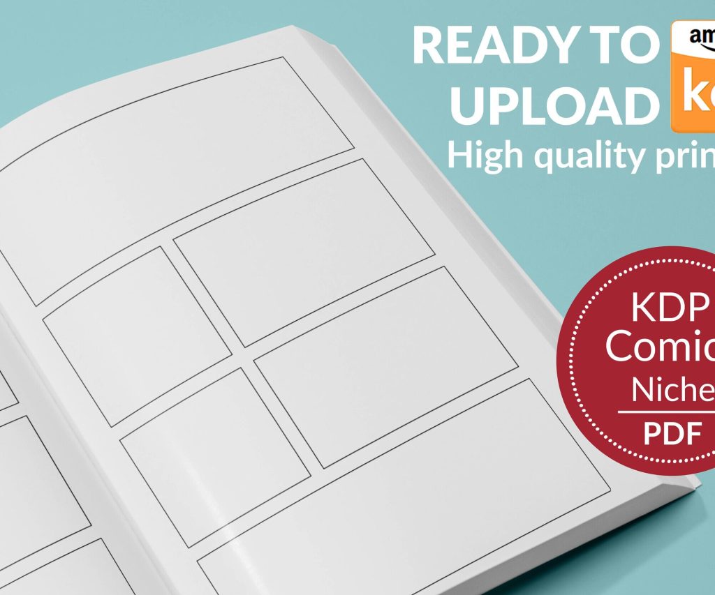
 Printable Blank Comic Book Pages PDF : Create Your Own Comics - 3 Available Sizes
 Subtotal: $0.00
Amazon KDP guide, KDP book publishing
Paperback Book Cover Template for KDP: Design Requirements
22
Mar
Mar
Okay so the KDP paperback cover template thing is honestly way more confusing than it needs to be, but once you get it you’ll never mess it up again. I was literally up till 2am last week fixing a client’s cover because they didn’t understand the bleed and it got rejected three times.
First thing – you absolutely need to download the correct template from KDP directly. Don’t just guess the dimensions or use some random template you found on Etsy. KDP has a cover calculator built into their system and it’s gonna give you the exact pixel dimensions based on your page count, paper type, and trim size.
The trim size is basically your book’s finished dimensions. Most people do 6×9 for non-fiction or 5×8 for fiction, but there’s like a dozen options. Here’s what nobody tells you though – the page count affects your spine width, which then changes your entire cover dimensions. So a 100-page book has a different template than a 200-page book even if they’re both 6×9. This tripped me up so bad when I first started.
Getting Your Template Dimensions Right
Go to KDP’s cover calculator or just start the upload process for your book. You’ll need to know:
– Trim size (let’s say 6×9 inches)
– Page count (count the interior PDF pages, not just your manuscript)
– Paper type (white or cream – cream adds like 0.002 inches per page to spine width)
– Bleed or no bleed
The bleed is this extra 0.125 inches (or 3.2mm) around all edges where your background color or images extend beyond the final cut line. If you’re doing a full-color cover that goes to the edges, you need bleed. If you’re doing like a white background with centered text, technically you don’t need it but I always use it anyway because it gives you more flexibility.
Actual Pixel Dimensions You’ll Get
For a 6×9 inch book with 120 pages on white paper with bleed, you’re looking at roughly:
– Width: around 12.5 inches (that’s front + spine + back + bleed)
– Height: 9.25 inches (that’s 9 + bleed top and bottom)
– At 300 DPI that’s like 3,750 x 2,775 pixels
But don’t use my numbers – get yours from the calculator because even 10 pages difference changes the spine width.
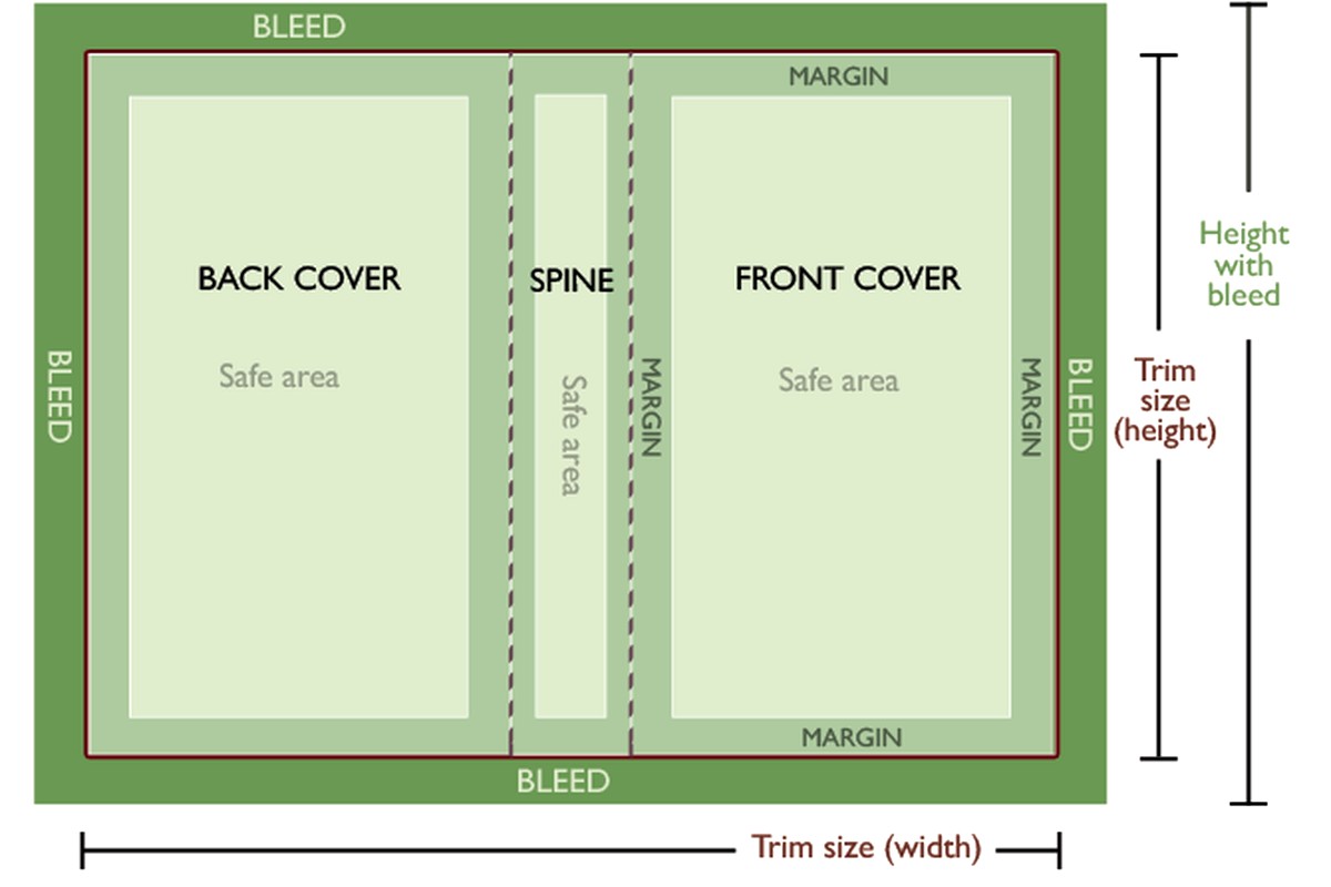
The Three Zones That’ll Save Your Life
Your cover template has three critical zones and I literally print these out and tape them to my wall when I’m designing because it’s so easy to forget.
The Bleed Zone: That outer 0.125 inch border. Extend your background colors and images into this area. Anything in the bleed might get trimmed off during cutting – that’s literally its purpose, to account for slight variations in the cutting process.
The Safe Zone: This is 0.125 inches INSIDE the trim line. Keep all your important text and logos within this area. I made the mistake once of putting an author name too close to the edge and it got partially cut off. The book wasn’t rejected but it looked terrible.
The Spine Safe Zone: Oh man this one. The spine has an additional safe zone of 0.0625 inches (that’s 1/16 inch) on each side. So if your spine is 0.3 inches wide, you only really have about 0.175 inches of safe printing area. For thin books under like 80 pages, KDP actually recommends NOT putting text on the spine at all because it’s too narrow.
I was watching The Bear while designing a cover last month and totally forgot about the spine safe zone. Had to redo the whole thing.
Design Software and Setup
You can use whatever you want – Photoshop, Affinity Designer, Canva Pro (if you upgrade the export resolution), even GIMP if you’re brave. The key things:
Set your document to exactly the dimensions KDP gave you. Like if they say 3,750 x 2,775 pixels, that’s what you set. Don’t round up “just to be safe” – you’ll throw off the spine alignment.
Resolution must be 300 DPI minimum. This is non-negotiable. 72 DPI looks fine on screen but prints like garbage. I’ve seen people try to upscale 72 DPI to 300 DPI and it just makes blurry garbage at a higher resolution.
Color mode should be RGB actually, not CMYK. KDP converts to their own color profile anyway, and RGB gives you more vibrant colors on screen which is where 95% of people see your cover anyway (on Amazon).
Save as PDF for upload – either PDF/X-1a:2001 or just a high-quality PDF. PNG works too but file size gets huge. Never upload a JPEG because compression artifacts.
Actually Laying Out Your Cover
Open your template PDF from KDP in your design software as a guide layer. It’ll show you the fold lines, trim lines, bleed lines, and safe zones. Some templates have these in cyan or magenta – keep that layer visible while designing but turn it off before export.
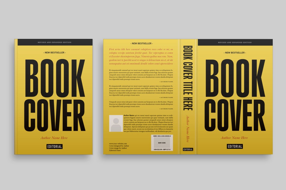
Your cover wraps around the book, so from left to right you’ve got:
– Back cover
– Spine
– Front cover
The spine is that vertical strip in the middle. For a 120-page book it’s probably like 0.25-0.3 inches wide – super thin.
Here’s what I put on each section:
Front cover: Title, subtitle if any, main imagery, author name. This is your Amazon thumbnail so make the title HUGE and readable at tiny sizes. I test this by shrinking my design to like 150 pixels wide and seeing if I can still read it.
Spine: Book title, author name, maybe a small logo. Text runs vertically from bottom to top (so when the book is sitting on a shelf with the front facing out, the spine text reads correctly).
Back cover: Book description or blurb, author bio, maybe some testimonials, ISBN barcode area, and your author photo if you want.
Oh wait I forgot to mention – you don’t need to add the ISBN barcode yourself. KDP adds it automatically in the lower right corner of the back cover. They need a 2×1.2 inch white rectangle there (or at least an area without critical design elements). Some people design around it, some people just leave white space.
Common Mistakes That’ll Get You Rejected
Low resolution is number one. Upload at 300 DPI or don’t bother.
Text in the wrong zones. I’ve had KDP reject covers where the author name was like 0.1 inches from the edge. They’re picky about the safe zones for good reason – books get trimmed slightly differently and they don’t want cut-off text.
Spine text misaligned. If your spine text doesn’t line up with the actual spine of the physical book, it looks really bad. Use the template guides exactly as shown.
Wrong dimensions entirely. This happens when people use an old template or guess at dimensions. Every book is custom-sized based on page count.
Color issues – if you’re doing a dark background, make sure it extends fully into the bleed. I’ve seen covers with white gaps at the edges because the designer didn’t extend the background properly.
File Format and Upload Specs
- File format: PDF or PNG (I prefer PDF)
- Resolution: 300 DPI minimum, 600 DPI if you’re feeling fancy
- Color profile: RGB (seriously, not CMYK)
- Maximum file size: 40 MB but try to keep it under 10 MB
- Fonts: embed all fonts or convert text to outlines/curves
That last one about fonts bit me once. I used a Google Font and didn’t embed it properly, KDP’s system substituted it with Arial, and the whole cover looked wrong. Now I always convert text to outlines before exporting the final PDF.
Testing Your Cover Before Upload
This is gonna sound weird but I literally print out my covers on regular paper at actual size and fold them around a book of similar dimensions. You’d be amazed at what you notice – text that’s too small, images that don’t line up at the spine, colors that look different on paper vs screen.
Also check your cover at thumbnail size. Upload it to your phone and look at it like you’re scrolling Amazon. Can you read the title? Does it stand out? Is it visually distinct from the 50 other books in your category?
The Spine Text Nightmare
Okay so spine text deserves its own section because this is where people mess up constantly. The spine width varies based on page count and paper type. For every 24 pages on white paper, you add roughly 0.0625 inches to the spine. Cream paper is slightly thicker.
If your book is under 78 pages, the spine is too narrow for text – KDP literally won’t let you put text there. Just leave it blank or use a solid color that matches your front/back.
For books between 78-120 pages, you can fit text but it needs to be small and carefully positioned. I use 10-14pt font max, and only sans-serif fonts because they’re more readable at small sizes.
Above 120 pages you’ve got more room to work with. You can do larger text, maybe add a small graphic element.
The text orientation matters too – it should read from bottom to top when the front cover is facing you. This is standard for English-language books. Some designers get this backwards and it looks unprofessional.
Margins and Gutters
Remember those spine safe zones I mentioned? They’re basically gutters – areas where you don’t want important elements. The spine flexes and bends when the book is opened, so anything too close to the spine edge might get lost in the curve.
For the front and back covers, keep text and logos at least 0.125 inches from all edges (that’s your safe zone). For critical elements like author names or subtitles, I go 0.25 inches just to be extra safe.
Color Considerations
Print colors never match screen colors exactly. That vibrant blue you see on your monitor? It’s gonna be darker and maybe slightly purple-ish when printed. This is just physics – screens emit light, paper reflects it.
I always darken my colors by about 10-15% from what looks good on screen. Especially whites – pure white (255,255,255) can look blown out, so I use an off-white like (245,245,240).
Black text should be pure black (0,0,0) for maximum contrast and readability. Don’t use dark gray for body text on covers – it’ll look faded when printed.
Typography Tips Nobody Tells You
Use no more than 2-3 fonts on your cover. One for the title, one for the author name, maybe one for the subtitle. More than that and it looks cluttered.
Sans-serif fonts (like Arial, Helvetica, Montserrat) are easier to read at small sizes and on thumbnails. Serif fonts (like Times New Roman, Garamond) can work for certain genres like historical fiction or literary fiction.
Script fonts are dangerous. They look elegant but they’re hard to read at thumbnail size. If you use one, make sure it’s LARGE and has good contrast with the background.
Letter spacing (kerning) matters. Some fonts look cramped by default. Add 50-100 units of letter spacing to open them up. But don’t go crazy – too much spacing looks amateurish.
The Barcode Space Thing
KDP requires a 2 x 1.2 inch white or light-colored rectangle in the bottom right corner of the back cover. This is where they’ll place the ISBN barcode. You can design around it – put it in a white box with a border, or if your back cover is already light-colored, just leave that area clean.
Some designers get creative and integrate the barcode space into their design – like making it part of a white banner that contains other text. That works fine as long as the actual barcode area stays clear.
Don’t try to add your own barcode. KDP does this automatically and they need to use their specific format and encoding. If you add your own, they’ll just cover it with theirs anyway.
Wrapping Up the Template Process
Once your cover is designed, turn off all guide layers and export at 300 DPI as a PDF. Name it something logical like “BookTitle_Cover_6x9_120pages.pdf” so you know what version it is.
Upload to KDP and use their preview tool. It’ll show you the cover wrapped around a 3D book model. Rotate it and check the spine carefully – this is where alignment issues become obvious.
If KDP rejects your cover, they’ll usually tell you why. Common rejections are resolution too low, text outside safe zones, or file corruption. Fix it and re-upload.
My cat just knocked over my coffee so I gotta go clean that up, but honestly that’s the whole process. Get the right template, design within the safe zones, export at 300 DPI, and you’re golden. It seems complicated at first but after you do it twice you’ll have the workflow down.
DISCOVER OUR FREE BEST SELLING PRODUCTS
Editable Canva Lined Journal: Express Your Thoughts – KDP Template
Lined Pages Journal 120 pages Ready to Upload PDF Commercial Use KDP Template 6×9 8.5×11 5×8 for Notebooks, Diaries, Low Content
Lined Pages Journal 120 pages Ready to Upload PDF Commercial Use KDP Template 6×9 8.5×11 5×8 for Notebooks, Diaries, Low Content
Cute Dogs Coloring Book for Kids | Activity Book | KDP Ready-To-Upload
Daily Planner Diary : Diary Planners for Everyday Productivity, 120 pages, 6×9 Size | Amazon KDP Interior
Wolf Coloring KDP interior For Adults, Used as Low Content Book, PDF Template Ready To Upload COMMERCIAL Use 8.5×11"
Coloring Animals Head Book for Kids, Perfect for ages 2-4, 4-8 | 8.5×11 PDF
Printable Blank Comic Book Pages PDF : Create Your Own Comics – 3 Available Sizes
Notes KDP interior Ready To Upload, Sizes 8.5×11 6×9 5×8 inch PDF FILE Used as Amazon KDP Paperback Low Content Book, journal, Notebook, Planner, COMMERCIAL Use
Black Lined Journal: 120 Pages of Black Lined Paper Perfect for Journaling, KDP Notebook Template – 6×9
Student Planner Journal 120 pages Ready to Upload PDF Commercial Use KDP Template 6×9" 8.5×11" for Low Content book
Recipe Journal Template – Editable Recipe Book Template, 120 Pages – Amazon KDP Interior