-
×
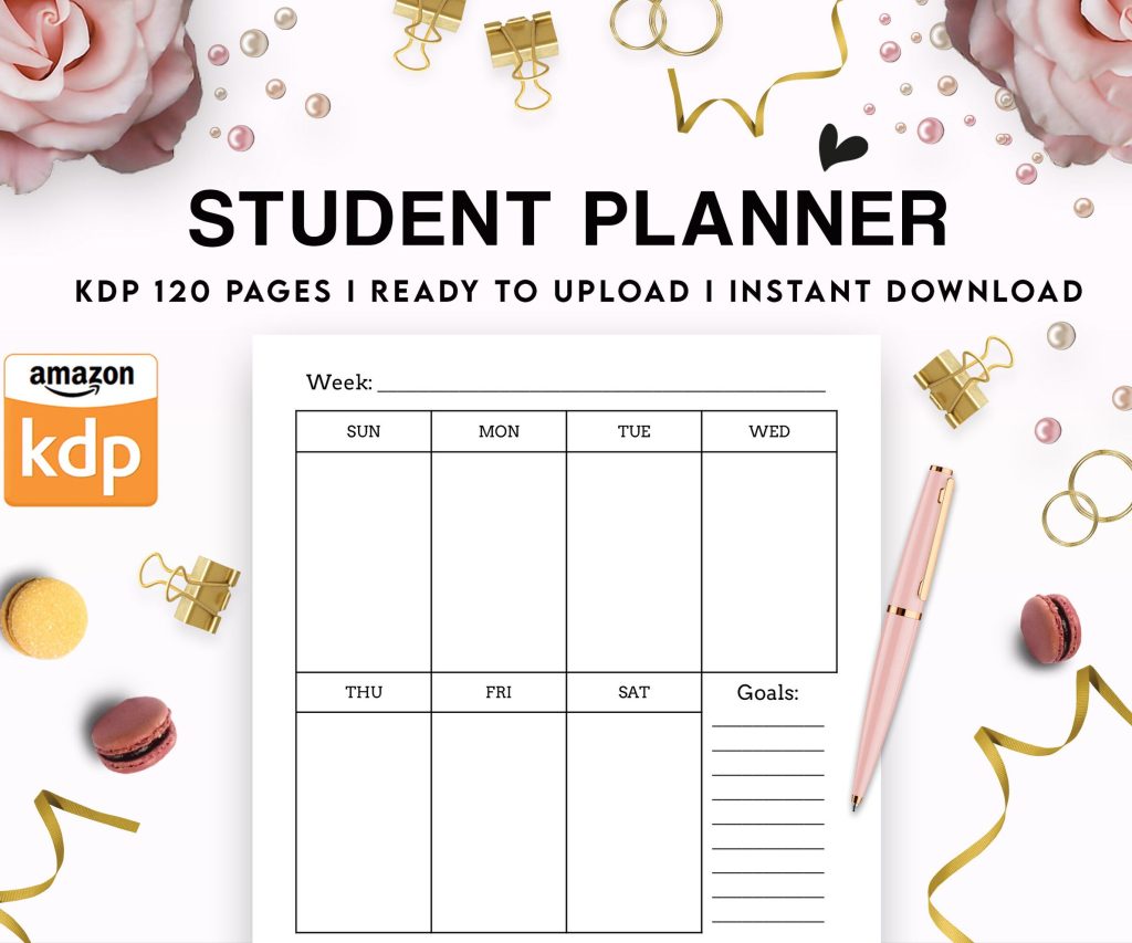 Student Planner Journal 120 pages Ready to Upload PDF Commercial Use KDP Template 6x9" 8.5x11" for Low Content book
1 × $0.00
Student Planner Journal 120 pages Ready to Upload PDF Commercial Use KDP Template 6x9" 8.5x11" for Low Content book
1 × $0.00
Subtotal: $0.00

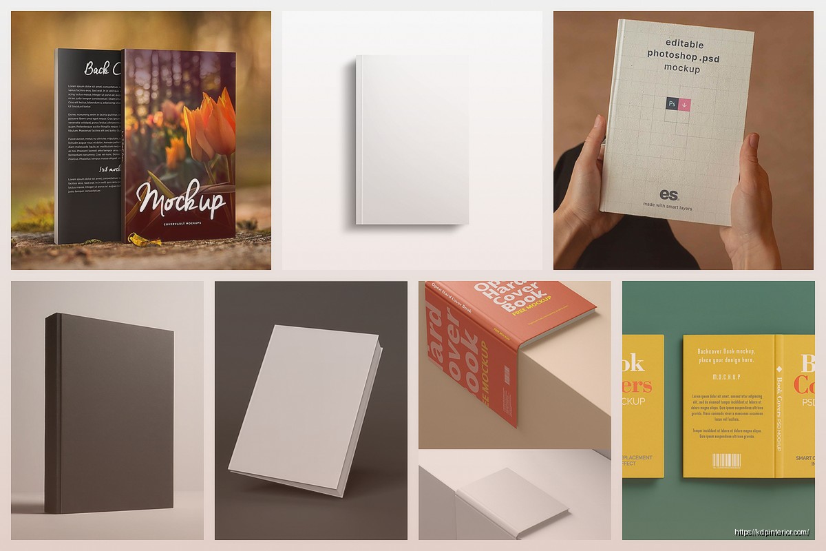
Okay so I just spent like three hours yesterday testing different mockup tools because a client asked about soft cover visuals and honestly, the whole paperback mockup thing is way more nuanced than people think.
Look, when I started on KDP seven years ago I was just slapping flat covers on my Amazon listings and wondering why my click-through rates were garbage. The thing is, customers scroll through search results fast—like really fast—and a 3D mockup with that soft cover curl at the edges just stops the scroll better than a flat image. It’s psychological or whatever, makes the book look real instead of like a digital file someone threw together.
Your brain for sale needs to look like something they can actually hold. I tested this with two identical books last year, same niche (dog training logs if you’re curious), one with a flat cover and one with a proper paperback mockup. The mockup version got 34% more clicks. Not saying that’s scientific but it’s enough for me to never skip mockups again.
So Canva has these paperback mockup templates now and honestly they’re… fine? Not amazing but fine for when you’re starting out or testing a niche. You gotta search for “book mockup” in their template library and then swap out the cover image with yours.
The problem I keep running into with Canva is the spine thickness never looks quite right for KDP books. Like they design these templates for traditionally published books that are thicker, so if you’ve got a 120-page KDP paperback it’s gonna look weird and chunky. You can kinda work around it by—wait I forgot to mention you need Canva Pro for most of the good mockup templates. The free ones are pretty limited.
This is gonna sound weird but Photopea (the free Photoshop alternative) has become my go-to lately. Someone in a Facebook group shared a PSD mockup file and I’ve been customizing it for months now. You just drag your cover into the smart object layer and boom, it updates the whole mockup.
The learning curve is steeper than Canva obviously, but once you figure out smart objects it’s literally 30 seconds per mockup. I made like fifteen different angle variations of my planners last month while watching that Ted Lasso show everyone kept recommending.
Okay so Placeit by Envato is the one I actually pay for monthly. It’s like $15 a month or something and you get unlimited downloads. The paperback mockups there are really solid—they have different paper textures, lighting setups, background scenes, all that stuff.
What I like is they have lifestyle mockups where the book is like sitting on a coffee table with a plant and a mug or whatever. Those work crazy good for Facebook ads. I ran ads for a recipe journal last quarter and the lifestyle mockup outperformed the plain mockup by almost double in terms of conversions.
The downside is you can’t customize everything. Sometimes the spine angle is fixed or the lighting is baked in and you can’t change it. But for speed and variety it’s hard to beat.
If you’re already in the low-content space you probably know about these. Bookbrush has a mockup creator that’s decent—it’s more geared toward authors who want promo images for social media but it works for product listings too. The 3D renderer is pretty basic though.
Bookbolt added mockup features last year I think? I haven’t used them as much because their interface is kinda cluttered with all the research tools and keyword stuff. But if you’re already paying for Bookbolt might as well use their mockup generator instead of paying for another tool.
This is probably overkill for most people but I learned Blender basics during lockdown when I had way too much time on my hands. You can create completely custom 3D book mockups with perfect spine thickness, exact page counts, realistic paper texture, custom lighting… it’s wild what you can do.
The problem is Blender has like the steepest learning curve of anything I’ve ever tried to learn. I watched probably 20 hours of YouTube tutorials before I could make a mockup that didn’t look like hot garbage. But now I can pump out custom angles and scenes that nobody else has.
There’s this free addon called “Book Generator” that automates a lot of the setup. You just input your dimensions and page count and it builds the book model for you. Then you add your cover image as a texture and render it out.
I only recommend this if you’re really into that kind of thing or if you’re doing super high-volume publishing and want totally unique visuals. For most people it’s not worth the time investment.
Okay so here’s where people mess up—they create gorgeous mockups but the dimensions are wrong for KDP or the resolution is too low. Your mockup needs to be at least 2560 pixels on the longest side for Amazon’s image requirements. I usually go with 3000px just to be safe.
The other thing is color profiles. Make sure you’re exporting in sRGB color space because that’s what web browsers display. I had this whole batch of mockups that looked perfect on my computer but appeared super saturated on Amazon because I exported them in Adobe RGB like an idiot.
This drives me crazy because KDP’s spine calculator gives you the width but then you gotta figure out how thick that looks in 3D space. For reference, a 120-page cream paper book is roughly 0.29 inches thick. White paper is slightly thinner because it’s less dense.
Most mockup tools let you adjust spine thickness but if you’re doing it manually in Photoshop or whatever, here’s the deal: measure your actual printed books if you have them. I keep one copy of different page counts (100 pages, 200 pages, etc.) just for reference when I’m creating mockups.
Nothing looks more amateur than a 50-page journal with a spine that’s thick as a textbook.
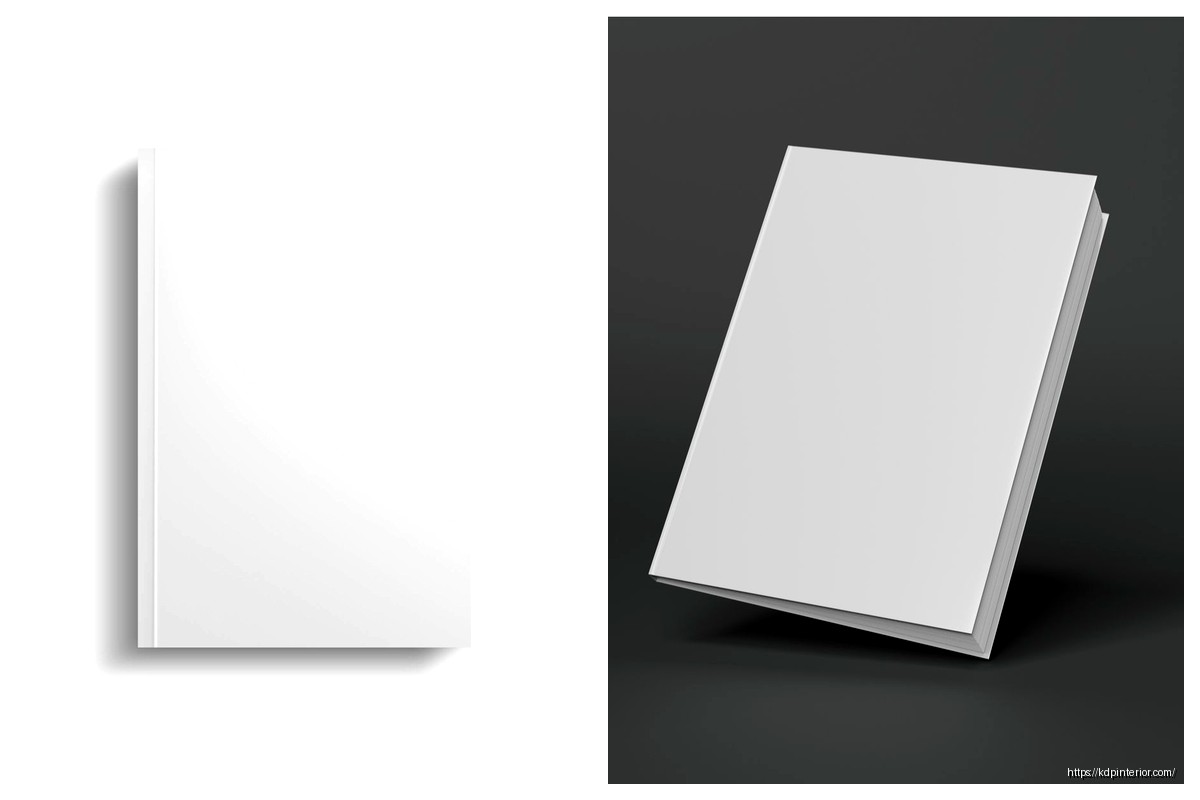
I’ve tested a bunch of different angles and the slight three-quarter view works best for me. Like where you can see the front cover clearly but also get a bit of the spine and top edge. Full-on straight view is boring, and too much perspective distortion makes it hard to read the title.
The mockup should tilt back slightly—maybe 15-20 degrees from vertical. This mimics how someone would naturally hold a book to look at the cover. I dunno the exact psychology but it just feels more inviting than a book standing straight up like it’s at attention.
Oh and another thing, soft shadows are your friend. Hard shadows look fake and dated. Most good mockup tools have soft shadow options built in but if you’re doing it manually, use a large feathered brush at low opacity.
White backgrounds are safe and clean—they work fine for Amazon listings where you want the product to pop. But for ads and social media you want something with more context.
Wood table backgrounds are kinda overused at this point but they still work. I like light-colored wood with minimal grain because it doesn’t compete with the book cover for attention. Marble is trendy right now but it can look too bougie for certain niches.
For journals and planners, I’ll often do a desk scene with like a pen and maybe some flowers slightly out of focus in the background. The key is keeping the book as the clear focal point—everything else should be supporting elements that add context without distraction.
Honestly my cat walked across my keyboard while I was setting up a mockup last week and somehow made the background blur slider go crazy… ended up looking pretty good so I kept it. Happy accidents or whatever.
If you’re publishing multiple books you gotta batch this stuff. I use Photoshop actions to automate the mockup creation process. Once you’ve got your mockup template set up with smart objects, you can record an action that opens the cover file, places it in the smart object, saves the mockup, and moves to the next one.
I can process like 30 book covers into mockups in maybe 20 minutes now. It’s a game-changer when you’re doing high-volume publishing.
For Placeit you can’t really batch process but you can save your favorite mockup styles and reuse them quickly. I have like five go-to mockup templates saved and I just rotate through them depending on the book niche.
This is boring but important—name your mockup files consistently so you can find them later. I use this format: BookTitle_Mockup_Angle_Version.png
So like “DogTrainingLog_Mockup_3Quarter_v2.png” which tells me exactly what it is at a glance. I keep them all in a Dropbox folder organized by book project.
Trust me, six months from now when you need to update a listing you’ll thank yourself for being organized. I’ve wasted hours looking for specific mockup files because I named them something dumb like “final_FINAL_actualfinal.png”… we’ve all been there.
Most people view Amazon on mobile now so your mockup needs to look good on a small screen. The title and subtitle need to be readable even when the image is thumbnail-sized. I actually test this by viewing my mockups on my phone before I upload them.
Sometimes a mockup that looks amazing on desktop is completely unreadable on mobile because the perspective angle makes the text too small or skewed. If your title is hard to read, people scroll past. Simple as that.
Vertical or square mockups tend to work better for mobile than horizontal ones because they fill more of the screen when someone’s scrolling through search results.
Covers that don’t fit the mockup properly—like you can see weird edges or the spine is misaligned. This screams amateur hour. Take an extra minute to adjust the placement.
Shadows pointing the wrong direction from the light source. If the light is coming from top-right, your shadow should fall to the bottom-left. Basic stuff but people mess it up.
Over-editing with too many filters and effects. Your mockup should look realistic, not like an Instagram filter exploded on it. I see people adding like vignettes and color grading and lens flares… just stop. Keep it clean and natural.
Using mockups that don’t match your book’s actual dimensions. If you’re selling a 6×9 book, don’t use an 8×10 mockup template. The proportions will be off and it looks weird to anyone who knows books.
Add a subtle page curl or page edge visibility—makes the book look more dimensional and less like a cardboard box. Most mockup tools have this option.
Use realistic paper textures. Cream paper should look slightly off-white, not pure white. It’s a small detail but it adds authenticity.
Pay attention to the cover finish—if your KDP book is matte, don’t use a super glossy reflective mockup. Match the finish to reality.
Experiment with different lighting—soft diffused light for journals and planners, more dramatic lighting for fiction or darker niches. The mood should match your content.
Anyway that’s basically everything I’ve learned from making probably thousands of these mockups over the years. It’s one of those things where you get better with practice and you start developing an eye for what works. Start with the easy tools and level up as you go.
DISCOVER OUR FREE BEST SELLING PRODUCTS
Editable Canva Lined Journal: Express Your Thoughts – KDP Template
Lined Pages Journal 120 pages Ready to Upload PDF Commercial Use KDP Template 6×9 8.5×11 5×8 for Notebooks, Diaries, Low Content
Lined Pages Journal 120 pages Ready to Upload PDF Commercial Use KDP Template 6×9 8.5×11 5×8 for Notebooks, Diaries, Low Content
Cute Dogs Coloring Book for Kids | Activity Book | KDP Ready-To-Upload
Daily Planner Diary : Diary Planners for Everyday Productivity, 120 pages, 6×9 Size | Amazon KDP Interior
Wolf Coloring KDP interior For Adults, Used as Low Content Book, PDF Template Ready To Upload COMMERCIAL Use 8.5×11"
Coloring Animals Head Book for Kids, Perfect for ages 2-4, 4-8 | 8.5×11 PDF
Printable Blank Comic Book Pages PDF : Create Your Own Comics – 3 Available Sizes
Notes KDP interior Ready To Upload, Sizes 8.5×11 6×9 5×8 inch PDF FILE Used as Amazon KDP Paperback Low Content Book, journal, Notebook, Planner, COMMERCIAL Use
Black Lined Journal: 120 Pages of Black Lined Paper Perfect for Journaling, KDP Notebook Template – 6×9
Student Planner Journal 120 pages Ready to Upload PDF Commercial Use KDP Template 6×9" 8.5×11" for Low Content book
Recipe Journal Template – Editable Recipe Book Template, 120 Pages – Amazon KDP Interior