-
×
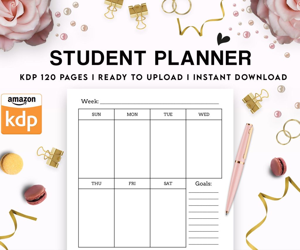 Student Planner Journal 120 pages Ready to Upload PDF Commercial Use KDP Template 6x9" 8.5x11" for Low Content book
1 × $0.00
Student Planner Journal 120 pages Ready to Upload PDF Commercial Use KDP Template 6x9" 8.5x11" for Low Content book
1 × $0.00
Subtotal: $0.00

Okay so the KDP paperback interior files thing – I literally just walked someone through this yesterday while my cat was knocking stuff off my desk, so it’s fresh in my mind.
First thing, KDP wants a PDF. That’s it. Not a Word doc, not an InDesign file, a PDF. But here’s where people mess up – they export whatever they’ve got without thinking about trim size and margins and then wonder why their text gets cut off or looks weird.
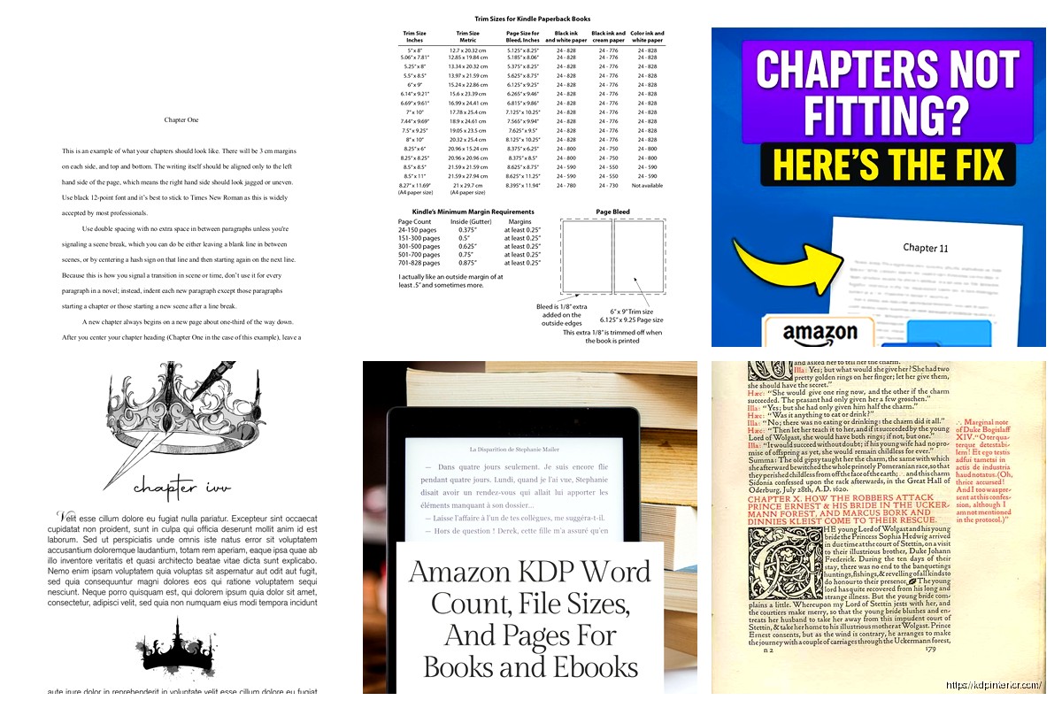
Your trim size matters before you even start designing. Most people go with 6×9 for nonfiction or journals, maybe 5×8 for fiction. I use 8.5×11 for planners and workbooks because that’s what people expect. You gotta decide this FIRST because changing it later means redoing literally everything.
So KDP has this margin calculator or you can just follow their basic rules. For a book under 150 pages, you need:
– Inside margin (gutter): 0.375 inches minimum
– Outside margin: 0.25 inches
– Top and bottom: 0.25 inches
But here’s the thing – I always add more. Like way more. I do 0.5 inches on the gutter because I’ve had books where the text was technically fine by KDP standards but looked cramped when someone actually held the physical book. Amazon approved it but customers complained in reviews and that tanks your ranking.
Oh and the gutter switches sides. Left page has the gutter on the left, right page has it on the right. Sounds obvious but I’ve seen people set up symmetrical margins and then half their book is wrong.
I’ve used pretty much everything at this point. Started with Word, moved to InDesign, now I use a mix depending on the project.
Word is fine for simple stuff. Like if you’re doing a lined journal or basic notebook, Word can handle it. Set up your page size under Layout > Size > More Paper Sizes, then set your margins. The trick is using section breaks if you need different formatting for different parts – like if your intro pages don’t have headers but the rest of the book does.
But Word gets glitchy with complex layouts. I was working on a recipe book last month and Word kept moving my images around randomly. Spent two hours fixing it, exported the PDF, opened it and everything had shifted again. That’s when you need something better.
Okay so this is gonna sound weird but Canva is actually great for low-content interiors. Notebooks, journals, planners, coloring books – stuff where you’re repeating the same page design over and over.
You set up your custom dimensions (they let you do exact sizes), design one page, then duplicate it 100 times or whatever you need. Export as PDF, done. I made a gratitude journal in Canva in like 45 minutes including the time I spent watching an episode of that baking show.
The problem with Canva is bleed. KDP wants 0.125 inch bleed on all sides if your interior has content that goes to the edge. Canva does this automatically now on their paid plan but you gotta double-check. I’ve had files rejected because the bleed wasn’t set up right even though Canva said it was.
InDesign is expensive but if you’re serious about this, it’s worth it. Or you can use Affinity Publisher which is like 50 bucks one-time and does 90% of what InDesign does.
Setting up an InDesign template:
– New document > Intent: Print
– Page size: your trim size (6×9 or whatever)
– Facing pages: checked (this makes it show left and right pages together)
– Bleed: 0.125 inches all around if you need it
– Margins: set your gutter and outside margins different
Master pages are where InDesign gets powerful. You set up your page numbers, headers, footers on the master page and they apply to every page automatically. Took me forever to figure this out but once you do, it saves hours.
Your PDF needs to be in grayscale or black and white color mode, not RGB or CMYK. This catches people all the time. You design everything, export, upload, and KDP rejects it because the color mode is wrong.
In InDesign, when you export to PDF, there’s a color conversion option. Set it to “Convert to Destination: Grayscale” or “Black and White.” In Word, you gotta check your printer settings when you “print” to PDF – look for color options and choose grayscale.
I forgot this on a book once, got rejected, spent an hour trying to figure out what was wrong. The KDP error message wasn’t even helpful, just said “color mode not supported” or something vague.
Fonts matter more than you think. KDP supports most standard fonts but weird custom fonts can cause problems. Stick with Times New Roman, Garamond, Georgia, Palatino for body text. For headers you have more flexibility.
Font size: 10-12pt for body text usually. I do 11pt Garamond for most of my books. Line spacing (leading) should be 1.2 to 1.5 times your font size. So 11pt font gets about 13-14pt leading. This creates enough white space that pages don’t look crammed.
Paragraph spacing – here’s what looks professional: no space between paragraphs in the same section, but indent the first line by 0.2-0.3 inches. OR do space between paragraphs (like 6pt after) with no indent. Don’t do both, that looks weird.
Headers should start after your title page, copyright page, table of contents. Usually chapter 1 is page 1. Put page numbers in the outside corner (right on right pages, left on left pages) or centered at the bottom.
Headers typically show the book title on left pages and chapter title on right pages. Or author name on left, book title on right. Don’t put headers on chapter opening pages, that looks cluttered.
Wait I forgot to mention – always start chapters on right-hand pages. That means if your previous chapter ends on a right page, insert a blank left page before the next chapter. Professional books do this and readers notice when you don’t even if they can’t explain why your book feels off.
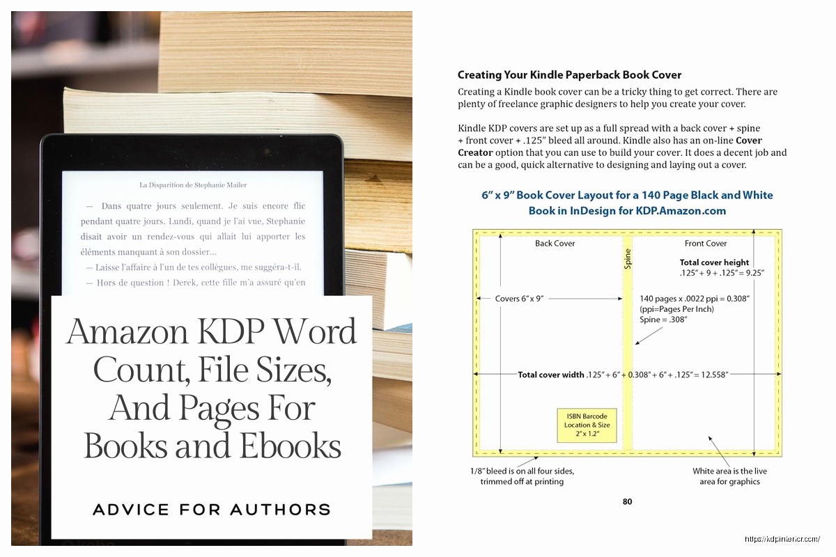
Resolution needs to be 300 DPI minimum at final print size. So if your image is 4 inches wide in the book, it needs to be 1200 pixels wide (4 inches × 300 DPI). Lower resolution looks blurry in print even if it looks fine on your screen.
Black and white images should be actual grayscale, not color images that look gray. There’s a difference and it affects file size and printing quality.
If you’re using images that touch the page edge, they need to extend into the bleed area. So the image goes 0.125 inches past the trim line. Otherwise you get white slivers when the book is cut.
Tables are tricky in Word. They break across pages weird sometimes. In InDesign you have way more control. My advice – keep tables simple. Don’t get fancy with colors and borders because it’s all printing in black and white anyway unless you’re doing a color interior which is way more expensive.
For bullet lists and numbered lists, make sure the indent is consistent throughout the book. I see a lot of books where the bullet points are different distances from the margin on different pages. It looks sloppy.
This is where people mess up constantly. Your PDF settings matter.
From Word: File > Save As > PDF. But then click Options and make sure “ISO 19005-1 compliant (PDF/A)” is NOT checked. KDP doesn’t want PDF/A format. Also uncheck “Document structure tags for accessibility” because that can cause issues.
From InDesign: File > Export > Adobe PDF (Print). Use the PDF/X-4 preset as a starting point. Make sure color conversion is set to grayscale, include bleed marks if you have bleed, and set compatibility to Acrobat 5 (PDF 1.4) or later.
From Canva: just click Share > Download > PDF Print. They handle the technical stuff automatically which is nice.
Open that PDF in Adobe Reader or whatever and actually look through it. Check:
– Page count is correct
– Text isn’t cut off at margins
– Images look clear not blurry
– Page numbers are right
– No weird white spaces or missing content
– File size isn’t huge (under 650 MB for KDP)
I use the preview function to flip through quickly. Takes 5 minutes and saves you from uploading a broken file.
KDP’s reviewer is gonna check for these and reject you if there’s problems:
Wrong color mode – already mentioned but it’s the #1 issue. Grayscale only for black and white books.
Margins too small – if text gets within 0.125 inches of the trim edge, rejected. Amazon’s picker is strict about this.
Page size doesn’t match – if you said 6×9 but your PDF is actually 6×8.5, rejected. Double-check your document setup.
Incorrect bleed – either you have bleed when you said you don’t, or you don’t have bleed when you said you do. Be consistent.
Embedded fonts missing – if you used a weird font and didn’t embed it properly, text might show up wrong. Always embed fonts in your PDF export settings.
Once your file is approved, order a proof copy before you publish. I cannot stress this enough. Digital previews don’t show you how the physical book actually looks. I’ve had books where the text looked fine on screen but too small in print. Or the margins seemed okay but felt cramped when holding the actual book.
It costs like 3-4 bucks plus shipping to get a proof. So worth it. I’ve caught typos, formatting issues, and design problems in proofs that I never saw in the PDF.
Oh and another thing – if you make changes after seeing the proof, you gotta go through the whole upload and review process again. So try to get it right the first time but don’t skip the proof step.
KDP has templates you can download for different trim sizes. They’re Word documents with margins already set up. They’re… okay. Basic but functional. Good starting point if you’re new to this.
I’ve made my own templates over the years for the sizes I use most. Takes time upfront but then I just duplicate the template and drop in new content. Way faster than setting up margins and styles every time.
For low-content books, there are sellers on Etsy and Creative Fabrica who sell interior templates. Some are good, some are garbage. Check the reviews and make sure they specify the files are KDP-ready with correct margins and bleed.
You can also find free templates on sites like BookDesignTemplates or KDPKIT. Quality varies but it’s free so worth checking out.
Honestly though, learning to make your own templates is the move if you’re publishing multiple books. You get exactly what you want and you’re not limited by someone else’s design choices. Plus you understand how everything works so when something breaks you can fix it yourself instead of being stuck.
My cat just knocked over my coffee which is probably a sign I should wrap this up, but yeah – interior files aren’t complicated once you understand the basic requirements. Just gotta pay attention to margins, trim size, color mode, and actually check your work before uploading. Most rejections happen because people rush and skip steps.
DISCOVER OUR FREE BEST SELLING PRODUCTS
Editable Canva Lined Journal: Express Your Thoughts – KDP Template
Lined Pages Journal 120 pages Ready to Upload PDF Commercial Use KDP Template 6×9 8.5×11 5×8 for Notebooks, Diaries, Low Content
Lined Pages Journal 120 pages Ready to Upload PDF Commercial Use KDP Template 6×9 8.5×11 5×8 for Notebooks, Diaries, Low Content
Cute Dogs Coloring Book for Kids | Activity Book | KDP Ready-To-Upload
Daily Planner Diary : Diary Planners for Everyday Productivity, 120 pages, 6×9 Size | Amazon KDP Interior
Wolf Coloring KDP interior For Adults, Used as Low Content Book, PDF Template Ready To Upload COMMERCIAL Use 8.5×11"
Coloring Animals Head Book for Kids, Perfect for ages 2-4, 4-8 | 8.5×11 PDF
Printable Blank Comic Book Pages PDF : Create Your Own Comics – 3 Available Sizes
Notes KDP interior Ready To Upload, Sizes 8.5×11 6×9 5×8 inch PDF FILE Used as Amazon KDP Paperback Low Content Book, journal, Notebook, Planner, COMMERCIAL Use
Black Lined Journal: 120 Pages of Black Lined Paper Perfect for Journaling, KDP Notebook Template – 6×9
Student Planner Journal 120 pages Ready to Upload PDF Commercial Use KDP Template 6×9" 8.5×11" for Low Content book
Recipe Journal Template – Editable Recipe Book Template, 120 Pages – Amazon KDP Interior