Amazon KDP guide, KDP book publishing
Paperback Manuscript Templates KDP: Multi-Format Pack

Mar
Okay so I just uploaded three different manuscript templates to KDP last week and here’s what actually matters with these multi-format packs.
The biggest thing nobody tells you is that KDP’s trim size options are weirdly specific and you can’t just wing it. Like you need your manuscript formatted EXACTLY to their specs or the interior preview is gonna look janky. I learned this the hard way back in 2018 when I uploaded a 6×9 template that had 0.5 inch margins and KDP’s preview tool literally cut off half my text. Not fun.
The Trim Sizes That Actually Sell
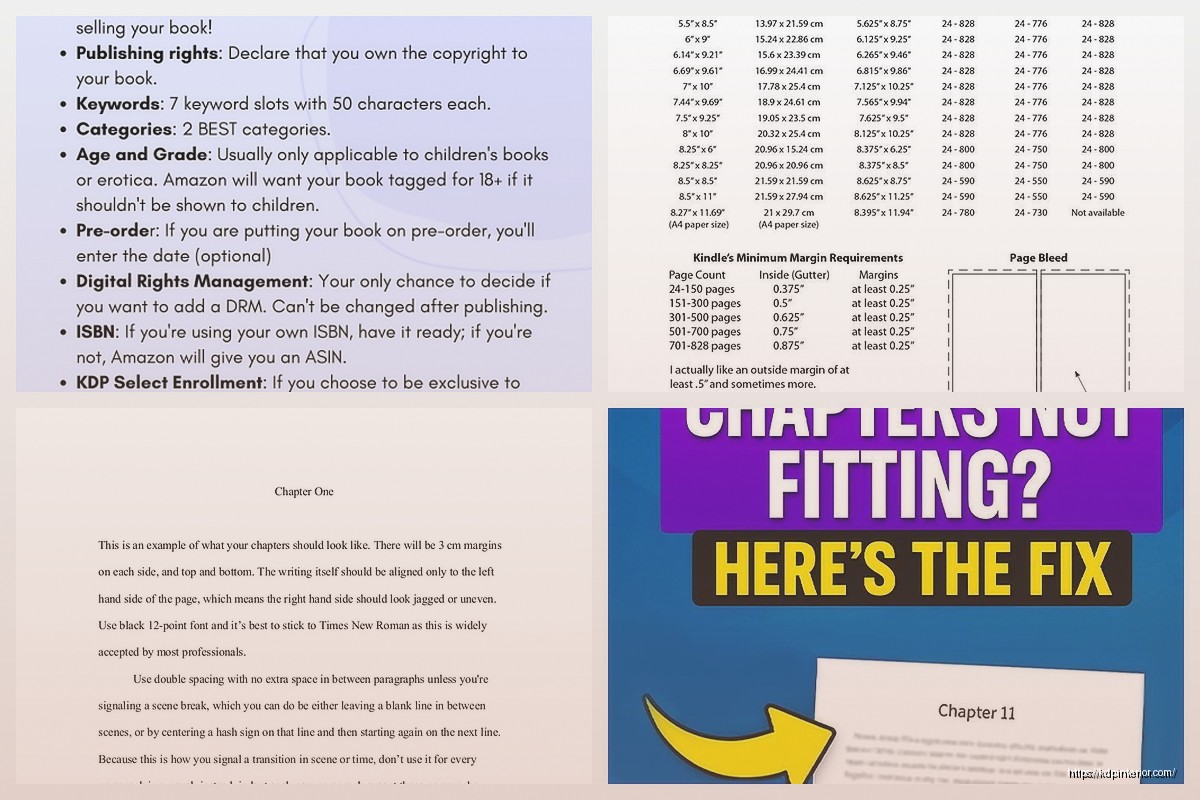
So here’s the deal with trim sizes. KDP offers like 15 different options but honestly only 5-6 matter for most books. The 6×9 is your bread and butter for nonfiction and novels. It’s what readers expect, it looks professional, and the printing costs are reasonable. Then you’ve got 5×8 which is great for smaller books, pocket guides, that kind of thing. I use this size a lot for my guided journals and activity books.
8.5×11 is your standard workbook size but watch out because the printing costs jump way up. Like significantly. I had a client once who insisted on 8.5×11 for a 200-page planner and the production cost was almost $8 per unit which meant she had to price it at like $24.99 to make any profit. Just something to keep in mind.
The square formats (8×8, 8.5×8.5) work amazing for kids books and photo books but that’s pretty niche. And then there’s 5.25×8 which is kinda the sweet spot for fiction if you want something that feels more premium than mass market but not as bulky as 6×9.
Margin Requirements That’ll Save Your Butt
This is where people mess up constantly. KDP requires specific margins based on page count and it’s not intuitive at all. The gutter margin (that’s the inside margin near the binding) needs to increase as your page count goes up. For books under 150 pages you need at least 0.375 inches. For 151-300 pages it’s 0.5 inches. Goes up from there.
I keep a spreadsheet with all these specs because trying to remember them is impossible. Outside margins can be 0.25 inches minimum but I usually go with 0.5 just to be safe. Top and bottom should be at least 0.5 inches but again I usually do 0.75 to give breathing room.
Oh and another thing – if you’re doing headers or footers with page numbers you gotta make sure they’re positioned within the margin boundaries. I see so many manuscripts where the page numbers are sitting right at the edge of the page and they get cut off in printing.
Setting Up Templates in Word vs InDesign
Okay so most people use Word because it’s accessible but honestly InDesign is worth learning if you’re serious about this. Word has this annoying habit of reformatting things randomly, especially if you’re working with images or text boxes. My cat literally walked across my keyboard once and somehow Word changed the entire document’s line spacing to 1.15 and I didn’t notice until after I’d uploaded it. Good times.
In Word you wanna set up your page size first. Go to Layout > Size > More Paper Sizes and enter your exact trim size dimensions. Then set your margins under Layout > Margins > Custom Margins. Make sure you check “Mirror margins” if you’re doing different inside/outside margins which you should be.
For the gutter, there’s a specific field for that in the margin settings. Don’t just try to make the left margin bigger because it won’t mirror properly on left-hand pages.
InDesign is more robust but the learning curve is real. You set up master pages with your margins and those automatically apply to all pages. Way cleaner. Plus InDesign handles images and formatting way better. The downside is it costs money unless you’re doing the Adobe subscription thing.
The Font Situation
This is gonna sound weird but font choice matters more than you think for production. Stick with standard fonts that are embedded in PDFs properly. Times New Roman, Garamond, Palatino, Georgia – these are safe. I had a manuscript once where I used some fancy downloaded font and when it converted to PDF for KDP the font didn’t embed right and everything showed up as Arial. Disaster.
For body text you want 10-12pt depending on the font. Some fonts run smaller than others. Garamond at 11pt looks about the same as Times at 10pt. Do a test print to see what’s actually readable.
Line spacing should be 1.15 to 1.5 for most books. Single spacing looks cramped. Double spacing wastes too much paper and drives up printing costs. I usually go with 1.25 as a happy medium.
Creating the Actual Multi-Format Pack
So when I say multi-format pack I mean having templates ready to go for your most-used trim sizes. I keep master templates for 6×9, 5×8, and 8.5×11 saved in both Word and InDesign. Each template has the margins already set, master pages configured, page numbers in the right spot, headers set up if needed.
The trick is to create these once and then duplicate them for each new project. Don’t try to resize an existing manuscript to fit a different trim size – the margins won’t calculate right and you’ll end up with weird spacing issues.
Wait I forgot to mention – you also need different templates for black/white interior vs color interior. The bleed requirements are different. B&W books don’t need bleed. Color books need 0.125 inch bleed on all sides that extend past your trim size. So if you’re doing a 6×9 color book your actual document size needs to be 6.25×9.25 to accommodate the bleed.
Page Count Considerations
KDP has minimum and maximum page counts depending on the paper type and binding. For cream paper (which I recommend for most books because it’s easier on the eyes) you need at least 24 pages and max is 828 pages for black/white. White paper goes up to 828 too. Color printing maxes out at 550 pages.
Here’s something that trips people up – your page count needs to be divisible by 2 obviously because pages come in pairs. But ideally you want it divisible by 4 for printing efficiency. Doesn’t affect you directly but it’s just cleaner.
Also KDP charges based on page count so every page costs you money in production costs. I see people adding tons of blank pages or filler content and it’s like… you’re just making your book more expensive to produce and less profitable. Be intentional about your page count.
Headers, Footers, and Page Numbers
This is where things get fiddly. You generally don’t want page numbers on the first few pages (title page, copyright page, table of contents). In Word you do this by creating section breaks and then formatting each section differently.
Insert > Page Number and choose your position. Then for the front matter section, double-click the header/footer area and check “Different First Page” and “Different Odd & Even Pages” if you want different headers on left/right pages.
The page numbering should typically start on the first page of actual content (not the title page). So you might need to format the page number to start at 1 even though it’s actually page 7 of the document. There’s an option in the page number settings for this.
I usually put page numbers in the footer, centered or outside corner depending on the book style. Headers can have the book title on left pages and chapter title on right pages, or just leave them blank. Depends on how formal you want it to look.
Interior File Formats
KDP accepts PDF, DOC, DOCX, RTF, HTML, MOBI, and EPUB for upload but honestly just use PDF. It’s the most reliable. When you export to PDF make sure you’re using PDF/X-1a:2001 or PDF/X-3:2002 settings if possible. These are print-optimized formats.
In Word go to File > Save As > PDF and click Options. Uncheck “ISO 19005-1 compliant” because that’s for archival not printing. Make sure fonts are embedded.
From InDesign export as PDF using the [PDF/X-1a:2001] preset. This automatically handles bleed, color profiles, font embedding, all that stuff.
The Bleed Thing Again
Okay so I mentioned bleed earlier but let me explain why it matters. If your book has any color elements – images, colored text, background colors, whatever – that extend to the edge of the page, you need bleed. Without bleed you risk having white slivers at the edges if the cutting isn’t perfectly precise (and it never is).
The bleed area is basically extra content that extends 0.125 inches beyond your trim size on all sides. This gets cut off during trimming but it ensures color coverage goes all the way to the edge.
In your template you set the document size to trim size PLUS bleed. So 6×9 becomes 6.25×9.25. Then you create guides showing the actual trim line so you know not to put important text or images in the bleed area because they’ll get cut off.
Testing Your Templates
Here’s what I do every single time. Before I use a new template for a real project, I create a test document with placeholder text and images. Upload it to KDP and order a proof copy. This costs you like $5-10 depending on the book but it’s worth it to catch issues.
Check for:
- Margins looking correct and consistent
- Page numbers positioned right and sequencing properly
- Headers/footers not cut off
- Images positioned correctly and not pixelated
- Overall readability and professional appearance
I’ve caught so many problems this way that would’ve been embarrassing if they’d gone live. Like one time my 5×8 template had the gutter margin flipped and all the text was smooshed against the binding on one side. Would’ve looked terrible.
Organizing Your Template Library
I keep all my templates in a dedicated folder with clear naming. Like “KDP_6x9_BW_Cream_Template.docx” so I know exactly what it is. Inside each template I have a notes page at the beginning (that I delete before using) with the specs written out – trim size, margins, gutter, page count requirements, etc.
This seems overly organized but when you’re juggling multiple projects it’s easy to grab the wrong template or forget which specs go with which size. Trust me it saves headaches.
Also version control matters. When I update a template I save it with a version number or date. Because nothing’s worse than realizing you’ve been using an outdated template with wrong margins for the last three books.
Common Mistakes to Avoid
Don’t use text boxes for body content in Word. They don’t flow properly across pages and they mess with the PDF conversion. Text boxes are fine for special elements like sidebars or callouts but main content should be regular text.
Don’t forget about recto/verso conventions. In traditional publishing, chapters should start on right-hand (recto) pages. You don’t have to follow this but it looks more professional if you do. Means you might need to add blank pages before chapters which affects your page count.
Image resolution needs to be at least 300 DPI for print. 72 DPI web images will look pixelated. I see this mistake constantly. People pull images from their website or social media and wonder why they look blurry in print.
Watch your file size too. KDP has upload limits and if you’ve got tons of high-res images your PDF can balloon to like 500MB. You can compress PDFs but quality suffers. Better to optimize images before placing them.
Oh and make sure your copyright page has the right info. Not template-related exactly but while you’re setting up your template include a copyright page with placeholder text for title, author, copyright year, ISBN if you’re using one, publisher info, etc.
The whole multi-format pack approach has saved me probably hundreds of hours over the years. Instead of formatting from scratch every time, I just open the appropriate template, drop in my content, adjust as needed, and export. Makes the whole KDP publishing process way faster and less stressful.
Just gotta remember to keep those templates updated when KDP changes their specs which they do occasionally. Usually they announce it but sometimes things shift quietly and you only notice when a manuscript gets rejected. Fun stuff.

DISCOVER OUR FREE BEST SELLING PRODUCTS
Editable Canva Lined Journal: Express Your Thoughts – KDP Template
Lined Pages Journal 120 pages Ready to Upload PDF Commercial Use KDP Template 6×9 8.5×11 5×8 for Notebooks, Diaries, Low Content
Lined Pages Journal 120 pages Ready to Upload PDF Commercial Use KDP Template 6×9 8.5×11 5×8 for Notebooks, Diaries, Low Content
Cute Dogs Coloring Book for Kids | Activity Book | KDP Ready-To-Upload
Daily Planner Diary : Diary Planners for Everyday Productivity, 120 pages, 6×9 Size | Amazon KDP Interior
Wolf Coloring KDP interior For Adults, Used as Low Content Book, PDF Template Ready To Upload COMMERCIAL Use 8.5×11"
Coloring Animals Head Book for Kids, Perfect for ages 2-4, 4-8 | 8.5×11 PDF
Printable Blank Comic Book Pages PDF : Create Your Own Comics – 3 Available Sizes
Notes KDP interior Ready To Upload, Sizes 8.5×11 6×9 5×8 inch PDF FILE Used as Amazon KDP Paperback Low Content Book, journal, Notebook, Planner, COMMERCIAL Use
Black Lined Journal: 120 Pages of Black Lined Paper Perfect for Journaling, KDP Notebook Template – 6×9
Student Planner Journal 120 pages Ready to Upload PDF Commercial Use KDP Template 6×9" 8.5×11" for Low Content book
Recipe Journal Template – Editable Recipe Book Template, 120 Pages – Amazon KDP Interior