Amazon KDP guide, KDP book publishing
Photoshop Book Cover Template: Adobe Design Files
Apr
Okay so I’ve been using Photoshop book cover templates for like 3 years now and honestly it’s one of those things where you think it’ll be complicated but once you get the workflow down it’s actually pretty straightforward.
Where to Actually Find Good Templates
First thing – Creative Market is where I grab most of mine. They’ve got these bundles that are like $19-$29 and you get maybe 10-15 different cover designs. The key is looking for ones that say “fully editable” and have the PSD file included. I learned this the hard way when I bought one that was just a JPEG with some text layers and I was like… what am I supposed to do with this?
Envato Elements is another solid option if you’re gonna be doing a bunch of covers. It’s a subscription thing, maybe $16/month or something, but you get unlimited downloads. Worth it if you’re pumping out multiple books. I used it for about 6 months when I was doing a romance series and needed consistent branding across like 8 covers.
Oh and another thing – Etsy actually has some decent ones. Yeah I know, Etsy for Photoshop templates sounds weird but there are some designers there who specialize in book covers. Usually cheaper too, like $5-$15 range. Just make sure they’re sending you the actual PSD file and not just a flattened image.
What You’re Actually Getting in These Files
So when you download a proper Photoshop book cover template, you should be getting a PSD file that’s already sized correctly. Most of them come in standard KDP dimensions – usually 6×9 inches is the most common because that’s what like 70% of paperbacks use. The file should have multiple layers organized in folders.
Good templates will have:
- Background layers (textures, colors, gradients)
- Image placeholders using smart objects
- Text layers that are already styled
- Design elements like lines, shapes, ornaments
- Sometimes mockup scenes so you can preview how it looks
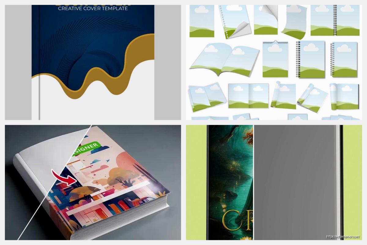
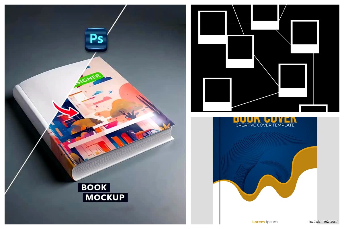
The smart object thing is crucial because that’s how you swap in your own images without messing up the effects. You double-click the smart object layer, it opens in a new window, you paste your image, save and close, and boom – it updates in the main file with all the effects applied. My cat walked across my keyboard while I was doing this last week and somehow saved over one and I had to start from scratch so like… save your work frequently.
Setting Up Your Workspace
Before you even open the template, make sure you’ve got your specs figured out. KDP has this cover calculator tool on their website – you put in your page count, paper type (cream or white), and trim size. It spits out the exact dimensions you need including the spine width.
This is gonna sound obvious but write those numbers down somewhere. I keep a Google Doc with all my book specs because I’ve definitely been in situations where I’m like “wait was this 250 pages or 275” and then your spine width is wrong and KDP rejects it.
When you open the template in Photoshop, first thing I do is check the image size (Image > Image Size). Make sure it matches what you need. If it doesn’t, you’ll need to adjust but be careful with the spine area – that needs to be precise. I usually add guides where the spine starts and ends so I don’t accidentally put important text there.
Customizing the Design Elements
Okay so here’s where it gets fun. Most templates are set up so you can change colors really easily. Look for adjustment layers or solid color fill layers. Double-click on those and you can pick whatever color scheme matches your genre or brand.
For thriller covers I’m doing dark blues and blacks. Romance gets the burgundies and golds. Fantasy… honestly fantasy is all over the place but I tend to go with rich purples or deep greens.
The text layers – you’re gonna want to replace the placeholder text obviously. But here’s what most people don’t think about: the fonts. The template comes with specific fonts that might not be installed on your computer. When you open the file, Photoshop will warn you about missing fonts. You’ve got a few options:
- Find and install the same fonts (the template should list what fonts they used)
- Replace them with similar fonts you already have
- Use Adobe Fonts which is included with your Creative Cloud subscription
I usually just replace them because tracking down specific fonts is annoying. DaFont and Google Fonts are free resources. For book covers you want something readable – fancy script fonts look cool but if people can’t read your title on a thumbnail that’s like 120 pixels wide, you’ve lost them.
Working With Smart Objects and Images
This is where templates really shine. If the template has image placeholders, they’re probably smart objects. You’ll see a little icon on the layer thumbnail that looks like a page or document.
Double-click that layer. It opens a new PSB file. This is your placeholder workspace. You can paste your image here, resize it, position it however you want. When you save this PSB file and go back to your main document, the image updates automatically with all the effects, masks, and blending modes applied.
I spent like two hours once trying to figure out why my images looked weird and it’s because I was pasting them OVER the smart object instead of INTO it. Don’t be like me.
For stock photos, I use Depositphotos and Shutterstock mostly. Unsplash is free but the selection for book-cover-appropriate images is kinda limited. You need high resolution – at least 3000 pixels on the longest side for print covers. KDP requires 300 DPI for print.
Blending and Effects
The cool thing about good templates is they already have blending modes and effects set up. You’ll see layers with things like “Multiply” or “Overlay” in the blend mode dropdown. These create the professional-looking color overlays and lighting effects.
Don’t mess with these too much unless you know what you’re doing. I’ve accidentally ruined covers by changing blend modes and then couldn’t figure out what it was originally set to.
Layer styles are another thing – if you click on a layer and see little icons under it (fx), that means it has effects applied. Drop shadows, glows, bevels, whatever. You can double-click the fx icon to see what effects are there and adjust them if needed.
Typography and Text Hierarchy
Your title needs to be the biggest element obviously. Then author name, then subtitle if you have one. The template should have this hierarchy already built in but you might need to adjust sizes based on your actual title length.
Short titles are easier – you can go bigger and bolder. Long titles… you gotta get creative. Maybe stack them differently or use two different font sizes for different words. I did a book called “The Systematic Approach to Digital Publishing Success” and yeah that was a nightmare to fit nicely.
Make sure your text has enough contrast with the background. Light text on dark backgrounds or dark text on light backgrounds. Photoshop has a stroke option (layer styles) that can add an outline to text which helps it pop. Or drop shadows work too.
Wait I forgot to mention – some templates come with separate files for ebook and print. Ebook covers are just the front cover, usually 2560×1600 pixels or a 1.6:1 ratio. Print covers include front, spine, and back. Make sure you’re working with the right file for what you need.
The Spine and Back Cover
If you’re doing print, the spine width changes based on page count. This is why you need those exact specs from KDP’s calculator. The template should have guides showing where the spine is, but you might need to adjust them.
Spine text is tricky because it needs to be readable when the book is sitting on a shelf. Use a simple font, not too thin. And make sure it’s centered on the spine – if it wraps around to the front or back even slightly, KDP will reject it.
Back cover is usually:
- Book description or blurb
- Author bio maybe
- Barcode area (bottom right corner – leave this blank, KDP adds it)
- Maybe some design elements that match the front
The barcode area needs to be like 2×3 inches of blank space. I usually put a white or light colored rectangle there with low opacity so I remember to keep text out of it.
Exporting and File Specs for KDP
Okay so you’ve customized everything, it looks amazing, now what? You gotta export it correctly or KDP will reject it and you’ll be sad.
For print covers go to File > Save As and save it as a PDF. Use the “High Quality Print” preset or “Press Quality” – both work. Make sure “Preserve Photoshop Editing Capabilities” is UNCHECKED because that makes the file size huge and KDP doesn’t need it.
Actually wait, some people prefer TIFF files. Those work too. Just make sure it’s flattened (all layers merged) and 300 DPI.
For ebook covers, save as JPEG. File > Export > Export As, choose JPEG, quality at like 80-90%. You don’t need 100% quality because it just makes the file bigger. KDP has a file size limit and you don’t wanna hit it.
The dimensions for ebook should be at least 1600 pixels on the shortest side. I usually do 2560×1600 which is overkill but whatever, looks crisp.
Common Rejection Issues
I’ve had covers rejected for dumb stuff like:
- Text too close to the spine edge (needs 0.125″ margin)
- Low resolution images that looked fine on screen but were pixelated in print
- Color profile issues – always use sRGB for both ebook and print even though print “should” be CMYK, KDP wants RGB
- File size too large (over 50MB usually triggers issues)
The bleed area is another thing – your background should extend 0.125″ past the trim line on all sides. Good templates have this built in but if you’re adjusting the canvas size make sure you account for it.
Organizing Your Template Library
After you’ve bought or downloaded a bunch of templates, organization becomes important. I keep mine in Dropbox folders organized by genre. Like I’ve got folders for:
Thriller templates
Romance templates
Non-fiction templates
Fantasy templates
Inside each folder I keep the original template files (never edit the original, always duplicate it first) and then subfolders for each book project.
Some templates come with documentation or instruction PDFs. Actually read those because sometimes there are specific steps for customizing that template and if you skip them things break.
Creating Your Own Template System
Once you’ve used enough templates you start seeing patterns in what works. I eventually made my own “base template” that has my preferred layer organization, guides already set up, and my go-to fonts loaded.
It’s literally just a PSD file with placeholder text and shapes, but it saves me like 30 minutes every time I start a new cover because I don’t have to set everything up from scratch.
You can do this too – take a template you really like, strip out the specific design elements, and save it as your starting point. Just make sure if it was a paid template that you’re not redistributing it or violating the license.
Oh and speaking of licenses – most template licenses allow unlimited projects but you can’t resell the template itself or offer it as a freebie. You’re buying it to use for your own books, not to pass along to other people. Just FYI because I’ve seen people get confused about that.
Alternative Options If Photoshop Isn’t Your Thing
Real talk – if Photoshop feels too complicated, there are alternatives. Canva has book cover templates and it’s way more user-friendly. You lose some advanced control but for simple covers it works fine. I use it sometimes when I need something quick and don’t wanna deal with Photoshop layers.
GIMP is free and can open PSD files mostly. Some effects don’t translate perfectly but it’s better than nothing if you don’t have a Creative Cloud subscription.
BookBrush is specifically made for book covers and it’s pretty intuitive. They have templates built in and you can customize them in your browser.
But honestly if you’re serious about self-publishing, learning Photoshop is worth it. The control you get over your designs is just way better than drag-and-drop tools. Plus you can use it for formatting interiors, creating graphics for social media, all that stuff.
I was watching that show The Last of Us while working on covers last month and honestly the atmospheric stuff in that show gave me ideas for some post-apocalyptic thriller covers I’m working on. Funny how inspiration hits you from random places.
Anyway yeah, Photoshop templates are definitely the way to go if you want professional-looking covers without hiring a designer for every single book. The learning curve is real but once you’ve done like 5 or 6 covers you’ll have the workflow down and it becomes pretty quick. My first cover took me probably 6 hours of fumbling around. Now I can knock one out in maybe an hour if I’ve got all my assets ready.
Just remember to save frequently, work in layers, don’t skip the bleed and margin requirements, and test how your cover looks as a tiny thumbnail because that’s how most people will see it first on Amazon.
DISCOVER OUR FREE BEST SELLING PRODUCTS
Editable Canva Lined Journal: Express Your Thoughts – KDP Template
Lined Pages Journal 120 pages Ready to Upload PDF Commercial Use KDP Template 6×9 8.5×11 5×8 for Notebooks, Diaries, Low Content
Lined Pages Journal 120 pages Ready to Upload PDF Commercial Use KDP Template 6×9 8.5×11 5×8 for Notebooks, Diaries, Low Content
Cute Dogs Coloring Book for Kids | Activity Book | KDP Ready-To-Upload
Daily Planner Diary : Diary Planners for Everyday Productivity, 120 pages, 6×9 Size | Amazon KDP Interior
Wolf Coloring KDP interior For Adults, Used as Low Content Book, PDF Template Ready To Upload COMMERCIAL Use 8.5×11"
Coloring Animals Head Book for Kids, Perfect for ages 2-4, 4-8 | 8.5×11 PDF
Printable Blank Comic Book Pages PDF : Create Your Own Comics – 3 Available Sizes
Notes KDP interior Ready To Upload, Sizes 8.5×11 6×9 5×8 inch PDF FILE Used as Amazon KDP Paperback Low Content Book, journal, Notebook, Planner, COMMERCIAL Use
Black Lined Journal: 120 Pages of Black Lined Paper Perfect for Journaling, KDP Notebook Template – 6×9
Student Planner Journal 120 pages Ready to Upload PDF Commercial Use KDP Template 6×9" 8.5×11" for Low Content book
Recipe Journal Template – Editable Recipe Book Template, 120 Pages – Amazon KDP Interior