okay so picture book layouts are actually way more technical than people think
I spent like three days last month just staring at spreads because a client’s illustrator kept sending files that wouldn’t work for print and honestly it made me realize most people don’t get the actual mechanics of this stuff. So here’s what you actually need to know.
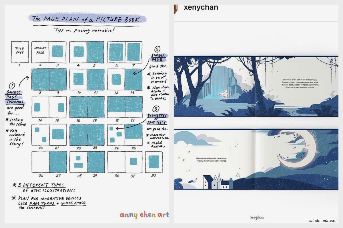
First thing – picture books are almost always 32 pages. Not 30, not 35. Thirty-two. This is because of how printing works with signatures and binding and yeah it’s annoying but that’s the standard. You’re gonna lose some of those pages to front matter though – title page, copyright, maybe dedication. So really you’ve got like 28-29 pages for your actual story which means 14-15 spreads to work with.
The spread is everything. That’s your two-page layout when the book is open flat. Most illustrators who are new to this keep thinking in single pages and then wonder why their compositions feel off. You gotta think in spreads because that’s how kids experience the book.
the gutter problem nobody warns you about
Okay so the gutter is that center crease where the pages meet and it’s gonna eat about a quarter inch to half inch of your image depending on the binding type. I’ve seen SO many illustrations ruined because someone put a character’s face right in the gutter. Their nose disappears into the binding and it looks terrible.
What I tell illustrators now – keep anything important at least 0.5 inches away from center. Better yet, design your spreads so the action flows ACROSS the gutter instead of landing right on it. Like if you’ve got a character running, have them running from left page to right page, jumping over that center line. Makes the gutter work FOR you instead of against you.
My cat just knocked over my coffee which is perfect timing because I need to talk about bleed anyway…
bleed and trim and why your files keep getting rejected
Standard bleed is 0.125 inches on all sides. This means your illustration needs to extend past where the final page will be cut. KDP wants this, IngramSpark wants this, every printer wants this. If you don’t include bleed, you’ll get white edges when they trim the book and it looks amateur.
So if you’re doing an 8×10 book (pretty standard picture book size), your actual canvas needs to be 8.25 x 10.25 inches. That extra quarter inch total is your bleed.
But here’s where people mess up – they extend the bleed but they also put important stuff in the bleed zone. Don’t do that. You’ve got three zones on every page:
- Bleed zone – the outer 0.125 inches that might get cut off
- Safe zone – where text and important visual elements should live, usually 0.25-0.5 inches from the trim edge
- Everything in between – background elements, patterns, stuff that can get partially cut without ruining the image
I literally keep a template file with these zones marked in bright pink so I never forget. Saved me probably a dozen rejections at this point.
text placement is its own nightmare
Where you put words matters SO much and it’s always the last thing people think about. I was watching The Bear last week while reviewing a client’s book and the whole episode about organization made me think about how chaotic most picture book text placement is.
General rules I follow: text usually goes on the left page of the spread, illustration dominates the right. This is because of how Western readers scan – left to right, top to bottom. Kids are learning this pattern so you might as well work with it.
But also you can break this rule if you’re doing full-bleed illustrations across both pages. Then text can float wherever makes sense compositionally. Just keep it consistent throughout the book. Don’t switch systems halfway through.
Text needs breathing room. Like minimum 0.25 inches between text and any important visual elements. Otherwise it feels cramped and becomes hard to read. Kids need that white space even more than adults do.
oh and another thing – if you’re putting text over an illustration instead of on a plain background, you need serious contrast. Light text on dark areas, dark text on light areas. Seems obvious but I’ve rejected files where someone put gray text on a medium-blue sky and wondered why it was unreadable.
the rhythm of page turns
This is gonna sound weird but picture books have a rhythm based on page turns. Every time a kid turns the page, there’s this little moment of anticipation. Good layouts use this.
You want your story beats to land on the right-hand page of a spread because that’s what they see when they turn. The left page is setup, right page is payoff. So if your text says “and then the door opened” that should be on the left page, and the right page shows what’s behind the door.
I learned this from studying old Maurice Sendak books honestly. Where the Wild Things Are is a masterclass in this. Watch how the illustrations get bigger as Max’s imagination grows. The pages literally expand with the story.
You can play with illustration size to control pacing too. Small spot illustrations for quiet moments, full-bleed spreads for big dramatic moments. I worked on a bedtime story last year where we gradually reduced the illustration size as the story wound down, and parents told us kids actually got calmer as they read it. The layout was doing psychological work.
actual file setup for kdp
Okay so practical stuff. KDP wants PDF files for picture books. Not JPG, not PNG. PDF with fonts embedded and images at 300 DPI minimum.
If you’re doing a standard 8.5×11 picture book (landscape orientation is super common), your file needs to be:
- 17.25 inches wide x 8.625 inches tall for the interior spreads
- That’s the full spread plus bleed on all sides
- Each spread is one page in your PDF
- So a 32-page book becomes a 16-page PDF of spreads
wait I forgot to mention – you DON’T include the cover in the interior file. That’s separate. The cover is its own beast with its own dimensions that include the spine width.
Color profile should be CMYK if you’re printing, not RGB. RGB colors won’t print the same way they look on your screen and you’ll get weird color shifts. I’ve had illustrators furious about their blues printing purple until I checked and yep, they submitted in RGB.
common layout patterns that actually work
Most picture books follow a few standard patterns:
Pattern 1: Text left, image right – Classic and safe. Text on left page with maybe a small spot illustration, main illustration on right page. Works great for beginning readers who need clear text separation.
Pattern 2: Full-bleed spread with floating text – Illustration goes across both pages, text placed in a clear area. More immersive but harder to execute because you need good composition skills to leave text space.
Pattern 3: Alternating – Some spreads are full-bleed, some are text-left image-right. Gives you variety and lets you emphasize certain moments. This is what I use most often.
Pattern 4: Image top, text bottom – Less common but works for certain stories. Illustration across the top of the spread, text in a band across the bottom.
You can mix these but don’t go crazy. Pick maybe two patterns and stick with them. Too much variety looks disorganized.
the stuff nobody tells you about working with illustrators
If you’re hiring an illustrator and you’re not one yourself, you gotta give them actual specs. Can’t just say “make it pretty.” Here’s what I include in every illustration brief now:
- Exact trim size and bleed requirements
- Number of spreads needed
- Color palette preferences
- Style references from other books
- Character descriptions with visual refs
- Notes on where text will go on each spread
I also do a rough thumbnail layout before any illustration starts. Just stick figures and boxes showing composition. Saves SO much revision time later. Can’t tell you how many projects I’ve seen go over budget because people started illustrating without a layout plan.
testing your layout before you print
Print a dummy. Seriously. Even if it’s just on your home printer, print the whole thing and staple it together. You’ll catch stuff you’d never see on screen.
Things I’ve caught in dummy prints: text too close to gutter, illustrations that don’t flow well from spread to spread, pacing that felt off, a two-page spread where the character was looking off the page instead of into the next scene.
If you’re doing a 32-page book, print it as 8 sheets double-sided, fold them, stack them in order. This is basically what a printer does except they do it with nicer equipment. But you’ll get the feel of the book.
Read it out loud with your dummy. Time it. Picture books should take about 3-5 minutes to read aloud. If yours is taking 10 minutes, you’ve got too much text and your layout probably feels cramped.
cover layout is different
Quick thing about covers since people always ask – the cover is one continuous wrap around the book. Front cover, spine, back cover all in one file.
KDP has a cover calculator that tells you exact dimensions based on your page count and paper type. Use it. The spine width changes based on how many pages you have and what paper you choose. Cream paper is thicker than white, so your spine will be wider.
Most important elements (title, author name, main character) should be on the front cover obviously. But also consider the thumbnail. Your cover image gets shrunk to like 100 pixels on Amazon. Can you still tell what it is? Can you read the title? If not, your fonts are too small or your composition is too busy.
software and tools I actually use
People always ask what software to use. Honestly it depends on whether you’re doing the illustration or just layout.
For layout only: InDesign is industry standard but it’s expensive. Affinity Publisher is like $50 and does basically the same thing. I use Affinity for most client work now because the cost is reasonable and it handles print files great.
For illustration: Procreate on iPad is huge right now for children’s illustration. Photoshop for digital painting. Illustrator for vector work if you’re doing that style. Some people still do traditional media and scan, which is totally valid but make sure you’re scanning at 600 DPI minimum.
Whatever you use, it needs to export print-quality PDFs with CMYK color and embedded fonts. If your software can’t do that, you’re gonna have problems.
things that seem small but matter
Page numbers – you don’t usually put page numbers in picture books. They’re distracting and kids don’t need them.
Backgrounds – every spread needs a complete background even if characters are in the foreground. No floating characters on white unless that’s your deliberate style choice.
Consistency – character sizes should stay relatively consistent unless there’s a story reason for change. I’ve seen books where a rabbit is huge on one page and tiny on the next and it’s just confusing.
Eye direction – characters should generally look toward the center of the spread or toward the next page. Don’t have them looking off the left edge of the left page, it leads the eye out of the book.
Okay I think that covers most of the technical stuff you actually need to know. The rest is really about storytelling and art which is way more subjective. But if you get the mechanics right – the trim, bleed, gutter, spreads, file specs – you’re like 80% of the way to a professional-looking book. The other 20% is making it beautiful and that’s the fun part anyway.
 Coloring Animals Head Book for Kids, Perfect for ages 2-4, 4-8 | 8.5x11 PDF
2 × $0.00
Coloring Animals Head Book for Kids, Perfect for ages 2-4, 4-8 | 8.5x11 PDF
2 × $0.00  Daily Planner Diary : Diary Planners for Everyday Productivity, 120 pages, 6×9 Size | Amazon KDP Interior
1 × $0.00
Daily Planner Diary : Diary Planners for Everyday Productivity, 120 pages, 6×9 Size | Amazon KDP Interior
1 × $0.00 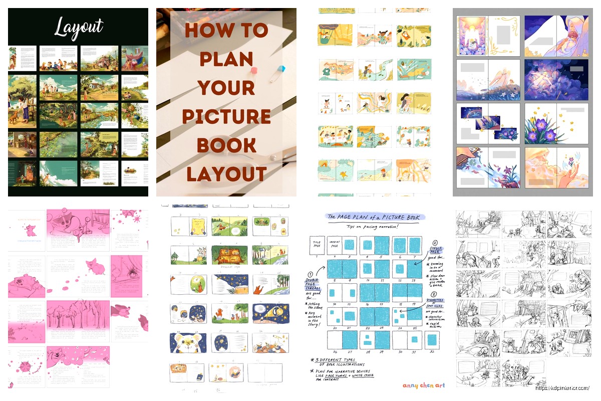
DISCOVER OUR FREE BEST SELLING PRODUCTS
Editable Canva Lined Journal: Express Your Thoughts – KDP Template
Lined Pages Journal 120 pages Ready to Upload PDF Commercial Use KDP Template 6×9 8.5×11 5×8 for Notebooks, Diaries, Low Content
Lined Pages Journal 120 pages Ready to Upload PDF Commercial Use KDP Template 6×9 8.5×11 5×8 for Notebooks, Diaries, Low Content
Cute Dogs Coloring Book for Kids | Activity Book | KDP Ready-To-Upload
Daily Planner Diary : Diary Planners for Everyday Productivity, 120 pages, 6×9 Size | Amazon KDP Interior
Wolf Coloring KDP interior For Adults, Used as Low Content Book, PDF Template Ready To Upload COMMERCIAL Use 8.5×11"
Coloring Animals Head Book for Kids, Perfect for ages 2-4, 4-8 | 8.5×11 PDF
Printable Blank Comic Book Pages PDF : Create Your Own Comics – 3 Available Sizes
Notes KDP interior Ready To Upload, Sizes 8.5×11 6×9 5×8 inch PDF FILE Used as Amazon KDP Paperback Low Content Book, journal, Notebook, Planner, COMMERCIAL Use
Black Lined Journal: 120 Pages of Black Lined Paper Perfect for Journaling, KDP Notebook Template – 6×9
Student Planner Journal 120 pages Ready to Upload PDF Commercial Use KDP Template 6×9" 8.5×11" for Low Content book
Recipe Journal Template – Editable Recipe Book Template, 120 Pages – Amazon KDP Interior