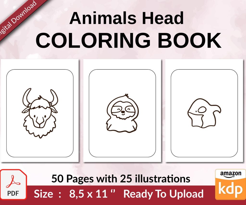
 Coloring Animals Head Book for Kids, Perfect for ages 2-4, 4-8 | 8.5x11 PDF
 Subtotal: $0.00
Amazon KDP guide, KDP book publishing
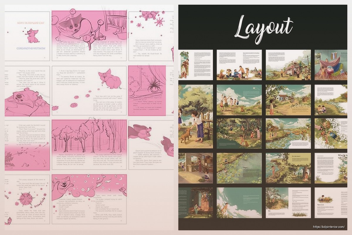
Picture Book Template: Children’s Illustration Layout
04
Apr
Apr
Okay so picture book templates are probably one of the most misunderstood things in the KDP world and I see people mess this up constantly. Let me just walk you through what actually works because I’ve been doing this since like 2017 and the layout stuff? It’s not as complicated as those $200 courses make it seem.
The Basic Structure Nobody Tells You About
So first thing – standard picture book is 32 pages. That’s including the cover and all the front matter. Most people don’t realize you’re actually working with maybe 24-26 pages of actual story content because you gotta account for title page, copyright page, dedication if you’re doing that.
The trim size everyone defaults to is 8.5 x 8.5 inches but honestly? I’ve had way better success with 8.5 x 11 inches for certain niches. The square format looks cute but parents actually prefer the vertical format for bedtime reading – they can prop it up easier. Found that out after my daughter kept complaining about one of my test books sliding off her lap lol.
Bleed and Margins Are Gonna Drive You Crazy
Alright so KDP requires 0.125 inches bleed on all sides. That means your actual design canvas needs to be bigger than your trim size. If you’re doing 8.5 x 8.5, you’re really working with 8.75 x 8.75 inches.
Here’s what nobody mentions though – you need a SAFETY ZONE inside that. I keep at least 0.25 inches from the trim edge for any important text or illustration elements. Amazon’s cutting machines aren’t perfect and I’ve had books where stuff got chopped off because I pushed elements too close to the edge.
The gutter (that’s the inside margin where the book binds) needs even MORE space. I use 0.5 inches minimum on the gutter side. Trust me on this. I had a whole batch of 100 books where the text was too close to the spine and it looked terrible when people tried to photograph it for reviews.
Setting Up Your Template in Photoshop or Whatever
I use Photoshop but this works in Affinity Photo or even Canva Pro if you set it up right. Create a new document with these specs:
- Width: trim width + 0.25 inches (0.125 bleed on each side)
- Height: trim height + 0.25 inches
- Resolution: 300 DPI minimum – KDP will reject anything lower
- Color mode: RGB for ebooks, CMYK if you’re doing print but honestly RGB usually converts fine
Then I create guide lines at 0.125 inches from each edge (that’s your trim line) and another set of guides 0.25 inches inside that (safety zone). The gutter gets its own guide at 0.5 inches from the binding edge.
The Illustration Layout Patterns That Actually Sell
Okay so this is where it gets interesting. I’ve tested probably 30 different layout styles and there are clear patterns that perform better. Not gonna sugarcoat it – some layouts just convert better than others.
Full-Bleed Illustrations
This is where the illustration extends all the way to the edges (into the bleed area). Kids love this because it’s immersive. The trick is making sure your focal points aren’t near the edges because of that cutting issue I mentioned. I usually put characters and important elements in the center third of the page.
For text placement with full-bleed, I either do:
- Text on a semi-transparent overlay box (50-70% opacity works)
- Text integrated into empty sky areas or ground areas of the illustration
- Text on the opposite page with illustration on the facing page
Framed Illustrations with Border Space
This is actually easier for beginners. You leave a 0.5-1 inch white (or colored) border around your illustration. Text can go in this border area or on the facing page. It’s more forgiving with the cutting/binding issues and honestly looks pretty professional if you keep it clean.
Split Page Layouts
Illustration on top 60-70% of the page, text on bottom 30-40%. Or vice versa. This works really well for early reader books where you need more text per page. I use this format for my animal fact books and they do consistently well.
Text Placement Rules That Nobody Follows But Should
So here’s the thing about text in picture books – it needs to be READABLE on a phone screen. Yeah, I know, picture books are print products mostly, but Amazon shows previews on mobile and if parents can’t read your sample pages easily, they bounce.
Font size minimum should be 16pt for body text, 24pt+ for headers or emphasis. I typically use 18-20pt because I’m paranoid about readability.
Safe fonts that actually work:
- Century Gothic – clean and kid-friendly
- Quicksand – rounded and approachable
- Baloo or Baloo Paaji – specifically designed for children’s content
- Andika – created for literacy so it’s super clear
Don’t use more than two fonts per book. One for body text, one for titles/emphasis. That’s it. I see people using like five different fonts and it looks chaotic.
Text Color and Contrast
White text needs a dark background or shadow. Black text needs light background. Sounds obvious but you’d be surprised… I use drop shadows on almost all my text (2-3px offset, 50-70% opacity black shadow) just to make sure it pops off any background.
Oh and another thing – if you’re doing text directly on illustrations, make sure you’re testing it at actual size. What looks good on your 27-inch monitor might be unreadable when printed at 8.5 inches. I always print test pages on my home printer before finalizing.
Page Spreads vs Single Pages
Okay so this confuses everyone. When you’re designing, you need to think in SPREADS (two facing pages) but you submit to KDP as SINGLE pages.
The way I handle this: I design in spreads to make sure everything flows visually, then I export as individual pages for upload. In Photoshop I’ll have a canvas that’s 17 x 8.5 inches (for an 8.5 x 8.5 book) showing both pages, then I slice it and export left and right separately.
Important – page 1 is always a right-hand page. The spreads go:
- Cover (separate file)
- Page 1 (right side) – usually blank or title page
- Pages 2-3 (first spread) – copyright left, dedication or start of story right
- Pages 4-5, 6-7, 8-9, etc (story spreads)
The Gutter Problem and How to Work Around It
So the gutter is that center binding area and it’s gonna eat some of your page. For perfect bound books (most KDP picture books) you lose visibility in maybe 0.25-0.5 inches of the gutter depending on page count.
Never put important visual elements across the gutter. It’ll look weird and distorted. If you’re doing a spread illustration, either:
- Design it so there’s a natural break point at the gutter (like a tree trunk or a wall)
- Keep it simple in the center area – sky, grass, water – stuff that doesn’t matter if it curves
- Just don’t do spread illustrations if you can avoid it honestly
I learned this the hard way with a book about dinosaurs where I had a T-Rex spanning both pages and its body got all warped in the gutter. Looked terrible. Now I keep characters on single pages.
File Format and Export Settings
KDP accepts PDF. That’s what you want to use. Here’s my export settings that haven’t failed me yet:
- PDF/X-1a:2001 or PDF/X-3:2002 preset
- High Quality Print settings
- Compression: JPEG quality set to Maximum
- Marks and Bleeds: Include bleed (0.125″), no crop marks or other marks
- Color conversion: Convert to Destination (Preserve Numbers) if you’re in CMYK
File size usually ends up 20-50MB for a full color picture book. KDP accepts up to 650MB so you’re fine.
This Is Gonna Sound Weird But
Always flatten your layers before exporting. I keep my working file with all layers intact, but the PDF export should be flattened. Had an issue once where transparent layers caused weird rendering on KDP’s preview and cost me like three days of back and forth with support.
Template Organization for Multiple Books
If you’re planning to do multiple picture books (which you should because one book won’t make money) set up a master template. I have a Photoshop file called “Picture-Book-Master-Template.psd” with:
- All the guides already set up
- A locked layer with safe zones marked in light blue
- Text layer with my standard font and size
- Folders for: Background, Main-Illustration, Text, Effects
Then I just duplicate this file for each new book project. Saves like 20 minutes per book setup.
Common Mistakes I See All The Time
Text too small – seriously people submit books with 12pt font and wonder why they get bad reviews
Inconsistent page layouts – if you do text-on-bottom for page 4, keep that style throughout the book don’t randomly switch to text-on-left on page 12
Ignoring the gutter – already ranted about this but worth repeating
Wrong resolution – 150 DPI or 72 DPI will get rejected immediately need 300 DPI minimum
No bleed – if you don’t set up bleed you’ll get white lines on the edges when it’s cut
Forgetting about the preview – Amazon shows a preview to customers test how your pages look at thumbnail size
Working With Illustrators
If you’re outsourcing the illustrations (which most KDP publishers do) you need to give them the RIGHT specs upfront. I send my illustrators a document that specifies:
- Exact canvas size including bleed
- Safe zone requirements
- File format (usually PNG with transparent background or layered PSD)
- Resolution (300 DPI always)
- Color profile (RGB usually fine)
And I request they deliver each illustration as a separate file named by page number. Makes assembly so much easier.
Wait I forgot to mention – if you’re using Fiverr or Upwork for illustrations, make sure they understand KDP requirements. I’ve had illustrators deliver gorgeous work that was 72 DPI and I had to get it redone. Now I include “must be 300 DPI for print” in every project description.
Testing Your Template Before Publishing
Order a proof copy always. I don’t care how perfect it looks on screen. Colors print differently, binding affects page visibility, sometimes the paper texture makes thin lines disappear. It’s like $5-10 for a proof and it’ll save you from having to unpublish and fix things later.
I usually order 2-3 proofs if I’m testing a new template style just to make sure everything holds up.
My cat just knocked over my coffee but anyway – the other thing about proofs is they let you test actual readability. Have someone else (ideally a parent with kids) look at it and tell you if anything’s hard to read or looks off.
That’s pretty much the core of what you need to know for picture book templates. The rest is just iteration and testing different styles to see what sells in your niche. Some niches prefer minimal text and big illustrations, others need more educational content per page. You gotta test and see what works for your specific audience.
DISCOVER OUR FREE BEST SELLING PRODUCTS
Editable Canva Lined Journal: Express Your Thoughts – KDP Template
Lined Pages Journal 120 pages Ready to Upload PDF Commercial Use KDP Template 6×9 8.5×11 5×8 for Notebooks, Diaries, Low Content
Lined Pages Journal 120 pages Ready to Upload PDF Commercial Use KDP Template 6×9 8.5×11 5×8 for Notebooks, Diaries, Low Content
Cute Dogs Coloring Book for Kids | Activity Book | KDP Ready-To-Upload
Daily Planner Diary : Diary Planners for Everyday Productivity, 120 pages, 6×9 Size | Amazon KDP Interior
Wolf Coloring KDP interior For Adults, Used as Low Content Book, PDF Template Ready To Upload COMMERCIAL Use 8.5×11"
Coloring Animals Head Book for Kids, Perfect for ages 2-4, 4-8 | 8.5×11 PDF
Printable Blank Comic Book Pages PDF : Create Your Own Comics – 3 Available Sizes
Notes KDP interior Ready To Upload, Sizes 8.5×11 6×9 5×8 inch PDF FILE Used as Amazon KDP Paperback Low Content Book, journal, Notebook, Planner, COMMERCIAL Use
Black Lined Journal: 120 Pages of Black Lined Paper Perfect for Journaling, KDP Notebook Template – 6×9
Student Planner Journal 120 pages Ready to Upload PDF Commercial Use KDP Template 6×9" 8.5×11" for Low Content book
Recipe Journal Template – Editable Recipe Book Template, 120 Pages – Amazon KDP Interior