 Editable Canva Lined Journal: Express Your Thoughts - KDP Template
 Subtotal: $0.00
Amazon KDP guide, KDP book publishing
Poem Layout: Poetry Book Design Principles
19
May
May
Okay so here’s the thing about poetry book layouts that nobody really tells you until you’ve already published like three collections that look kinda amateur – white space is literally your best friend and most people screw this up completely.
Margins Are Where You Start
I spent my first year doing 0.5 inch margins because I thought I was maximizing space and honestly it looked terrible. Poetry needs breathing room or it just dies on the page. You want at least 0.75 inches on all sides, but honestly I go with 1 inch now for most projects. Amazon’s templates will tell you different minimums depending on page count but don’t go with the bare minimum just because you can.
The gutter – that’s the inside margin where the binding is – needs extra space. Like at least 0.125 inches more than your outside margins. I learned this the hard way when a client’s book came back and half the words were disappearing into the spine. Not a good look when you’re trying to sell intimate poetry about heartbreak or whatever.
Font Selection Actually Matters More Than You Think
So everyone and their mother wants to use some fancy script font because poetry = artistic right? Wrong. Super wrong. I tested this with one of my collections last year and the script font tanked readability scores in my beta reader group. People over 40 basically couldn’t read it without squinting.
Stick with serif fonts for the actual poems. Garamond is my go-to – it’s classic, readable, and has this slight elegance without being pretentious. Times New Roman works too but it’s kinda boring. Baskerville is another solid choice. For titles and headers you can get a bit more creative but don’t go wild.
Font size is where people mess up constantly. 11pt minimum for the poem text itself, but honestly 12pt is better. I usually do 12pt for poems and 14pt for poem titles. Your readers shouldn’t need a magnifying glass and poetry readers tend to skew a bit older anyway.
Line Spacing Gets Weird With Poetry
This is gonna sound weird but you can’t just use standard 1.5 or double spacing like you would with prose. Poetry has its own rhythm and each poem might need different spacing. Most of my books use 1.15 to 1.3 line spacing within the poems themselves.
But then between stanzas? You need more space. I usually add an extra blank line between stanzas – so if your line spacing is 1.2, you’re looking at about 2.4 between stanzas. It creates visual breaks that help readers process the poem in chunks.
Between individual poems you need even MORE space. I typically start each new poem on a fresh page, but if you’re doing multiple short poems per page (like haiku collections), leave at least 3-4 blank lines between poems.
Alignment Is Trickier Than You’d Think
Most poetry looks best left-aligned. Center alignment can work for specific effects but honestly it usually just looks amateurish unless you really know what you’re doing. I did a whole collection center-aligned once and the feedback was… not great. People said it felt like reading greeting cards.
Right-aligned poetry exists but it’s rare and usually only for experimental stuff. Don’t do it unless you have a specific artistic reason.
The thing about left-alignment though – you gotta watch your indentation. Some poems use indentation as part of their structure. When you’re setting this up in Word or whatever, use the ruler tool to set custom indents. Don’t just hit the space bar a bunch of times because that’ll shift when you convert to PDF and you’ll want to scream.
Page Numbers and Headers
Okay so funny story – my second poetry book didn’t have page numbers because I thought it looked “cleaner” and more artistic. Amazon’s review team flagged it and I had to reupload. Page numbers are basically required unless you have like under 24 pages.
Put page numbers in the footer, centered or on the outside edges. Outside edges look more professional – even numbers on the left pages, odd on the right. Start numbering after your front matter (title page, copyright, table of contents if you have one).
Headers are optional for poetry but I usually skip them. They can feel cluttered with short poems. If you do use them, just put the book title on left pages and maybe the section title on right pages if your book has sections.
Front Matter Setup
Your first page should be a half-title page – just the book title, nothing else, lots of white space. Then the full title page with your name. Copyright page comes next with your copyright notice, ISBN, and any acknowledgments or publication info.
Table of contents is optional for poetry but I include one if the book is over 50 pages or has clear sections. Makes it easier for readers to find specific poems they want to revisit.
Oh and another thing – if you’re including an introduction or foreword, that comes after the table of contents but before the poems. Keep it short though. Nobody buys a poetry book to read 10 pages of introduction.
Poem Titles Need Consistency
Whatever style you choose for poem titles, stick with it through the whole book. I usually do 14pt bold, left-aligned, with 2-3 blank lines before the title and 1 blank line after before the poem starts.
Some people do all caps for titles, some do title case, some do italics. Just be consistent. I saw a book once where the formatting changed halfway through and it looked like two different people designed it.
If you have untitled poems, you can use numbers (I, II, III) or just leave extra space. Don’t use “Untitled” as the title – that’s lazy and everyone will judge you for it.
Section Breaks and Organization
If your poetry book has sections or chapters, you need section divider pages. These should be their own page with just the section title, usually centered both horizontally and vertically on the page. I make these in a slightly larger font than poem titles – like 16-18pt.
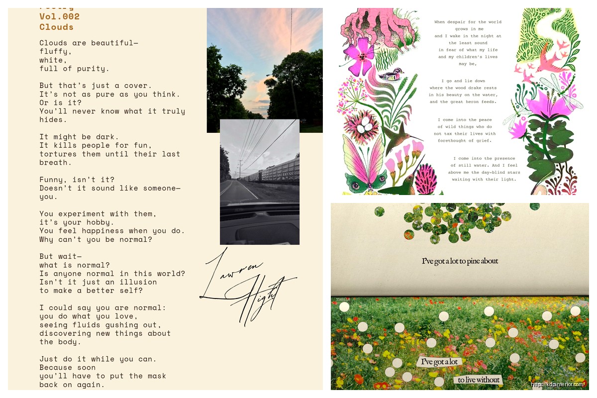
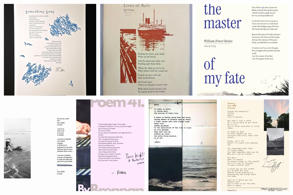
Some people get fancy with decorative elements or images on section pages. That’s fine but don’t overdo it. One small graphic or ornament is enough.
The blank page after a section divider is intentional – always start the next section’s first poem on a right-hand page (odd numbered). This means sometimes you’ll have a blank left page. That’s normal and correct.
Special Formatting for Different Poetry Styles
Haiku and other short forms can go multiple per page but give each one space. I usually fit 3-4 haiku max per page with good spacing between them.
Long narrative poems or epic poetry might need to break across pages. When this happens, don’t orphan single lines at the top or bottom of pages if you can avoid it. Try to break at stanza endings when possible.
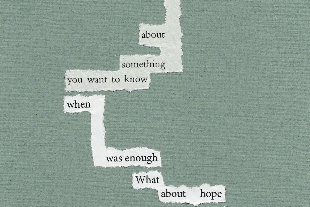
Concrete or visual poetry where the shape matters – this is a nightmare honestly. You’ll need to create these as images and insert them. Make sure they’re high resolution (at least 300 DPI) so they don’t look pixelated in print.
The Back Matter Nobody Thinks About
After your last poem, include an acknowledgments page if poems were previously published elsewhere. Author bio page is good too – keep it to one page max, third person, professional but not stuffy.
Wait I forgot to mention – if you’re doing this in Microsoft Word (which most people do), save multiple versions as you work. Word has a habit of randomly shifting your formatting when you convert to PDF and it’s infuriating.
Color vs Black and White
Most poetry books are black and white interior. It’s cheaper to print and honestly color doesn’t add much to text-based poetry. If you’re including color illustrations or photos, that’s different, but the printing costs will be way higher and your royalties will suffer.
Black and white with cream paper is the standard and it looks good. White paper is fine too but cream is easier on the eyes for extended reading.
Cover Design Matters But That’s A Whole Other Thing
Interior layout is what we’re talking about here but just quickly – your cover needs to match your interior vibe. If you’ve got this clean, minimalist interior with lots of white space, don’t put a busy cluttered cover on it.
Testing Before You Publish
Order a proof copy. I don’t care if you’ve checked the PDF seventeen times, order the physical proof. Poetry formatting looks different on paper than on screen and you’ll catch stuff you missed. I found a weird spacing issue on page 34 of a collection once that wasn’t visible in the PDF at all.
Read it out loud with the physical book. Sounds weird but you’ll notice if the line breaks are awkward or if there’s not enough space between stanzas.
My cat knocked over my coffee onto a proof copy once and honestly it was a blessing because I noticed the margins were too tight when the pages warped. Would’ve missed that otherwise.
Size and Trim Matters
5×8 inches is standard for poetry collections. It feels intimate and fits nicely in hands. 6×9 works too and is super common for all books on Amazon.
Don’t go smaller than 5×8 unless you’re doing a specialty format. Don’t go bigger than 6×9 unless you have a specific reason – bigger books cost more to ship and print.
Page count affects your spine width which affects your cover design. Amazon has calculators for this but basically under 100 pages you’re looking at a pretty thin spine.
The Formatting Checklist I Actually Use
Before I upload anything to KDP, I check:
- Margins at least 0.75 inches, gutter slightly larger
- Font is readable serif, 11-12pt minimum
- Line spacing consistent within poems
- Extra space between stanzas and poems
- Page numbers starting after front matter
- Each poem starts on right-hand page if possible
- Section breaks on their own page
- No orphaned lines at page breaks
- Copyright page has all necessary info
- Proof copy ordered and reviewed
The thing about poetry layout is it’s both easier and harder than prose. Easier because you have less text per page so fewer words to manage. Harder because every spacing choice is visible and affects how the poem reads.
You’re creating silence on the page just as much as you’re presenting words. That white space around a poem isn’t empty – it’s giving the reader room to breathe and think and feel whatever the poem is supposed to make them feel.
I spent years overthinking this stuff and honestly the basics I just laid out will get you like 90% of the way there. The last 10% is personal preference and style choices that depend on your specific collection. Some poetry wants to feel cramped and urgent, some wants to float on the page. You gotta match the layout to the content but always keep readability as your baseline requirement.
DISCOVER OUR FREE BEST SELLING PRODUCTS
Editable Canva Lined Journal: Express Your Thoughts – KDP Template
Lined Pages Journal 120 pages Ready to Upload PDF Commercial Use KDP Template 6×9 8.5×11 5×8 for Notebooks, Diaries, Low Content
Lined Pages Journal 120 pages Ready to Upload PDF Commercial Use KDP Template 6×9 8.5×11 5×8 for Notebooks, Diaries, Low Content
Cute Dogs Coloring Book for Kids | Activity Book | KDP Ready-To-Upload
Daily Planner Diary : Diary Planners for Everyday Productivity, 120 pages, 6×9 Size | Amazon KDP Interior
Wolf Coloring KDP interior For Adults, Used as Low Content Book, PDF Template Ready To Upload COMMERCIAL Use 8.5×11"
Coloring Animals Head Book for Kids, Perfect for ages 2-4, 4-8 | 8.5×11 PDF
Printable Blank Comic Book Pages PDF : Create Your Own Comics – 3 Available Sizes
Notes KDP interior Ready To Upload, Sizes 8.5×11 6×9 5×8 inch PDF FILE Used as Amazon KDP Paperback Low Content Book, journal, Notebook, Planner, COMMERCIAL Use
Black Lined Journal: 120 Pages of Black Lined Paper Perfect for Journaling, KDP Notebook Template – 6×9
Student Planner Journal 120 pages Ready to Upload PDF Commercial Use KDP Template 6×9" 8.5×11" for Low Content book
Recipe Journal Template – Editable Recipe Book Template, 120 Pages – Amazon KDP Interior