Okay so the biggest mistake I see with poetry book templates is people treating them like regular books and wondering why everything looks cramped or weird. Poetry needs breathing room, like way more than you think.
First thing – your margins gotta be wider than standard. I usually go with at least 0.75 inches all around, sometimes pushing to 1 inch on the inside margin depending on page count. Learned this the hard way when my first poetry collection came back from KDP with half the verses disappearing into the gutter. My cat knocked over my coffee right when I was checking the proof and I almost missed it entirely but yeah… not fun.
Page Size Actually Matters Here
Most poetry books work best at 5×8 or 6×9. The 6×9 gives you more room to play with longer lines without breaking them awkwardly. I’ve done 5×8 for shorter, punchier collections and it works when your lines are naturally brief, but if you’re working with someone who writes those sprawling narrative poems, go bigger.
Setting Up Your Base Template
In Word or whatever you’re using, start with these settings:
- Page size: 6×9 inches
- Top margin: 0.75–1 inch
- Bottom margin: 0.75 inch
- Inside margin: 1 inch
- Outside margin: 0.75 inch
- Header: 0.5 inches from top
- No footer usually, or 0.5 from bottom
The inside margin being bigger is crucial because of the binding. Trust me on this one.
Line Spacing Is Where Poetry Gets Tricky
Here’s where it gets interesting – you can’t just use single or double spacing. Most poems need something in between. I typically use 1.15 or 1.5 line spacing as a baseline, but then you gotta adjust per poem based on the poet’s intention.
If there are intentional line breaks or spacing within a poem, you need to preserve that exactly. Use paragraph spacing (the before/after settings) rather than hitting Enter multiple times. Set your “Space After” to like 6pt or 12pt between stanzas. This keeps things consistent and you can adjust globally if needed.
Font Choices That Don’t Suck
Okay so funny story, I once used some fancy decorative font because the author insisted it looked “more poetic” and Amazon’s preview generator absolutely butchered it. Stick with clean, readable fonts:
- Garamond (my go-to, looks professional without being boring)
- Baskerville
- Minion Pro if you have it
- Even Times New Roman works honestly
Size should be 11pt or 12pt. Some people go smaller thinking it looks sophisticated but readers hate squinting at poetry. The whole point is they should focus on the words not struggle to see them.
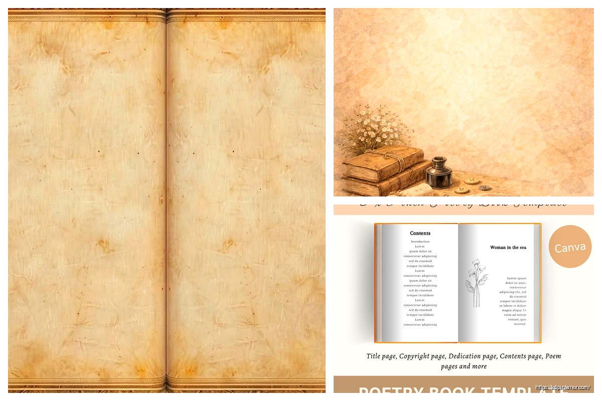
Title Pages and Front Matter
Each poem should start on a new page, usually right-hand (odd-numbered). The title goes about 1/3 down the page, not at the very top. Center it or left-align it depending on the vibe, but be consistent throughout.
Your front matter needs:
- Half-title page (just the book title, nothing else)
- Blank page
- Full title page (title, author, maybe a small graphic or publisher name)
- Copyright page (left-side, even number)
- Optional dedication
- Optional table of contents (actually helpful for poetry collections)
The copyright page should include your copyright notice, ISBN if you have one, edition info, and maybe a disclaimer if any poems were previously published. Keep it simple.
Table of Contents Strategy
Wait I forgot to mention – TOC for poetry is different than regular books. You list poem titles but not page numbers usually, or if you do include page numbers, make sure they’re accurate because nothing looks more amateur than wrong page numbers.
I actually skip the TOC sometimes for shorter collections (under 40 poems) but for anything bigger it helps readers navigate. Format it clean, use dot leaders if you’re including page numbers, and make sure the font is consistent with the rest of your book.
Individual Poem Layout
This is where you really gotta pay attention. Each poem is its own little world. Some guidelines:
The poem title should be in the same font as body text but maybe bold or slightly larger (13-14pt if body is 12pt). Put it about 2-3 inches from the top of the page, centered or left-aligned based on your style choice.
Then drop down about 3-4 line spaces before starting the actual poem. This white space is critical – it frames the poem and gives readers a visual pause.
Handling Different Poem Structures
For left-aligned poems (most common), just use a simple left indent of maybe 0.5 inches from your margin. Don’t use tabs to indent individual lines within a poem – use the ruler or indent settings to preserve the poet’s formatting.
Centered poems are trickier. Each line needs to be individually centered, and you gotta watch for lines of different lengths creating a weird jagged look. Sometimes centering doesn’t work and you need to manually position using indents.
For concrete or shaped poems… honestly those are a pain. You might need to create them as images and insert them, especially if the shape is crucial to the meaning. I did this for a collection last year where the poet had this whole thing where words formed a staircase and there was literally no other way.
Headers and Page Numbers
Keep headers minimal. Either the book title on left pages and author name on right pages, or just page numbers. Use a smaller font (9-10pt) and make sure they’re at least 0.5 inches from the top.
Page numbers can go center-bottom, outside corners, or outside-top. Just be consistent. Don’t number front matter pages with regular numbers – use Roman numerals (i, ii, iii) if you number them at all.
First page of each poem shouldn’t have a header usually, looks cleaner without it.
Section Breaks and Organization
If the collection is divided into sections, each section needs its own title page. Just the section name, centered, maybe 40% down the page. You can add a small graphic element or epigraph if it fits the vibe.
Put a blank page after each section title so the next poem starts on a right-hand page. This is standard practice and looks way more professional.
Special Formatting Situations
Oh and another thing – some poems have intentional indentation patterns or specific spacing. You gotta preserve this exactly. Use the ruler tool in Word or paragraph settings to set precise indents. Don’t eyeball it because it’ll be inconsistent.
For poems with epigraphs (those little quotes at the beginning), format them in italics, smaller font (10pt), and indent them. Usually right-aligned or far-right positioned looks good.
If there are translations or dual-language poems, you can do them side-by-side in two columns or one after the other. Side-by-side looks cooler but only works if both versions are roughly the same length.
Back Matter Stuff
At the end you’ll want:
- Acknowledgments page (if poems were published elsewhere)
- About the author (keep it brief, one page max)
- Maybe a page listing other books by the author
These all start on right-hand pages ideally.
Exporting for KDP
When you’re done, export as PDF but check these settings:
- High quality print (300 dpi minimum)
- Embed all fonts
- Don’t compress images if you have any
- Check your page size is exact
Before uploading, open that PDF and scroll through every single page. I know it’s boring but you’ll catch weird formatting glitches that only show up in PDF. Had this happen where Word decided to add random page breaks between stanzas and I didn’t notice until the PDF stage.
Common Mistakes to Avoid
Don’t use text boxes for positioning poems. They cause all kinds of problems with KDP’s conversion process and might not print correctly.
Don’t go crazy with fonts or colors. Black text on white pages, maybe very light gray for section dividers if you must.
Don’t forget bleed settings if you’re doing a cover that bleeds to the edge, but that’s more cover stuff than interior layout.
Make sure your line breaks are actual line breaks (Shift+Enter) not paragraph breaks if you want lines within a stanza to be closer together.
Testing Your Template
Order a proof copy before publishing the actual book. I cannot stress this enough. What looks good on screen can look totally different printed. Check the gutter margins especially – hold the book open and make sure no text disappears into the spine.
I usually order two proofs actually, one to mark up with notes and one to keep pristine for comparison. Costs more upfront but saves you from publishing something with issues.
This is gonna sound weird but read the proof copy out loud in different lighting. You’ll notice if the font is too small or the spacing is off in ways you didn’t on screen. Was watching this documentary about book design while doing this once and it made me realize how much physical interaction with the book matters.
Template Variations by Style
For traditional/formal poetry – stick with centered titles, consistent spacing, classic fonts like Garamond. Everything symmetrical and balanced.
For contemporary/experimental – you have more freedom with alignment, can play with spacing more dramatically, maybe use a slightly more modern font.
For narrative poetry collections – treat longer poems almost like short stories, you might need to continue poems across multiple pages which requires careful page break management.
The key thing is consistency within your chosen style. Pick your formatting rules and stick with them throughout the entire manuscript. Readers notice inconsistency even if they don’t consciously realize it.
Anyway that’s the basic framework I use for poetry templates. It’s more art than science honestly, you gotta feel what works for each specific collection while following these general principles. The breathing room thing is really the most important takeaway – give poems space to exist on the page and don’t crowd them.
 Autobiography Journal Prompts: 100 Journal Prompts to Write Your Life Story - 8.5×11
1 × $19.99
Autobiography Journal Prompts: 100 Journal Prompts to Write Your Life Story - 8.5×11
1 × $19.99  Student Planner Journal 120 pages Ready to Upload PDF Commercial Use KDP Template 6x9" 8.5x11" for Low Content book
1 × $0.00
Student Planner Journal 120 pages Ready to Upload PDF Commercial Use KDP Template 6x9" 8.5x11" for Low Content book
1 × $0.00 
DISCOVER OUR FREE BEST SELLING PRODUCTS
Editable Canva Lined Journal: Express Your Thoughts – KDP Template
Lined Pages Journal 120 pages Ready to Upload PDF Commercial Use KDP Template 6×9 8.5×11 5×8 for Notebooks, Diaries, Low Content
Lined Pages Journal 120 pages Ready to Upload PDF Commercial Use KDP Template 6×9 8.5×11 5×8 for Notebooks, Diaries, Low Content
Cute Dogs Coloring Book for Kids | Activity Book | KDP Ready-To-Upload
Daily Planner Diary : Diary Planners for Everyday Productivity, 120 pages, 6×9 Size | Amazon KDP Interior
Wolf Coloring KDP interior For Adults, Used as Low Content Book, PDF Template Ready To Upload COMMERCIAL Use 8.5×11"
Coloring Animals Head Book for Kids, Perfect for ages 2-4, 4-8 | 8.5×11 PDF
Printable Blank Comic Book Pages PDF : Create Your Own Comics – 3 Available Sizes
Notes KDP interior Ready To Upload, Sizes 8.5×11 6×9 5×8 inch PDF FILE Used as Amazon KDP Paperback Low Content Book, journal, Notebook, Planner, COMMERCIAL Use
Black Lined Journal: 120 Pages of Black Lined Paper Perfect for Journaling, KDP Notebook Template – 6×9
Student Planner Journal 120 pages Ready to Upload PDF Commercial Use KDP Template 6×9" 8.5×11" for Low Content book
Recipe Journal Template – Editable Recipe Book Template, 120 Pages – Amazon KDP Interior