-
×
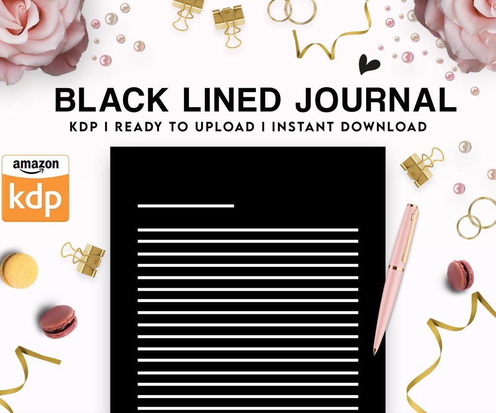 Black Lined Journal: 120 Pages of Black Lined Paper Perfect for Journaling, KDP Notebook Template - 6×9
1 × $0.00
Black Lined Journal: 120 Pages of Black Lined Paper Perfect for Journaling, KDP Notebook Template - 6×9
1 × $0.00
Subtotal: $0.00
Black Lined Journal: 120 Pages of Black Lined Paper Perfect for Journaling, KDP Notebook Template - 6×9
1 × $0.00 Subtotal: $0.00
Okay so I literally just finished setting up three new book covers using printable templates last night while watching The Bear season 2, and here’s what actually works…
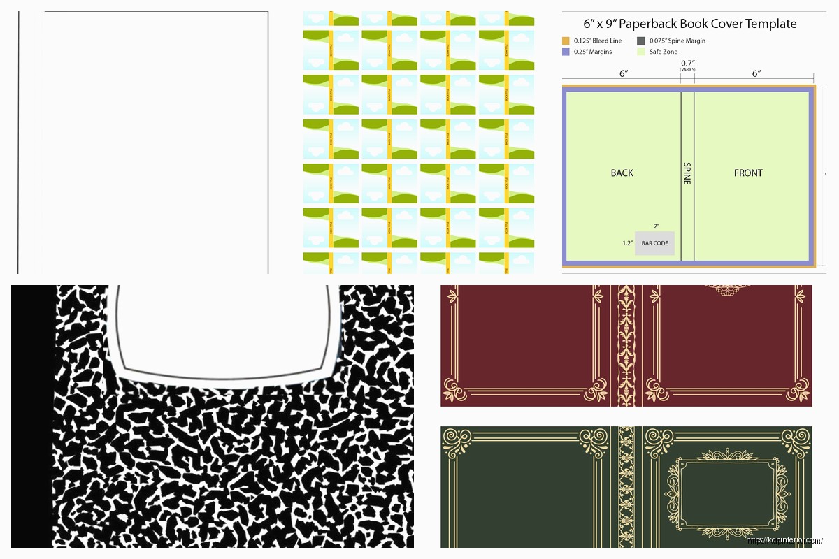
The biggest thing nobody tells you about printable book cover templates is that you need to understand the spine width calculation first or everything’s gonna be off. I learned this the hard way back in 2019 when I uploaded like 15 books with covers that looked perfect on my screen but were completely misaligned when the physical copies arrived.
So Amazon KDP has this spine calculator tool buried in their help section. You gotta know your page count and paper type before you even open Canva or whatever design software you’re using. White paper vs cream paper actually affects spine width because cream is slightly thicker. For a 100-page book on white paper, you’re looking at around 0.22 inches for the spine. But here’s the thing—add 50 more pages and suddenly you need 0.33 inches.
The full cover template width formula is: (2 × trim width) + spine width + 0.25 inches for bleed. Height is just trim height + 0.25 inches bleed. I keep a spreadsheet now with all the common sizes because I was constantly recalculating this stuff at midnight when I wanted to upload something quickly.
I’ve published over 200 books and honestly 6×9 is like 60% of my catalog. It just works for everything from lined journals to recipe books.
So there’s the free route and the paid route. Amazon gives you free templates but they’re literally just blank PDFs with guides. You download them from your KDP dashboard under “Download a Cover Template” when you’re setting up a new book. They work fine but you’re starting from absolute zero.
Creative Fabrica has been my go-to for the past two years. For like $10-15 you can get fully designed templates that you just customize. The catch is you need to make sure they specify “commercial use” and “KDP ready.” I bought this one pack last summer that had 50 templates and I’m still using variations of them.
Etsy is hit or miss honestly. Some sellers give you amazing layered PSD files where you can change every element. Others give you flattened JPGs that are basically useless if you want to customize colors or text. Always check the file format before buying—you want PSD, AI, or editable PDF formats.
Canva has KDP cover templates now but you gotta search specifically for “KDP book cover” in their template library. The free version limits you on fonts and some graphics but it’s totally workable. I made probably my first 30 covers entirely in Canva free before upgrading to Pro.
BookBrush is another one—they have a cover creator tool with templates. It’s more niche for book covers specifically vs Canva which is everything. Their free tier is pretty limited though.
Oh and another thing, GIMP is free Photoshop basically if you can deal with the learning curve. There are YouTube tutorials for making KDP covers in GIMP. It’s clunky but it works and some people swear by it.
I use Photoshop now because I already had it for other stuff, but honestly Canva Pro does like 90% of what I need. The Photoshop advantage is really just better text effects and more precise control over layers. If you’re just starting out, don’t spend money on Adobe subscription yet.
Affinity Designer is a one-time purchase alternative to Illustrator and it’s actually really good. I bought it during a sale for $25 and use it sometimes for vector elements I want to scale without quality loss.
The template files you download usually come in PSD format. If you don’t have Photoshop, you can upload PSDs to Photopea which is this free browser-based editor that reads Photoshop files. Works surprisingly well—I used it on my laptop when traveling last month because I didn’t wanna install software.
Okay so you’ve got your template file open. First thing is setting up your guides. Most templates come with guide layers already but if not, you need guidelines for:
I always start with the back cover because it’s less pressure than the front. Add your book description, author bio, maybe a barcode placeholder even though Amazon adds their own. This helps me figure out the overall design vibe before tackling the front.
Your title needs to be readable in thumbnail size. This is crucial because like 90% of people see your book first as a tiny thumbnail on Amazon search results. I do this test where I shrink my design to 1 inch tall on my screen and if I can’t read the title clearly, the font’s too small or too fancy.
Subtitle can be smaller but should still be visible. Author name honestly doesn’t matter as much unless you’re already well-known. I usually make mine pretty small especially on my first books in a series.
Wait I forgot to mention—use high-resolution images. At least 300 DPI for print books. I made the mistake early on using 72 DPI web images and they looked pixelated and terrible in print. Stock photo sites like Unsplash and Pexels have free high-res images. Pixabay too. Just make sure the license allows commercial use.
This is gonna sound weird but your colors will look different in print than on screen. RGB (screen colors) vs CMYK (print colors) is a whole thing. Bright blues and greens especially tend to look duller when printed.
I always convert my final design to CMYK color mode before uploading to see how it’ll really look. In Photoshop that’s Image > Mode > CMYK Color. Some colors will shift and you can adjust them. Canva automatically handles this conversion when you download for print which is nice.
My dog just knocked over my coffee so gonna wrap up this section quickly—order a physical proof copy before you publish anything. It costs like $5-10 and saves you from discovering your colors are off after you’ve launched. I still order proofs for every new design because I’ve been burned too many times.
Font choice matters more than you think. Avoid these fonts that scream “beginner”:
Stick with clean sans-serif fonts for modern looks or classic serif fonts for traditional books. I use combinations like Montserrat + Playfair Display or Raleway + Merriweather a lot. Google Fonts is free and has tons of options you can use commercially.
Maximum two fonts per cover, maybe three if one is just for a small accent. More than that looks messy. And for the love of god, don’t use 10 different colors. Pick 2-3 main colors and stick with them.
So you bought a template, now you’re customizing it. Here’s what I actually change:
Change the title and subtitle text obviously. Adjust font size if needed to fit your specific title length. Some titles are long, some are short, the template’s placeholder is never exactly right.
Swap out background images or textures. Most templates have these as separate layers. Find an image that fits your book’s niche better. Like if the template has a generic mountain background but your book is about ocean stuff, swap it for a beach image.
Adjust colors to match your niche or series branding. I have a whole series of planners that all use this teal and gold color scheme. Every template I buy gets recolored to match. This takes like 5 minutes if the template has good layers.
Add or remove design elements. Sometimes templates have decorative flourishes that don’t fit your vibe. Just hide those layers or delete them. Or add your own from sites like Creative Fabrica or Design Bundles.
The spine is tricky because it depends on page count like I mentioned earlier. For books under 100 pages, your spine is too narrow for text—just extend your cover design across it.
For thicker books, you can add the title and author name vertically on the spine. Text should read from top to bottom on the spine. I use a font size that’s proportional to spine width—usually 12-16pt for a 0.5 inch spine.
Don’t stress the spine too much though. People mostly see the front cover online and on shelves the spine is often not visible depending on how books are displayed.
Amazon wants a single PDF file that’s your entire cover—front, spine, and back combined. Some people call this a “wrap-around cover” or “full cover template.”
Save your final design as a PDF with these settings:
File size needs to be under 40 MB for KDP which is usually fine unless you’ve got like a million high-res images layered in there.
I always keep my original working file (PSD or whatever) separate from the final PDF. That way if I need to make changes later, I can edit the original and re-export rather than starting over.
Text too close to edges—it’ll get cut off in trimming. Keep everything at least 0.125 inches from the trim line, preferably 0.25 inches.
Forgetting bleed—your background needs to extend all the way to the bleed edge or you’ll have white borders on your printed book. This looks really unprofessional.
Low resolution images—anything under 300 DPI looks blurry in print. Always check your image resolution before using it.
Ignoring thumbnail readability—your cover needs to work at tiny sizes. Zoom out and check if it’s still clear and readable.
Not ordering a proof—seriously, order the physical proof. You’ll catch issues you never noticed on screen. Colors, alignment, text size… all of it looks different in hand.
I’ve got folders organized by trim size and then by niche. So like “6×9 – Journals” and “6×9 – Planners” and “8.5×11 – Workbooks” etc. Inside each folder I keep the original template files and my customized versions.
Name your files clearly. I use this format: BookTitle_CoverDesign_v1.psd so I know exactly what it is and which version. When you’re managing dozens or hundreds of books, this organization saves so much time.
Also keep a swipe file of covers you like—both your own and competitors. Screenshot covers from Amazon that catch your eye and save them in an inspiration folder. When I’m stuck on a design, I look through these for ideas on layout, color schemes, typography, etc.
If you’re doing a series of books, use the same template base for all of them with variations. Change the background image or color but keep the same fonts, layout structure, and general style. This creates immediate visual connection so readers know the books are related.
I have this gratitude journal series where every cover uses the same text placement and decorative elements but different background colors—one’s purple, one’s blue, one’s pink. They look cohesive on my author page and people who buy one often buy the others because they recognize the style.
Template dimensions don’t match your book specs? You can resize in Photoshop using Image > Canvas Size but be careful not to distort anything. Sometimes it’s easier to just find a different template that’s already the right size.
Fonts look weird or are missing when you open a template? The creator used fonts you don’t have installed. You can usually find similar fonts on Google Fonts or just replace them with something you like better.
Colors look off or muddy? Check if you’re in RGB vs CMYK mode. Convert to CMYK and adjust. Also check if there are multiple layers with different opacities stacked up—sometimes simplifying the layer stack improves color clarity.
Okay so that’s basically everything I’ve learned through trial and error over the past seven years. The main thing is just to start with a template, customize it to fit your book, and order that proof copy before you go live. You’ll learn more from actually doing it than from reading about it honestly.
DISCOVER OUR FREE BEST SELLING PRODUCTS
Editable Canva Lined Journal: Express Your Thoughts – KDP Template
Lined Pages Journal 120 pages Ready to Upload PDF Commercial Use KDP Template 6×9 8.5×11 5×8 for Notebooks, Diaries, Low Content
Lined Pages Journal 120 pages Ready to Upload PDF Commercial Use KDP Template 6×9 8.5×11 5×8 for Notebooks, Diaries, Low Content
Cute Dogs Coloring Book for Kids | Activity Book | KDP Ready-To-Upload
Daily Planner Diary : Diary Planners for Everyday Productivity, 120 pages, 6×9 Size | Amazon KDP Interior
Wolf Coloring KDP interior For Adults, Used as Low Content Book, PDF Template Ready To Upload COMMERCIAL Use 8.5×11"
Coloring Animals Head Book for Kids, Perfect for ages 2-4, 4-8 | 8.5×11 PDF
Printable Blank Comic Book Pages PDF : Create Your Own Comics – 3 Available Sizes
Notes KDP interior Ready To Upload, Sizes 8.5×11 6×9 5×8 inch PDF FILE Used as Amazon KDP Paperback Low Content Book, journal, Notebook, Planner, COMMERCIAL Use
Black Lined Journal: 120 Pages of Black Lined Paper Perfect for Journaling, KDP Notebook Template – 6×9
Student Planner Journal 120 pages Ready to Upload PDF Commercial Use KDP Template 6×9" 8.5×11" for Low Content book
Recipe Journal Template – Editable Recipe Book Template, 120 Pages – Amazon KDP Interior