Amazon KDP guide, KDP book publishing
Printable Book Covers: DIY Design Downloads
Apr
Okay so I just spent like three hours last Tuesday messing around with printable book covers because one of my clients wanted to do a super limited run for a local book fair and didn’t want to deal with KDP’s whole process for like 50 copies. Here’s what actually works.
The Basic Setup Most People Get Wrong
First thing – and I see this constantly – people think they can just slap a cover together at whatever size looks good on their screen. Nope. You need actual print dimensions from the start or you’re gonna waste paper and ink like crazy. Standard paperback is usually 6×9 inches but you gotta account for the spine width too if you’re doing a wraparound cover.
The spine calculation is where everyone messes up. It’s literally just page count divided by the paper’s pages-per-inch rating. For standard 60lb paper that’s roughly 0.002252 per page. So a 200-page book needs about a 0.45-inch spine. But honestly I just use calculators online because math at 11pm isn’t my thing.
Software That Won’t Make You Want to Throw Your Laptop
I’ve tried pretty much everything at this point. Canva’s probably the easiest if you’re not a designer – they’ve got templates that are already sized right and you can export as PDF with bleed marks. The pro version is like $13/month and worth it just for the background remover tool alone.
GIMP is free and works but the learning curve is… yeah. I spent two days figuring out layers when I first started. My cat knocked over my coffee during one tutorial and I had to rewatch the whole thing.
Affinity Publisher is what I use now for client work. One-time payment of like $70 and it’s basically InDesign without the subscription nonsense. The bleed settings are actually intuitive once you find them – they’re under Document Setup not Export which is weird but whatever.
Getting Your Bleed and Trim Right
So bleed is the extra image area that extends past your trim line. Standard is 0.125 inches on all sides. This means if your book is 6×9, your actual design canvas needs to be 6.25×9.25 inches. The trim is where the cutter actually cuts.
Wait I forgot to mention – you need to keep important stuff like text and logos at least 0.25 inches INSIDE the trim line. That’s your safe zone. I learned this the hard way when I printed 100 covers for a cookbook client and the title got cut off on like 30 of them because I put it too close to the edge.
File Format Stuff Nobody Tells You
PDF is your friend. Always export as PDF/X-1a if you’re printing at a professional shop. If you’re printing at home on your own printer, regular high-quality PDF works fine.
CMYK color mode, not RGB. This is huge. RGB looks great on screens but prints all wonky and desaturated. I once printed a bright red cover that came out looking like old brick because I forgot to convert. My client was… not happy.
Resolution needs to be 300 DPI minimum. 600 DPI if you’ve got lots of fine text or detailed illustrations. Anything less and it’ll look fuzzy or pixelated when printed.
Where to Actually Get Design Elements
Creative Fabrica has unlimited downloads for $9/month and honestly their font selection is insane. I probably use fonts from there on 60% of my covers now.
Unsplash and Pexels for free stock photos but check the licenses – some don’t allow print use commercially. Depositphotos is paid but their extended licenses are clearer for book covers you’re gonna sell.
Oh and another thing – Envato Elements is like $16/month and has literally millions of graphics, textures, and templates. I grabbed a whole pack of vintage paper textures from there last month that I’ve used on probably a dozen covers already.
Typography That Doesn’t Look Amateur
Don’t use more than two fonts. Title font and subtitle/author font. That’s it. Three fonts starts looking like a ransom note.
Serif fonts (the ones with the little feet on letters) work great for traditional genres – literary fiction, historical stuff, memoirs. Sans-serif (clean modern letters) for contemporary, business books, self-help.
Font pairing is an art but a simple rule: pair a decorative/bold title font with a simple clean subtitle font. Like if your title is this fancy script thing, your author name should be in something basic like Montserrat or Open Sans.
The Actual Printing Part
Home printing is gonna cost you more per unit but gives you total control. I use an Epson EcoTank for covers now – the ink is way cheaper than cartridges. You’ll want cardstock, minimum 80lb but I prefer 100lb cover stock. Staples and Amazon both carry it.
Your printer settings matter SO much. Set it to “Best” quality, turn off any eco or fast modes, and use the cardstock/heavy paper setting. I wasted like 20 sheets once because I left it on “Draft” mode and everything looked grainy.
Local print shops can do short runs for pretty reasonable prices. I’ve got a guy here in town who does 50 covers for about $75 if I bring him the PDF ready to go with proper bleed and trim marks. FedEx Office and Staples do it too but they’re usually more expensive.
Lamination and Finishing
This is gonna sound weird but laminating your covers makes them look 10x more professional. You can get a basic laminator for like $30 on Amazon. Use 5mil or 7mil pouches – 3mil is too flimsy for book covers.
Matte lamination hides fingerprints better and gives it that expensive feel. Glossy looks cheaper imo unless it’s a children’s book or something really colorful.
If you’re doing hardcovers (which is more complicated but doable), you’ll need book board and book cloth. Talas sells bookbinding supplies online and their stuff is legit. But that’s like a whole different tutorial.
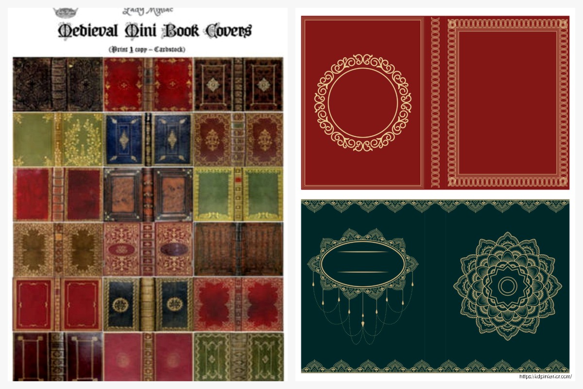
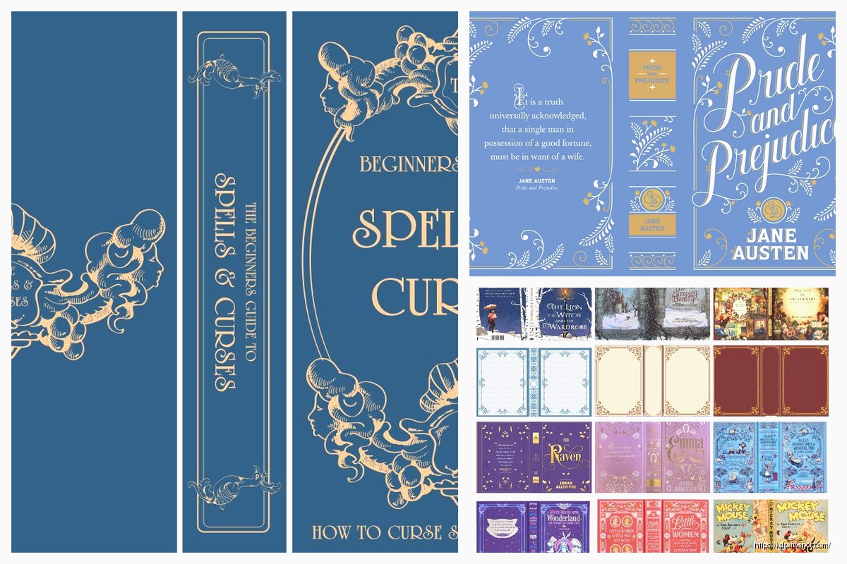
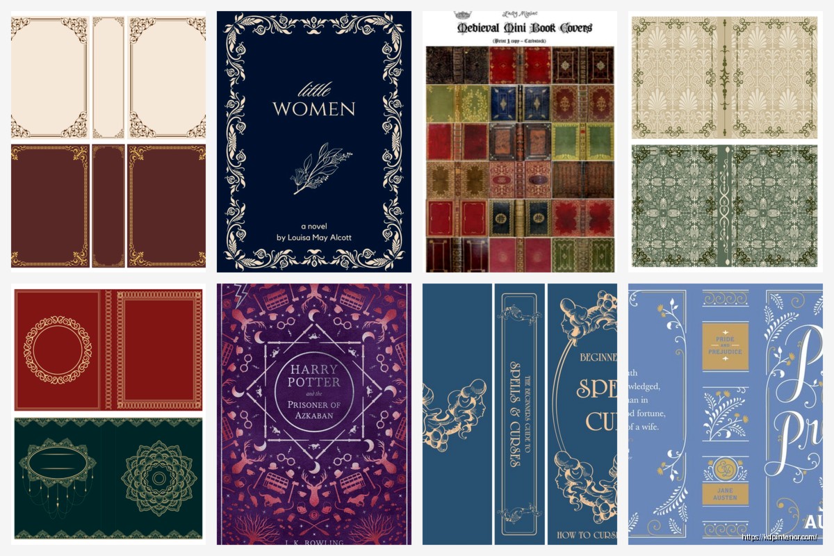
Design Templates Worth Downloading
BookBolt has printable cover templates specifically for KDP dimensions – even though you’re not uploading to KDP, the sizing translates perfectly to physical printing. They’re like $9-20 each but come with all the guides and layers set up.
Creative Market has indie designers selling templates that are actually unique. Not the same stuff you see on every other book. I bought a mystery/thriller template pack there for $15 that I’ve customized probably 30 times for different clients.
Make your own template once you understand the dimensions and save it. I’ve got like 15 saved templates now for different book sizes. Saves so much time when you’re not starting from scratch every single time.
Color Management Without Losing Your Mind
Get a color calibration tool if you’re serious about this. X-Rite ColorMunki is like $100 and it’ll make sure what you see on screen actually matches what prints. Otherwise you’re just guessing.
Print test sheets before doing a full run. Just print one cover, look at it in natural light, check if the colors are right, if text is readable, if everything’s positioned correctly.
Black isn’t just black in CMYK. Rich black (using all four colors) looks way better than pure 100% black. Most design programs have a rich black swatch preset. Use it for backgrounds and large text.
Common Mistakes I See All The Time
Text too small. If your author name is in 8pt font, nobody’s gonna see it. Minimum 12pt for anything you want readable from a few feet away. I’m looking at you, people who put their entire author bio on the back cover in tiny font.
Low resolution images stretched to fit. This looks terrible every time. If you’ve got a small image, find a bigger one or redesign around what you have. Upscaling doesn’t work no matter what those AI tools promise.
Forgetting the back cover and spine exist. Your wraparound needs to include back cover copy, author bio, maybe a barcode placeholder if you’re printing these for sale. The spine needs the title and author name if it’s thick enough (anything over 100 pages usually).
Testing Before You Commit
Print one cover. Fold it around an actual book that’s the same size. Does it fit? Does it look good? Is the spine width right? I cannot stress this enough – printing 50 covers and then realizing the spine is off is expensive and annoying.
Check it in different lighting. Indoor lighting, outdoor lighting, under those horrible fluorescent store lights. Colors shift depending on the light source.
Show it to someone who doesn’t know anything about your book. Can they read the title from across the room? Do they understand what genre it is? If not, redesign.
Organizing Files So You Don’t Lose Everything
Name your files with the book title, version number, and date. “MysteryNovel_Cover_v3_2024Jan15.pdf” not “finalcover.pdf” because you’ll have 50 files called that eventually.
Keep your working files separate from your print-ready PDFs. I’ve got folders for each project with subfolders: Assets (images and fonts), Working Files (the editable versions), and Print Ready (the final PDFs).
Back everything up. External hard drive, cloud storage, whatever. I use Dropbox for active projects and an external drive for archives. Lost a whole week’s worth of work once when my computer crashed and I wasn’t backing up regularly.
Okay so that’s basically the workflow I use for every printable cover project. It sounds like a lot but once you’ve done it a few times it becomes pretty automatic. The key is just understanding the technical requirements upfront so you’re not redesigning later because something doesn’t print right.
One last thing – if you’re selling these books, make sure your cover design doesn’t accidentally infringe on anyone’s copyright or trademark. Use properly licensed images and fonts, don’t copy existing covers too closely, and you’ll be fine. I had a client almost get in trouble for using a font that looked identical to a major publisher’s branding. Just be smart about it.
DISCOVER OUR FREE BEST SELLING PRODUCTS
Editable Canva Lined Journal: Express Your Thoughts – KDP Template
Lined Pages Journal 120 pages Ready to Upload PDF Commercial Use KDP Template 6×9 8.5×11 5×8 for Notebooks, Diaries, Low Content
Lined Pages Journal 120 pages Ready to Upload PDF Commercial Use KDP Template 6×9 8.5×11 5×8 for Notebooks, Diaries, Low Content
Cute Dogs Coloring Book for Kids | Activity Book | KDP Ready-To-Upload
Daily Planner Diary : Diary Planners for Everyday Productivity, 120 pages, 6×9 Size | Amazon KDP Interior
Wolf Coloring KDP interior For Adults, Used as Low Content Book, PDF Template Ready To Upload COMMERCIAL Use 8.5×11"
Coloring Animals Head Book for Kids, Perfect for ages 2-4, 4-8 | 8.5×11 PDF
Printable Blank Comic Book Pages PDF : Create Your Own Comics – 3 Available Sizes
Notes KDP interior Ready To Upload, Sizes 8.5×11 6×9 5×8 inch PDF FILE Used as Amazon KDP Paperback Low Content Book, journal, Notebook, Planner, COMMERCIAL Use
Black Lined Journal: 120 Pages of Black Lined Paper Perfect for Journaling, KDP Notebook Template – 6×9
Student Planner Journal 120 pages Ready to Upload PDF Commercial Use KDP Template 6×9" 8.5×11" for Low Content book
Recipe Journal Template – Editable Recipe Book Template, 120 Pages – Amazon KDP Interior