Amazon KDP guide, KDP book publishing
Program Booklet Template: Event Publication Design
Apr
Okay so I just wrapped up a program booklet project for a client last week and honestly the template structure matters way more than people think. Most folks just grab whatever looks pretty on Canva but then wonder why their print files get rejected or the margins look weird.
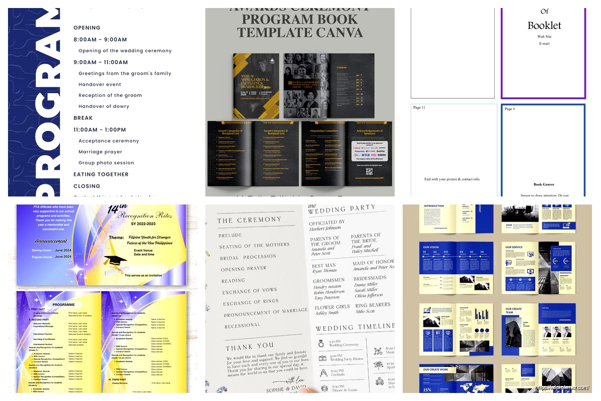
First thing you gotta understand is program booklets aren’t like regular books. They’re usually saddle-stitched which means the page count has to be divisible by 4. I learned this the hard way back in 2018 when I had to redo an entire wedding program layout because we had 22 pages and the printer was like yeah no that doesn’t work. So always plan for 8, 12, 16, 20, 24 pages etc.
Setting Up Your Base Template
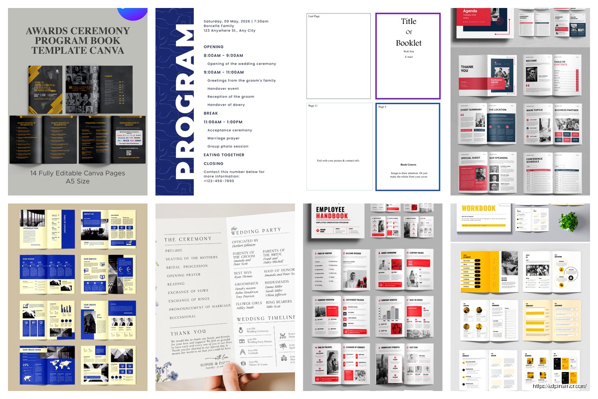
Start with your dimensions. Most program booklets are either 5.5 x 8.5 inches (half letter) or 8.5 x 11 inches folded in half. The 5.5 x 8.5 is honestly the sweet spot because it feels substantial but isn’t awkward to hold during an event. Your margins should be at minimum 0.25 inches on all sides but I usually go 0.375 or even 0.5 inches because printers are temperamental and also people’s hands cover the edges when they’re holding it.
For the gutter (that’s the center margin where the fold happens) you need more space. I typically add an extra 0.25 inches so like if your outer margins are 0.5 then your inside margins should be 0.75. This prevents text from disappearing into the binding crease. Trust me on this one.
Oh and another thing about bleeds… if you’re doing any background colors or images that go to the edge you need to extend them 0.125 inches beyond your trim size. So your actual document size becomes 5.625 x 8.625 if your final is 5.5 x 8.5. Most template platforms mess this up and then you get those annoying white slivers on the edges after trimming.
Cover Design Structure
The front cover is where people get creative but also where they make the biggest mistakes. You need a clear hierarchy like event name should be the biggest element obviously but I see people making everything the same size and it just looks cluttered.
Here’s my basic formula:
- Event name: 24-36pt depending on length
- Date and time: 12-14pt
- Location: 10-12pt
- Organization/host name: 10-14pt
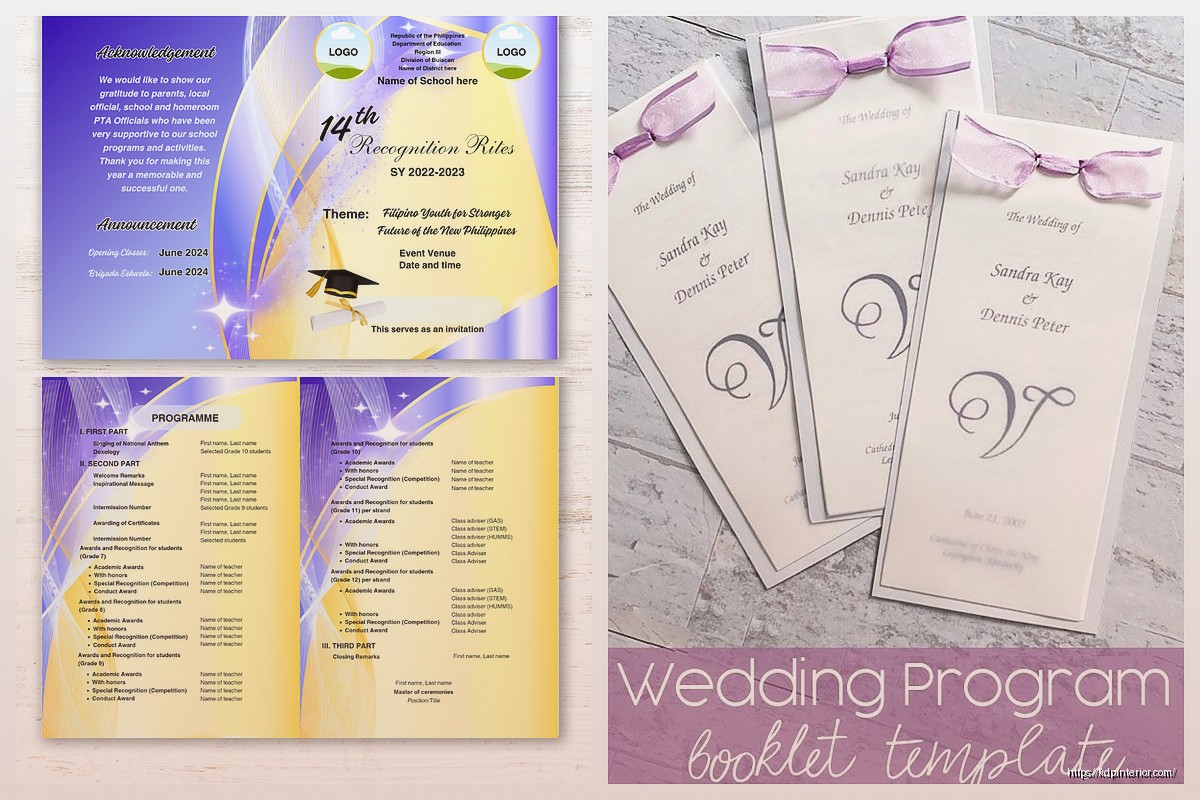
The back cover usually gets ignored but it’s prime real estate for sponsor logos or social media info or even just a nice quote or image. Don’t just leave it blank unless you’re going for that minimalist thing.
Inside front cover is great for a welcome message or quick agenda overview. I was watching that Netflix show the other night, the one about the restaurant, and they had these beautiful menu booklets that used the inside cover for the chef’s note… anyway same principle applies here.
Interior Layout That Actually Works
Okay so funny story, I once spent three hours designing this elaborate two-column layout for a conference program and then realized the agenda items were too long and everything broke. Now I stick with simpler structures that are flexible.
Single column layouts work best for programs honestly. Your text width should be around 3.5-4.5 inches max for comfortable reading. Anything wider and people’s eyes get tired tracking across the page.
For schedules and agendas use tables or structured lists. Something like:
Time blocks on the left: 10-12pt bold
Event descriptions on the right: 9-11pt regular weight
Add some breathing room between items. I use at least 12-18pt spacing between schedule blocks. White space is your friend even though clients always want to cram more stuff in.
Typography Choices
Don’t use more than two font families total. Usually I go with one serif for headings and one sans-serif for body text or vice versa. Some safe combinations:
- Playfair Display + Open Sans
- Montserrat + Lora
- Bebas Neue + Roboto
- Cormorant + Lato
Body text should be 10-12pt for print. Yeah it seems big on screen but trust me at 10pt it’s readable in hand. Line spacing around 1.3-1.5 for body copy.
Wait I forgot to mention color modes… this is important. Always design in CMYK color mode not RGB if you’re printing. RGB colors look vibrant on screen but can print muddy and disappointing. I learned this selling my first batch of planners and the purple came out looking like sad brown.
Content Sections to Include
Most program booklets need these sections and honestly having a template with these already laid out saves so much time:
Cover page – event branding and key info
Welcome/introduction – message from organizer or host
Schedule/agenda – the main content people reference
Speaker/performer bios – headshots plus 50-100 word descriptions
Sponsor recognition – logos and acknowledgments
Venue information – maps, parking, amenities
Additional notes – wifi passwords, hashtags, emergency info
You don’t need all of these obviously but having placeholder pages in your template means you can just delete what you don’t need instead of building from scratch each time.
The Schedule Page Problem
This is where most DIY program booklets fall apart. People try to fit too much info and the font gets tiny and illegible. My cat just knocked over my coffee but anyway… the solution is to break complex schedules across multiple pages or use a two-page spread.
For multi-track events use columns or separate sections. Color coding helps too like all workshop sessions in blue, keynotes in orange etc. Just make sure your colors have enough contrast for readability.
Photo and Image Guidelines
Resolution matters in print way more than digital. You need 300 DPI minimum for any photos or graphics. That Instagram screenshot someone sent you? Probably 72 DPI and gonna look pixelated and terrible.
For headshots I usually use 2×3 inch frames at 300 DPI. Keeps file sizes manageable but looks professional. Always embed images don’t link them or they’ll disappear when you send the file.
This is gonna sound weird but I actually keep a folder of placeholder images in the right dimensions and DPI so I can build templates that show clients exactly how it’ll look. Makes the whole approval process faster.
File Format and Export Settings
When you’re done designing export as PDF/X-1a format for printing. This flattens everything and embeds fonts so the printer can’t mess it up. Regular PDF exports can have issues with transparency and fonts.
Your export settings should be:
- Color mode: CMYK
- Resolution: 300 DPI
- Compression: minimal or none for best quality
- Crop marks: include if printer requests
- Bleed: 0.125 inches included
I keep both a working file (InDesign or whatever you use) and a print-ready PDF. The working file lets you make quick edits later without rebuilding everything.
Template Software Options
InDesign is obviously the professional choice and what I use for client work but it’s expensive. If you’re just starting out or doing occasional projects:
Canva Pro works fine for simple booklets and has print settings built in. The template library is huge but customize everything because you don’t want your event program looking like everyone else’s.
Affinity Publisher is like $50 one-time and has most InDesign features. Good middle ground.
Microsoft Word can technically work but the layout control is frustrating and export quality isn’t great. Only use this if you absolutely have no other option.
Google Docs… just no. Don’t even try for printed booklets.
Building Template Systems
Once you have one good program booklet template you can create variations pretty easily. I have like a base template then versions for different event types:
- Corporate conferences (more formal, lots of agenda space)
- Weddings (decorative, photo-heavy)
- School events (playful fonts, colorful)
- Nonprofit galas (elegant, sponsor-focused)
- Theater productions (cast lists, scene breakdowns)
Each one has the same basic structure and margins but different style elements. Saves me probably 2-3 hours per project just having these ready to go.
Common Mistakes to Avoid
Okay so things I see all the time that make booklets look amateur:
Too many fonts – stick to two families max I already said this but people keep ignoring it
Inconsistent spacing – pick your margins and spacing and use them throughout
Low resolution images – fuzzy headshots look terrible in print
Ignoring the gutter – text disappearing into the center fold
Wrong page counts – remember the divisible by 4 rule
No hierarchy – everything the same size and weight
Overcrowding – white space makes things readable not empty
Also people forget to proofread. Always get fresh eyes on the schedule and names especially. Misspelling a keynote speaker’s name in 500 printed copies is not fun to fix.
Printing Considerations
Paper weight matters more than you’d think. 80lb or 100lb text weight is standard for interior pages. Cover should be heavier like 100lb cover stock or even 120lb. Glossy vs matte is personal preference but matte hides fingerprints better for events where people are handling them a lot.
Get a proof copy before printing the full run always always always. Even with perfect files things can look different in physical form. Colors shift, that margin you thought was fine might feel cramped, binding might be tighter than expected.
For quantities under 100 digital printing is usually cheaper. Over 100 offset printing becomes cost effective. Shop around because prices vary wildly. I use local printers for rush jobs and online services like PrintNinja or 48HourPrint for bigger runs.
The turnaround time is usually 3-5 business days plus shipping so plan accordingly. I’ve had clients wait until a week before their event and then panic about rush fees which are brutal.
Oh wait one more thing about templates… include a notes/instructions layer or page that explains the margins and spacing rules. Future you or whoever inherits the template will appreciate not having to reverse engineer your decisions. I started doing this after forgetting my own setup on a template I hadn’t touched in six months.
Anyway that’s basically the whole process I use. Start with proper dimensions and margins, keep the design clean and hierarchical, use good photos, export correctly, and proof before mass printing. The template does like 70% of the work once it’s set up right which is why spending time on that foundation is worth it.
DISCOVER OUR FREE BEST SELLING PRODUCTS
Editable Canva Lined Journal: Express Your Thoughts – KDP Template
Lined Pages Journal 120 pages Ready to Upload PDF Commercial Use KDP Template 6×9 8.5×11 5×8 for Notebooks, Diaries, Low Content
Lined Pages Journal 120 pages Ready to Upload PDF Commercial Use KDP Template 6×9 8.5×11 5×8 for Notebooks, Diaries, Low Content
Cute Dogs Coloring Book for Kids | Activity Book | KDP Ready-To-Upload
Daily Planner Diary : Diary Planners for Everyday Productivity, 120 pages, 6×9 Size | Amazon KDP Interior
Wolf Coloring KDP interior For Adults, Used as Low Content Book, PDF Template Ready To Upload COMMERCIAL Use 8.5×11"
Coloring Animals Head Book for Kids, Perfect for ages 2-4, 4-8 | 8.5×11 PDF
Printable Blank Comic Book Pages PDF : Create Your Own Comics – 3 Available Sizes
Notes KDP interior Ready To Upload, Sizes 8.5×11 6×9 5×8 inch PDF FILE Used as Amazon KDP Paperback Low Content Book, journal, Notebook, Planner, COMMERCIAL Use
Black Lined Journal: 120 Pages of Black Lined Paper Perfect for Journaling, KDP Notebook Template – 6×9
Student Planner Journal 120 pages Ready to Upload PDF Commercial Use KDP Template 6×9" 8.5×11" for Low Content book
Recipe Journal Template – Editable Recipe Book Template, 120 Pages – Amazon KDP Interior