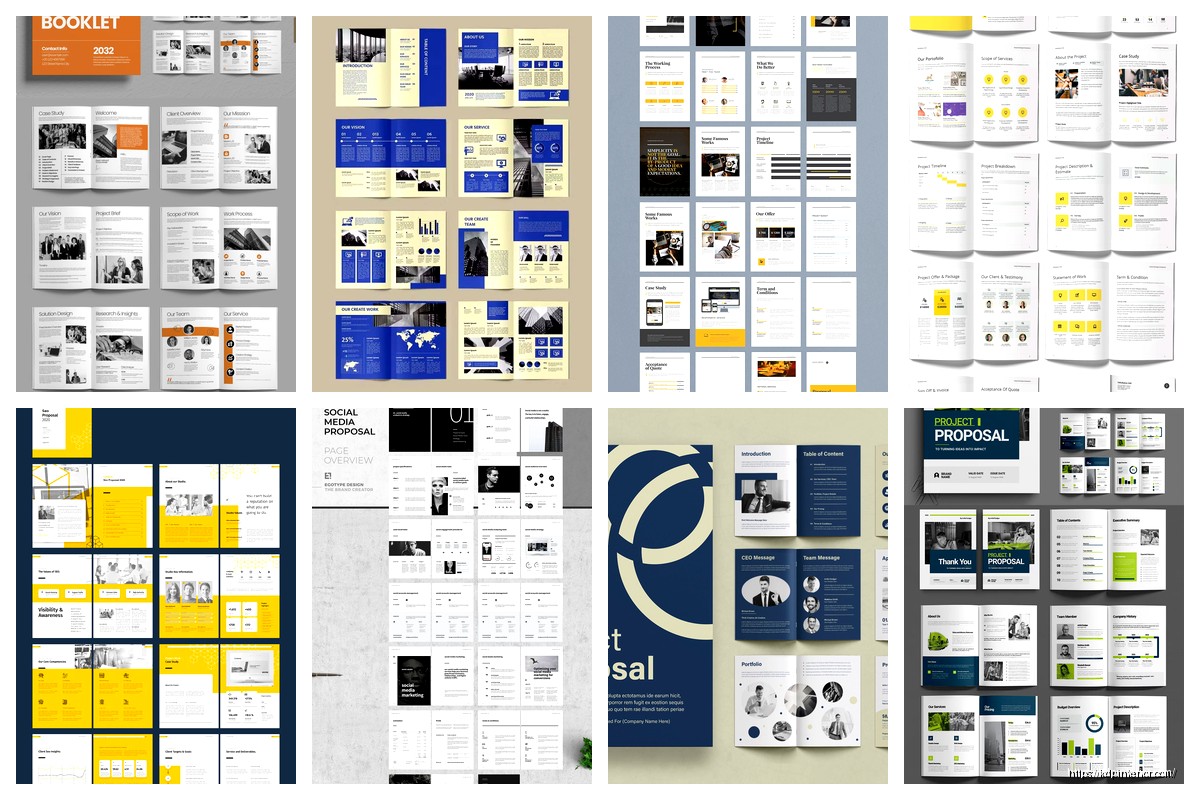
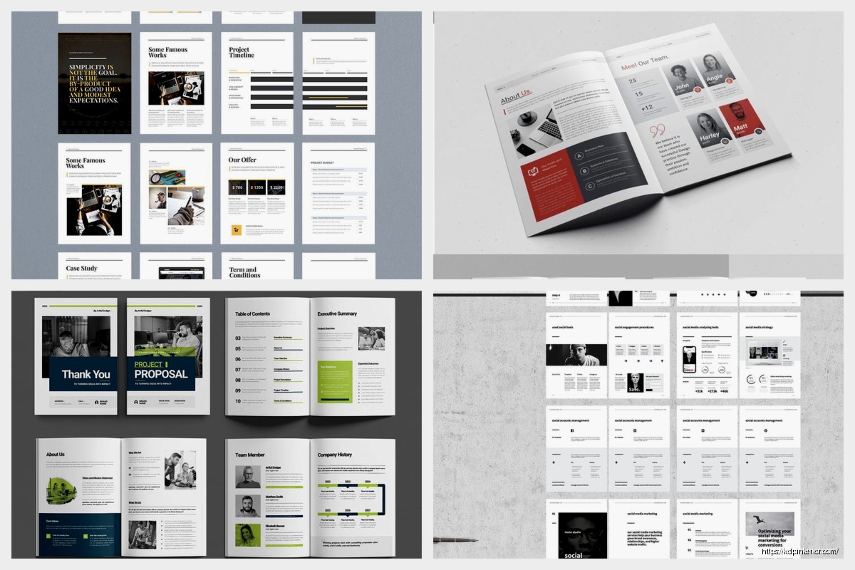
Okay so proposal booklets are honestly where most people mess up their entire business pitch and I’ve seen this play out like hundreds of times with my consulting clients. The thing is you’re basically creating a physical or digital document that needs to do ALL the heavy lifting – convince someone to say yes, look professional enough that they take you seriously, but not so corporate that it feels soulless.
The Format Thing Everyone Gets Wrong
First thing – size matters but not how you think. Most people default to standard 8.5×11 which fine whatever but if you’re printing these you gotta consider that a smaller booklet format like 5.5×8.5 (literally just fold your paper in half) feels way more intentional. I tested this last month with two identical proposals, one standard size one booklet size, and the booklet got responded to first. Could be coincidence but I don’t think so.
For digital proposals you can go wider, maybe 8×10 or even keep it at standard dimensions because people are viewing on screens anyway. But here’s the thing – you need to design for how it’ll actually be consumed. If you’re sending a PDF that someone’s gonna read on their phone during their commute (which happens more than you’d think), don’t make your text tiny or your layout complicated.
Cover Design That Actually Works
Your cover needs like three elements max. I’m serious. Company logo or your name, the word “Proposal” or “Business Proposal” or whatever makes sense, and maybe a subtitle that says what it’s for. That’s it.
I see people cramming their cover with graphics and colors and honestly it just looks desperate? The cleanest proposal covers I’ve ever made were just:
- White or cream background
- One accent color (usually pulled from the client’s branding)
- Clean sans-serif font for the title
- Maybe a thin line or subtle geometric shape
My dog literally stepped on my keyboard while I was designing a proposal cover last week and somehow made it better by deleting half the elements I’d added. Sometimes less really is the move.
Inside Front Cover Strategy
This is where you put your table of contents but also – and this is gonna sound weird but trust me – a one-sentence mission statement or value proposition. Something like “Helping mid-size retailers optimize their supply chain through data-driven solutions” right above your TOC. It primes the reader for what’s coming and gives context immediately.
Your TOC doesn’t need to be fancy. Just clean, easy to read, with page numbers that actually match where stuff is. I’ve received proposals where the page numbers were off and it immediately made me question everything else about their attention to detail.
What Goes In Your TOC
- Executive Summary (page 2 or 3)
- Understanding Your Needs (or Problem Statement)
- Our Proposed Solution
- Timeline & Deliverables
- Investment (or Pricing)
- About Us/Credentials
- Terms & Conditions
- Next Steps
You can shuffle this order but honestly this flow works for like 90% of business proposals.
Executive Summary Page Layout
Keep this to ONE page. I cannot stress this enough. Decision makers read this and maybe only this if they’re busy. Use wider margins here, bigger font size (like 11 or 12pt instead of 10pt), more white space. Make it scannable.
Break it into short paragraphs, maybe 2-3 sentences each. Hit these points:
- What problem you’re solving
- Your solution in one sentence
- Key benefit or outcome
- Timeline snapshot
- Investment range
Wait I forgot to mention – use bold text for the first few words of each paragraph if you want extra scannability. Like “Problem: Your current system…” or “Solution: We’ll implement…” People’s eyes naturally grab onto that bold text first.
Body Page Design Principles
Okay so here’s where most proposal booklets fall apart. People either make them too text-heavy (walls of paragraphs) or too design-heavy (looks like a brochure, not substantial enough).
The sweet spot is around 60% text, 40% visual breathing room (which includes white space, images, charts, whatever).
Typography Rules That Matter
Pick two fonts MAX. One for headers (can be slightly more decorative but still professional), one for body text (needs to be super readable – Georgia, Garamond, or Helvetica work great). Your body text should be 10-11pt for print, 11-12pt for digital.
Line spacing matters more than people think. Set it to 1.15 or 1.25 for body text. Single spacing looks cramped, double spacing wastes too much space. That middle ground is perfect.
Margins should be at least 0.75 inches on all sides for print (you need room for binding if you’re doing that). For digital you can go a bit narrower but don’t cram stuff to the edges.
Visual Elements You Actually Need
Icons are your friend but use them consistently. If you use a clock icon for timeline stuff, don’t randomly switch to a different style icon later. I usually grab icon sets from places like Flaticon or Noun Project, pick one style, stick with it.
Charts and graphs – if you’re showing data, make it visual. But keep it simple. A clean bar chart beats a complicated 3D pie chart every single time. Use your accent color for data visualization, keep everything else grayscale.
Photos or images should only be there if they add value. Don’t just throw in stock photos of people shaking hands or whatever. If you’re showcasing previous work, showing your team, or illustrating a concept, fine. Otherwise skip it.
The Color Psychology Thing
I’m not gonna go deep into color theory but basically:
- Blue = trustworthy, corporate, stable (most common for proposals)
- Green = growth, eco-friendly, health
- Orange/Yellow = creative, energetic, friendly
- Purple = luxury, innovative, creative
- Gray/Black = sophisticated, professional, serious
Pick one main color, maybe one accent color. That’s it. Rainbow proposals look amateurish unless you’re in a creative industry where that’s expected.
The Pricing Section Layout
This is always the most nerve-wracking page to design because you’re literally showing someone what they’ll pay. I’ve tested different approaches and here’s what converts best:
Create a simple table or grid. Three columns: what they’re getting, details/description, cost. Make sure the total is clearly visible and stands out (bigger font, bold, maybe in your accent color).
If you have different package tiers, show them side by side. List features down the left, checkmarks or details for each tier across. Make your recommended option stand out slightly – maybe a colored background or a “Recommended” badge.
Oh and another thing – always include what’s NOT included if there are common misconceptions. Like “Does not include: hosting fees, third-party licensing costs” or whatever applies. Prevents scope creep later.
Timeline and Deliverables Pages
Visual timelines work way better than paragraphs of text. I usually do a simple horizontal timeline with milestones marked, or a Gantt-style chart if the project is complex. You can create these in PowerPoint or Canva pretty easily, then drop them into your proposal.
For deliverables, bullet points or a numbered list works fine but consider using a table format:
Deliverable | Description | Due Date
Makes it super clear what they’re getting and when.
About Us Section Without the Fluff
Keep this section short – like one or two pages max. People don’t care about your entire company history. They care about why you’re qualified to solve THEIR problem.
Include:
- Brief company overview (2-3 sentences)
- Relevant experience or case studies
- Key team members who’ll work on this project
- Any certifications or credentials that matter
- Maybe 2-3 client testimonials if they’re really good
I usually put headshots of key team members with their name, title, and one sentence about their expertise. Makes it personal without taking up tons of space.
Technical Stuff For Production
If you’re printing these, you gotta think about binding. Saddle stitch (stapled spine) works for booklets up to about 48 pages. Beyond that you need perfect binding or coil binding. I usually go saddle stitch for proposals because they’re rarely that long and it’s cheaper.
Paper weight matters – use at least 80lb text weight for inside pages, 100lb cover stock for the cover. Anything lighter feels cheap. Matte finish looks more professional than glossy for business proposals IMO.
For digital proposals, save as PDF with compression optimized for viewing on screen. Keep file size under 10MB if possible so it doesn’t bounce back from email servers. And for the love of everything make sure your hyperlinks work if you’ve included any.
The Signature Page Setup
Last page or second-to-last page should be where they sign. Keep this simple – lines for signature, printed name, date, company name if relevant. Add a sentence like “By signing below, you agree to the terms outlined in this proposal.”
Some people are doing digital signatures now which is fine, just make sure you’re using a legit e-signature service not just like… asking people to type their name in a PDF form.
Common Design Mistakes I See Constantly
Too many fonts. Seriously just stop. Two fonts. Maybe three if you really need a monospace font for technical stuff but probably not.
Inconsistent spacing. If you have 0.5 inches between sections on page 3, keep that same spacing throughout. Visual consistency = professional.
Ignoring hierarchy. Your H1 headers should be biggest, H2 slightly smaller, H3 smaller than that, body text smallest. This creates a visual flow that guides the eye.
Forgetting page numbers. Put them on every page except maybe the cover. Bottom center or bottom right corner works fine.
Software Recommendations Real Quick
I mostly use InDesign for complex proposals because you get precise control over everything. But honestly? Canva has proposal templates now that are actually pretty good for simpler projects. Microsoft Word works fine too if you know how to use styles and formatting properly.
For quick proposals I’ll sometimes just use Google Docs with a template I’ve created, export to PDF, done. Doesn’t need to be complicated if the content is solid.
The main thing is whatever tool you use, create a template you can reuse. Don’t start from scratch every time – that’s just inefficient and you’ll end up with inconsistent branding across different proposals.
Anyway that’s like the core stuff for designing proposal booklets that actually look professional and get results. The biggest thing is just keeping it clean, making information easy to find, and not overdesigning it to the point where the design distracts from your actual proposal content.
 Coloring Animals Head Book for Kids, Perfect for ages 2-4, 4-8 | 8.5x11 PDF
1 × $0.00
Coloring Animals Head Book for Kids, Perfect for ages 2-4, 4-8 | 8.5x11 PDF
1 × $0.00  Printable Blank Comic Book Pages PDF : Create Your Own Comics - 3 Available Sizes
1 × $0.00
Printable Blank Comic Book Pages PDF : Create Your Own Comics - 3 Available Sizes
1 × $0.00  Editable Canva Lined Journal: Express Your Thoughts - KDP Template
1 × $0.00
Editable Canva Lined Journal: Express Your Thoughts - KDP Template
1 × $0.00 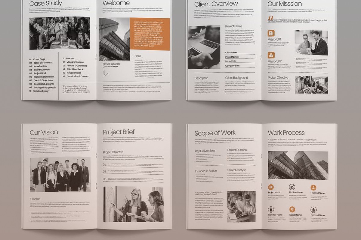
DISCOVER OUR FREE BEST SELLING PRODUCTS
Editable Canva Lined Journal: Express Your Thoughts – KDP Template
Lined Pages Journal 120 pages Ready to Upload PDF Commercial Use KDP Template 6×9 8.5×11 5×8 for Notebooks, Diaries, Low Content
Lined Pages Journal 120 pages Ready to Upload PDF Commercial Use KDP Template 6×9 8.5×11 5×8 for Notebooks, Diaries, Low Content
Cute Dogs Coloring Book for Kids | Activity Book | KDP Ready-To-Upload
Daily Planner Diary : Diary Planners for Everyday Productivity, 120 pages, 6×9 Size | Amazon KDP Interior
Wolf Coloring KDP interior For Adults, Used as Low Content Book, PDF Template Ready To Upload COMMERCIAL Use 8.5×11"
Coloring Animals Head Book for Kids, Perfect for ages 2-4, 4-8 | 8.5×11 PDF
Printable Blank Comic Book Pages PDF : Create Your Own Comics – 3 Available Sizes
Notes KDP interior Ready To Upload, Sizes 8.5×11 6×9 5×8 inch PDF FILE Used as Amazon KDP Paperback Low Content Book, journal, Notebook, Planner, COMMERCIAL Use
Black Lined Journal: 120 Pages of Black Lined Paper Perfect for Journaling, KDP Notebook Template – 6×9
Student Planner Journal 120 pages Ready to Upload PDF Commercial Use KDP Template 6×9" 8.5×11" for Low Content book
Recipe Journal Template – Editable Recipe Book Template, 120 Pages – Amazon KDP Interior