-
×
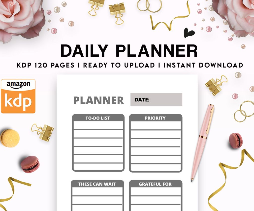 Daily Planner Diary : Diary Planners for Everyday Productivity, 120 pages, 6×9 Size | Amazon KDP Interior
1 × $0.00
Daily Planner Diary : Diary Planners for Everyday Productivity, 120 pages, 6×9 Size | Amazon KDP Interior
1 × $0.00
Subtotal: $0.00
Daily Planner Diary : Diary Planners for Everyday Productivity, 120 pages, 6×9 Size | Amazon KDP Interior
1 × $0.00 Subtotal: $0.00
Okay so I just spent like three hours last Tuesday organizing my reading log templates and honestly the whole thing started because my Kindle library hit 487 books and I realized I couldn’t remember half of what I’d read last year…
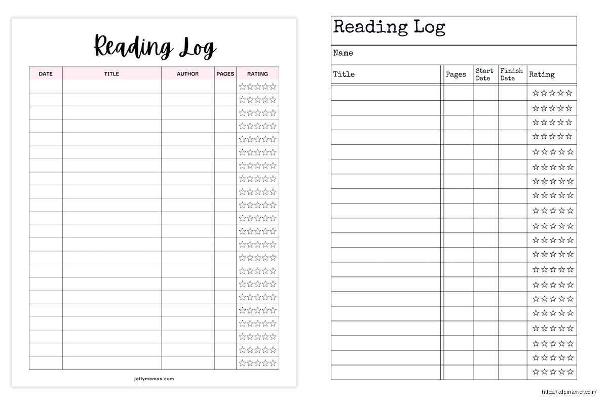
The basic reading log printable is just a table with columns for title, author, date finished, and maybe rating. That’s it. But here’s where people mess up – they make it too complicated right out of the gate. I see sellers on Amazon KDP cramming in genres, subgenres, favorite quotes, character names, plot summaries, and like… nobody’s gonna fill all that out. Your readers want something they’ll actually use, not something that looks pretty in the preview but becomes homework.
I’ve tested probably 40 different layouts over the past few years and the ones that sell consistently have 4-6 columns max. Title and author are obvious. Date started/finished – pick one or both but don’t do separate columns for month, day, year because that’s annoying to fill out. Rating system, usually 5 stars or out of 10. Then maybe one flex column for notes or genre.
Simple lined version is your bread and butter. Each book gets one row, columns are clearly labeled at the top, repeat that header every page or every other page. People forget this but if someone’s flipping through their log six months later, they don’t wanna hunt for what each column means.
Oh and another thing – page numbers matter more than you’d think. I put them bottom center on every template now because readers get annoyed when they’re trying to reference “that book I logged in March” and they gotta flip through unmarked pages. Small detail but it shows up in reviews.
The box-style layout gives each book its own little section, maybe 4-6 books per page. Works really well for people who want more space to write notes or doodle or whatever. I’ve got a customer who sends me photos sometimes (weird but cool) and she draws tiny illustrations of book covers in these boxes. Not what I designed it for but hey, it works for her.
This is gonna sound weird but the monthly divided logs sell better in January and September. Like clockwork. People want that fresh start feeling. You’ve got a page or spread for each month with space for maybe 10-15 books depending on how much they read.
Continuous logs work year-round because readers don’t have to commit to a specific timeframe. They just keep going until the journal’s full. I usually make these 100-120 pages, enough for 200-300 books depending on the layout.
Wait I forgot to mention – always include a “books read this year” counter section at the front. Just a simple grid where they can shade in boxes or tick off numbers. People LOVE tracking their reading goals and it’s literally just numbered boxes from 1-100 or whatever. Takes five minutes to design, adds value.
Headers and titles should be clear but you don’t need fancy fonts. I use Libre Baskerville or Crimson Text for headers, something clean and readable. The actual logging space needs to be in a simple sans-serif or a very readable serif. Nobody wants to write between decorative script letters.
Lines vs no lines is personal preference but here’s what I’ve found – younger readers (teens to 30s) prefer minimalist designs with just underlines or dots for writing guides. Older readers want actual ruled lines, usually 0.3-0.5 pt weight in gray, not black. Black lines feel too much like school homework apparently.
My cat just knocked over my coffee which is perfect timing because I need to talk about margins. You need AT LEAST 0.5 inches on the binding side, preferably 0.75. People who use these logs actually write in them (shocking, I know) and if the margins are too tight, the binding eats their words. I learned this the hard way when I got like 8 reviews in one week complaining about it.
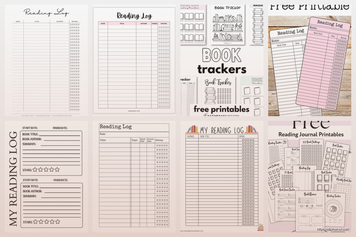
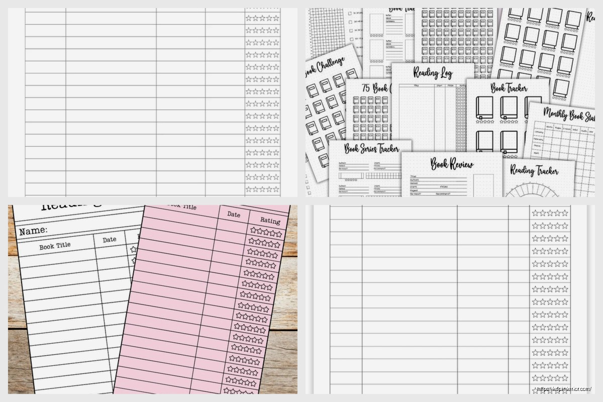
Plain black and white minimalist is your foundation. Always create this version first. Then you can spin off themed versions – floral borders, geometric patterns, vintage library aesthetic, modern bold designs. The themed ones catch eyes in thumbnails but honestly the plain versions outsell them like 3 to 1.
Genre-specific logs are a whole thing too. A romance reading log with columns for heat level and tropes. Mystery/thriller logs with a “figured it out?” column. Fantasy logs with series tracking built in. These are more niche but the people who want them REALLY want them.
Okay so funny story – I added a TBR (to be read) list section almost as an afterthought to one template and sales jumped 40%. Turns out people want to track what they’re gonna read just as much as what they’ve finished. Include like 10-20 pages of TBR lists, just simple lines with little checkboxes.
Books to reread section, same deal. Maybe 5 pages max.
Reading statistics pages where they can track books by genre, books by rating, longest/shortest book, favorite author of the year. This stuff is candy for people who like data about their reading. You can create simple charts or just labeled spaces for them to fill in.
Bookshelf inventory pages if you wanna get fancy. Grid layout where each square represents one book they own. Physical book collectors eat this up.
8.5×11 is standard and safe. Easy to print at home, fits in normal binders, familiar size. This is like 70% of what I sell.
6×9 is more portable, fits in bags better, feels more like a personal journal. Good for people who track while commuting or sitting in coffee shops or whatever.
5×8 is cute but honestly harder to write in. The columns get cramped. I’ve only got like two templates in this size and they’re not top performers.
A4 if you’re selling to European markets. Just convert your US letter size, adjust margins, you’re good.
Interior needs to be PDF, obviously. I design in Affinity Publisher now but used Canva for years and it worked fine. Make sure your document is the exact trim size – don’t add bleeds unless you’ve got elements going to the edge, which you shouldn’t for a reading log.
Cover’s gotta account for spine width. Use KDP’s calculator, don’t guess. I usually keep covers simple for these – relevant imagery (books, shelves, reading-related stuff), clear title, maybe a subtitle like “Track Your Reading Journey” or whatever. The cover sells the click but the interior preview sells the purchase.
Price these between $5.99-$8.99 in my experience. Lower than $5.99 and people assume it’s low quality. Higher than $8.99 and you’re competing with established journal brands. I usually land at $6.99 for basic versions, $7.99 for themed or expanded editions.
You’ve got seven keyword slots, use all of them. “reading log” and “book tracker” are obvious. Then think about who’s buying – “reading journal for book lovers,” “book log notebook,” “bookish planner,” stuff like that. Check what’s actually selling in the niche and model your keywords after that.
Categories are limited but go for Books > Literature & Fiction > History & Criticism and Crafts, Hobbies & Home > Crafts & Hobbies > Book & Paper Crafts. The second one sounds random but it works.
Wait I should mention – seasonal versions do well around New Year’s. “2025 Reading Log” or whatever year. People search specifically for the current year, so update and republish annually if you’re gonna do dated versions.
Too much clip art. One customer-focused element per page MAX. The log itself should be clean and functional.
Inconsistent formatting. If your header style changes halfway through the book, it looks sloppy and people notice.
No page numbers I mentioned this but seriously, page numbers.
Forgetting about the person who’s actually gonna use this. They’re probably logging books on their couch at night or during their lunch break. They don’t want complicated systems or tiny writing spaces or columns that don’t make sense.
Not testing print quality. Order an author copy before you publish. Check how the lines look printed, whether there’s enough contrast, if the paper quality works with the design. I’ve had to republish templates because the gray I used was too light on actual paper versus my screen.
Create matching companion products – bookplates, bookmark designs, reading challenge trackers. Build out a whole “reading journal collection” so people buy multiple products from you.
Different year ranges. Some readers want a journal that’ll last multiple years, so make a “5-Year Reading Log” with dated sections or year dividers.
Specialized formats for different reader types. Speed readers need more entries per page. Slow, thoughtful readers want more note space. Academic readers want citation formats maybe.
The thing is there’s no perfect reading log template because every reader tracks differently. Some people just want title and author, done. Others want full book reports. Your job is to create options that serve different tracking styles and then see what sells. I’ve got like 15 different reading log variations live right now and three of them make up 80% of my sales from this niche.
Test your designs, check your reports monthly, adjust what isn’t working. And honestly? The simple, clean, functional templates always win over the super decorated ones. People want to use these things, not frame them.
DISCOVER OUR FREE BEST SELLING PRODUCTS
Editable Canva Lined Journal: Express Your Thoughts – KDP Template
Lined Pages Journal 120 pages Ready to Upload PDF Commercial Use KDP Template 6×9 8.5×11 5×8 for Notebooks, Diaries, Low Content
Lined Pages Journal 120 pages Ready to Upload PDF Commercial Use KDP Template 6×9 8.5×11 5×8 for Notebooks, Diaries, Low Content
Cute Dogs Coloring Book for Kids | Activity Book | KDP Ready-To-Upload
Daily Planner Diary : Diary Planners for Everyday Productivity, 120 pages, 6×9 Size | Amazon KDP Interior
Wolf Coloring KDP interior For Adults, Used as Low Content Book, PDF Template Ready To Upload COMMERCIAL Use 8.5×11"
Coloring Animals Head Book for Kids, Perfect for ages 2-4, 4-8 | 8.5×11 PDF
Printable Blank Comic Book Pages PDF : Create Your Own Comics – 3 Available Sizes
Notes KDP interior Ready To Upload, Sizes 8.5×11 6×9 5×8 inch PDF FILE Used as Amazon KDP Paperback Low Content Book, journal, Notebook, Planner, COMMERCIAL Use
Black Lined Journal: 120 Pages of Black Lined Paper Perfect for Journaling, KDP Notebook Template – 6×9
Student Planner Journal 120 pages Ready to Upload PDF Commercial Use KDP Template 6×9" 8.5×11" for Low Content book
Recipe Journal Template – Editable Recipe Book Template, 120 Pages – Amazon KDP Interior