Okay so I just spent like three weeks testing different printable cookbook cover designs because one of my students kept asking about it and honestly the whole thing is way simpler than people make it out to be but there’s some specific stuff you gotta know.
The Basic Size Thing Everyone Gets Wrong
First off, most people design their covers at totally random sizes and then wonder why they look weird when printed. Here’s what actually works – if you’re doing a standard 8.5×11 cookbook, your cover needs to account for the spine width. Like, you can’t just slap a front cover on there and call it done.
The formula is: front cover width + spine width + back cover width = total cover width. So for an 8.5×11 book that’s maybe 100 pages, you’re looking at roughly 17.25 inches wide (8.5 + 0.25 spine + 8.5) by 11 inches tall. But that spine width changes based on page count and paper type, which is annoying.
I use this calculator thing from KDP even when I’m not publishing there because it’s free and actually accurate. You just plug in your page count and paper type and it spits out the exact dimensions. Saved it to my bookmarks probably two years ago and reference it constantly.
Software Options That Don’t Suck
So Canva is the obvious choice and yeah it works fine. They’ve got cookbook templates already which is honestly the fastest route. But here’s the thing – their free version limits you to like 96 DPI downloads which looks terrible when printed. You need 300 DPI minimum for print quality.
I was watching that new season of The Bear while testing this stuff and got distracted like four times but anyway – Canva Pro is worth it if you’re doing multiple projects. It’s like $13/month or something. Otherwise you can use:
- GIMP – totally free, kinda ugly interface but gets the job done
- Affinity Publisher – one-time payment around $70, really solid
- PowerPoint or Google Slides – sounds weird but actually works for simple designs
- Adobe InDesign – overkill unless you already have it
I’ve designed probably 40+ covers in PowerPoint because I already knew how to use it and didn’t wanna learn new software. Set your slide dimensions to custom, punch in your cover measurements, and you’re good. Export as PDF at highest quality settings.
The Bleed and Margin Situation
Wait I forgot to mention bleed which is super important. Bleed is the extra space around your design that gets trimmed off during printing. Standard bleed is 0.125 inches on all sides.
So if your trim size is 8.5×11, your actual design canvas needs to be 8.75×11.25. And then you keep all your important text and images at least 0.25 inches away from where the cut happens. I screwed this up on my first like five attempts and had titles getting chopped off. Not cute.
Most print-on-demand services will reject your file if you don’t have proper bleed. I learned this the hard way when I uploaded a cookbook cover at 2am thinking I was done and got an error message about bleed specifications.
Design Elements That Actually Work
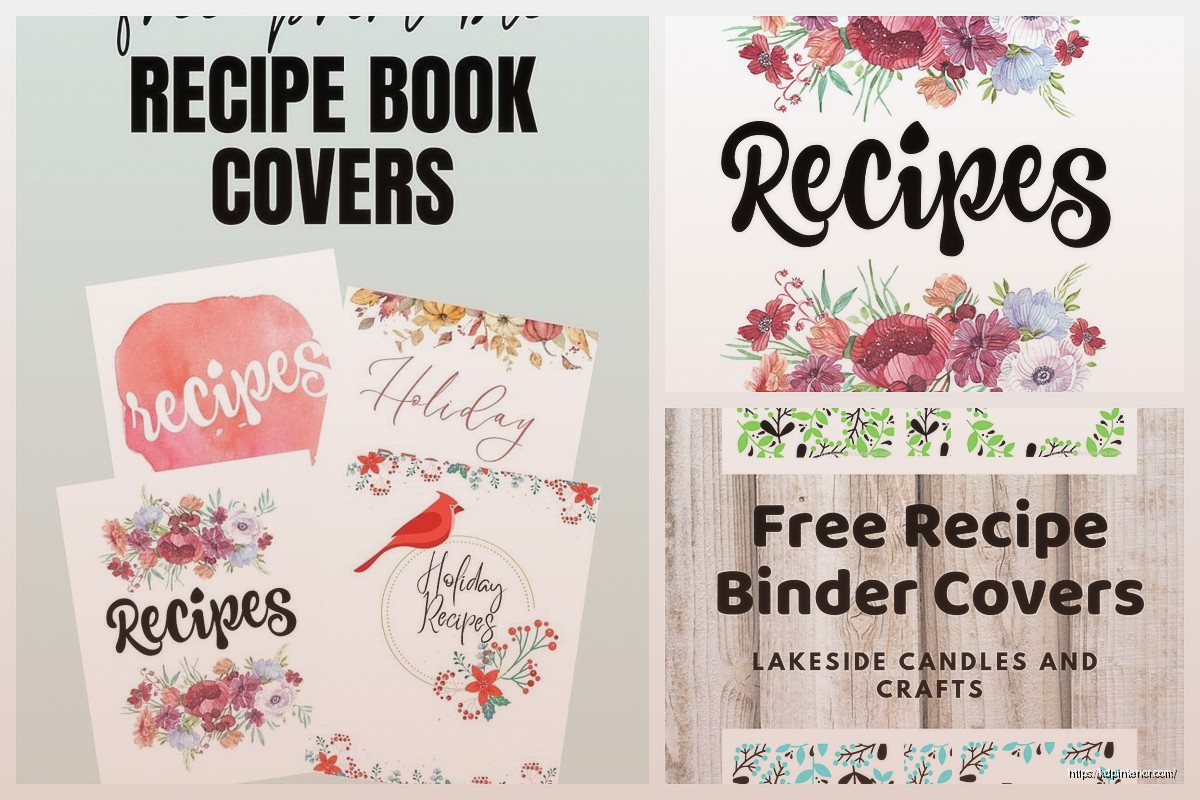
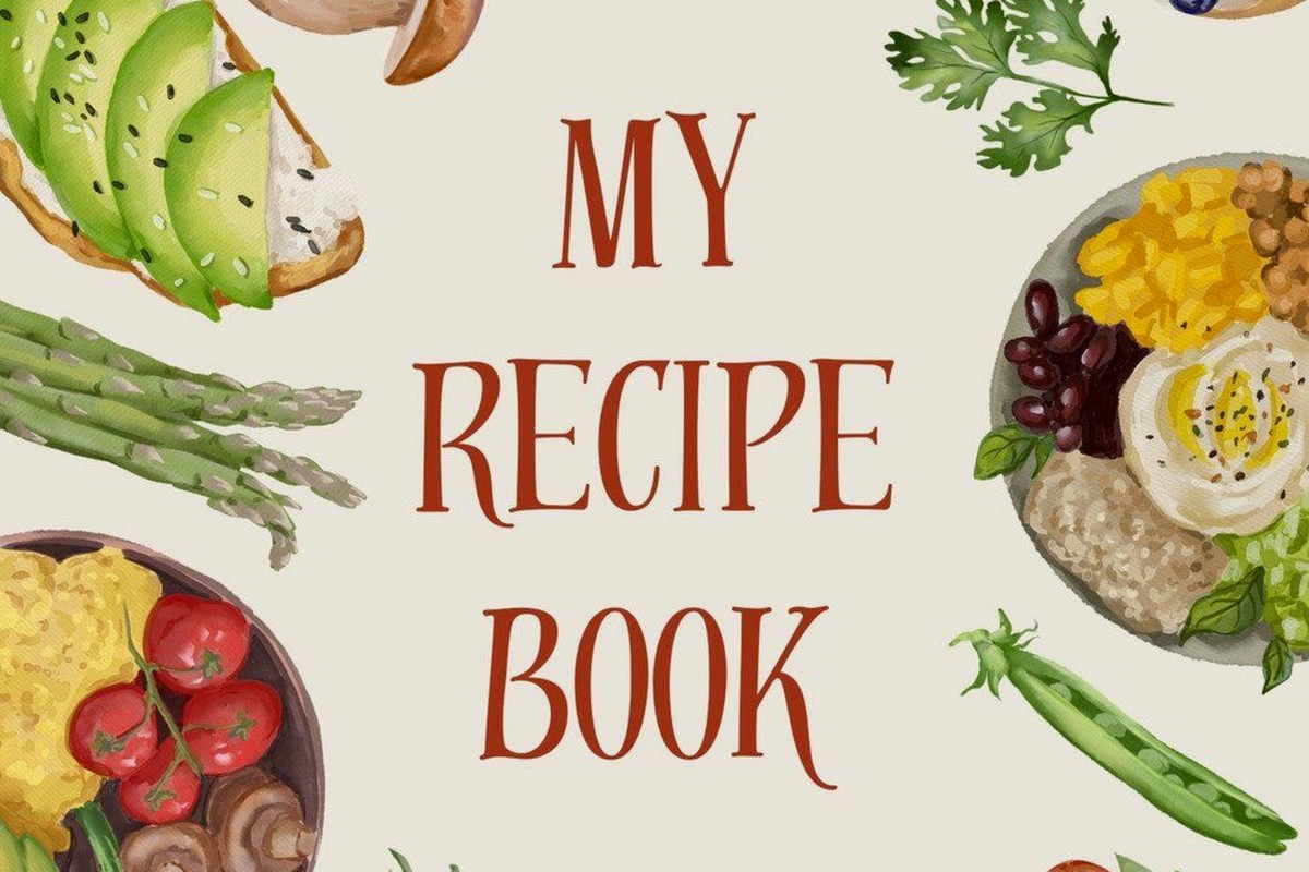
Okay so for the visual stuff – food photography is the obvious choice but stock photos can look really generic. I’ve had better luck with:
Illustrated designs – hand-drawn vegetables, kitchen tools, that watercolor aesthetic that’s everywhere right now. Sites like Creative Market have bundles for like $20 that give you hundreds of elements.
Typography-focused covers – just really strong fonts with maybe a subtle pattern background. Works especially well for specific niches like “Weeknight Dinners” or “Instant Pot Recipes.”
Minimalist layouts – white space, one hero image, clean fonts. These actually convert better than busy designs in my testing.
Oh and another thing – your title needs to be readable in thumbnail size. Like when someone’s scrolling on their phone or looking at a printed book from across the room. I test this by shrinking my design down to 1 inch wide and seeing if I can still read it. If not, the font’s too small or there’s too much going on.
Color Psychology Nobody Talks About
This is gonna sound weird but color choice actually matters way more than you’d think. I ran some split tests with identical designs in different color schemes and the results were wild.
For cookbooks specifically:
- Red and orange trigger appetite – classic choice for general cookbooks
- Green works for healthy/vegan/organic themes
- Navy or burgundy feels more sophisticated, good for gourmet stuff
- Pastels work for baking and dessert books
- Black with gold accents = instant premium vibe
I did a dessert cookbook cover in navy blue once thinking it looked elegant and it totally flopped. Switched to a soft pink version of the same design and it performed like 3x better. People have expectations based on the category.
Font Pairing Without Overthinking It
Fonts are where people get analysis paralysis. Here’s my lazy but effective method – use two fonts max. One for the title (usually a serif or bold display font) and one for subtitles and author name (clean sans-serif).
Google Fonts is free and has everything you need. My go-to combinations:
- Playfair Display + Lato
- Montserrat + Merriweather
- Bebas Neue + Open Sans
- Cormorant + Nunito
Don’t use more than two fonts though. I see people using like five different fonts trying to make it “interesting” and it just looks messy. My cat knocked over my coffee while I was working on a cover last week and honestly the coffee stain looked better than some of the five-font disasters I’ve seen.
The Back Cover Layout
So many people forget about the back cover or just slap some random text there. The back needs to include:
A compelling description of what’s inside – not just “this book has recipes” but like “50 quick weeknight meals ready in 30 minutes or less using ingredients you already have.”
Author bio if you want, but keep it short. Three sentences max.
Barcode space if you’re doing ISBN stuff – leave a 2×1.25 inch white rectangle in the lower right corner.
Maybe some testimonials or a few recipe highlights. I usually do a simple list like “Inside you’ll find: • Breakfast favorites • One-pot dinners • Make-ahead desserts.”
The back cover doesn’t need to be fancy. Clean, readable, informative. That’s it.
Print-at-Home vs Professional Printing
If you’re actually printing these yourself at home, your options are kinda limited. Most home printers can’t handle the full wrap-around cover in one piece. You’d need to either:
Print front and back separately and use a clear cover sleeve situation, or take your file to a print shop like FedEx Office or Staples and have them print it on cardstock.
For cardstock I recommend 80lb cover weight minimum. The 65lb stuff feels flimsy. And get it printed on a color laser printer, not inkjet, because inkjet can smudge if it gets wet.
I tested this with my own printer and the colors were way off compared to what I saw on screen. Print shops have better color calibration. Worth the $3-5 per cover if you’re only doing a few.
The Lamination Question
Should you laminate? Depends. Lamination makes it more durable and wipeable which is great for cookbooks that’ll get messy. But it adds cost and you can’t do it at home unless you have a laminator.
I bought a cheap laminator on Amazon for like $25 and it works okay for smaller covers. Anything bigger than 8.5×11 though and you need the professional lamination from a print shop.
Matte lamination looks way more professional than glossy in my opinion. Glossy shows fingerprints and glare. But that’s personal preference I guess.
Template Resources I Actually Use
Creative Fabrica has unlimited downloads for $9/month and I’ve grabbed probably 200 cookbook templates from there. Not all are good but you can find solid starting points.
Etsy has one-off templates usually $5-15. Search for “cookbook cover template” and filter by file type – you want PSD, AI, or editable PDF files.
Creative Market is pricier but higher quality. Templates range from $12-40 but they’re usually really well-designed and include multiple format options.
I’ve bought templates from all three and honestly the Etsy ones are fine for beginners. You’re paying for convenience and a head start, not rocket science.
File Format and Export Settings
When you’re done designing, export as PDF with these settings:
- 300 DPI resolution minimum
- CMYK color mode for print (not RGB)
- Embed all fonts
- Include bleed marks if your software allows it
The CMYK thing trips people up. Your screen shows RGB colors but printers use CMYK ink. If you design in RGB, the colors will shift when printed. Most design software lets you switch color modes.
I forgot to convert to CMYK on a project once and the reds printed way more orange than I wanted. Had to redo the whole thing.
Testing Before You Print a Bunch
Always do a test print. Always. Print one copy, look at it in real life, see what needs adjusting. I’ve caught so many issues this way – text too small, colors off, spine alignment wrong, whatever.
It’s way cheaper to fix mistakes on one test print than to realize you printed 50 copies with a typo in the title. Which yes, I’ve seen happen. Not to me thankfully but to someone in one of my consulting groups.
Common Mistakes to Avoid
Using low-resolution images – anything under 300 DPI will look pixelated when printed. If you’re pulling images from Google they’re usually 72 DPI which is only good for screens.
Forgetting about the spine – it needs text too if your book is thick enough. Usually author name at the bottom and title at the top, reading vertically.
Too much text – your cover isn’t a flyer. Keep it simple and let the design breathe.
Not checking print specifications – every printer has different requirements for margins, bleed, file format. Check before you design, not after.
Oh and don’t use pure black (#000000) for large areas. Use rich black instead which is like 60% cyan, 40% magenta, 40% yellow, 100% black. It prints deeper and more consistent. Pure black can look washed out.
Pricing Your Time and Materials
If you’re doing this as a service or for resale, factor in your actual costs. Design time, software subscriptions, printing, materials. I usually estimate 2-3 hours for a custom cover design start to finish.
Print costs vary but for a full-color cardstock cover you’re looking at maybe $2-5 per unit depending on quantity and where you print. Add lamination and it goes up another $1-2.
People will pay $15-30 for a professionally designed printable cookbook cover template they can customize themselves. I’ve sold these as digital products and they’re pretty passive income once you build up a library.
Anyway that’s basically everything I’ve learned from doing this way too many times. Start simple, test your prints, and don’t overthink the design part. A clean, readable cover beats a complicated mess every single time.
 Lined Pages Journal 120 pages Ready to Upload PDF Commercial Use KDP Template 6x9 8.5x11 5x8 for Notebooks, Diaries, Low Content
1 × $0.00
Lined Pages Journal 120 pages Ready to Upload PDF Commercial Use KDP Template 6x9 8.5x11 5x8 for Notebooks, Diaries, Low Content
1 × $0.00  Editable Canva Lined Journal: Express Your Thoughts - KDP Template
1 × $0.00
Editable Canva Lined Journal: Express Your Thoughts - KDP Template
1 × $0.00  Daily Planner Diary : Diary Planners for Everyday Productivity, 120 pages, 6×9 Size | Amazon KDP Interior
1 × $0.00
Daily Planner Diary : Diary Planners for Everyday Productivity, 120 pages, 6×9 Size | Amazon KDP Interior
1 × $0.00 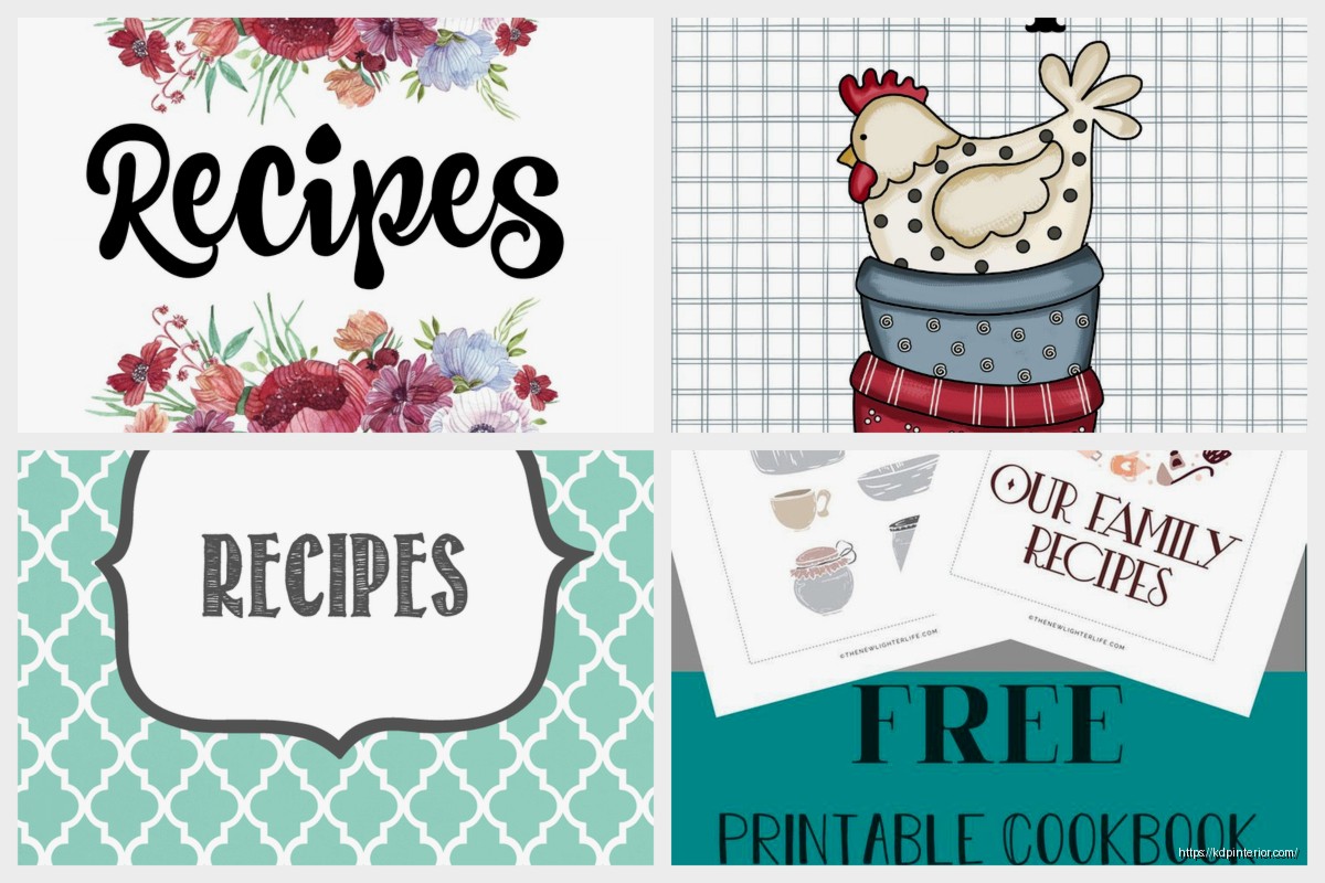
DISCOVER OUR FREE BEST SELLING PRODUCTS
Editable Canva Lined Journal: Express Your Thoughts – KDP Template
Lined Pages Journal 120 pages Ready to Upload PDF Commercial Use KDP Template 6×9 8.5×11 5×8 for Notebooks, Diaries, Low Content
Lined Pages Journal 120 pages Ready to Upload PDF Commercial Use KDP Template 6×9 8.5×11 5×8 for Notebooks, Diaries, Low Content
Cute Dogs Coloring Book for Kids | Activity Book | KDP Ready-To-Upload
Daily Planner Diary : Diary Planners for Everyday Productivity, 120 pages, 6×9 Size | Amazon KDP Interior
Wolf Coloring KDP interior For Adults, Used as Low Content Book, PDF Template Ready To Upload COMMERCIAL Use 8.5×11"
Coloring Animals Head Book for Kids, Perfect for ages 2-4, 4-8 | 8.5×11 PDF
Printable Blank Comic Book Pages PDF : Create Your Own Comics – 3 Available Sizes
Notes KDP interior Ready To Upload, Sizes 8.5×11 6×9 5×8 inch PDF FILE Used as Amazon KDP Paperback Low Content Book, journal, Notebook, Planner, COMMERCIAL Use
Black Lined Journal: 120 Pages of Black Lined Paper Perfect for Journaling, KDP Notebook Template – 6×9
Student Planner Journal 120 pages Ready to Upload PDF Commercial Use KDP Template 6×9" 8.5×11" for Low Content book
Recipe Journal Template – Editable Recipe Book Template, 120 Pages – Amazon KDP Interior