-
×
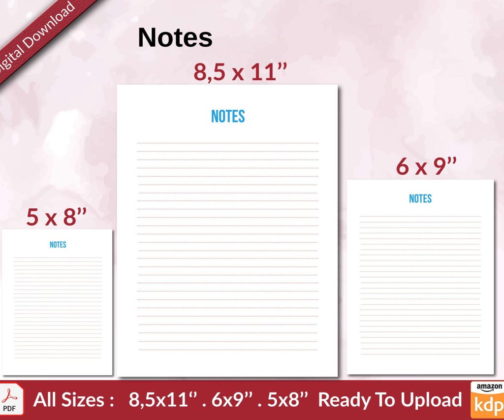 Notes KDP interior Ready To Upload, Sizes 8.5x11 6x9 5x8 inch PDF FILE Used as Amazon KDP Paperback Low Content Book, journal, Notebook, Planner, COMMERCIAL Use
2 × $0.00
Notes KDP interior Ready To Upload, Sizes 8.5x11 6x9 5x8 inch PDF FILE Used as Amazon KDP Paperback Low Content Book, journal, Notebook, Planner, COMMERCIAL Use
2 × $0.00
Subtotal: $0.00
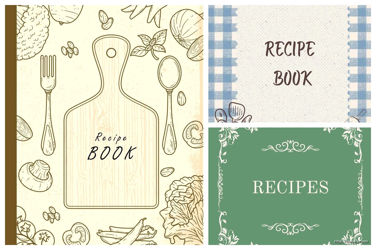
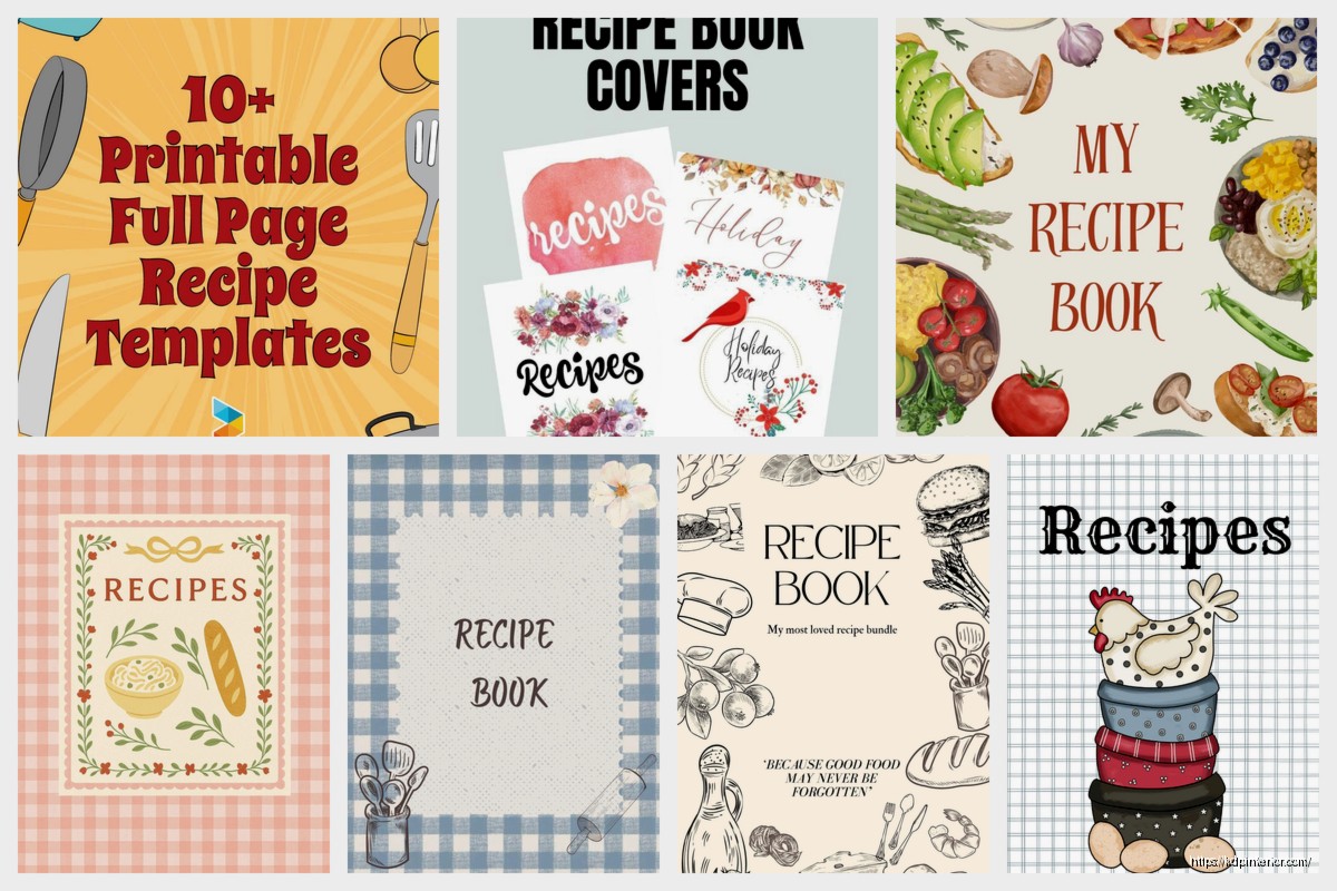
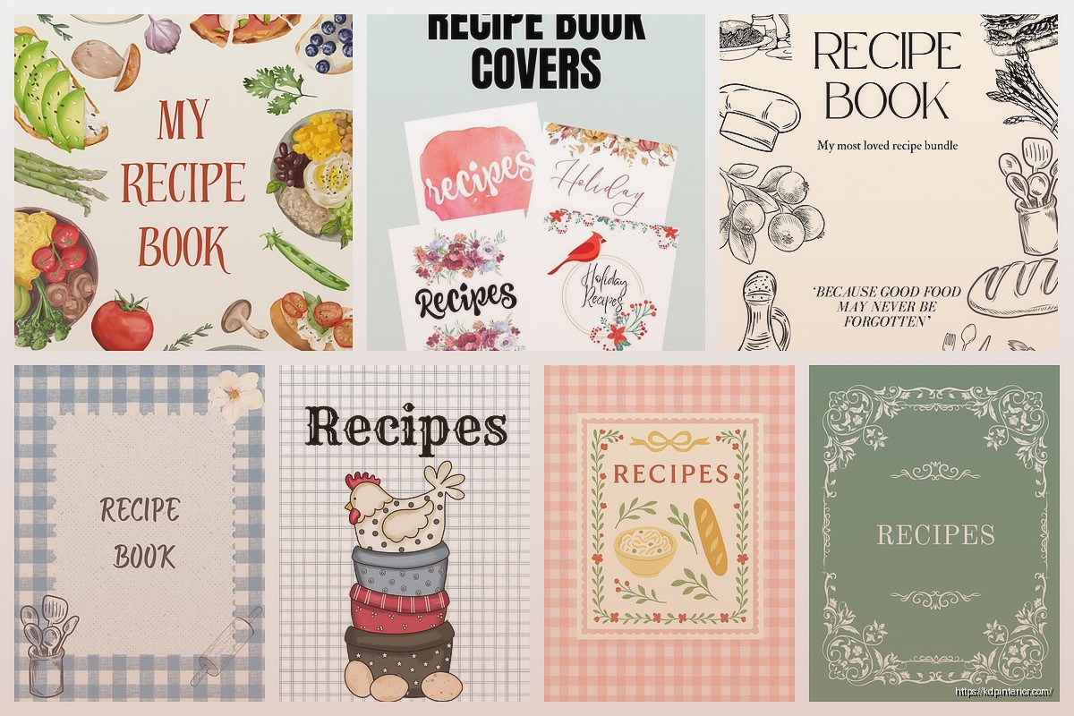
Okay so I just finished designing like three recipe book covers last week and here’s what actually works when you’re putting together a template for cookbook front pages…
The biggest mistake I see people making is they jump straight into Canva or whatever design tool and start slapping clipart everywhere. Don’t do that yet. First thing you gotta figure out is what kind of cookbook you’re making because a dessert cookbook cover looks totally different from like a keto meal prep book or whatever.
So Amazon KDP is gonna be your main platform probably and they’re pretty specific about dimensions. For a standard cookbook you’re looking at 8.5 x 11 inches which is the most popular size. The full cover template though… this is where people get confused. You need the front cover, the spine, and the back cover all in one file when you upload. Amazon has this cover calculator tool that’ll give you exact dimensions based on your page count.
Wait I forgot to mention – add like 0.125 inches bleed on all sides. That’s the safety zone where nothing important should go because it might get trimmed off. I learned this the hard way when my first cookbook cover had the title cut off slightly and I had to redo the whole thing.
Your images need to be 300 DPI minimum. I see so many people use like 72 DPI images they grabbed from Google and then wonder why their covers look blurry when printed. It’s always the resolution. Always.
Alright so you need these things and honestly not much else if you want it to look professional:
That’s it. People try to cram too much stuff on there and it ends up looking like a MySpace page from 2005.
Okay so fonts… you want maybe two fonts max. Three if you’re really confident but I’d stick with two. Usually I go with a decorative or script font for the title and then a clean sans-serif for everything else.
For cookbook titles specifically these font styles work really well: brush scripts for casual cooking, elegant serifs for fancy cuisine or baking books, bold sans-serifs for diet or fitness cookbooks. I was watching The Bear the other night actually and noticed how their food styling had this like… intentional messiness that translates well to modern cookbook covers too.
The title should be readable as a thumbnail because that’s how 90% of people will first see your book on Amazon. I test this by shrinking my cover down to like 500 pixels wide and if I can’t read the title clearly it’s not gonna work.
So you got three main approaches here and each one works for different cookbook types.
Food photography is what most people think of. Get high quality images – either take them yourself with good lighting or buy stock photos from places like Adobe Stock or Shutterstock. The free sites like Unsplash can work but everyone uses the same photos so your cover might look identical to someone else’s.
When I’m shooting my own food photos for covers I use natural window light and a simple background. My cat keeps trying to jump on the table during photo shoots which is… not helpful but also kinda funny when you’re trying to get that perfect overhead shot of pasta.
Illustrations work better for specific niches – like kids cookbooks or diet books where you want a cleaner less intimidating vibe. You can commission custom illustrations on Fiverr for like $30-100 or use design elements from Creative Market.
Patterns or minimal designs are having a moment right now. Think solid color background with maybe a subtle pattern and just really strong typography. These work great for niche cookbooks where you’re targeting a specific audience who already knows what they want.
Different colors make people feel different ways about food which sounds obvious but you gotta be intentional about it.
Red and orange make people hungry – literally there’s science behind this. That’s why fast food places use these colors. For cookbooks these work great for comfort food, BBQ, Italian, anything hearty.
Green signals healthy, fresh, organic. Every vegan and clean eating cookbook uses green for a reason.
White or cream backgrounds with pops of color look sophisticated and work for baking books or elevated cuisine.
Dark backgrounds (black, navy, dark gray) can look really elegant for fine dining cookbooks or cocktail recipe books.
I tested this with two versions of the same cookbook cover last month – one with a red background and one with green. The red version got like 40% more clicks in my Amazon ads. Same book, same title, just different color.
Your text needs to contrast with your background image. This seems obvious but I see so many covers where the title is like light yellow on a light background and you literally cannot read it.
Easy fix: add a semi-transparent overlay between your background image and your text. Just a dark rectangle at like 30-50% opacity can make your white text totally readable. Or go the opposite way with a light overlay and dark text.
Okay so let’s say you’re using Canva because it’s easiest for most people. Here’s my actual process:
First create a custom dimension – 8.5 x 11 inches for just the front cover (or whatever size you picked). Set up your bleed zones using guides.
Drop in your background – either a photo, pattern, or solid color. This is your base layer.
Add your title text. Position it in the top third or center depending on your design. Make it BIG. Like bigger than you think it should be. Then maybe make it slightly smaller but not much.
Add your subtitle or description if you have one. This should be way smaller than your title but still readable.
Author name goes usually at the bottom. Don’t make this huge – nobody’s buying your cookbook because of your name unless you’re already famous.
If you’re using food photos add them now. I usually do a large central image or a collection of 3-4 smaller images arranged nicely.
Oh and another thing – leave some breathing room. Empty space is good. Your cover doesn’t need to be packed with stuff.
If you don’t wanna design from scratch there are pre-made templates everywhere. Canva has a bunch of free cookbook cover templates. Creative Market sells template bundles for like $20-40. Book Bolt has templates specifically for KDP dimensions.
I use templates as starting points and then customize them because otherwise your cover looks exactly like everyone else’s. Change the colors, swap the fonts, use your own images. The template just gives you the layout structure which honestly is the hardest part.
If design really isn’t your thing you can hire someone on Fiverr or Upwork. I’ve paid anywhere from $50 to $300 for cookbook covers depending on complexity. The cheap ones are usually template-based with minor customization. The expensive ones involve custom photography or illustration.
Make sure whoever you hire understands KDP requirements and can deliver print-ready files with bleed. I’ve had designers send me files in the wrong dimensions and then getting revisions takes forever.
This is gonna sound weird but print your cover out on regular paper before you finalize it. Colors look different on screen vs printed. I’ve had covers that looked amazing on my monitor but when printed the colors were way too dark.
Also do the thumbnail test I mentioned earlier. Your cover needs to work at small sizes.
Show it to people who’d actually buy the book – don’t ask your mom because she’ll say it’s great no matter what. Ask people in Facebook groups related to your cookbook topic.
When you’re ready to upload you need a PDF or JPG file. I usually export as PDF because it preserves quality better. Make sure all fonts are embedded or converted to outlines so they don’t get substituted with random fonts during upload.
Color mode needs to be CMYK for print, not RGB. This is important because RGB colors don’t translate directly to print and your colors might look totally different when the book arrives.
The spine width calculation is based on page count and paper type – cream paper is thicker than white paper so your spine needs to be wider. Amazon’s cover calculator handles this math for you thankfully.
Using too many fonts – stick with two maybe three.
Text that’s too small – remember the thumbnail view.
Low resolution images – nothing under 300 DPI.
Ignoring genre conventions – look at bestselling cookbooks in your category and notice patterns. If every keto cookbook has a dark background and yours is bright pink… you’re confusing your target audience.
Spelling errors in the title – I’ve done this and it’s embarrassing. Proofread everything.
Not checking the safe zone – important elements too close to the edge might get trimmed.
Forgetting the back cover – it needs design too even though people focus on the front.
Adobe InDesign is what professionals use but it’s got a learning curve and costs money monthly. Adobe Photoshop works too if you’re comfortable with layers.
GIMP is free and works similar to Photoshop but the interface is clunky.
Book Brush is specifically for book covers and has KDP templates built in.
Affinity Designer or Publisher are one-time purchase alternatives to Adobe stuff.
Honestly though for most people doing low-content or simple cookbooks Canva is totally fine. I still use it for like 60% of my covers because it’s fast.
The key thing with any of these tools is learning layers and how to organize your design elements. Keep your text on separate layers from your images so you can adjust things easily.
Look I’m not gonna tell you that cover design is easy because it’s not really, but it’s also not as hard as people make it out to be. Start with templates, study what’s already selling in your category, and don’t overthink it. Your first cover probably won’t be perfect and that’s fine – you can always update it later if the book isn’t selling.
The recipe book market on KDP is pretty saturated so your cover needs to stand out while still looking like it belongs in the category. That balance is tricky but once you figure out your style you can replicate it across multiple books pretty quickly.
DISCOVER OUR FREE BEST SELLING PRODUCTS
Editable Canva Lined Journal: Express Your Thoughts – KDP Template
Lined Pages Journal 120 pages Ready to Upload PDF Commercial Use KDP Template 6×9 8.5×11 5×8 for Notebooks, Diaries, Low Content
Lined Pages Journal 120 pages Ready to Upload PDF Commercial Use KDP Template 6×9 8.5×11 5×8 for Notebooks, Diaries, Low Content
Cute Dogs Coloring Book for Kids | Activity Book | KDP Ready-To-Upload
Daily Planner Diary : Diary Planners for Everyday Productivity, 120 pages, 6×9 Size | Amazon KDP Interior
Wolf Coloring KDP interior For Adults, Used as Low Content Book, PDF Template Ready To Upload COMMERCIAL Use 8.5×11"
Coloring Animals Head Book for Kids, Perfect for ages 2-4, 4-8 | 8.5×11 PDF
Printable Blank Comic Book Pages PDF : Create Your Own Comics – 3 Available Sizes
Notes KDP interior Ready To Upload, Sizes 8.5×11 6×9 5×8 inch PDF FILE Used as Amazon KDP Paperback Low Content Book, journal, Notebook, Planner, COMMERCIAL Use
Black Lined Journal: 120 Pages of Black Lined Paper Perfect for Journaling, KDP Notebook Template – 6×9
Student Planner Journal 120 pages Ready to Upload PDF Commercial Use KDP Template 6×9" 8.5×11" for Low Content book
Recipe Journal Template – Editable Recipe Book Template, 120 Pages – Amazon KDP Interior