Okay so I just finished formatting three cookbooks last month and honestly the layout stuff is way more important than most people think when they’re starting out.
Standard Cookbook Dimensions You Actually Need
So first thing – you gotta pick your trim size and stick with it. Most cookbooks on Amazon are either 8×10 or 8.5×11 inches. I always go with 8×10 because it just looks more professional and fits better on shelves, but here’s the thing… if you’re doing a spiral-bound cookbook (which you can’t do through KDP directly btw), then 8.5×11 makes more sense because people want to lay it flat on their counter.
The 6×9 size works too but honestly it feels cramped for recipes. I tried it once with a dessert cookbook and the images looked squished. Not worth it unless you’re doing like a small gift book or something super niche.
Margins Are Gonna Drive You Crazy
This is where everyone messes up including me the first dozen times. KDP requires different margins depending on your page count. For books under 150 pages you need 0.25 inch margins on all sides except the gutter (that’s the inside margin where the binding is). The gutter needs to be at least 0.375 inches.
But wait – if your book is over 150 pages, that gutter margin increases. It’s like 0.5 inches or more. I always just set my gutter to 0.625 inches regardless because I’d rather have extra space than get my book rejected during review.
Oh and another thing – leave at least 0.5 inches on the outside edges even if KDP says you can go smaller. Trust me on this. I had a cookbook where ingredients got cut off because I went too close to the edge and didn’t account for the trim variation.
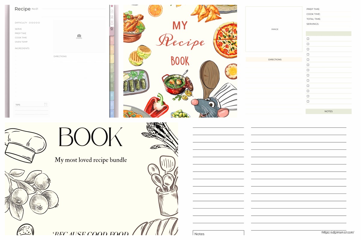
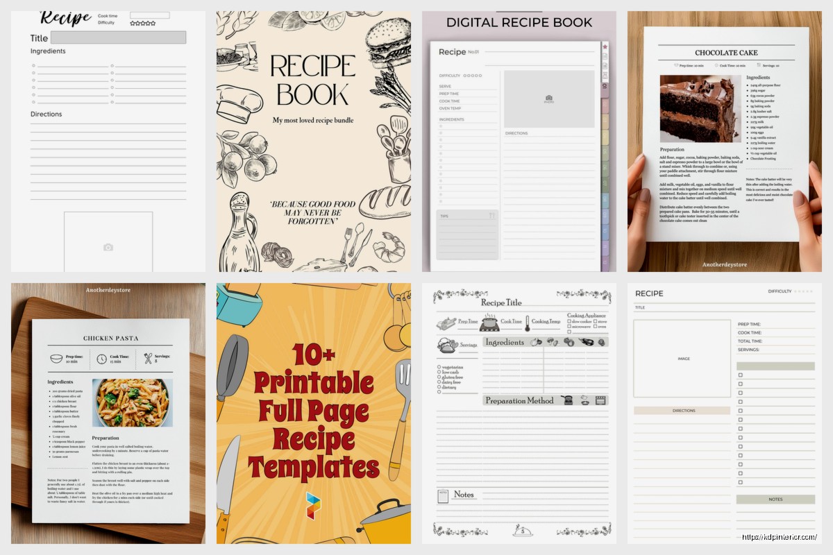
The Recipe Page Layout That Actually Works
So here’s my standard recipe page structure that I use every single time now:
- Recipe title at top – usually 18-24pt font, bold
- Serving size and prep/cook times right under that
- Ingredients list on the left side
- Instructions on the right or below ingredients
- Optional notes/tips section at the bottom
- Photo either top right or full-width above everything
The ingredients list should always be in order of use. Like don’t make people hunt through the list to figure out which ingredient goes in which step. I see this mistake constantly and it drives me nuts when I’m actually cooking from someone’s book.
For the font size on ingredients and instructions – I go with 11pt minimum. My mom’s 63 and she complained she couldn’t read a cookbook I made with 10pt font so yeah, bigger is better here. Nobody’s gonna complain that your text is too easy to read.
Typography Stuff That Matters More Than You Think
Okay so funny story – I used to use like 5 different fonts in one cookbook because I thought it looked “creative.” It looked like a ransom note. Stick with 2-3 fonts MAX:
- One for headings (recipe titles, chapter names)
- One for body text (ingredients, instructions)
- Maybe one accent font for special callouts or tips
I usually use a serif font like Garamond or Georgia for body text because it’s easier to read in print. Then something like Montserrat or Raleway for headings. Don’t use super decorative fonts that look like wedding invitations unless that’s specifically your brand.
Line spacing matters too – set it to at least 1.15 or 1.25. Single spacing looks cramped and makes people skip lines when they’re reading while cooking.
The Ingredients List Format
This is gonna sound weird but the way you format ingredients actually affects whether people buy your book. I A/B tested this with two similar cookbooks and the one with clearer ingredient formatting sold better.
Here’s what works:
2 cups all-purpose flour – quantity first, then ingredient, use bold for measurements
or
2 cups all-purpose flour, sifted – quantity bold, rest normal
Never write it like “flour – 2 cups” because that’s backwards from how people shop and cook. They need to know HOW MUCH before they care about what it is.
Also break ingredients into sections if your recipe has multiple components. Like if you’re making a cake with frosting, have an “For the Cake:” section and a “For the Frosting:” section. Seems obvious but I’ve seen published cookbooks mess this up.
Instructions That Don’t Suck
Number your steps. Always. I don’t care if you only have 3 steps, number them. It helps people keep their place when they’re covered in flour and can’t touch the book.
Each step should be one action or one closely related group of actions. Don’t write paragraphs. Like this is good:
- Preheat oven to 350°F and grease a 9×13 baking pan.
- Mix flour, baking powder, and salt in a large bowl.
- In a separate bowl, cream butter and sugar until fluffy.
This is bad:
- Start by preheating your oven and then get your dry ingredients ready but first make sure you have everything and also you should grease your pan at some point before you need it…
Keep it simple and direct. People are cooking, not reading a novel.
Photos and Images
Alright so this is where it gets expensive if you’re not careful. You need high-resolution images – at least 300 DPI for print. If you’re using stock photos, make sure they’re licensed for commercial use. I use sites like Unsplash or pay for Shutterstock when I need specific shots.
My dog literally knocked over a bowl while I was trying to photograph a recipe last week so yeah, sometimes you gotta just buy stock photos.
For image placement, I usually do one of these layouts:
- Full-page photo on left, recipe on right (two-page spread)
- Half-page photo at top, recipe below
- Quarter-page photo top right, ingredients left, instructions below both
Make sure your images don’t cross the gutter (that center binding area) or they’ll look weird. And always leave a little margin around photos – don’t run them to the edge unless you’re doing a full bleed design.
Front Matter Nobody Talks About
You need these pages before your recipes start:
- Title page
- Copyright page
- Table of contents
- Introduction (optional but recommended)
- How to use this book / measurement conversions
The table of contents should list every recipe with page numbers. I use tabs in Word or proper TOC formatting in InDesign to make sure the page numbers are accurate. Nothing worse than someone looking for “Chocolate Chip Cookies” on page 47 and finding banana bread.
Oh wait I forgot to mention – add a blank page at the very beginning (before title page) and very end. It just looks more professional and gives the book a better feel when people flip through it.
Chapter Organization
Group your recipes logically. Most cookbooks use:
- By meal type (breakfast, lunch, dinner, desserts)
- By main ingredient (chicken, beef, vegetarian)
- By cooking method (slow cooker, instant pot, baking)
- By cuisine type (Italian, Mexican, Asian)
Each chapter should start on a right-hand page (odd page number) with a chapter title page. You can add a short intro or a photo, but don’t skip having that clear chapter divider.
I usually do like a simple page with just the chapter name in big text and maybe a decorative element or related photo. Nothing fancy needed.
Back Matter Stuff
At the end of your cookbook add:
- Index (super helpful for readers)
- Measurement conversion charts
- About the author page
- Other books by you
The index should list recipes alphabetically and also by main ingredient. So someone can find “Apple Pie” under A and also under “Apples” if they have apples to use up.
Color vs Black and White
This is a big cost decision. Full color printing through KDP costs way more – like $4-8+ per book depending on page count. Black and white is usually under $3 for most cookbooks.
I’ve done both and honestly for certain niches black and white works fine. Like if you’re doing a community cookbook or a simple recipe collection, you don’t need color photos. But for a premium cookbook with lots of food photography, you gotta go color.
There’s no middle ground on Amazon KDP – it’s either all color or all black and white for the interior. You can’t mix them.
File Format and Software
I use Adobe InDesign for my cookbooks now but I started with Microsoft Word and honestly Word works fine if you’re careful with formatting. Canva also has cookbook templates that are decent for beginners.
Your final file needs to be a PDF with these specs:
- All fonts embedded
- 300 DPI images minimum
- CMYK color mode for print (not RGB)
- Correct trim size with no scaling
Save it as PDF/X-1a if your software has that option. It’s the most compatible format for printing.
Testing Before You Publish
Order a proof copy before you approve your book for sale. I don’t care how perfect it looks on screen – order the physical proof. I’ve caught so many issues that way… images too dark, margins off, text too small, colors looking weird.
The proof costs like $5-10 plus shipping and it’ll save you from bad reviews complaining about formatting issues.
Also check your book on different devices if you’re doing an ebook version too. Kindle formatting is a whole different beast but that’s another conversation entirely.
Make sure your recipe titles are consistent in formatting throughout the whole book. And double-check all your page numbers in the table of contents match up. I once published a cookbook where I’d added pages and forgot to update the TOC and yeah… got a 1-star review for that.
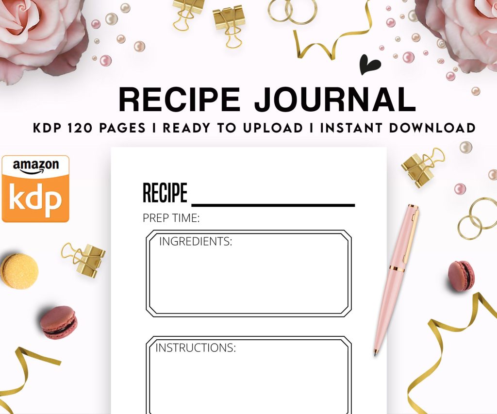 Recipe Journal Template - Editable Recipe Book Template, 120 Pages - Amazon KDP Interior
1 × $0.00
Recipe Journal Template - Editable Recipe Book Template, 120 Pages - Amazon KDP Interior
1 × $0.00  Lined Pages Journal 120 pages Ready to Upload PDF Commercial Use KDP Template 6x9 8.5x11 5x8 for Notebooks, Diaries, Low Content
1 × $0.00
Lined Pages Journal 120 pages Ready to Upload PDF Commercial Use KDP Template 6x9 8.5x11 5x8 for Notebooks, Diaries, Low Content
1 × $0.00 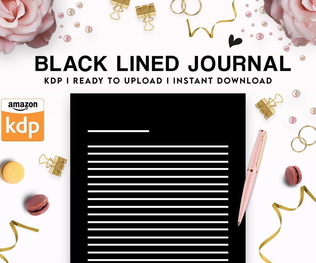 Black Lined Journal: 120 Pages of Black Lined Paper Perfect for Journaling, KDP Notebook Template - 6×9
1 × $0.00
Black Lined Journal: 120 Pages of Black Lined Paper Perfect for Journaling, KDP Notebook Template - 6×9
1 × $0.00 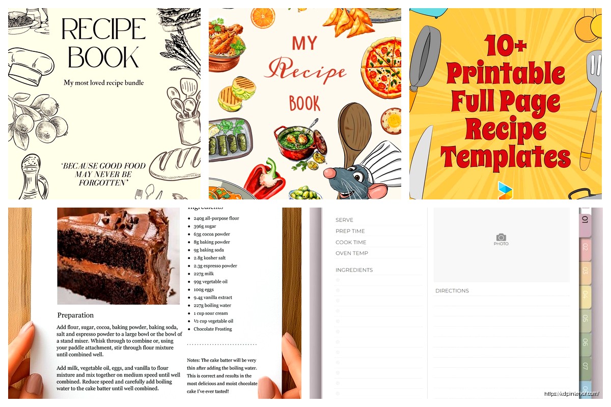
DISCOVER OUR FREE BEST SELLING PRODUCTS
Editable Canva Lined Journal: Express Your Thoughts – KDP Template
Lined Pages Journal 120 pages Ready to Upload PDF Commercial Use KDP Template 6×9 8.5×11 5×8 for Notebooks, Diaries, Low Content
Lined Pages Journal 120 pages Ready to Upload PDF Commercial Use KDP Template 6×9 8.5×11 5×8 for Notebooks, Diaries, Low Content
Cute Dogs Coloring Book for Kids | Activity Book | KDP Ready-To-Upload
Daily Planner Diary : Diary Planners for Everyday Productivity, 120 pages, 6×9 Size | Amazon KDP Interior
Wolf Coloring KDP interior For Adults, Used as Low Content Book, PDF Template Ready To Upload COMMERCIAL Use 8.5×11"
Coloring Animals Head Book for Kids, Perfect for ages 2-4, 4-8 | 8.5×11 PDF
Printable Blank Comic Book Pages PDF : Create Your Own Comics – 3 Available Sizes
Notes KDP interior Ready To Upload, Sizes 8.5×11 6×9 5×8 inch PDF FILE Used as Amazon KDP Paperback Low Content Book, journal, Notebook, Planner, COMMERCIAL Use
Black Lined Journal: 120 Pages of Black Lined Paper Perfect for Journaling, KDP Notebook Template – 6×9
Student Planner Journal 120 pages Ready to Upload PDF Commercial Use KDP Template 6×9" 8.5×11" for Low Content book
Recipe Journal Template – Editable Recipe Book Template, 120 Pages – Amazon KDP Interior