Okay so I just redesigned three cookbooks last month and the layout thing is honestly where most people screw up their whole project. Like you can have amazing recipes but if the layout’s a mess nobody’s gonna use it.
First thing – margins matter way more than you think. I was watching The Bear while working on this Italian cookbook and almost forgot to adjust my inside margins and that would’ve been a disaster. You need at least 0.75 inches on all sides for KDP but honestly I go with 1 inch on the binding side because people need to actually lay the book flat while cooking. Outside margins can be 0.5 but don’t go smaller or Amazon might reject it.
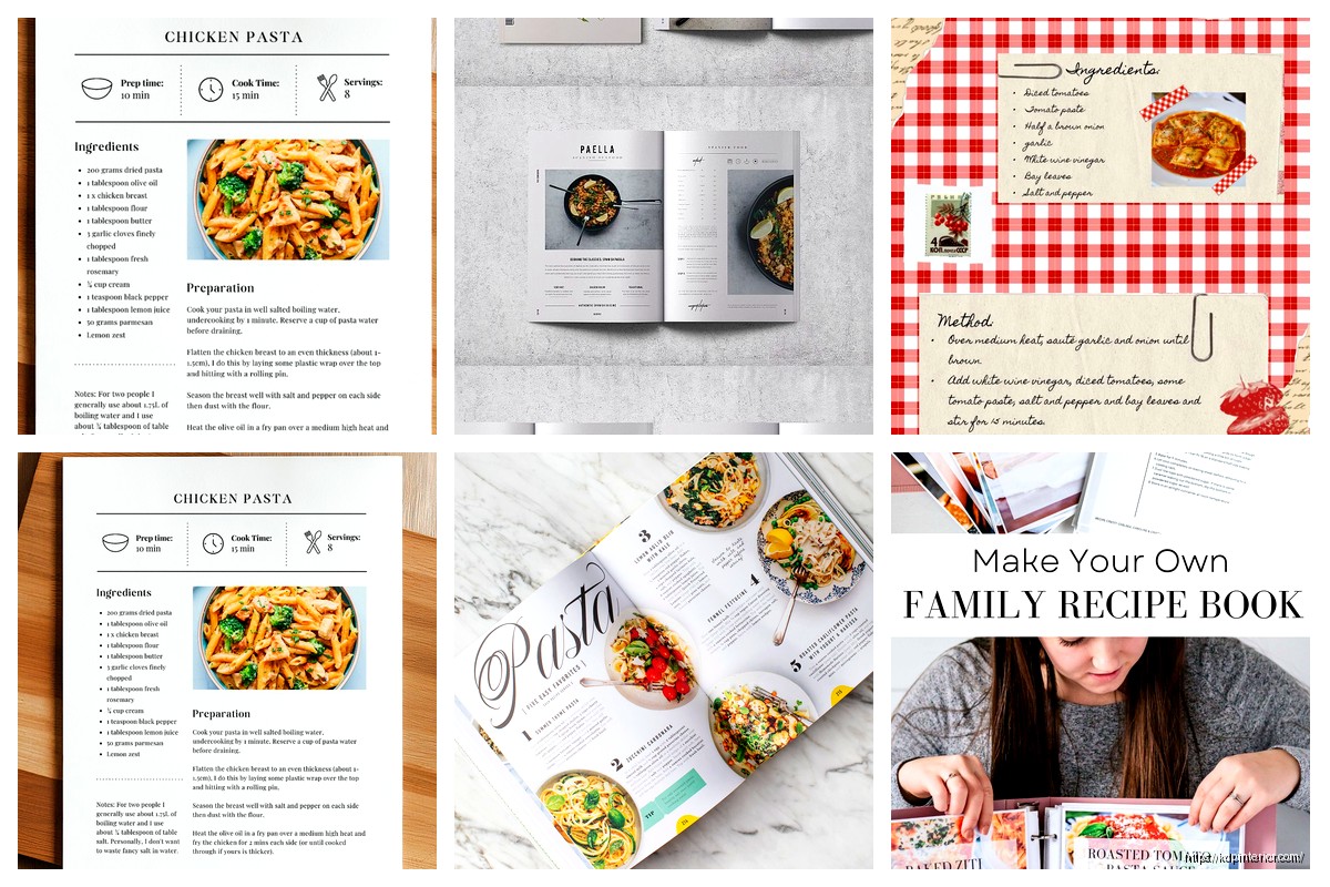
The ingredient list placement is where I see people mess up constantly. You’ve got two real options here – either run it vertically down the left side of the page or put it in a box at the top. I tested both formats with my Mediterranean cookbook and the left-side layout performed better in reviews. People said it was easier to reference while cooking. Makes sense right because you’re not constantly scrolling or flipping back up.
Font choices are gonna make or break the readability. I use Crimson Text or Libre Baskerville for body text because they’re free Google fonts and super readable at 11pt. For headings I’ll go with Montserrat or Raleway, something clean and modern. Don’t get cute with script fonts for ingredients – I tried that once and got roasted in reviews. Someone literally said “I can’t read this while my hands are covered in flour” and they were right.
Oh and another thing about fonts – keep it to two font families max. One for headings and one for body. I see people using like four different fonts and it looks like a ransom note. Your recipe title might be 18pt bold, section headers 14pt, ingredients 11pt, and instructions 11pt. That’s it.
Line spacing needs to be at least 1.15 for the instructions. I learned this the hard way when my first cookbook had 1.0 spacing and people complained it felt cramped. For ingredient lists you can tighten it to 1.0 because they’re short lines anyway. The white space between recipes should be substantial – I usually do a page break between each recipe unless they’re really short then maybe two per page.
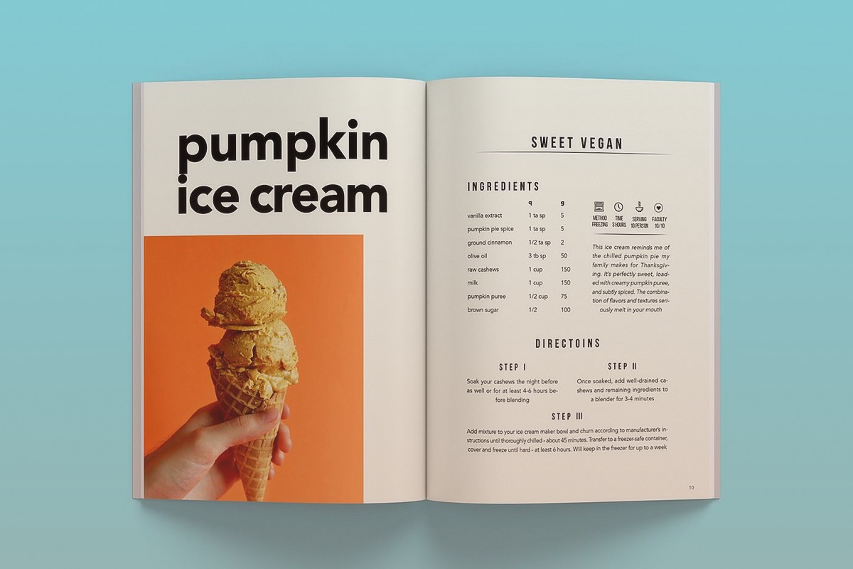
The hierarchy thing is huge. Your recipe title should be the biggest element obviously. Then you might have a little description or headnote in italics. Then ingredients section clearly labeled. Then instructions. Some people add prep time and cook time at the top which is smart – I format those as icons or just bold labels like “Prep: 15 min | Cook: 30 min”
Wait I forgot to mention the whole index situation. You need a good table of contents upfront organized by category. Breakfast, lunch, dinner, desserts whatever makes sense for your book. But also consider an alphabetical index at the back. Takes forever to build but readers love it. I use a two-column layout for indexes to save space.
Images are tricky with KDP because color printing gets expensive fast. If you’re doing full color you gotta decide – one image per recipe or multiple progress shots. I usually do one hero shot of the finished dish positioned either at the top of the page or on the opposite page. Never put the image in the middle of the instructions that’s just annoying. My dog knocked over my ring light during a photo session last week and I had to reshoot like 15 recipes ugh.
For black and white cookbooks skip the photos entirely or just do simple line drawings. I’ve seen some beautiful minimalist cookbooks that use illustrations instead of photos and they work great plus way cheaper to print.
The recipe card layout – this is gonna sound weird but think about how people actually use cookbooks in the kitchen. They’re usually propped up or laying flat on the counter. So important info can’t be in the gutter where the binding is. I keep a 1.5 inch clear zone in the center spread.
Numbering your steps is essential don’t just use paragraphs. People lose their place constantly while cooking. I do bold numbers followed by the instruction. Some designers use a different color for numbers but in black and white that doesn’t help so bold is the way.
Measurements need to be consistent throughout. Pick either US or metric or both. I usually do both in parentheses like “2 cups (475ml)” because it broadens your market. International buyers appreciate it.
Section dividers really help break up the book. I’ll do a full page with just the category name in big text maybe a simple graphic or pattern. It gives readers a mental break and makes navigation easier.
The grid system matters even though nobody talks about it. I work on a 12-column grid in InDesign which lets me do flexible layouts. Sometimes ingredients are 4 columns wide, instructions are 8 columns. Or for a different recipe I might do 5 and 7. Keeps things interesting but still structured.
Headers and footers – put the recipe name or category in the header and page numbers in the footer. Seems basic but you’d be surprised how many cookbooks skip this. Makes it way easier when someone’s trying to find that one recipe they bookmarked.
Oh and speaking of bookmarks consider leaving extra white space at the top of recipe pages so people can actually clip a bookmark there without covering the title. Small thing but thoughtful.
Ingredient grouping is important for complex recipes. If you’ve got multiple components like a cake with frosting, separate them visually. I use subheaders like “For the cake:” and “For the frosting:” in bold or a different color if doing color printing.
The notes section at the bottom of each recipe is clutch. Put substitutions, storage tips, serving suggestions there. I format it in a smaller font 9pt or 10pt maybe in a light gray box to distinguish it from the main recipe.
Bleed settings if you’re doing color – you need 0.125 inches of bleed on all sides. Extend your background colors or images past the trim line or you’ll get white edges when they cut the book. Learned that one the expensive way on my first proof copy.
Gutter margins I mentioned earlier but seriously don’t ignore this. Calculate your book’s spine width based on page count and add extra margin on the inside. For a 200-page cookbook I’m doing 1.25 inches on the binding side minimum.
Typography tricks – use small caps for section labels like INGREDIENTS and INSTRUCTIONS. Looks professional and creates clear visual breaks. All caps is too shouty regular title case doesn’t stand out enough.
Color palette if you’re going color – stick to 2-3 accent colors max. I usually do one main brand color for headers and icons then keep everything else neutral. Too many colors looks chaotic and costs more to print.
Template consistency is key. Once you nail down your recipe layout use it for every single recipe. Don’t get creative and change it up halfway through the book. Readers want predictability in a cookbook.
The cover obviously matters but that’s a whole other conversation. Just make sure your spine text is readable and the back cover has a compelling description plus maybe a few sample recipe names.
Proofing – always order a physical proof before going live. I caught so many issues with my first cookbook that looked fine on screen but were obvious in print. Colors were different text was smaller than I thought margins were off on like three pages.
Trim size standard is usually 8×10 inches for cookbooks but 6×9 works for simpler recipe collections. Bigger is better for cookbooks honestly because people want to see the details and have room for notes.
Okay last thing – export settings matter. For KDP you want PDF/X-1a format RGB for color CMYK is fine too but RGB is simpler. Embed all fonts obviously and make sure your resolution is 300 DPI minimum for any images.
The whole process takes me about 3-4 weeks per cookbook if I’m doing it right. Rushing it always leads to mistakes that you’ll catch after you’ve already published which sucks because then you gotta upload a new version and wait for Amazon to review it again.
 Printable Blank Comic Book Pages PDF : Create Your Own Comics - 3 Available Sizes
1 × $0.00
Printable Blank Comic Book Pages PDF : Create Your Own Comics - 3 Available Sizes
1 × $0.00  Daily Planner Diary : Diary Planners for Everyday Productivity, 120 pages, 6×9 Size | Amazon KDP Interior
1 × $0.00
Daily Planner Diary : Diary Planners for Everyday Productivity, 120 pages, 6×9 Size | Amazon KDP Interior
1 × $0.00 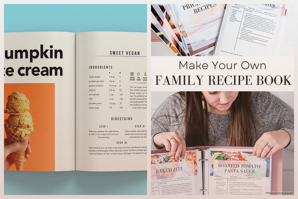
DISCOVER OUR FREE BEST SELLING PRODUCTS
Editable Canva Lined Journal: Express Your Thoughts – KDP Template
Lined Pages Journal 120 pages Ready to Upload PDF Commercial Use KDP Template 6×9 8.5×11 5×8 for Notebooks, Diaries, Low Content
Lined Pages Journal 120 pages Ready to Upload PDF Commercial Use KDP Template 6×9 8.5×11 5×8 for Notebooks, Diaries, Low Content
Cute Dogs Coloring Book for Kids | Activity Book | KDP Ready-To-Upload
Daily Planner Diary : Diary Planners for Everyday Productivity, 120 pages, 6×9 Size | Amazon KDP Interior
Wolf Coloring KDP interior For Adults, Used as Low Content Book, PDF Template Ready To Upload COMMERCIAL Use 8.5×11"
Coloring Animals Head Book for Kids, Perfect for ages 2-4, 4-8 | 8.5×11 PDF
Printable Blank Comic Book Pages PDF : Create Your Own Comics – 3 Available Sizes
Notes KDP interior Ready To Upload, Sizes 8.5×11 6×9 5×8 inch PDF FILE Used as Amazon KDP Paperback Low Content Book, journal, Notebook, Planner, COMMERCIAL Use
Black Lined Journal: 120 Pages of Black Lined Paper Perfect for Journaling, KDP Notebook Template – 6×9
Student Planner Journal 120 pages Ready to Upload PDF Commercial Use KDP Template 6×9" 8.5×11" for Low Content book
Recipe Journal Template – Editable Recipe Book Template, 120 Pages – Amazon KDP Interior