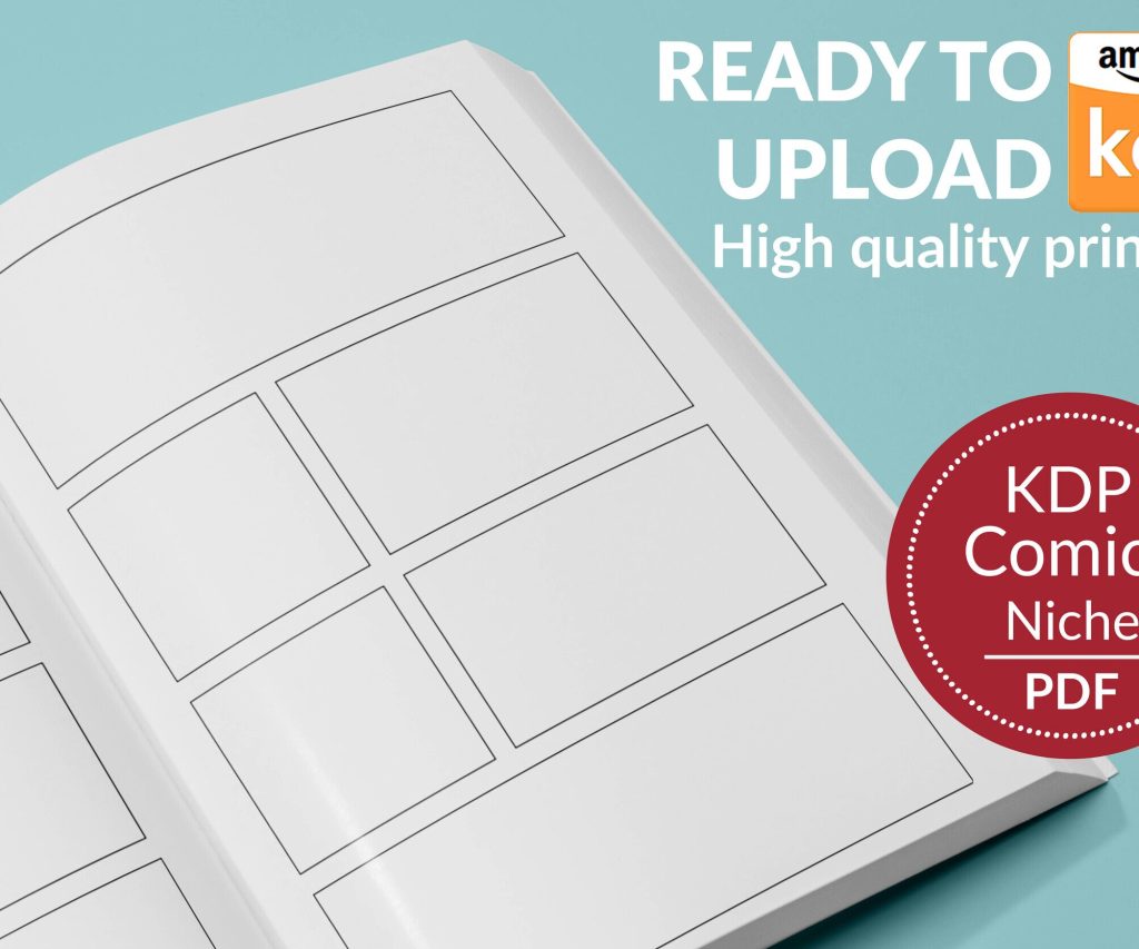
 Printable Blank Comic Book Pages PDF : Create Your Own Comics - 3 Available Sizes
 Subtotal: $0.00
Amazon KDP guide, KDP book publishing
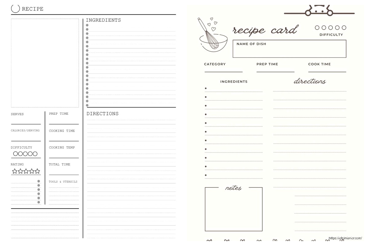
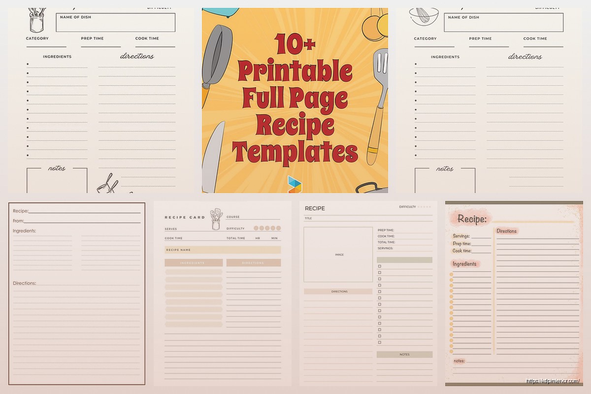
Recipe Book Page Template: Individual Recipe Layout
03
May
May
Okay so I just finished laying out like 15 recipe books last month and honestly the individual recipe page template is where most people completely mess up their whole project. Let me show you what actually works because I’ve tested this with readers who left reviews specifically mentioning the layout.
The Basic Structure That Actually Gets Used
So here’s the thing – you need to start with your recipe title at the top, obviously, but make it like 24-28pt font. I see people going either way too small or making it this massive 48pt thing that eats up a third of the page. You want it visible but not obnoxious. I use Playfair Display or Georgia usually, something that looks kinda cookbook-ish without being too fancy.
Right under the title, you gotta have these key elements in this order:
- Prep time, cook time, total time (people skim for this first)
- Servings/yield
- Difficulty level – but only if it’s actually relevant
I tried putting difficulty level on everything and readers told me it was condescending for simple recipes. Like nobody needs to see “EASY” above a grilled cheese recipe, you know?
The Icon Situation
Oh and another thing – those little icons for time and servings? They’re nice but don’t go overboard. I spent like two days finding the perfect little clock icon and then realized it made the template look cluttered. Simple text labels work fine. If you do use icons, keep them 16-18px max and make sure they’re actually clear at print resolution.
My cat knocked over my coffee right onto my mockup last week and honestly the water damage showed me that simple layouts survive printing issues better than complex ones. Random lesson but there it is.
Ingredients Section Layout
This is where it gets specific. Your ingredients need their own clearly defined space – I use a light background box or a simple border, nothing fancy. The heading should say “Ingredients” in like 16-18pt, bold.
Here’s what I learned after getting feedback on probably 50 recipe books: people want ingredients listed in the order they’re used. Seems obvious but you’d be surprised how many templates group them by type (all dairy together, all spices together). Don’t do that unless it’s specifically a prep-ahead style recipe.
Format them as a simple bulleted list with:
- Amount first (1 cup, 2 tablespoons, whatever)
- Ingredient name
- Any prep notes in parentheses (diced, melted, at room temperature)
The spacing between ingredient lines matters more than you think. I use 1.5 line spacing minimum, sometimes 1.75 if the recipe is short. People are gonna be cooking with this book open on their counter, probably with flour on their hands, squinting at it. Make it readable from 2 feet away.
The Checkbox Hack
Wait I forgot to mention – add little checkboxes next to each ingredient. Just empty squares. Sounds old-school but people LOVE checking off ingredients as they add them. I tested two versions of the same book, one with checkboxes and one without. The checkbox version got way better reviews and people specifically mentioned it in feedback. It’s such a small thing but it makes the book feel more interactive.
Instructions Section That People Actually Follow
Okay so funny story, I was watching that cooking show with the British guy, you know the one, and I realized how he breaks down steps. That’s how your instructions should flow – numbered steps, each one a complete action.
Your instructions section needs:
- Clear “Instructions” or “Directions” heading (same size as Ingredients heading)
- Numbered steps, always numbered not bulleted
- One action per step when possible
- White space between steps
The numbering format I use is just bold numbers followed by a period. Nothing fancy like circles or boxes around the numbers. Keep it clean. Each step should be like 2-3 sentences max. If you’re going longer, break it into two steps.
And here’s something I learned from a reader email – don’t assume knowledge. If something needs to be stirred “constantly,” say constantly. If something should be “golden brown,” say that. I had someone complain that “cook until done” was useless and they were absolutely right.
The Visual Flow Thing
This is gonna sound weird but I literally print out my templates and tape them to my kitchen wall to see if I can follow them while actually cooking. Stand back like 3 feet. Can you see the next step without squinting? Is there enough contrast between the ingredient list and the instructions that you don’t accidentally skip something?
I use slightly different background colors sometimes – like ingredients in a very light gray box (like 5% gray) and instructions on white. Or vice versa. Just enough differentiation that your eye knows where to go next.
The Photo Placement Debate
So this is where everyone has opinions. I’ve tested recipe books with photos and without, and here’s the deal: if you’re gonna include a photo, it needs to be high quality or don’t bother. But for the template itself, you need to decide early.
Three options that work:
- Photo at the top, above the title (takes up like 40% of the page)
- Photo on the opposite page in a two-page spread layout
- No photo, just a decorative element or border
The full-page photo on the opposite page thing is my favorite for premium recipe books. You get the whole left page as a beauty shot, right page is all the actual recipe info. Looks professional, easy to reference while cooking.
But if you’re doing a budget book or something simple, skip the photos entirely and use that space for bigger text and more white space. Seriously, white space sells. I know it feels like wasted space but cramming everything together makes people’s eyes glaze over.
Additional Elements That Actually Add Value
Okay so beyond the basics, here’s what I include on individual recipe pages:
Notes section: Just a small area at the bottom labeled “Notes” or “Chef’s Tips” with 3-4 lines. People write substitutions here, their own modifications, whatever. Leave it blank in the template.
Nutrition info: Only if you’re actually calculating it properly. Don’t just make up numbers. If you can’t do accurate nutrition facts, skip this entirely. Half-assed nutrition info is worse than none.
Tags or categories: Little indicators like “Vegetarian” or “Quick & Easy” or “Kid-Friendly” – keep these small, maybe in the header area. I use small text or subtle icons.
Difficulty rating: If you include this, use something visual but simple. I like 1-3 spoons or chef hats, not the 5-star thing that looks like Amazon reviews.
The Margins You’re Probably Getting Wrong
This is critical for KDP printing – your margins need to account for the gutter (where the book binds). I use:
- Inside margin (gutter side): 0.75-1 inch minimum
- Outside margin: 0.5 inches
- Top margin: 0.75 inches
- Bottom margin: 0.75 inches
These are bigger than you think you need but trust me, you don’t want recipe text disappearing into the spine. I’ve had to reformat entire books because I went too tight on the inside margin.
Font Choices That Don’t Suck
People overthink this but here’s what works: one serif font for titles and headings, one sans-serif for body text. Or all serif if it’s a traditional cookbook vibe. Just don’t mix more than two fonts.
My go-to combinations:
- Playfair Display (titles) + Open Sans (body)
- Crimson Text (titles) + Lato (body)
- All Georgia if I’m feeling classic
Body text should be 11-12pt minimum. I usually go with 12pt because again, people are reading this while cooking. Their glasses might be in the other room. Make it easy.
The Template Grid System
Wait I should’ve mentioned this earlier – you need a grid system or your pages will look inconsistent. I use a simple 2-column or 3-column grid in InDesign or whatever layout software you’re using.
Typically my grid is:
- Title spans full width
- Meta info (time, servings) in top section, maybe 2 columns
- Ingredients take up left column or top half
- Instructions take up right column or bottom half
- Notes section at the very bottom, full width
The grid keeps everything aligned even when recipes are different lengths. Short recipes don’t look lost on the page, long recipes don’t feel cramped.
Dealing with Different Recipe Lengths
This is tricky – some recipes fit on one page, others need two or even three. Your template needs to handle both. I create two master templates:
Single-page template: Everything fits on one page, compact but readable. For recipes with like 8 ingredients or fewer and simple instructions.
Multi-page template: Designed to flow across pages. Title and ingredients on first page, instructions continue on the next. Or title and photo on page one, everything else on page two.
The key is consistency. Don’t randomly switch formats halfway through your book. Pick a system and stick with it.
Software-Specific Tips
If you’re using InDesign (which I recommend), set up your template as a master page. Then each individual recipe is just filling in the master page elements. Saves so much time.
For Canva users – yeah you can make recipe books in Canva but it’s gonna be tedious. You’ll need to manually copy your template for each recipe. Not ideal but doable for smaller books. Just make sure you’re working at 300 DPI and the right trim size from the start.
Word or Google Docs? Honestly, it’s rough for complex layouts but if you’re doing basic text-only recipes, you can make it work. Use tables to create structure and keep things aligned. Not my first choice though.
Testing Your Template Before You Fill It
Before you create 50 or 100 recipes with your template, test it with like 5-10 varied recipes. Short ones, long ones, ones with weird ingredient lists. See what breaks. I guarantee something will look off and you’ll need to adjust.
Print one or two pages actual size. Look at them in real lighting. Show them to someone who cooks. Get actual feedback before you commit to the whole book.
I skipped this step on my second recipe book and ended up redoing like 30 pages because the instructions section was too cramped. Learn from my mistakes.
Okay that’s basically everything I’ve learned about recipe page templates through way too many iterations and customer complaints. The main thing is just keep it clean, keep it readable, and actually test it with real recipes before you go all in.
DISCOVER OUR FREE BEST SELLING PRODUCTS
Editable Canva Lined Journal: Express Your Thoughts – KDP Template
Lined Pages Journal 120 pages Ready to Upload PDF Commercial Use KDP Template 6×9 8.5×11 5×8 for Notebooks, Diaries, Low Content
Lined Pages Journal 120 pages Ready to Upload PDF Commercial Use KDP Template 6×9 8.5×11 5×8 for Notebooks, Diaries, Low Content
Cute Dogs Coloring Book for Kids | Activity Book | KDP Ready-To-Upload
Daily Planner Diary : Diary Planners for Everyday Productivity, 120 pages, 6×9 Size | Amazon KDP Interior
Wolf Coloring KDP interior For Adults, Used as Low Content Book, PDF Template Ready To Upload COMMERCIAL Use 8.5×11"
Coloring Animals Head Book for Kids, Perfect for ages 2-4, 4-8 | 8.5×11 PDF
Printable Blank Comic Book Pages PDF : Create Your Own Comics – 3 Available Sizes
Notes KDP interior Ready To Upload, Sizes 8.5×11 6×9 5×8 inch PDF FILE Used as Amazon KDP Paperback Low Content Book, journal, Notebook, Planner, COMMERCIAL Use
Black Lined Journal: 120 Pages of Black Lined Paper Perfect for Journaling, KDP Notebook Template – 6×9
Student Planner Journal 120 pages Ready to Upload PDF Commercial Use KDP Template 6×9" 8.5×11" for Low Content book
Recipe Journal Template – Editable Recipe Book Template, 120 Pages – Amazon KDP Interior