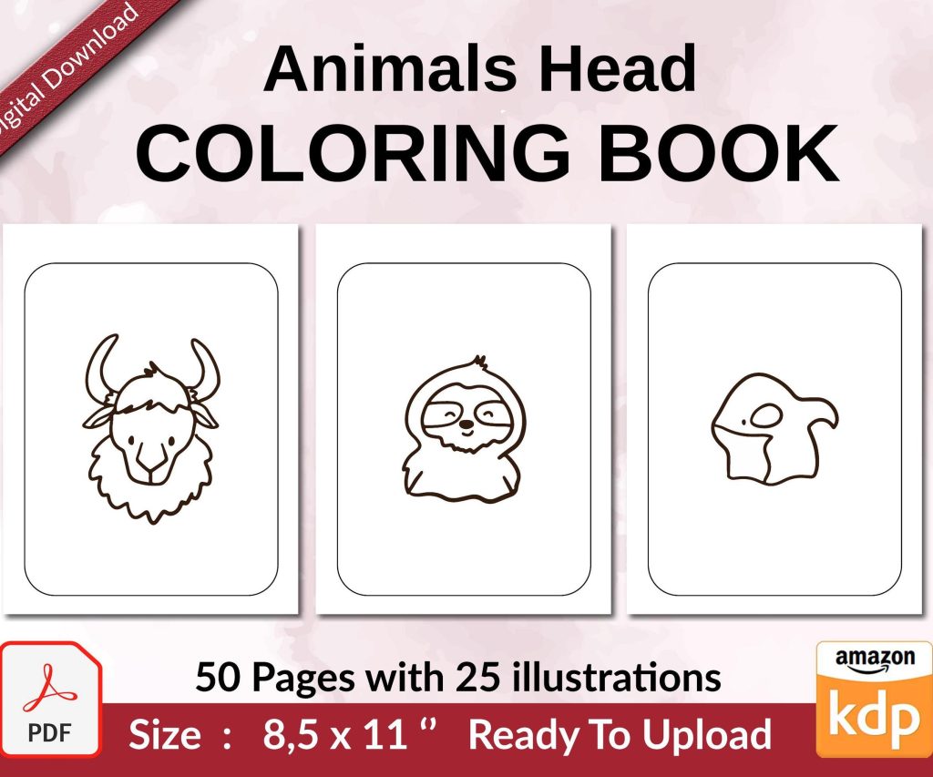
 Coloring Animals Head Book for Kids, Perfect for ages 2-4, 4-8 | 8.5x11 PDF
 Subtotal: $0.00
Amazon KDP guide, KDP book publishing
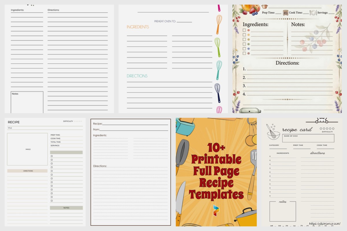
Recipe Template Pages: Cookbook Interior Design
03
May
May
Okay so recipe template pages are basically the backbone of your entire cookbook and I spent like three months testing different layouts before I figured out what actually converts to sales versus what just looks pretty on Canva.
First thing you gotta understand is that people buying cookbooks on Amazon are NOT looking at your interior preview the same way a traditional publisher would. They’re clicking through maybe 4-5 pages max before deciding. So your template needs to work immediately or they’re gone.
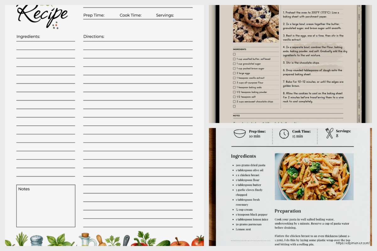
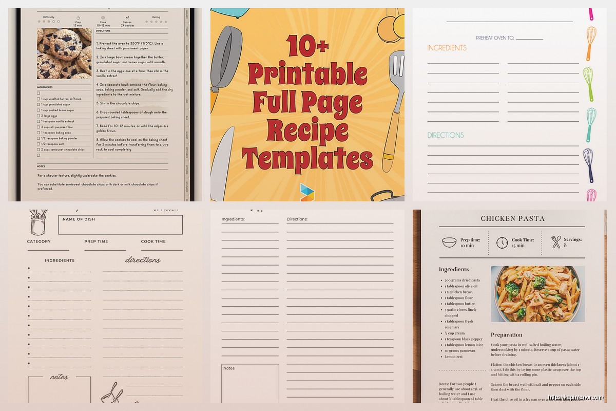
The standard recipe page layout I use now has the recipe title at the top obviously, then I do this thing where I split the page into two columns. Left side gets your ingredients list, right side gets the instructions. This is gonna sound weird but I tested single column layouts for like 20 books and the two-column always performs better in reviews. People mention “easy to follow” way more often.
For the actual template structure you need these sections minimum:
– Recipe title (I use 18-22pt depending on the font)
– Prep time, cook time, total time, servings (people NEED this info upfront)
– Ingredients list with checkboxes (more on this in a sec)
– Instructions numbered clearly
– Space for notes at the bottom
The checkbox thing is critical. I add little empty squares next to each ingredient. Sounds simple but customers mention this feature specifically in reviews all the time. They actually use these cookbooks in the kitchen and they want to check things off. I use a light gray box, maybe 0.5 inches square.
Oh and another thing about ingredients – always align them left, never center. I see so many new publishers centering their ingredient lists because it looks “designed” but it’s actually harder to scan quickly when you’re cooking. Your readers are gonna have flour on their hands trying to find “2 cups sugar” in your list.
For fonts I’m using Crimson Text or Libre Baskerville for body text, around 11-12pt. The title font can be more decorative but keep it readable. I made the mistake on my third cookbook of using this gorgeous script font for recipe titles and got multiple reviews saying they couldn’t read it. Had to reupload the entire interior which was a nightmare because I had already run some ads.
Margins are super important and nobody talks about this enough. Amazon’s bleed requirements are 0.125 inches but I actually go with 0.75 inch margins on all sides for cookbook interiors. You need the extra space because people are propping these books open on counter tops, sometimes in those cookbook stands. If your text is too close to the spine, it’s unreadable when the book is laying flat.
Wait I forgot to mention the most important part – consistency. Your template needs to be EXACTLY the same on every single page. Same spacing, same font sizes, same layout. I use InDesign now but when I started I was doing everything in Canva and I’d accidentally make the prep time section 0.2 inches lower on page 47 than on page 12. Looks unprofessional when someone notices.
The notes section at the bottom should be at least 1 inch of lined space. Some publishers skip this entirely which is insane to me. People want to write “added more garlic” or “kids loved this” or whatever. I use three horizontal lines, light gray, about 0.25 inches apart.
For the actual instructions section, number them clearly. I use a bold number in a circle sometimes, or just bold numbers with a period. The key is making sure each step is its own paragraph with space between. I see people cramming instructions together to save pages and it just makes everything harder to read.
Here’s something I tested last month that made a difference – adding a small icon or symbol next to difficulty level or dietary info. Like a little leaf for vegetarian recipes or a clock icon next to prep time. Very subtle but it helps with visual scanning. I use icons from Noun Project, make sure you get the license if you’re selling the book.
Page count matters for production costs so you’re gonna want to be strategic about your template. If you’re doing a 6×9 inch book (which is standard for cookbooks), you can usually fit one recipe per page comfortably. For 8×10 inch books you have more space obviously. I’ve done both and the 6×9 sells better for some reason, probably because it’s cheaper to produce so I can price it lower.
Oh and the inside margins – the gutter – needs to be slightly larger than your outside margins. I do 0.875 inches on the gutter side, 0.75 on the outside. This compensates for the curve of the spine. If you don’t do this, your text literally disappears into the binding and people will roast you in reviews.
Color versus black and white is a whole thing. Color printing is expensive on KDP. Like REALLY expensive. I only do color interiors if the cookbook is photography-based. For recipe template pages with just text and maybe some decorative elements, black and white is fine. You can add gray tones for visual interest without the color printing costs.
The header and footer situation – I usually put the recipe category in the header (like “DESSERTS” or “MAIN COURSES”) and page numbers in the footer. Keep these small, like 9pt font. They’re wayfinding elements, not focal points. My cat just knocked over my coffee and I’m realizing I haven’t mentioned spacing enough.
Spacing between elements is where most people mess up. Between the title and the time info, I leave 0.3 inches. Between the time info and ingredients, another 0.3 inches. Between ingredients section and instructions, 0.4 inches. This creates visual rhythm and makes the page scannable.
You also need to think about the full page spread when someone opens the book. Left and right pages should feel balanced. I usually put a recipe on the right page and either another recipe or a photo on the left page. Never leave a left page completely blank in the middle of your book, it looks unfinished.
For the ingredients list specifically, use a hanging indent. First line of each ingredient starts at the margin, but if an ingredient wraps to a second line, that second line should be indented about 0.25 inches. This keeps everything clean and organized.
The instructions need breathing room between steps. I do 0.15 inches between each numbered step. Sounds fussy but it matters when someone is trying to follow along while cooking. They need to quickly find “step 3” without hunting through a wall of text.
Something I learned the hard way – test your template by actually printing it. I use Lulu for test prints because they’re cheaper than ordering author copies from Amazon. You’ll catch spacing issues and readability problems that you can’t see on screen. I printed my fourth cookbook template and realized the font was way too small for the margins I’d chosen. Had to redo everything.
Border decorations can work but keep them minimal. A simple line border or corner flourishes are fine. Don’t go crazy with decorative frames on every page because it gets distracting and can make the text feel cramped. I use corner decorations on section divider pages but keep the actual recipe pages clean.
If you’re doing a themed cookbook, your template should reflect that theme subtly. Like for a farmhouse style cookbook I used a rustic sans-serif font and added small wheat illustrations in the corners. For a modern minimalist cookbook, everything was clean lines and lots of white space. But the core template structure stayed the same.
The yield section is important – some recipes serve 4, some serve 12. Make sure this is prominent. I put it right under the title with the timing info. Use clear labels like “Serves: 6” not just “6 servings” because people scan for that specific word.
One more thing about layout – if a recipe is longer and needs more than one page, make sure the page break happens at a logical spot. Never break in the middle of an ingredient list. Always break between the ingredients and instructions, or between instruction steps if you have to. This should be obvious but I’ve seen published cookbooks that break an ingredient list across two pages and it’s infuriating.
For dietary tags or allergen info, I put this in a small text block right under the servings info. Just a line that says “Vegetarian, Gluten-Free” or whatever applies. Keep it simple and scannable.
The actual design software matters less than you’d think. I started in Canva, moved to Affinity Publisher, now use InDesign. They all work fine as long as you’re consistent with your measurements and you export at high enough resolution. Amazon wants 300 DPI minimum for print books.
Okay last thing because I gotta wrap this up – create your template once and save it as a master file. Then duplicate it for each recipe. Don’t recreate the template from scratch every time, you’ll introduce inconsistencies. I have a template file with placeholder text that I just duplicate and fill in for each new recipe. Saves so much time and keeps everything uniform.
DISCOVER OUR FREE BEST SELLING PRODUCTS
Editable Canva Lined Journal: Express Your Thoughts – KDP Template
Lined Pages Journal 120 pages Ready to Upload PDF Commercial Use KDP Template 6×9 8.5×11 5×8 for Notebooks, Diaries, Low Content
Lined Pages Journal 120 pages Ready to Upload PDF Commercial Use KDP Template 6×9 8.5×11 5×8 for Notebooks, Diaries, Low Content
Cute Dogs Coloring Book for Kids | Activity Book | KDP Ready-To-Upload
Daily Planner Diary : Diary Planners for Everyday Productivity, 120 pages, 6×9 Size | Amazon KDP Interior
Wolf Coloring KDP interior For Adults, Used as Low Content Book, PDF Template Ready To Upload COMMERCIAL Use 8.5×11"
Coloring Animals Head Book for Kids, Perfect for ages 2-4, 4-8 | 8.5×11 PDF
Printable Blank Comic Book Pages PDF : Create Your Own Comics – 3 Available Sizes
Notes KDP interior Ready To Upload, Sizes 8.5×11 6×9 5×8 inch PDF FILE Used as Amazon KDP Paperback Low Content Book, journal, Notebook, Planner, COMMERCIAL Use
Black Lined Journal: 120 Pages of Black Lined Paper Perfect for Journaling, KDP Notebook Template – 6×9
Student Planner Journal 120 pages Ready to Upload PDF Commercial Use KDP Template 6×9" 8.5×11" for Low Content book
Recipe Journal Template – Editable Recipe Book Template, 120 Pages – Amazon KDP Interior