Okay so last month I was going through like 300 book covers from top sellers and honestly the patterns are so obvious once you start really looking at them. Let me show you what actually works because I’ve spent way too much time analyzing this stuff when I should’ve been watching that new season of The Last of Us.
Romance Covers That Actually Convert
Right so romance is probably the easiest to break down because the formula is SUPER clear. You’ve got basically three main styles that dominate the bestseller lists. The shirtless dude cover – yeah I know it’s cliche but it works. Go look at any contemporary romance in the top 100 and you’ll see these half-naked torsos with like strategic lighting and usually some tattoos. The models are always shot from neck to waist, no face showing most of the time because readers wanna imagine their own fantasy I guess.
Then there’s the illustrated couple embrace thing. This one’s gotten huge in the last two years, especially for romantasy. Think soft focus, painterly style, usually the couple is facing away or their faces are kinda blurred. Colors are either really saturated jewel tones or those soft pastels that look like a sunset. I tested this style on three of my romance pen names last year and the click-through rate jumped like 40% compared to the stock photo covers I was using before.
The Typography Thing Everyone Gets Wrong
So here’s what drives me crazy – people spend all this money on cover art and then slap on some random font they found on dafont. The title needs to be READABLE as a thumbnail. I’m talking like when it’s the size of a postage stamp on someone’s phone. Go into your Amazon app right now and look at the bestsellers in your genre as tiny thumbnails. Can you read the titles? The ones you can’t are losing sales.
For romance you want those script fonts but not the super swirly ones that look like a wedding invitation from 1987. Something with decent weight to it. And here’s a trick I learned from a designer I hired on Fiverr – put a subtle shadow or glow behind the text so it pops off the background. Not like a harsh drop shadow, just enough so there’s separation.
Thriller and Mystery Covers
This genre is all about creating that sense of unease without being too on the nose about it. The bestselling thrillers right now are using really minimal designs. Dark backgrounds, maybe a single object that’s symbolic – a bloody knife, a silhouette in a window, whatever fits your plot. The title is usually in bold sans-serif fonts, all caps, taking up like half the cover.
I published a psychological thriller in 2022 and initially had this super busy cover with like a house and storm clouds and a woman’s face overlaid and it looked like a mess. Redid it with just a simple image of a door slightly ajar, black background, white text. Sales literally doubled the first month after the change. Sometimes less really is more, which sounds like advice from a minimalist blog but it’s actually true for this genre.
The Blue and Black Problem
Oh and another thing – so many thriller covers are dark blue or black. Like SO many. This means yours might just blend into the search results. I’ve started experimenting with deep reds or even orange-tinted covers for thrillers and they stand out way more in a sea of blue. Just something to think about if you’re trying to catch someone’s eye while they’re scrolling through 47 pages of serial killer novels.
Non-Fiction is Where It Gets Interesting
Wait I forgot to mention – non-fiction is completely different and honestly easier in some ways. The covers are way more straightforward. You basically need to communicate two things: what’s the benefit and why should I trust you. That’s it.
Look at any business book or self-help book in the top 50. The title is huge, usually takes up 60-70% of the cover. Subtitle explains exactly what you’re gonna learn. Author name is prominent if they’re known, smaller if they’re not. Background is either a solid color, a subtle texture, or maybe an abstract image that relates to the topic.
I did a book about Amazon FBA last year and the cover is literally just text on a gradient background. Orange to yellow gradient because those colors test well for business topics apparently. Title in big bold letters, subtitle in smaller text, my name at the bottom. Added some simple geometric shapes for visual interest. That’s it. The book does like $800 a month and I spent maybe 20 minutes on the cover in Canva.
The Canva vs Professional Designer Debate
This is gonna sound weird but I use both depending on the project. For non-fiction and some of the simpler fiction genres, Canva is honestly fine. They’ve got templates now that are specifically for book covers and while they’re not groundbreaking, they work. You can customize them enough that they don’t look like every other Canva cover if you put in some effort.
But for fiction, especially if you’re trying to compete in really saturated genres like fantasy or romance, you gotta hire someone. I use 99designs for contests sometimes or I’ve got a couple designers on Fiverr I work with regularly. Budget like $150-300 for a decent fiction cover. Yeah I know that seems like a lot but my cat’s vet bill last month was $400 so it’s all relative I guess.
Fantasy and Sci-Fi Examples
These genres are probably the hardest to get right because readers have such specific expectations. Epic fantasy needs to look EPIC. Big dramatic landscapes, castles, magical elements, maybe a figure in the foreground but not always. The typography is usually serif fonts with some decorative elements, medieval-ish looking.
Urban fantasy is different – darker, grittier, often has a figure front and center in a leather jacket or something. City skylines in the background. Color schemes are usually dark with neon accent colors. Think purples, electric blues, that kind of thing.
Sci-fi splits into two camps. Hard sci-fi wants to look technical and serious – spaceships, planets, stars, clean modern fonts. Softer sci-fi or space opera can be more colorful and dramatic, similar to fantasy actually. I published a space opera trilogy and the covers have these huge planet-scapes with ships in the foreground and they’re really saturated colors. Purple nebulas and orange planets and stuff. Very 80s sci-fi poster vibes which is apparently what sells in that subgenre right now.
Series Branding That Actually Works
Okay so funny story – I launched a fantasy series where each book had a completely different cover style because I thought it would be “artistic” or whatever. Sales were terrible on books 2 and 3 because readers didn’t realize they were part of a series. Redid all the covers to have the same layout, same fonts, same color scheme, just different character or scene in the main image. Sales picked up immediately.
Your series covers need to be OBVIOUSLY part of a series. Same layout, same typography, same design elements. Just change the main image and the subtitle. When someone sees book 2, they should instantly recognize it’s connected to book 1. This seems obvious but you’d be surprised how many people mess this up.
Children’s Books Are Their Own Beast
If you’re doing children’s books the covers need to be bright, colorful, and immediately communicate what the book is about. No subtlety here. If it’s about a dinosaur, there better be a dinosaur on the cover. If it’s about friendship, show characters interacting.
The illustration style matters a lot. Parents are buying these books usually, not the kids, so it needs to appeal to adult aesthetics while still being kid-friendly. Those flat design illustrations with simple shapes and bright colors are huge right now. Very different from the realistic painted style that was popular like 10 years ago.
Quick Technical Stuff You Gotta Know
Amazon KDP needs covers that are at least 2560 pixels on the longest side. I usually do 2560 x 1600 for most covers which gives you that standard book ratio. RGB color mode, not CMYK. JPG or TIFF files.
The spine and back cover only matter if you’re doing print, and honestly most people never see those anyway since like 80% of sales are ebook. But if you are doing print, KDP has a cover calculator that tells you the exact dimensions based on your page count. Use that, don’t guess.
Testing Covers Before You Commit
This is something I learned the hard way – test your cover before you publish. Upload it to Amazon, don’t publish yet, but look at how it appears in search results. Make a fake Facebook ad and see how it looks in someone’s feed. Text it to a friend and see if they can read the title on their phone.
I use PickFu sometimes to test covers against each other. You upload two or three options and real people vote on which one they like better and tell you why. Costs like $50 but it’s worth it if you’re unsure between designs. Found out one of my covers that I LOVED was actually confusing to readers because they couldn’t tell what genre it was. Changed it based on the feedback and sales improved.
Common Mistakes I See Everywhere
Too much text on the cover. Your book doesn’t need a tagline, subtitle, endorsement quote, and author bio all on the front. Keep it simple – title, author name, maybe one tagline if it’s really good.
Using photos that look like stock photos. Everyone can spot a stock photo from Getty or Shutterstock. If you’re gonna use stock images, manipulate them enough that they don’t look generic. Add filters, combine multiple images, do something to make it unique.
Ignoring genre conventions. I get wanting to be different but if your romance novel looks like a textbook, nobody’s gonna buy it. You can be creative within the boundaries of what readers expect. Push the boundaries a little but don’t completely ignore them.
Wrong fonts. Comic Sans is never the answer unless you’re being deliberately ironic. Neither are those overused fonts like Papyrus or Bleeding Cowboys. Invest in some good fonts or use the decent free ones from Google Fonts.
Not checking how it looks in black and white. Some e-readers are still black and white and if your cover relies entirely on color to stand out, it’s gonna look flat on those devices. Make sure there’s enough contrast that the design still works in grayscale.
Look, I’m not saying you need to spend thousands on covers or hire some fancy designer from New York. But you gotta put in effort and pay attention to what’s actually working in your genre right now. Download covers from the top 100 in your category, study them, figure out the patterns. That’s what I did when I was starting out and it saved me from making a lot of expensive mistakes.
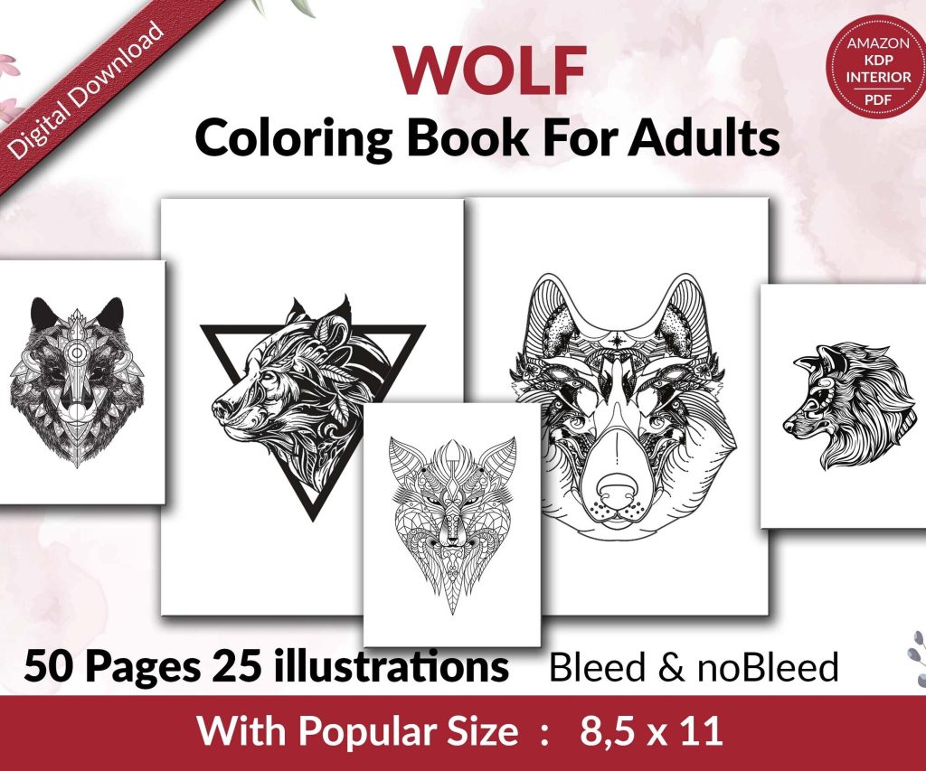 Wolf Coloring KDP interior For Adults, Used as Low Content Book, PDF Template Ready To Upload COMMERCIAL Use 8.5x11"
1 × $0.00
Wolf Coloring KDP interior For Adults, Used as Low Content Book, PDF Template Ready To Upload COMMERCIAL Use 8.5x11"
1 × $0.00 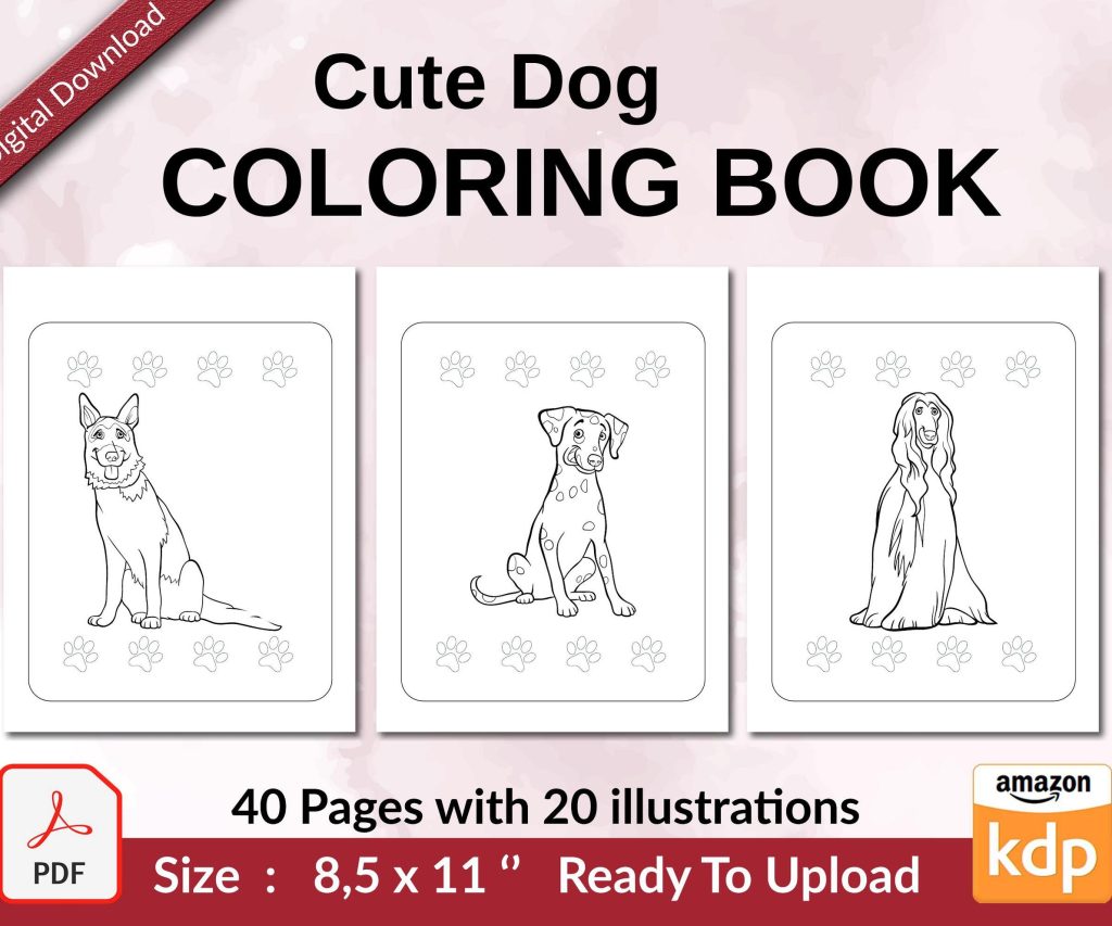 Cute Dogs Coloring Book for Kids | Activity Book | KDP Ready-To-Upload
1 × $0.00
Cute Dogs Coloring Book for Kids | Activity Book | KDP Ready-To-Upload
1 × $0.00 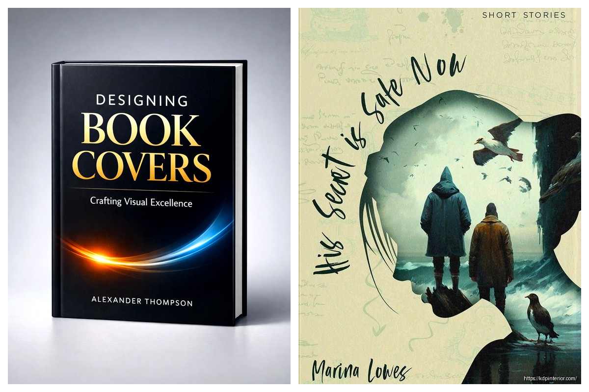
DISCOVER OUR FREE BEST SELLING PRODUCTS
Editable Canva Lined Journal: Express Your Thoughts – KDP Template
Lined Pages Journal 120 pages Ready to Upload PDF Commercial Use KDP Template 6×9 8.5×11 5×8 for Notebooks, Diaries, Low Content
Lined Pages Journal 120 pages Ready to Upload PDF Commercial Use KDP Template 6×9 8.5×11 5×8 for Notebooks, Diaries, Low Content
Cute Dogs Coloring Book for Kids | Activity Book | KDP Ready-To-Upload
Daily Planner Diary : Diary Planners for Everyday Productivity, 120 pages, 6×9 Size | Amazon KDP Interior
Wolf Coloring KDP interior For Adults, Used as Low Content Book, PDF Template Ready To Upload COMMERCIAL Use 8.5×11"
Coloring Animals Head Book for Kids, Perfect for ages 2-4, 4-8 | 8.5×11 PDF
Printable Blank Comic Book Pages PDF : Create Your Own Comics – 3 Available Sizes
Notes KDP interior Ready To Upload, Sizes 8.5×11 6×9 5×8 inch PDF FILE Used as Amazon KDP Paperback Low Content Book, journal, Notebook, Planner, COMMERCIAL Use
Black Lined Journal: 120 Pages of Black Lined Paper Perfect for Journaling, KDP Notebook Template – 6×9
Student Planner Journal 120 pages Ready to Upload PDF Commercial Use KDP Template 6×9" 8.5×11" for Low Content book
Recipe Journal Template – Editable Recipe Book Template, 120 Pages – Amazon KDP Interior