-
×
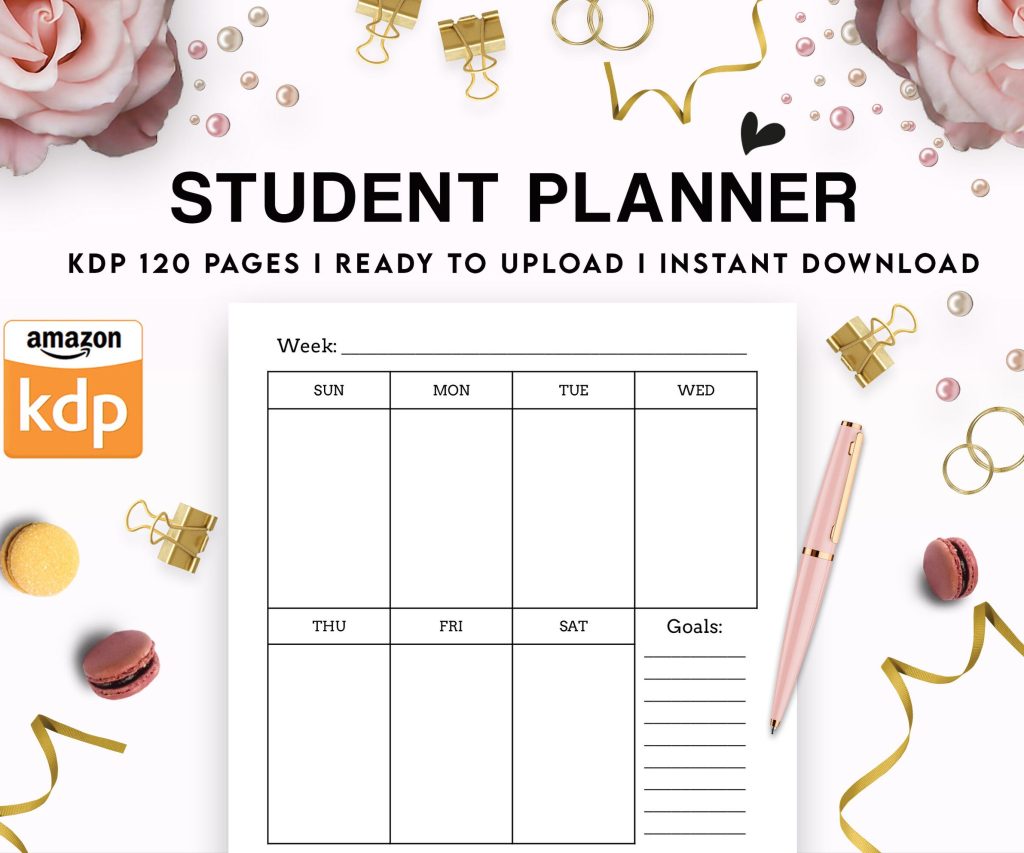 Student Planner Journal 120 pages Ready to Upload PDF Commercial Use KDP Template 6x9" 8.5x11" for Low Content book
1 × $0.00
Student Planner Journal 120 pages Ready to Upload PDF Commercial Use KDP Template 6x9" 8.5x11" for Low Content book
1 × $0.00
Subtotal: $0.00

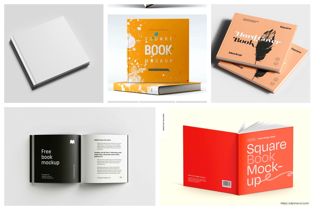
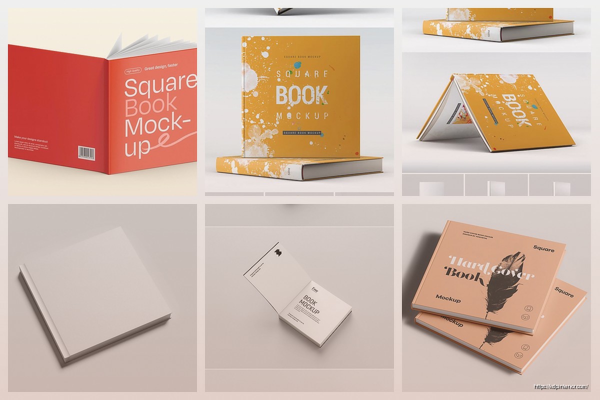
Okay so square book mockups are honestly one of those things I wish I’d figured out way earlier because they just hit different on social media, right? Like I was sitting here last Tuesday night watching some random Netflix show and scrolling through my KDP dashboard thinking my standard 6×9 mockups were getting zero engagement and then it clicked.
Square formats – we’re talking 8.5×8.5 inches mostly – they just look better in Instagram feeds and Facebook posts because they don’t get cropped weird. The problem is most mockup generators are optimized for rectangular books because that’s what 90% of people publish. But here’s the thing, KDP absolutely supports square formats and the mockups for them are actually not that hard once you know where to look.
So first off you gotta know what sizes you’re even working with. KDP supports 8.5×8.5 which is the most common square size, and then there’s 8×8 which works too. I’ve done both and honestly the 8.5×8.5 gives you slightly more real estate for content without looking awkwardly large.
The trim size matters because when you’re creating mockups you need the proportions exact or it looks fake. Like I made this mistake early on where I just cropped a 6×9 mockup into a square and it looked so obviously wrong that someone actually messaged me asking why my book looked “off.”
Placeit is probably the easiest starting point. They’ve got a decent collection of square book mockups and you can filter by format. I use their service maybe 3-4 times a week and yeah it’s a subscription but it’s like $15/month or something and honestly saves me hours. You just upload your cover, select square dimensions, and boom you’ve got something usable.
The catch with Placeit is their square selection isn’t huge compared to rectangular. So you might find yourself using the same 10-15 mockup styles over and over which gets boring fast.
Canva Pro also works and this is gonna sound weird but I actually prefer it sometimes because you have more control. They have mockup templates but you can also use Smart Mockups integration. The free version is limited but if you’re already paying for Pro it’s included. I was messing around with this last week and created like 20 variations in one sitting while my cat kept walking across my keyboard.
If you’re comfortable with Photoshop this is the move honestly. You can buy mockup PSDs from Creative Market or Etsy specifically designed for square books. The smart object workflow means you just double-click a layer, paste your cover, save, and the mockup updates automatically with perspective and lighting.
I bought a bundle of 50 square book mockups for like $19 on Creative Market back in March and I’m still using them. The quality is noticeably better than auto-generated ones because they’re photographed specifically for that format.
Wait I forgot to mention the completely free route. Smartmockups has a free tier that includes some square book options. It’s limited to like 2 downloads per day or something but if you’re just starting out it works.
Another option is literally taking your own photos. I did this once with a square notebook I bought from Target for $4. Took photos of it on different backgrounds around my house, then in Photoshop I replaced the cover with my book design. Sounds janky but it actually looked pretty professional and nobody could tell it wasn’t a real printed book.
The trick with DIY photos is lighting. Natural window light works best. I use this spot in my living room around 10am where the light comes in perfect and doesn’t create harsh shadows. Take the photo slightly above the book at an angle, not straight down.
Here’s what separates amateur mockups from ones that actually convert – and I learned this the hard way after getting basically no clicks for months. The spine matters even though you think people won’t notice. A lot of cheap mockups show square books with rectangular spine proportions and it just looks wrong subconsciously.
When you’re setting up your mockup make sure the spine width matches what KDP would actually produce. For an 8.5×8.5 book the spine calculator on KDP will tell you exact width based on page count. My coloring books are usually 100 pages so the spine is about 0.25 inches. That detail matters.
Okay so funny story, I spent like two hours creating this elaborate mockup with books stacked on a rustic wooden table with coffee cups and plants and whatever. Posted it thinking it would do great. Got less engagement than a simple white background mockup I threw together in 5 minutes.
White or very light gray backgrounds perform better for me consistently. I think it’s because the book cover itself stands out more and there’s no visual competition. Save the fancy lifestyle shots for when you’re trying to convey a specific vibe or niche.
Oh and another thing – shadow and reflection effects. They add so much depth. Most mockup tools include these automatically but if you’re doing DIY you gotta add them manually. In Photoshop it’s just a drop shadow layer effect with the settings adjusted to look natural. Not too harsh, maybe 30-40% opacity.
Instagram is where square mockups really shine obviously because of the 1:1 aspect ratio. But here’s something I discovered – if you’re posting to Pinterest you actually want a taller orientation. So sometimes I create the same mockup in square for Instagram and then a 2:3 ratio version for Pinterest.
Facebook is flexible but square works great there too. The algorithm seems to favor posts that don’t require clicking to see the full image so square fits nicely in the feed without cropping.
For Amazon ads though you need rectangular. Amazon’s ad specs are specific and square images either get rejected or look terrible when they auto-crop them. So don’t try to use your square mockups there, keep those for social media only.
This is gonna sound like overkill but trust me, create at least 3-5 different mockup styles for each book. I do a flat lay, an angled standing book, one with the book slightly open showing blank pages, and usually one lifestyle shot if it fits the niche.
Why multiple versions? Because you’re gonna be promoting this book for weeks or months and posting the same mockup over and over kills engagement. I rotate through my mockup variations and it keeps the content looking fresh without having to redesign everything.
For square books specifically the “stack” mockup works really well. Like showing 2-3 copies of your book stacked slightly offset. It fills the frame nicely and emphasizes that it’s a square format which somehow makes it look more premium? I don’t know why but it does.
Wait I forgot to mention video mockups. These are getting huge right now especially for Instagram Reels and TikTok. You can create a simple animation where the book spins or the cover flips open.
Placeit has animated mockup options included. You upload your cover same as usual but instead of a static image you get a 5-10 second video clip. I started using these last month and the engagement is literally 3x what static images get.
For square books the spin animation works perfect because it shows all sides equally. The square format actually makes the animation look more balanced than rectangular books which can look awkward when rotating.
Your cover file needs to be high resolution – at minimum 300 DPI. I export mine at 3000×3000 pixels for an 8.5×8.5 book which gives me room to work with. If you go too low res the mockup will look blurry and immediately screams unprofessional.
File format matters too. PNG with transparent background is ideal if you’re doing your own mockup work. JPG works fine for most mockup generators. I keep both versions saved just in case.
Color profile should be RGB for digital mockups even though your print file is CMYK. The colors will look slightly different than the actual printed book but that’s fine, screens display RGB anyway so it’ll match what people see online.
I track everything in Google Analytics connected to my author website and here’s what I’ve found. Square mockups on Instagram drive traffic but not necessarily immediate sales. They’re more top-of-funnel awareness building.
Facebook posts with square mockups in relevant groups though? Those convert way better for me. Especially in niche groups where I’m not being promotional just sharing what I created. The square format makes it look less like an ad somehow.
Pinterest is hit or miss with square mockups. Like I mentioned earlier, taller images perform better there algorithmically. But in specific boards where everything is square format they fit right in and get saved/clicked more.
This might seem random but square mockups work great in email newsletters too. They’re compact so they don’t force mobile users to scroll forever, and they look clean even in smaller email client windows.
I use a square mockup at the top of my monthly newsletter to highlight new releases and the click-through rate is noticeably higher than when I used rectangular images. Something about the symmetry just works in email layout.
Don’t try to force a rectangular mockup template to display a square book. I see this all the time and it looks terrible. The proportions are wrong, the perspective is off, it just doesn’t work. Use actual square mockup templates.
Also don’t over-edit. Like adding too many filters or effects that distract from the book itself. The mockup should showcase your cover design, not compete with it. I made this mistake early on adding all these fancy Photoshop filters thinking it looked artistic but really it just looked messy.
Text overlay is fine but keep it minimal. If you’re adding text to announce a launch or sale or whatever, make sure it doesn’t cover important parts of your cover design. I usually place text above or below the book mockup, not on top of it.
Here’s a workflow tip that saves me probably 2-3 hours per book. When I finish a cover design I immediately create all my mockup variations at once. Like same sitting, I’ll spend an hour and create 5-7 different mockups in various styles and save them all to a folder labeled with the book title.
Then when I need content to post I just grab from that folder instead of creating mockups on the fly. It’s way more efficient and ensures consistency across all my promotional materials.
For square books specifically I have a template folder in Photoshop with my most-used smart object mockups already set up. I just open those files, swap in the new cover, export, done. Takes maybe 5 minutes per mockup once you’ve got the system down.
Okay so that’s pretty much everything I’ve learned about square book mockups over the past couple years. The format is genuinely underutilized I think because people assume it’s harder to work with but honestly once you’ve got the right tools and templates it’s just as easy as standard formats and performs way better on social media. Just gotta actually commit to using square trim sizes when you’re setting up your books in KDP which means planning ahead a bit with your content layout but totally worth it for the marketing advantages.
DISCOVER OUR FREE BEST SELLING PRODUCTS
Editable Canva Lined Journal: Express Your Thoughts – KDP Template
Lined Pages Journal 120 pages Ready to Upload PDF Commercial Use KDP Template 6×9 8.5×11 5×8 for Notebooks, Diaries, Low Content
Lined Pages Journal 120 pages Ready to Upload PDF Commercial Use KDP Template 6×9 8.5×11 5×8 for Notebooks, Diaries, Low Content
Cute Dogs Coloring Book for Kids | Activity Book | KDP Ready-To-Upload
Daily Planner Diary : Diary Planners for Everyday Productivity, 120 pages, 6×9 Size | Amazon KDP Interior
Wolf Coloring KDP interior For Adults, Used as Low Content Book, PDF Template Ready To Upload COMMERCIAL Use 8.5×11"
Coloring Animals Head Book for Kids, Perfect for ages 2-4, 4-8 | 8.5×11 PDF
Printable Blank Comic Book Pages PDF : Create Your Own Comics – 3 Available Sizes
Notes KDP interior Ready To Upload, Sizes 8.5×11 6×9 5×8 inch PDF FILE Used as Amazon KDP Paperback Low Content Book, journal, Notebook, Planner, COMMERCIAL Use
Black Lined Journal: 120 Pages of Black Lined Paper Perfect for Journaling, KDP Notebook Template – 6×9
Student Planner Journal 120 pages Ready to Upload PDF Commercial Use KDP Template 6×9" 8.5×11" for Low Content book
Recipe Journal Template – Editable Recipe Book Template, 120 Pages – Amazon KDP Interior