-
×
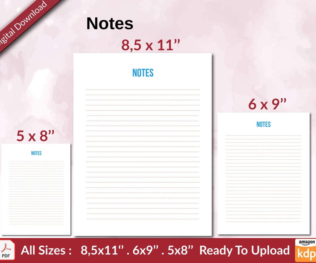 Notes KDP interior Ready To Upload, Sizes 8.5x11 6x9 5x8 inch PDF FILE Used as Amazon KDP Paperback Low Content Book, journal, Notebook, Planner, COMMERCIAL Use
1 × $0.00
Notes KDP interior Ready To Upload, Sizes 8.5x11 6x9 5x8 inch PDF FILE Used as Amazon KDP Paperback Low Content Book, journal, Notebook, Planner, COMMERCIAL Use
1 × $0.00
Subtotal: $0.00
Okay so I just spent like three hours last week rebuilding my children’s book template and here’s what actually matters when you’re setting up a storybook format for KDP.
First thing – storybooks aren’t just regular books with pictures. The whole format is different and if you screw this up, Amazon’s gonna reject your upload or worse, it’ll look terrible when people preview it. I learned this the hard way back in 2018 when I uploaded my first fairy tale collection and the text was literally overlapping the images because I didn’t understand bleed.
Your standard storybook template needs these dimensions: 8.5 x 8.5 inches is the sweet spot for kids books. Sometimes I do 8 x 10 but honestly the square format just works better for page spreads. You want your document set up with 0.125 inch bleed on all sides – that’s the part that gets trimmed off during printing.
In your design software (I use Affinity Publisher mostly, sometimes InDesign when I’m feeling fancy), you gotta set up master pages. Left page, right page, and if you’re doing full spreads those need their own master. The margins should be at least 0.5 inches on the outer edges and 0.625 inches on the inner gutter. Trust me on the gutter – I’ve had books where text disappeared into the spine because I went too narrow.
Here’s where people mess up constantly – they think they can just slap text anywhere. Nope. Your text blocks need consistent placement across every page or it looks amateurish.
I usually create a text frame that sits in the bottom third of the page, maybe 1 inch from the bottom, 0.75 inches from the sides. For a 8.5 x 8.5 book, that gives you roughly a 7 x 2 inch text box. Some pages you’ll have less text, some more, but the container stays the same size and position.
Font size matters way more than you think. For picture books aimed at 3-7 year olds, I’m using 18-24pt font. For middle grade chapter books with illustrations, maybe 14-16pt. The font itself should be super readable – I default to Century Gothic or Cabin for modern looks, or Garamond if it’s a classic fairy tale vibe.
Line spacing at 1.5 is usually perfect. Single spacing looks cramped, double is too much. And please, PLEASE align your text left, not justified. Justified text in kids books creates these weird spacing gaps that make it harder for beginning readers.
So this is gonna sound weird but the biggest mistake I see is people treating images like they’re separate from the text. Your illustrations need to interact with your words or the whole thing falls flat.
I set up my template with image placeholders – usually full bleed background images with the text overlaid in that bottom section I mentioned. Sometimes I’ll do wraparound text but honestly that’s more trouble than it’s worth for most projects. The image should occupy the full page (remember that bleed area) and your text sits in a semi-transparent box or on a solid color bar if the image is too busy behind it.
Resolution is critical here – 300 DPI minimum. I actually work at 350 DPI because I’m paranoid about Amazon’s compression. Your images need to be CMYK color mode for print, not RGB. I forget this like half the time and have to go back and convert everything.
Oh and another thing – if you’re using stock illustrations, make sure they’re actually licensed for commercial use and print distribution. I use Creative Fabrica and Elements Envato mostly, but you gotta read those licenses. Some are digital only.
Okay so the narrative structure of a picture book is different than writing a regular story. You’re working with page turns as a storytelling device. Most kids picture books are 24 or 32 pages – that’s including the title page, copyright page, dedication, all that stuff.
Your actual story might be 20-28 pages of content. Each page turn should either advance the plot or create a moment of surprise. I literally storyboard this out on index cards before I even open my design software. My dog ate one of my storyboards last month and I had to recreate the whole thing from memory, which actually made it better somehow.
The rhythm goes like this: setup pages 1-4, building action pages 5-12, climax around page 13-16, resolution pages 17-20. This isn’t a hard rule but it’s a framework that works. Each spread (that’s two pages facing each other) should feel complete while moving the story forward.
Your title page needs the biggest text – I usually go 48-72pt for the book title. Author name can be smaller, like 24-36pt.
Chapter titles if you have them (more common in early reader chapter books) should be 28-36pt. Body text I already mentioned at 18-24pt for picture books.
Don’t go crazy with fonts. Two fonts maximum – one for titles and headers, one for body text. Three if you absolutely need something for special emphasis but honestly that’s pushing it. I’ve seen people use like five different fonts and it just looks chaotic.
Wait I forgot to mention – your template needs to include space for all the publishing requirements. Copyright page goes on page 2 or 3 usually. You need your copyright symbol, year, your name or publishing imprint, ISBN if you’re using one (KDP gives you free ISBNs but they list KDP as publisher), and any illustration credits.
I keep a text file with my standard copyright language that I just copy-paste into new projects. Saves so much time. It includes the “all rights reserved” stuff and a note that no part can be reproduced without permission.
This still confuses people even though it’s pretty straightforward. Your actual content area is 8.5 x 8.5. Your document with bleed is 8.75 x 8.75 (that’s adding 0.125 inches on each side).
When you export for KDP, you export the full bleed size as a PDF. Make sure your PDF settings are PDF/X-1a:2001 format – this is the print-ready standard. High quality print, 300 DPI, embed all fonts, CMYK color.
KDP doesn’t need crop marks or printer marks, just the bleed area. I wasted like two weeks trying to figure out why my uploads kept getting rejected until I realized I was including trim marks in the PDF.
Okay so here’s my practical setup. I have three master templates saved:
Each template has the master pages set up, the margins configured, placeholder text showing the font and size, and guide layers showing safe zones for text and images.
I duplicate the template file for each new project so I never accidentally overwrite my base template. Learned that lesson after destroying a template I’d spent hours perfecting.
If you’re doing full color books, you need to manage your color palette carefully. I create a color swatch library for each book – usually 5-8 colors that appear throughout. This keeps the visual style consistent and makes the book feel professionally designed.
For print, remember CMYK has a smaller color gamut than RGB. That bright blue that looks amazing on your screen might print as a duller shade. I always do a test print through KDP’s proof copy service before launching. Costs like $5 but saves you from discovering your colors are off after you’ve already published.
The template changes based on your target reader. For board books (ages 0-3), you want minimal text – like one sentence per page, huge clear images. These are usually smaller trim sizes, 7 x 7 or 6 x 6.
Picture books (ages 3-8) are what I described above – bigger format, 1-3 sentences per page typically, images drive the story.
Early readers and chapter books (ages 6-9) have more text per page, smaller trim size, illustrations are supplementary not primary. I usually do 6 x 9 for these with maybe one illustration per chapter.
Middle grade (ages 8-12) is basically a regular novel format with occasional illustrations. Standard 6 x 9 or 5.5 x 8.5 trim, 11-12pt body text, chapter headers with small decorative elements.
Amazon shows customers a preview of your book and this is where formatting really matters. The preview includes your cover, first several pages, and random interior pages. If your formatting is inconsistent, they’ll see it immediately.
I always upload my book, then check the preview as if I’m a customer. View it on different devices – desktop, mobile, tablet. The preview renderer sometimes does weird things with fonts or spacing, and you need to catch that before someone leaves a one-star review about formatting.
Oh and make sure your cover design coordinates with your interior template. Nothing looks worse than a super colorful whimsical cover and then the interior is all muted tones and different fonts. The whole package should feel cohesive.
When you’re ready to upload to KDP, export as PDF with these settings: PDF/X-1a:2001, all fonts embedded, CMYK color mode, 300 DPI image compression, include bleed area. File size will probably be 20-50 MB for a full color picture book.
Don’t flatten your layers before exporting – keep your working file with layers intact in case you need to make changes. Export a separate PDF for upload. I learned this after having to recreate an entire book from scratch because I’d flattened everything and then needed to fix a typo.
The actual KDP upload process is pretty smooth if your file is formatted correctly. Choose paperback, enter your dimensions (8.5 x 8.5 or whatever), select bleed, upload your PDF. They’ll generate a preview in like 30 seconds.
Wait the other thing I should mention – pricing. Your printing costs on a full-color book are gonna be higher than black and white. An 8.5 x 8.5, 32-page color book costs about $3-4 to print through KDP. You need to price it at least $8-10 to make any royalty. I usually price kids books at $9.99-$12.99 depending on page count and market competition.
Anyway that’s basically the whole template setup. The key is having your master template dialed in so you can just drop in new content for each book without rebuilding the structure every time. Saves hours per project once you’ve got it down.
DISCOVER OUR FREE BEST SELLING PRODUCTS
Editable Canva Lined Journal: Express Your Thoughts – KDP Template
Lined Pages Journal 120 pages Ready to Upload PDF Commercial Use KDP Template 6×9 8.5×11 5×8 for Notebooks, Diaries, Low Content
Lined Pages Journal 120 pages Ready to Upload PDF Commercial Use KDP Template 6×9 8.5×11 5×8 for Notebooks, Diaries, Low Content
Cute Dogs Coloring Book for Kids | Activity Book | KDP Ready-To-Upload
Daily Planner Diary : Diary Planners for Everyday Productivity, 120 pages, 6×9 Size | Amazon KDP Interior
Wolf Coloring KDP interior For Adults, Used as Low Content Book, PDF Template Ready To Upload COMMERCIAL Use 8.5×11"
Coloring Animals Head Book for Kids, Perfect for ages 2-4, 4-8 | 8.5×11 PDF
Printable Blank Comic Book Pages PDF : Create Your Own Comics – 3 Available Sizes
Notes KDP interior Ready To Upload, Sizes 8.5×11 6×9 5×8 inch PDF FILE Used as Amazon KDP Paperback Low Content Book, journal, Notebook, Planner, COMMERCIAL Use
Black Lined Journal: 120 Pages of Black Lined Paper Perfect for Journaling, KDP Notebook Template – 6×9
Student Planner Journal 120 pages Ready to Upload PDF Commercial Use KDP Template 6×9" 8.5×11" for Low Content book
Recipe Journal Template – Editable Recipe Book Template, 120 Pages – Amazon KDP Interior