Okay so I’ve been messing with style guide templates for the past like three years and honestly they’re one of those things that sound super corporate and boring but they’ll literally save your butt when you’re scaling up your publishing business.
So here’s the thing – a style guide is basically just a document that tells anyone working on your brand exactly how everything should look and sound. Colors, fonts, how you write product descriptions, all that stuff. And yeah I know it sounds like overkill when you’re just starting out but trust me on this… I learned the hard way.
Why You Actually Need This Thing
Last year I hired someone on Upwork to help with my book covers and they came back with stuff that looked nothing like my brand. Like completely different vibe. And I realized I’d never actually written down what my brand was supposed to BE, you know? I just had it in my head. So I ended up paying for revisions that could’ve been avoided if I’d just spent two hours making a basic style guide.
The main stuff you gotta document is gonna be visual identity, writing voice, and formatting rules. Let’s break it down.
Visual Identity Stuff
Colors
You need your exact color codes written down. Not just “blue” but the actual hex codes. I use this format:
- Primary brand color: #2C5F8D (that deep blue I use everywhere)
- Secondary color: #F4A261 (orangey accent)
- Neutral colors: #FFFFFF, #F5F5F5, #333333
And here’s something nobody tells you – also write down where each color gets used. Like “primary blue for all headers and CTA buttons, orange for highlights and urgency elements only.” Because otherwise people will just randomly throw colors around.
I keep a little screenshot of my color palette in the doc too. Makes it super visual and easy to reference when you’re making quick decisions.
Typography
Fonts are weirdly important. I spent like a month using three different fonts across my products before I noticed how messy it looked. Now I stick to:
- Headings: Montserrat Bold
- Body text: Open Sans Regular
- Special elements: Sometimes Playfair Display for that fancy look
Document the font sizes too. Like for KDP interiors I always do 11pt for body text, 16pt for chapter headings, stuff like that. Sounds nitpicky but it creates consistency that readers notice subconsciously.
Oh and another thing – if you’re using Google Fonts or Adobe Fonts, put the links in your style guide. I’ve wasted time trying to remember which exact version of a font I was using.
Logo Usage
This part feels really official but it’s actually practical. I have like five versions of my author logo – full color, black, white, horizontal, stacked. In the style guide I show examples of when to use each one.
Like the white version goes on dark backgrounds obviously, but I also note the minimum size it can be before it gets unreadable (150px wide for me). Seems basic but when you’re rushing to make a Facebook ad at 11pm you’ll be glad you wrote it down.
Writing Voice and Tone
This is where it gets interesting because you’re basically documenting how you sound. I describe my brand voice as “knowledgeable but approachable, like a friend who’s done the research.” Then I give examples.
Wait I forgot to mention – I actually keep a “do and don’t” section for writing. It looks something like:
Do:
- Use contractions (you’re, don’t, can’t)
- Address reader directly as “you”
- Share specific examples from experience
- Keep paragraphs short, scannable
Don’t:
- Use corporate jargon or buzzwords
- Write in third person
- Make promises you can’t back up
- Use exclamation points excessively!!!
You can also include your common phrases or words you avoid. Like I never use “leverage” or “synergy” because it sounds too business-speaky for my audience.
Grammar and Style Rules
Okay this is gonna sound weird but documenting your grammar preferences actually matters. Do you use the Oxford comma? How do you write numbers – spell them out or use digits?
For my stuff:
- Oxford comma: Yes always
- Numbers: Spell out one through nine, digits for 10+
- Dashes: Em dashes with no spaces—like this
- Capitalization: Sentence case for headlines, not title case
My cat just knocked over my coffee while I’m writing this but anyway… these tiny details add up to make your content feel cohesive across 50+ books or products.
Templates You Can Actually Use
So there’s free templates out there but honestly the best one I ever made was just a Google Doc with clear sections. You don’t need fancy design software.
Here’s the basic structure I use:
Section 1: Brand Overview
Quick paragraph about what your brand stands for, who your audience is, what makes you different. Keep it to like 3-4 sentences max.
Section 2: Visual Elements
All your colors, fonts, logo files. I literally embed images right in the doc so people can see everything at a glance.
Section 3: Voice and Messaging
How you write, example phrases, your do’s and don’ts list.
Section 4: Product-Specific Guidelines
This is where I get into the nitty gritty for different product types. Like:
For KDP Books:
- Interior margins: 0.5″ all sides
- Chapter opening: Always start 1/3 down the page
- Page numbers: Bottom center, starting on page 1 of content
For Product Listings:
- Title format: [Main Keyword] – [Benefit] – [Format]
- Bullet points: Always 5, start with benefit not feature
- Description length: 1500-2000 characters
You get the idea. Make it specific to YOUR workflow.
Tools That Don’t Suck
I’ve tried a bunch of different ways to organize style guides and here’s what actually works:
Google Docs – Free, easy to share, everyone knows how to use it. I keep my main style guide here because I can give access to VAs and designers without worrying about software compatibility.
Notion – If you want something fancier, Notion is pretty great. You can embed images, create databases of approved vs not-approved examples, link to other pages. I moved to this after about a year and it’s nice for organization.
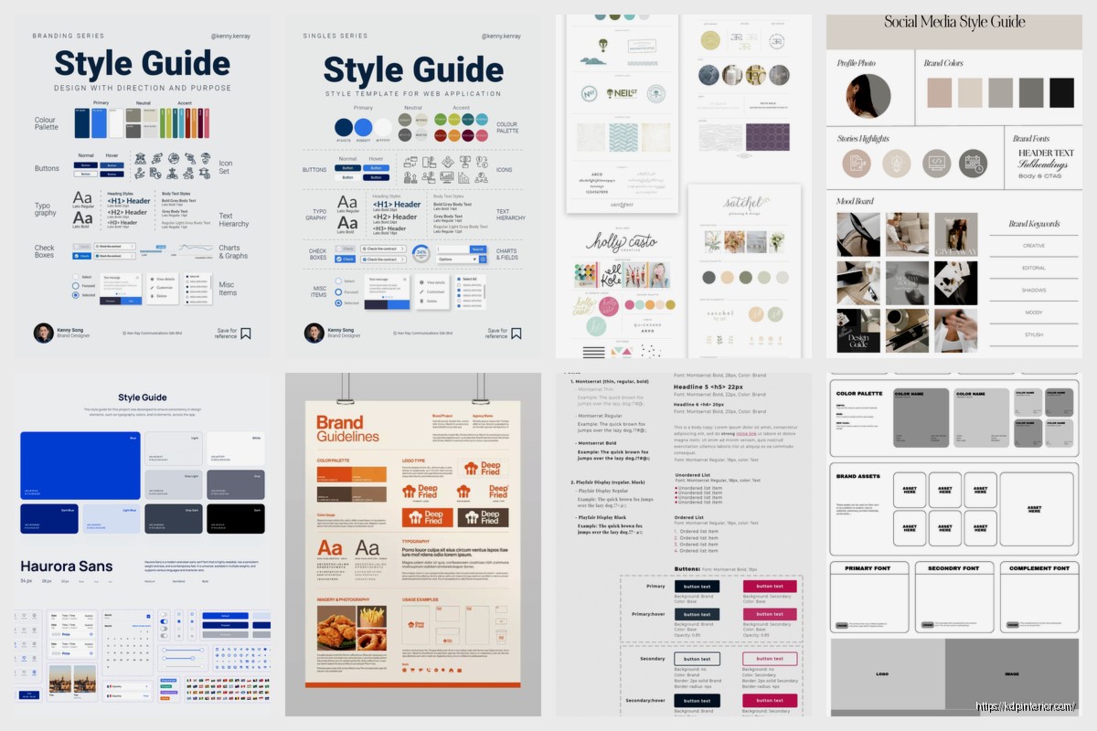
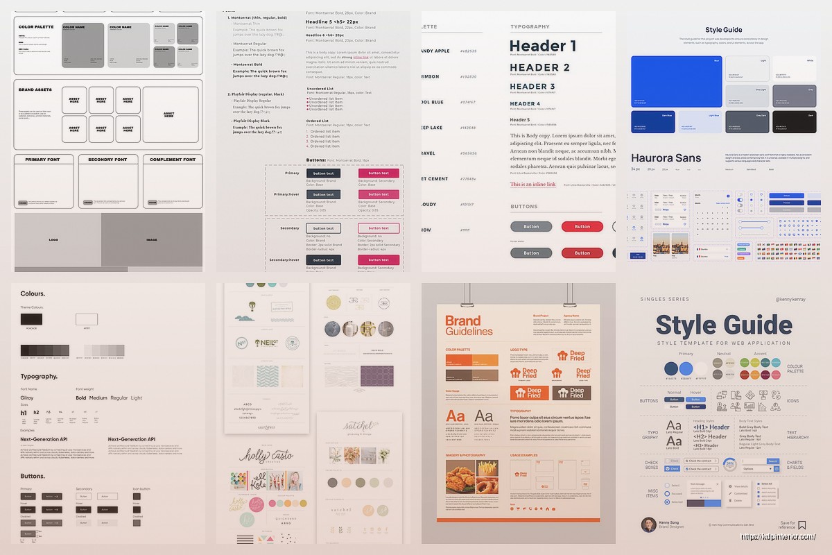
Canva – Weirdly good for making a visual brand board that you can reference. I have a Canva doc that’s just color swatches, font examples, and mood board images all on one page. Super quick reference.
Milanote – This one’s less known but it’s like a visual cork board. Good if you think visually. I used it for a while but honestly it was overkill for what I needed.
Common Mistakes I Made
Okay so funny story – my first style guide was like 40 pages long. Nobody read it. Including me after I wrote it. You want this to be a quick reference guide, not a novel.
Keep it to 5-10 pages max. If you need more detail on something, link out to other documents but keep the main guide scannable.
Also I initially didn’t include examples and that was dumb. People need to SEE what you mean, not just read descriptions. Show before/after, good vs bad examples, screenshots of actual products.
Another thing – I forgot to update it. Your brand evolves, right? So set a reminder every 6 months to review and update the style guide. I learned this when I changed my color scheme and forgot to update the guide… then hired someone who used my OLD colors because that’s what was documented.
Making People Actually Use It
The style guide only works if people reference it. When I onboard new freelancers now, I literally make them confirm they’ve read it. Not in a weird corporate way, just like “hey did you check out the style guide I sent? any questions?”
I also keep the link in my project management system (I use Trello) so it’s always accessible. Every project card has a link to the style guide in the description.
And this might sound excessive but I created a one-page “quick reference” version that’s just the most important stuff. Colors, fonts, main writing rules. Because sometimes people don’t need the full guide, they just need to know “what blue should I use?”
Real Examples From My Setup
Let me show you what I actually document for my Amazon KDP business specifically.
For book covers I note:
- Author name always in the same font and position (bottom third, centered)
- Title font size must be readable in thumbnail view (test at 100px wide)
- Spine width calculations for different page counts
- Where to place series numbers or edition info
For book interiors:
- Exact paragraph spacing (0pt before, 6pt after)
- Line spacing (1.15 for easier reading)
- Header/footer formatting for different book types
- How to format special elements like quotes or lists
For product descriptions:
- Keyword placement strategy
- How to structure the opening hook
- Call-to-action phrasing I use
- Words that convert well for my audience
See how specific that gets? That’s the level of detail that actually helps.
When to Create Different Versions
If you have multiple pen names or publish in different niches, you might need separate style guides. I have three – one for my main non-fiction brand, one for low-content books, and one for a fiction pen name I’m building.
They share some elements but the voice is totally different. Like my fiction guide allows way more creative language and varied sentence structure, while my non-fiction guide is more straightforward and instructional.
Don’t try to make one style guide cover everything if your brands are really different. You’ll just end up with a confusing mess.
Maintaining This Long Term
The style guide isn’t a set-it-and-forget-it thing. I add to mine probably every few months when I figure out a new process or make a branding decision.
Like recently I decided on a specific way to format my author bio across all platforms. Added that to the guide. Or when I tested a new cover style and it worked well – documented what made it successful.
Keep a “changelog” section at the bottom where you note what you updated and when. Helps if you’re working with regular freelancers so they know what’s new.
Anyway that’s basically everything I’ve learned about style guides from actually using them in my publishing business for the past few years. They seem like extra work at first but they save so much time and headache once you’ve got products across multiple platforms and maybe working with other people. Just start simple and build it out as you go.
 Recipe Journal Template - Editable Recipe Book Template, 120 Pages - Amazon KDP Interior
1 × $0.00
Recipe Journal Template - Editable Recipe Book Template, 120 Pages - Amazon KDP Interior
1 × $0.00  Anxiety Journal with questions, Therapy workbook 8.5x11 Canva Editable 30 Templates, Canva KDP interior with prompt, digital and printable
1 × $14.99
Anxiety Journal with questions, Therapy workbook 8.5x11 Canva Editable 30 Templates, Canva KDP interior with prompt, digital and printable
1 × $14.99 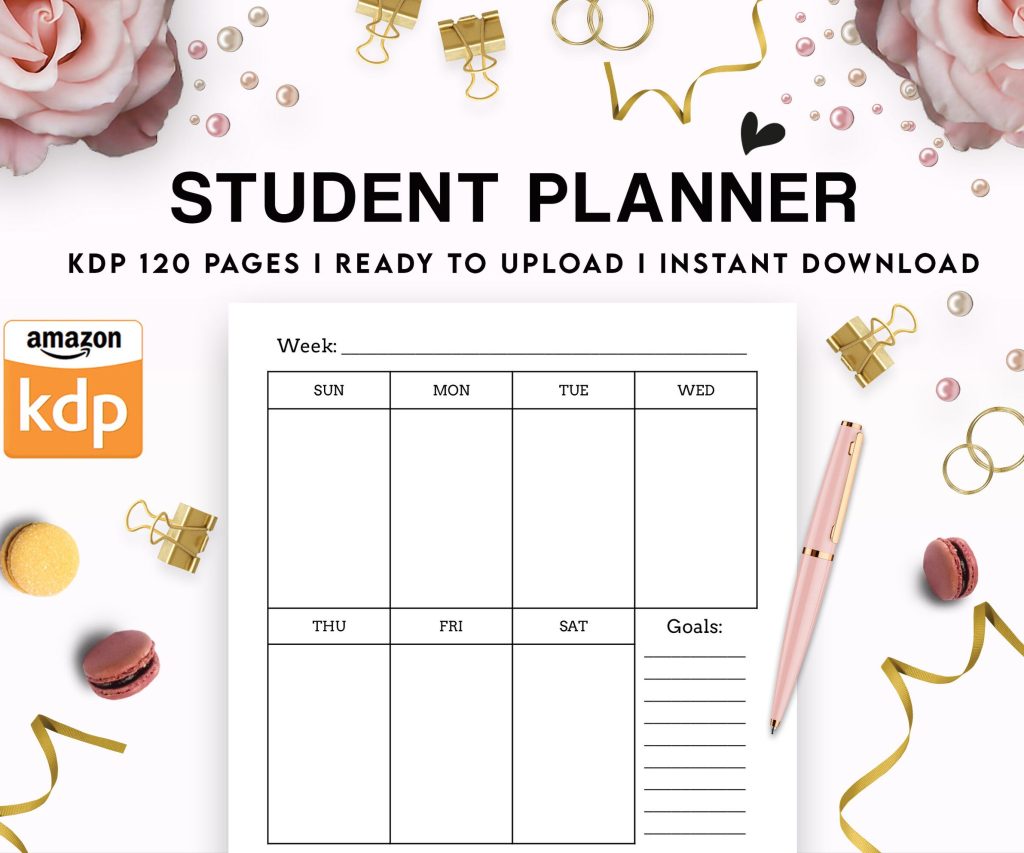 Student Planner Journal 120 pages Ready to Upload PDF Commercial Use KDP Template 6x9" 8.5x11" for Low Content book
1 × $0.00
Student Planner Journal 120 pages Ready to Upload PDF Commercial Use KDP Template 6x9" 8.5x11" for Low Content book
1 × $0.00 
DISCOVER OUR FREE BEST SELLING PRODUCTS
Editable Canva Lined Journal: Express Your Thoughts – KDP Template
Lined Pages Journal 120 pages Ready to Upload PDF Commercial Use KDP Template 6×9 8.5×11 5×8 for Notebooks, Diaries, Low Content
Lined Pages Journal 120 pages Ready to Upload PDF Commercial Use KDP Template 6×9 8.5×11 5×8 for Notebooks, Diaries, Low Content
Cute Dogs Coloring Book for Kids | Activity Book | KDP Ready-To-Upload
Daily Planner Diary : Diary Planners for Everyday Productivity, 120 pages, 6×9 Size | Amazon KDP Interior
Wolf Coloring KDP interior For Adults, Used as Low Content Book, PDF Template Ready To Upload COMMERCIAL Use 8.5×11"
Coloring Animals Head Book for Kids, Perfect for ages 2-4, 4-8 | 8.5×11 PDF
Printable Blank Comic Book Pages PDF : Create Your Own Comics – 3 Available Sizes
Notes KDP interior Ready To Upload, Sizes 8.5×11 6×9 5×8 inch PDF FILE Used as Amazon KDP Paperback Low Content Book, journal, Notebook, Planner, COMMERCIAL Use
Black Lined Journal: 120 Pages of Black Lined Paper Perfect for Journaling, KDP Notebook Template – 6×9
Student Planner Journal 120 pages Ready to Upload PDF Commercial Use KDP Template 6×9" 8.5×11" for Low Content book
Recipe Journal Template – Editable Recipe Book Template, 120 Pages – Amazon KDP Interior