
Amazon KDP guide, KDP book publishing
Year Book Layout: School Annual Design Principles
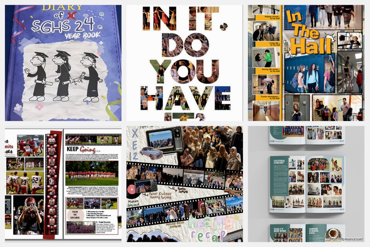
May
okay so yearbook layouts are actually way easier than people make them look but there’s definitely a system to it that I figured out after doing like 15 different school annual projects for clients last year
First thing – and I cannot stress this enough – you gotta establish a grid system before you do ANYTHING else. I see people just start slapping photos on pages and then wondering why everything looks chaotic. The grid is literally your foundation. Most yearbooks work best with either a 3-column or 4-column grid, sometimes 5 if you’re doing larger format books. I usually go with 4 because it gives you the most flexibility without making things too complicated.
The Grid System Thing Nobody Talks About
So the grid isn’t just about columns, it’s about creating consistent margins and gutters. I typically use 0.5 inch margins on all sides (some people go smaller but trust me you don’t want text getting cut off during printing – learned that the hard way on a middle school yearbook in 2019). The gutters between columns should be like 0.125 to 0.25 inches depending on your overall page size.
Here’s what I do: open up your design software (InDesign is obviously the standard but you can use Affinity Publisher or even Canva if you’re on a budget), set up your master pages with the grid, and then LOCK IT. Don’t let anyone mess with those guides.
Photo Sizing Rules That Actually Make Sense
Photos should follow what I call the modular approach. Every photo takes up space based on your column grid. So if you have a 4-column grid:
– Small photos = 1 column wide
– Medium photos = 2 columns wide
– Large photos = 3 columns wide
– Feature photos = 4 columns (full bleed)
The height can vary but I usually stick to increments that make sense… like if your column width is 2 inches, your heights might be 2 inches, 3 inches, 4 inches, etc. This keeps everything feeling organized even when you’re mixing different sized images.
Oh and another thing – dominant photos are KEY. Every spread (that’s the two pages you see when the book is open) needs ONE dominant image. Not two, not three. One photo that’s significantly larger than the others. This creates visual hierarchy and gives the reader’s eye somewhere to land first.
The Dominant Photo Should Be
- At least 2x larger than your next biggest photo
- High quality and well-composed
- Relevant to the main story on that spread
- Positioned in a power spot (usually top third or following the rule of thirds)
White Space Is Your Friend (Seriously)
I was watching this documentary about design last week while working on a high school yearbook and they were talking about how amateur designers fear empty space. It’s so true. You don’t need to fill every single pixel of the page. White space (or negative space if you wanna get technical) actually makes your content MORE readable and gives the design room to breathe.
My rule is that at least 15-20% of every spread should be white space. This includes your margins, the space between elements, and sometimes just… empty areas. It sounds weird but it works.
Typography Standards That Won’t Make You Look Amateur
Okay so typography in yearbooks is where I see the most mistakes. People use like 47 different fonts because they think it looks creative. It doesn’t. It looks messy.
Here’s my formula:
– ONE font for headlines (usually a bold sans-serif like Futura, Montserrat, or Bebas Neue)
– ONE font for body copy (a readable serif like Minion Pro or a clean sans-serif like Proxima Nova)
– MAYBE a third accent font for things like pull quotes or captions, but honestly you can skip this
Font sizes I use consistently:
- Body copy: 9-10pt (10pt is safer for younger readers)
- Captions: 7-8pt
- Subheadings: 14-18pt
- Main headlines: 24-48pt depending on importance
- Section dividers: 72pt+
Leading (that’s line spacing) should be about 120% of your font size. So if you’re using 10pt body copy, set your leading to 12pt. Makes everything way more readable.
Color Schemes Without the Guesswork
Most schools already have their colors which makes this easier. But you can’t just use school colors everywhere or it gets overwhelming. I usually create a palette like this:
- Primary school color – use for major headlines and section dividers
- Secondary school color – use sparingly for accents
- Neutral (usually a warm gray) – for body text and backgrounds
- Black – always have true black available
- White – duh
The trick is using your school colors at like 30% of the design max. The rest should be neutrals and black/white. This keeps things from looking like a bag of skittles exploded on your pages.
wait I forgot to mention – always check your colors in CMYK not RGB because that’s how they’ll print. RGB colors look way more vibrant on screen than they will in the actual printed book and I’ve had clients freak out about this before.
The Modular Layout Approach
This is gonna sound weird but I basically design yearbooks like I’m building with LEGO blocks. Every element is a module that fits within the grid system.
A typical spread might have:
- 1 dominant photo (3 columns wide)
- 3-4 secondary photos (1-2 columns each)
- 1 text block for the main story (2-3 columns)
- 3-5 captions
- 1 headline
- Maybe a pull quote or fun fact box
The key is arranging these modules so there’s visual flow. The reader’s eye should move naturally from the dominant image to the headline to the body copy to the supporting images. I usually sketch this out on paper first (my cat knocked over my coffee on one of these sketches last month and honestly the stain kinda improved the layout).
Consistency Across Sections
Each section of the yearbook (student life, sports, academics, etc.) should have its own identity but still feel cohesive with the whole book. I do this by:
Creating a template for each section that uses the same grid but varies the color accent or adds a specific graphic element. Like maybe the sports section has a subtle halftone dot pattern in the background, or the academics section uses a different style for pull quotes.
But the underlying structure – the grid, the font choices, the photo sizing – stays consistent throughout. This is what makes a yearbook look professional vs. like it was designed by 12 different people who never talked to each other (which is sometimes literally what happens).
Template Variations I Use
- Standard spread: balanced mix of photos and text
- Photo-heavy spread: minimal text, 8-12 smaller photos for events
- Feature spread: one massive photo, limited supporting images, longer story
- Portrait spread: organized grid of individual student/staff photos
- Timeline spread: chronological layout for year-in-review content
The Eyeline Thing That Changed Everything For Me
okay so this is something I figured out by accident in 2021. When you’re placing photos of people, pay attention to where their eyes are looking. If someone’s looking left, that photo should probably be on the right side of the page so they’re “looking into” the spread. If they’re looking right, put them on the left.
This creates this subconscious flow that guides readers through the content. When you do it wrong, it feels like the people in the photos are trying to escape the page, which sounds dramatic but it’s true.
Captions and Their Actual Purpose
Captions aren’t just about identifying people (though that’s important). They should tell a micro-story. The formula I use:
First sentence: What’s happening in the photo (present tense, active voice)
Second sentence: Context or a quote from someone in the photo
Example: “Junior Maya Patel concentrates during the robotics competition finals. ‘We’d been preparing for this moment all semester,’ she said.”
Keep captions to 2-3 sentences max. Nobody’s reading a paragraph under a photo, I don’t care how interesting the story is.
Bleed and Safety Margins Because Printing Is Annoying
If you want photos or backgrounds to go all the way to the edge of the page (called full bleed), you gotta extend them 0.125 inches beyond the trim line. Otherwise you’ll get this ugly white border when the book is cut.
Also, keep all important text and faces at least 0.25 inches INSIDE the trim line. This is your safety margin. Printing isn’t exact and pages shift slightly during cutting. I’ve seen so many yearbooks where names get chopped off because someone didn’t respect the safety margin.
Pacing and Visual Rhythm
You can’t have every spread be visually intense. It’s exhausting. Think of a yearbook like music – you need dynamics. Some spreads should be photo-heavy and energetic, others should be calmer with more white space and text.
I usually plan this out in the flatplan (that’s the master document showing every page of the book). I’ll mark spreads as:
– High energy (lots of photos, bold colors, dynamic layouts)
– Medium energy (balanced)
– Low energy (more text-focused, calm, simpler layouts)
Then I make sure they’re distributed evenly throughout the book. You don’t want five high-energy spreads in a row followed by ten boring ones.
The Thing About Candid vs Posed Photos
Mix them. Seriously. All posed photos looks stiff and formal (fine for portraits section but that’s it). All candid photos can look chaotic. The best spreads have both.
I aim for like 70% candid, 30% posed in most sections. The candids give you energy and authenticity, the posed shots give you the clean compositions and clear faces that make identification easier.
Quick Technical Specs That Matter
- Resolution: 300 DPI minimum for all photos
- Color mode: CMYK for everything
- File format: PDF/X-1a for final submission
- Page size: Usually 8.5×11 or 9×12 inches
- Binding: Factor in 0.25 inch gutter space for perfect binding
Your printer will have specific requirements so check those first, but these are pretty standard across most yearbook printers.
Organization Systems That Save Your Sanity
Name your files logically. I use: Section_PageNumber_Description.indd
Like: Sports_034_FootballFeature.indd
Keep all your photos in organized folders by section and event. Use Bridge or Lightroom to tag and rate photos before you even start designing. The design process goes SO much faster when you’re not hunting through 3000 unsorted photos trying to find that one shot from homecoming.
Also gonna be real – backup everything. Cloud storage, external drive, whatever. I lost an entire academics section once because my laptop died and I learned that lesson the hard way.
The main thing is that good yearbook design isn’t about being super creative or artistic, it’s about creating a system and sticking to it. The consistency is what makes it look professional. You can be creative WITHIN the system, but the system itself should be solid and repeatable.
DISCOVER OUR FREE BEST SELLING PRODUCTS
Editable Canva Lined Journal: Express Your Thoughts – KDP Template
Lined Pages Journal 120 pages Ready to Upload PDF Commercial Use KDP Template 6×9 8.5×11 5×8 for Notebooks, Diaries, Low Content
Lined Pages Journal 120 pages Ready to Upload PDF Commercial Use KDP Template 6×9 8.5×11 5×8 for Notebooks, Diaries, Low Content
Cute Dogs Coloring Book for Kids | Activity Book | KDP Ready-To-Upload
Daily Planner Diary : Diary Planners for Everyday Productivity, 120 pages, 6×9 Size | Amazon KDP Interior
Wolf Coloring KDP interior For Adults, Used as Low Content Book, PDF Template Ready To Upload COMMERCIAL Use 8.5×11"
Coloring Animals Head Book for Kids, Perfect for ages 2-4, 4-8 | 8.5×11 PDF
Printable Blank Comic Book Pages PDF : Create Your Own Comics – 3 Available Sizes
Notes KDP interior Ready To Upload, Sizes 8.5×11 6×9 5×8 inch PDF FILE Used as Amazon KDP Paperback Low Content Book, journal, Notebook, Planner, COMMERCIAL Use
Black Lined Journal: 120 Pages of Black Lined Paper Perfect for Journaling, KDP Notebook Template – 6×9
Student Planner Journal 120 pages Ready to Upload PDF Commercial Use KDP Template 6×9" 8.5×11" for Low Content book
Recipe Journal Template – Editable Recipe Book Template, 120 Pages – Amazon KDP Interior