Amazon KDP guide, KDP book publishing
Yearbook Page Templates: School Annual Layouts
Apr
Okay so here’s the thing about yearbook page templates – most people overthink this completely and I spent like three years doing the same thing before I figured out what actually sells on KDP.
The basic structure you need is way simpler than those fancy school yearbooks you remember. You’re not designing for a professional print shop with a $50k budget, you’re making templates that teachers and parents can actually use without losing their minds. I tested like 30 different layouts last month and honestly the simple ones outsold the complicated ones by a huge margin.
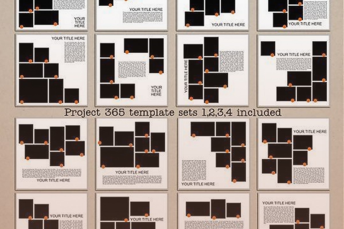
The Core Page Types You Actually Need
Start with these five and you’ve got 90% of what people search for. Individual portrait pages, class group pages, events/activities spreads, quotes or memories sections, and those signing pages everyone wants at the end.
Individual portrait pages are your bread and butter. Standard format is one large photo space at the top – make it like 4×5 inches or so – then underneath you need fields for name, grade, activities, quote, and future plans. The mistake I see constantly is people making these fields too small or too decorative. Teachers are gonna print these and hand them to students to fill out by hand half the time so you need actual writeable space.
I usually do a simple border around the whole thing, maybe 0.5 inches, then the photo box centered or slightly off to one side. Below that do clean horizontal lines with labels. “Name:” then a line. “Activities:” then 2-3 lines. Keep it functional. You can have a decorative element in one corner but don’t go crazy – my cat knocked over my coffee while I was designing one of these last week and honestly the simpler version I redid sold better anyway.
Class Group Pages Work Different
These need space for multiple photos – usually 6, 9, or 12 depending on class size. Grid layouts work best. Do a 3×2 grid for smaller classes, 3×3 for medium, 3×4 for larger. Each photo space should be identical size, around 2.5×3 inches works well.
At the top of the page you need a header section for the class name and year. “Mrs. Johnson’s 5th Grade Class – 2024” or whatever. Some people want space for a class motto or inside joke too so leave like an inch of space there.
Oh and another thing – leave a margin around the whole page. At least 0.5 inches, preferably 0.75. Print shops need bleed space and if your template goes edge to edge people will have issues. I learned this the hard way when I got like 15 complaints in one week about a template that didn’t have proper margins.
Events and Activities Spreads
This is where you can get a bit more creative but still gotta keep it practical. Two-page spreads work great here – left page and right page that connect visually.
Standard layout I use: large title across the top of both pages. “Fall Sports” or “Drama Club” or whatever. Then on the left page do 2-3 photo spaces of varying sizes – one big one, two smaller ones arranged around it. Right page mirrors this or does a different arrangement.
Include caption spaces under each photo. People forget this constantly. A photo without context is useless in a yearbook. Just a simple line or box where someone can write “Homecoming Game vs. Central High” or whatever.
Wait I forgot to mention – for these activity pages you want some kind of decorative element that matches the theme. Sports pages might have a subtle ball or equipment graphic. Music pages could have notes. But keep it subtle, like 20% opacity in the background or small corner elements. You’re not making a poster, you’re making a functional template.
The Quote and Memory Pages Everyone Wants
These are surprisingly popular and super easy to create. Basic format is a grid of boxes – usually 12, 16, or 20 boxes per page. Each box has space for a name and then 3-5 lines for writing.
I do these in a 3×4 grid usually, sometimes 4×5 if the page size allows. Each box is like 2.5 inches wide by 3 inches tall. Put “Name:” at the top of each box in small text, then horizontal lines below for writing.
Some variations that sell well – boxes with different decorative borders, boxes with small icons in the corners (stars, hearts, whatever), or boxes with prompts already printed like “My Favorite Memory:” or “What I’ll Miss Most:”.
This is gonna sound weird but I tested adding very light background patterns to these and they performed worse. People want clean, writable space. The fancier I made them, the fewer sales. Learned that after watching some Netflix show about design and trying to get all artistic… didn’t work.
Signing Pages Are Money
Everyone wants these at the end of their yearbook. Just blank or lightly decorated pages where friends can write messages.
Simplest version: “Autographs” or “Signatures” at the top in nice text, then the whole page is just horizontal lines. Like notebook paper but prettier. Maybe 20-25 lines per page.
Fancier version: divide the page into 4 or 6 boxes, each box has lines inside. This gives more structure and looks more designed.
Theme version: add small decorative elements between line groups – tiny stars, dots, small graphics that match your overall yearbook theme. But again, keep it light. 10-15% opacity max on any graphics.
I usually create 4-6 of these signing pages in a template pack because people want multiple pages. Some schools have small classes where everyone signs everyone’s book.
Cover and Divider Pages
Covers need to be bold but customizable. Big central area for the school name and year – like 6-8 inches of space. Around that you can have decorative borders, photo spaces for school building or mascot, or graphic elements.
The key with covers is leaving that central space VERY clearly defined. Put a light border box or subtle background shade so people know exactly where to put their text. I’ve had people email me confused about where things go when I didn’t make this obvious enough.
Divider pages separate different sections – “Fall Semester,” “Spring Semester,” “Sports,” “Clubs,” whatever. These can match your cover design but simplified. Large text area for the section name, maybe one photo space, some decorative elements that tie into the overall theme.
Technical Stuff You Gotta Know
Page size matters way more than you’d think. Standard yearbook is usually 8.5×11 inches. That’s what people expect and what prints easily. You can do 8×10 but honestly just stick with 8.5×11 for most templates.
Resolution needs to be 300 DPI minimum. I work at 300-600 DPI depending on the template. Lower resolution looks fine on screen but prints blurry and you’ll get refunds.
Color mode should be CMYK if you’re designing for print, but most KDP templates are gonna be used digitally then printed locally so RGB is usually fine. I typically design in RGB because it’s easier for most users to work with.
Fonts – oh man, fonts are important. Use readable fonts for labels and body text. Arial, Helvetica, Times New Roman, Georgia. Save the decorative fonts for headers and titles only. And keep decorative fonts simple enough that they’re still readable. Nobody wants to squint at curly script trying to figure out if that says “Name” or “Mame” or whatever.
Creating Template Variations
Here’s something I figured out that increased my sales like 40% – create the same template in multiple themes. Take your basic individual portrait page and make it in: classic/traditional theme, modern/minimalist theme, school colors theme (do a few color variations), seasonal themes, and sport-specific themes.
It’s the same layout, you’re just changing colors, borders, and small decorative elements. Takes maybe 20 minutes per variation once you have the base template done. But now instead of one product you have six products, and different buyers find different versions.
I sat down one weekend – I think I was watching that baking show, the British one – and cranked out like 30 variations of my best-selling template. Uploaded them over the next month and my monthly revenue from yearbook templates literally doubled.
What Actually Sells vs What You Think Sells
Okay so funny story, I spent two weeks creating this super elaborate template pack with custom illustrations and hand-drawn elements and all this stuff I thought would be amazing. Sold like 3 copies the first month.
Meanwhile I had this basic, almost boring template set that I made in like 4 hours total. Simple borders, clean lines, very traditional looking. That one sells 15-20 copies every single month and has for two years now.
People buying yearbook templates want functional and easy to use. They’re usually teachers, parent volunteers, or yearbook committee members who are already stressed and don’t have time to figure out complicated designs. They want to download it, plug in their content, and be done.
The templates that do best for me are: super clean with obvious spaces for content, include all the basic page types in one pack, have clear instructions included, and come in at least 3-4 color variations.
Pricing and Packaging
Don’t sell individual page templates. Package them. A good yearbook template pack should have:
– 3-5 individual portrait page layouts
– 2-3 class group page layouts
– 4-6 event/activity spread layouts
– 2-3 quote or memory page layouts
– 4-6 signing pages
– 1-2 cover options
– 2-3 divider pages
That’s like 20-30 total pages which sounds like a lot but you’re reusing elements and layouts so it goes fast once you have your system down.
Price these packs at $12-19 on KDP or Etsy or wherever you’re selling. Lower than $12 and people think it’s low quality. Higher than $19 and you’re competing with professional designers charging $50+. The $12-19 range is that sweet spot where you get volume sales.
Wait I forgot to mention file formats. Provide PDF and PowerPoint versions if possible. PDF for people who just want to print and fill by hand. PowerPoint for people who want to edit digitally before printing. Some people ask for Canva templates too but that’s a whole different thing with sharing and permissions.
Common Mistakes to Avoid
Making photo spaces too small. Nobody can work with a 1×1 inch photo box. Go at least 2×2, preferably larger.
Using too many fonts. Stick to 2-3 max per template. One for headers, one for body text, maybe one accent font.
Forgetting printer margins. Your template might look perfect on screen but if it cuts off when printed you’re gonna get complaints and refunds.
Making it too themed or specific. A football-only yearbook template has limited audience. A sports template that works for any sport sells way better.
Not including instructions. Even if it seems obvious to you, include a simple instruction page. “How to Use This Template” with basics like what size to print, how to add photos, etc.
Overdesigning. This is my biggest problem honestly – I always want to add more elements and make things fancier but simpler consistently outsells fancy in this niche.
Software Options
I use Adobe InDesign for most of my templates because I already had it and know it well. But it’s expensive and has a learning curve.
Canva works great and is way cheaper. You can design the whole template in Canva then export as PDF. The free version is limited but the Pro version is like $13/month and worth it if you’re doing this regularly.
PowerPoint or Google Slides actually work fine for simpler templates. Not gonna lie, some of my best sellers were made in PowerPoint. It’s not fancy but it gets the job done and most people already have access to it.
Photoshop can work but it’s designed for photos not page layouts so it’s not ideal. Possible though if that’s what you have.
Seasonal Timing Matters
Yearbook template sales spike hard in March-May. That’s when schools are pulling together their yearbooks for the school year. You’ll see another smaller spike in September-October for schools that do fall semester books or sports-specific yearbooks.
Upload your templates in January-February to catch that spring rush. Don’t wait until April when everyone’s already bought their templates.
I usually create new variations and update existing packs in December-January when it’s slower. Then I’m ready when March hits and suddenly everyone needs yearbook templates.
The rest of the year is slower but you’ll still get steady sales from homeschool groups, summer camps, sports teams, clubs, and other organizations that do yearbooks on different schedules.
Anyway that’s basically everything I’ve learned from selling yearbook templates for the past few years. Start simple, make it functional, create variations, and don’t overthink the design. The boring templates that actually work are way more profitable than the fancy ones that look cool but confuse users.
DISCOVER OUR FREE BEST SELLING PRODUCTS
Editable Canva Lined Journal: Express Your Thoughts – KDP Template
Lined Pages Journal 120 pages Ready to Upload PDF Commercial Use KDP Template 6×9 8.5×11 5×8 for Notebooks, Diaries, Low Content
Lined Pages Journal 120 pages Ready to Upload PDF Commercial Use KDP Template 6×9 8.5×11 5×8 for Notebooks, Diaries, Low Content
Cute Dogs Coloring Book for Kids | Activity Book | KDP Ready-To-Upload
Daily Planner Diary : Diary Planners for Everyday Productivity, 120 pages, 6×9 Size | Amazon KDP Interior
Wolf Coloring KDP interior For Adults, Used as Low Content Book, PDF Template Ready To Upload COMMERCIAL Use 8.5×11"
Coloring Animals Head Book for Kids, Perfect for ages 2-4, 4-8 | 8.5×11 PDF
Printable Blank Comic Book Pages PDF : Create Your Own Comics – 3 Available Sizes
Notes KDP interior Ready To Upload, Sizes 8.5×11 6×9 5×8 inch PDF FILE Used as Amazon KDP Paperback Low Content Book, journal, Notebook, Planner, COMMERCIAL Use
Black Lined Journal: 120 Pages of Black Lined Paper Perfect for Journaling, KDP Notebook Template – 6×9
Student Planner Journal 120 pages Ready to Upload PDF Commercial Use KDP Template 6×9" 8.5×11" for Low Content book
Recipe Journal Template – Editable Recipe Book Template, 120 Pages – Amazon KDP Interior