-
×
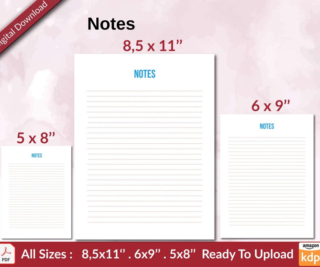 Notes KDP interior Ready To Upload, Sizes 8.5x11 6x9 5x8 inch PDF FILE Used as Amazon KDP Paperback Low Content Book, journal, Notebook, Planner, COMMERCIAL Use
1 × $0.00
Notes KDP interior Ready To Upload, Sizes 8.5x11 6x9 5x8 inch PDF FILE Used as Amazon KDP Paperback Low Content Book, journal, Notebook, Planner, COMMERCIAL Use
1 × $0.00
Subtotal: $0.00
Okay so here’s the deal with KDP templates – I literally just uploaded three books last week and had to redo one because the margins were completely off, so this is super fresh in my mind.
Most people overthink this part but there’s really only like 5-6 trim sizes that actually sell well on Amazon. The most common one is 6×9 inches which works for pretty much everything – fiction, non-fiction, journals, whatever. I use this probably 70% of the time because it’s just… standard. Readers expect it.
Then you’ve got 8.5×11 which is your workbook size. Activity books, planners, anything where people need space to write. The thing nobody tells you is that printing costs jump significantly at this size so your royalty takes a hit. I learned this the hard way on a journal that was selling okay but making me like $1.12 per sale.
5×8 is good for smaller books, poetry, gift books. Makes your page count look better too if you’ve got a shorter manuscript. And then there’s 8×10 which I honestly don’t use much but it works for coffee table style books or photography stuff.
So you’re gonna use either Microsoft Word, Google Docs, or if you’re fancy – InDesign or Affinity Publisher. I still use Word for like 80% of my books because it’s just easier and I’m not trying to win design awards here.
The margins are critical and Amazon gives you specific requirements but let me just save you time. For a 6×9 book under 150 pages, I do:
But wait – if your book is over 150 pages, that inside margin needs to be bigger. Like 0.625 inches. Over 300 pages? You’re looking at 0.75 inches minimum. This is because thick books need more space in the gutter or the text disappears into the spine and looks terrible.
Oh and another thing – Amazon has this interior reviewer tool that’ll flag margin issues before you even upload. Use it. I’ve uploaded books at 2am thinking they looked fine and gotten rejection emails in the morning.
Okay so bleed is when your images or background colors extend past the trim edge. Amazon charges more for bleed books and honestly unless you’re doing a full-color children’s book or something super design-heavy, skip it.
No-bleed templates are cleaner anyway. You just keep everything 0.125 inches away from all edges and you’re golden. I published probably my first 80 books before I ever used a bleed template.
When you DO need bleed – add 0.125 inches to all sides of your document. So a 6×9 becomes 6.25 x 9.25 in your design program. Your content still needs to stay in the “safe zone” but backgrounds can extend. This is gonna sound weird but I always forget to extend my backgrounds fully and end up with white edges, so now I make my backgrounds like 0.25 inches extra just to be safe.
Amazon doesn’t care what font you use as long as it’s readable and you have the rights to embed it. I stick with basic fonts mostly – Garamond for fiction, it just looks… book-like. Georgia or Palatino work too. For non-fiction I’ll use Calibri or Arial because they’re clean and easy to read.
Font size matters more than people think. 11pt or 12pt for the body text. I see people using 10pt to save pages and it’s just hard to read. Your readers are gonna leave reviews about small text and that tanks your ratings.
Line spacing should be 1.15 or 1.5. Single spacing looks cramped, double spacing wastes pages. I use 1.25 usually and it feels right.
Wait I forgot to mention – you need different first pages for your front matter. Like your title page shouldn’t have a header with your book title on it, that’s redundant and looks amateur.
In Word, you go to Insert > Header > Edit Header and check the box that says “Different First Page.” Then also check “Different Odd & Even Pages” if you want your headers to alternate (which looks professional).
Page numbers typically start on the first page of Chapter 1, not on your copyright page or table of contents. I number mine at the bottom center or outside corners. Outside corners look more traditional – odd numbers on the right page, even on the left.
My dog just knocked over my coffee but anyway – headers usually have the book title on the left page and chapter title or author name on the right page. Keep them small, like 9pt or 10pt. They’re not the main event.
This trips people up but there’s a standard order:
I usually skip the half-title page on shorter books to save pages but for anything over 150 pages it looks more professional to include it.
Just keep this simple. You need:
Copyright © [Year] by [Your Name]
All rights reserved.
ISBN: [Your ISBN if you bought one]
Published by [Your publishing imprint or just your name]
Some people add a bunch of legal text but honestly Amazon’s distribution agreement covers most of it. I add “No part of this book may be reproduced” blah blah but it’s not legally necessary.
Start each chapter on a new page. In Word this is Insert > Page Break, not just hitting Enter a bunch of times. Trust me, hitting Enter causes formatting nightmares when you convert to PDF.
Chapter headings should be bigger – I use 18pt to 24pt depending on the book size. Center them or left-align them, both work. Add some space before the chapter starts, like 2-3 inches from the top of the page. Makes it look less cramped.
First paragraph after a chapter heading or section break? No indent. Every other paragraph? Indent 0.3 inches. This is standard book formatting and it looks weird if you don’t do it this way.
Oh man okay so images need to be at least 300 DPI for print. This is non-negotiable. I’ve uploaded books with 150 DPI images thinking they’d be fine and they looked pixelated and terrible. Amazon’s preview tool will show you this but sometimes it’s hard to tell until you order a proof copy.
For black and white interiors, save your images as grayscale. For color interiors (which cost way more to print), keep them RGB. Don’t use CMYK even though that’s print standard – Amazon’s system converts everything anyway.
Position images using Word’s “In Line with Text” option, not the floating options. Floating images move around when you convert to PDF and it’s a mess.
This is where you gotta be careful. In Word, go to File > Save As > PDF. But BEFORE you click save, hit the Options button. Make sure “ISO 19005-1 compliant (PDF/A)” is NOT checked. Amazon doesn’t like PDF/A files for some reason.
Also uncheck “Document structure tags for accessibility” – I know that sounds bad but it causes issues with KDP’s system sometimes. Amazon has its own accessibility features.
Your PDF should have fonts embedded. This happens automatically in most programs but you can check by opening the PDF in Adobe Reader, going to File > Properties > Fonts. Everything should say “Embedded Subset.”
Wait I should mention – your print template is totally different from your ebook file. For ebooks you want a much simpler file. No page numbers, no headers, no manual page breaks except between chapters.
I usually create my print version first, then strip out all the print-specific stuff for the ebook. Takes like 20 minutes. Use Calibre or Kindle Create to convert your Word doc to a proper ebook file. Don’t just upload the Word doc directly, it causes weird formatting issues.
People use text boxes in Word thinking it’ll help with layout. Don’t. Text boxes don’t convert well to PDF and they’ll end up in weird positions.
Centered text for body paragraphs. I don’t know why people do this but I’ve seen it. Books are left-aligned. That’s it. Center your chapter titles if you want but not your actual content.
Using tabs instead of proper indents. Set your paragraph indent in the paragraph settings, don’t just hit tab. Tabs mess up when you convert files.
Not checking their PDF before uploading. I was watching this show the other night – anyway, always open your PDF and scroll through every single page. Look for weird page breaks, images that got cut off, text that’s too close to the margins.
Your interior template is only half of it. The cover template is separate and it includes your spine width which changes based on your page count and paper type.
Amazon has a cover calculator that tells you exact dimensions. A 200-page book on white paper at 6×9 trim size has a different spine width than the same book on cream paper. Cream paper is slightly thicker.
I use their Cover Creator tool for simple covers but for anything professional I download the template and send it to a designer. The template shows you where the barcode goes (bottom right of the back cover), where your spine text should be, and the bleed area.
Order a proof copy before you hit publish. Just do it. I don’t care if you’re in a hurry. I published a planner once without ordering a proof and the spiral binding area (even though I wasn’t using spiral binding) cut off part of my margins. Had to reformat the whole thing.
Proof copies cost like $3-5 depending on your book size and they ship free if you’re in the US. Takes a few days but it’s worth it to catch issues.
When you get your proof, check:
White vs cream paper – this affects your whole template vibe. White paper is brighter, better for images and graphics. Cream paper is easier on the eyes for text-heavy books, looks more traditional for fiction.
I use cream for novels and most non-fiction. White for workbooks, journals, anything with lots of graphics. The paper color doesn’t affect your template setup but it does affect spine width like I mentioned earlier.
Amazon offers free templates you can download. They’re Word documents with margins already set up for different trim sizes. Honestly they’re pretty good for beginners. I used them for my first maybe 20 books.
The downside is they’re kinda basic. If you want custom chapter heading designs or anything fancy, you’ll need to modify them or start from scratch.
They have templates for both bleed and no-bleed, all the common trim sizes. Download them from your KDP bookshelf under “formatting resources” or something like that – they move stuff around sometimes.
If you’re doing lots of books, Vellum is popular for Mac users. It’s like $250 but it formats print and ebook versions simultaneously and the output looks really professional. I don’t use it because I’m on PC but everyone I know who has it loves it.
Atticus is a newer option that works on PC and Mac, similar price point. Does the same thing – write, format, export to multiple formats.
For free options, Reedsy Book Editor is decent for basic formatting. It’s online so no download needed. Good for simple books but limited customization.
I still think Word is fine for most people. You already have it, might as well learn to use it properly.
You can update your interior file after publishing without getting a new ISBN. Just upload a new PDF through your KDP dashboard. Amazon reviews it like a new book though so it might take 72 hours to go live.
I do this sometimes to fix typos or update information. The book stays live while they review the new version, then it switches over automatically.
Just make sure your new file doesn’t drastically change the page count or spine width. If it does, you’ll need a new cover file too.
Alright so that’s basically everything I wish someone had told me when I started. The template stuff seems complicated at first but once you’ve done it a few times it becomes automatic. I can set up a 6×9 template in Word in like 5 minutes now because I’ve done it so many times.
The main thing is just to follow Amazon’s specs exactly and always check your PDF before uploading. Most rejection emails I get are from margin issues or image quality problems, both of which are easy to fix if you catch them early.
DISCOVER OUR FREE BEST SELLING PRODUCTS
Editable Canva Lined Journal: Express Your Thoughts – KDP Template
Lined Pages Journal 120 pages Ready to Upload PDF Commercial Use KDP Template 6×9 8.5×11 5×8 for Notebooks, Diaries, Low Content
Lined Pages Journal 120 pages Ready to Upload PDF Commercial Use KDP Template 6×9 8.5×11 5×8 for Notebooks, Diaries, Low Content
Cute Dogs Coloring Book for Kids | Activity Book | KDP Ready-To-Upload
Daily Planner Diary : Diary Planners for Everyday Productivity, 120 pages, 6×9 Size | Amazon KDP Interior
Wolf Coloring KDP interior For Adults, Used as Low Content Book, PDF Template Ready To Upload COMMERCIAL Use 8.5×11"
Coloring Animals Head Book for Kids, Perfect for ages 2-4, 4-8 | 8.5×11 PDF
Printable Blank Comic Book Pages PDF : Create Your Own Comics – 3 Available Sizes
Notes KDP interior Ready To Upload, Sizes 8.5×11 6×9 5×8 inch PDF FILE Used as Amazon KDP Paperback Low Content Book, journal, Notebook, Planner, COMMERCIAL Use
Black Lined Journal: 120 Pages of Black Lined Paper Perfect for Journaling, KDP Notebook Template – 6×9
Student Planner Journal 120 pages Ready to Upload PDF Commercial Use KDP Template 6×9" 8.5×11" for Low Content book
Recipe Journal Template – Editable Recipe Book Template, 120 Pages – Amazon KDP Interior