Okay so here’s what I figured out after designing like 50+ covers last year and realizing I was wasting SO much time going back and forth with designers because I didn’t plan properly…
You need a framework before you even touch Canva or message a designer on Fibrr. Like an actual outline. Most people skip this and wonder why their covers look generic or why the designer keeps missing the mark.
Start With Your Market Research Phase
First thing – screenshot like 20-30 bestselling covers in your niche. I’m serious. Open Amazon, search your main keyword, and just start screenshotting. I use a folder system on my desktop organized by genre because my cat walked across my keyboard once and deleted everything, learned that lesson the hard way.
Look at what’s actually working RIGHT NOW. Not what you think looks pretty. What’s selling. Notice the patterns:
- Font sizes – are titles huge or small?
- Image placement – centered, offset, top third?
- Color schemes – bright and poppy or dark and moody?
- How much text is actually on the cover
- Subtitle presence – do top sellers even use them?
This part takes maybe 30 minutes but saves you literal weeks of repositioning later. I spent three days once redesigning a planner cover because I didn’t notice that ALL the bestsellers in that sub-niche used landscape orientation. Three days.
The Actual Outline Structure
Okay so now you’re gonna create what I call a “cover brief” and honestly this changed everything for me around 2019 when I finally stopped being lazy about it.
Start with a Google Doc or whatever. Title it with your book’s working title. Then break it down:
Book Details Section
Write down the basic info. Sounds dumb but you’d be surprised:
- Exact title (finalized, not “maybe this or that”)
- Subtitle if you’re using one
- Dimensions – 8.5×11, 6×9, whatever
- Spine width if it’s a paperback (use Amazon’s calculator)
- Back cover yes or no
The spine width thing… wait I forgot to mention this earlier but calculate it BEFORE you start designing. I’ve had to redo covers because the spine was too narrow for the text. Amazon’s calculator is free, just plug in your page count and paper type.
Visual Direction
This is where you get specific about the actual design elements. Don’t just write “professional looking” because that means nothing.
Instead describe it like you’re explaining to someone who can’t see the cover:
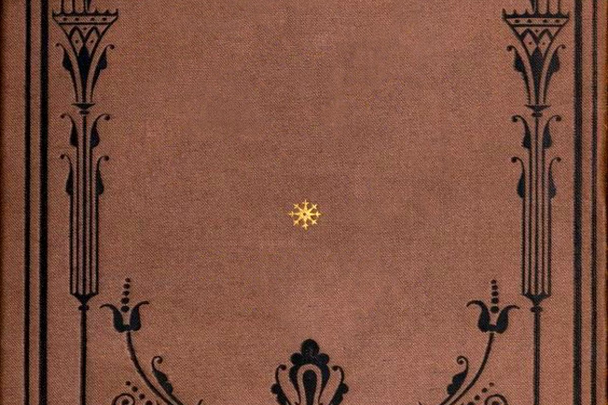
Primary Image/Graphics: What’s the main visual? For a recipe book, is it a single hero dish photo or a flat lay of ingredients? For a journal, is it a pattern, a minimalist geometric thing, or a photo? Be specific. “Watercolor floral border with roses and eucalyptus in the corners, leaving center space clear” is way better than “pretty flowers.”
Color Palette: List actual colors. I use Coolors.co to generate palettes and then I literally write down the hex codes. #4A5859, #B8860B, whatever. Because “gold” could mean 47 different things to a designer.
Oh and another thing – test your colors in grayscale. Sounds random but Amazon’s thumbnail is tiny and sometimes colors that pop on your screen look identical when shrunk down. I learned this after publishing a cover that looked like a gray blob in search results.
Typography Plan
Fonts make or break covers and this is where people get weirdly vague. You gotta specify:
- Title font style – serif, sans-serif, script, display?
- Is it bold and chunky or thin and elegant?
- Title placement – top, center, bottom third?
- Size relative to cover – does it dominate or sit small?
- Subtitle font (usually different from title)
- Author name size and placement
Here’s something that’s gonna sound weird but I always test title readability at thumbnail size before finalizing. Like actually shrink your mockup down to 150px tall and see if you can read it. If you can’t, your potential buyers definitely can’t.
The Mood Board Component
I used to skip this part thinking it was extra but it’s actually essential. Create a simple mood board – doesn’t need to be fancy.
Grab 5-10 images that capture the vibe you want. Not covers necessarily, just images. Going for a cozy hygge journal vibe? Screenshot some Pinterest images of candles and knit blankets. Doing a bold productivity planner? Grab images of minimalist desks and strong geometric patterns.
Stick them in your outline doc. This gives you (and any designer you hire) a visual reference point that’s way clearer than adjectives.
Competitive Differentiation Notes
This section is where you note what makes YOUR cover different from the competition you researched earlier. Because you can’t just copy what’s working – you need to fit in while standing out slightly.
I usually write something like: “Similar color scheme to top 10 (blues and golds) BUT using a different layout pattern – they all center their titles, I’m offsetting mine to the left with graphics on right.”
Or: “Matching the minimalist trend but adding a single pop of coral while they’re all using just black and white.”
Small distinctions matter more than wild creativity in KDP honestly.
Technical Specifications Checklist
Okay this part is boring but necessary. Create a checklist in your outline:
- Bleed included? (usually 0.125 inches)
- Safe zone margins marked? (0.25 inches minimum from trim)
- Resolution – 300 DPI minimum
- File format needed – PDF, PNG, JPG?
- Color mode – RGB or CMYK? (Amazon wants RGB for digital, CMYK for print)
- Barcode space if needed (usually bottom right back cover)
I keep a master template of this checklist and just copy-paste it for every new project. Saves me from that 2am panic when I’m uploading and realize I forgot the bleed.
Text Hierarchy Breakdown
Map out every text element and its importance level. This helps you (or your designer) know what to emphasize:
Primary: Main title – this is what needs to be readable from across a room basically
Secondary: Subtitle or author name (depending on your brand recognition)
Tertiary: Any additional text like “Volume 1” or “Revised Edition” or whatever
Sometimes I see covers with like five different font sizes fighting for attention and it’s because nobody planned this hierarchy first. Your eye shouldn’t have to work to figure out what to read first.
Designer Communication Section
If you’re hiring someone, this section saves so much back-and-forth. Include:
- Revision rounds included in price
- File delivery format expectations
- Timeline with specific dates
- Reference covers you like (with notes on WHY)
- Reference covers you hate (also with notes)
The “why” part is crucial. Don’t just link a cover and say “like this” – explain what specifically. “Like this cover’s bold typography but NOT the busy background pattern.”
Budget and Resource Allocation
Write down what you’re spending where:
Stock photos: $X from Depositphotos or whatever
Designer fee: $X from Fiverr/99designs/whoever
Fonts if not free: $X
Mockup generators for marketing: $X
I usually budget like $150-300 per cover depending on the project. Low-content books I go cheaper, ebooks with series potential I invest more. Having this written down keeps me from impulse-buying expensive design elements I don’t actually need.
Version Control Planning
This is gonna sound weird but plan your versions upfront. I learned this after creating like 8 different variations and forgetting which was which.
In your outline, note:
- Version 1: Original concept with blue background
- Version 2: Same but testing green instead
- Version 3: Different font on title
Name your files consistently. BookTitle_v1_blue.png or whatever system works for you. Future you will be grateful.
Testing and Feedback Framework
Build into your outline how you’ll test the cover before going live. I usually do:
Post in 2-3 Facebook groups for feedback (specific ones for my niche)
Run a PickFu poll with target audience – costs like $50 but worth it
Show to 5 people who actually buy books in this category
Check thumbnail visibility on phone screen
And here’s the thing – decide upfront what feedback you’ll actually listen to. Not every opinion matters equally. Someone saying “I don’t like blue” when your whole niche uses blue? Ignore that. Multiple people saying they can’t read the title? That’s actionable.
Series Consistency Notes
If you’re planning a series or multiple related books, document the consistent elements:
- Same fonts across all covers
- Same layout template
- Color coding system (Book 1 = blue, Book 2 = green, etc.)
- Logo or brand element placement
- Author name styling
I didn’t do this with my first planner series and they look like they’re from different publishers. Had to eventually redesign all of them to match. Expensive lesson.
Oh wait, one more thing about the actual workflow. Once your outline is done, don’t start designing immediately. Sleep on it. I know that sounds like productivity guru nonsense but genuinely, I’ve caught so many issues by reviewing my outline the next morning with fresh eyes.
The whole outline process takes maybe 2-3 hours if you’re thorough. Designing without one? You’ll waste 2-3 days easy going in circles. Trust me on this one.
And keep all your outlines saved in a master folder. They become templates you can adapt for future projects. My “gratitude journal outline” from 2021 has been the starting point for like 15 different books since then with minor adjustments.
That’s pretty much it. The framework isn’t sexy or complicated but it works. Most publishing failures I see come from people jumping straight to design without this planning phase and then wondering why their covers don’t convert.
 Printable Blank Comic Book Pages PDF : Create Your Own Comics - 3 Available Sizes
1 × $0.00
Printable Blank Comic Book Pages PDF : Create Your Own Comics - 3 Available Sizes
1 × $0.00  Editable Canva Lined Journal: Express Your Thoughts - KDP Template
1 × $0.00
Editable Canva Lined Journal: Express Your Thoughts - KDP Template
1 × $0.00  Wolf Coloring KDP interior For Adults, Used as Low Content Book, PDF Template Ready To Upload COMMERCIAL Use 8.5x11"
1 × $0.00
Wolf Coloring KDP interior For Adults, Used as Low Content Book, PDF Template Ready To Upload COMMERCIAL Use 8.5x11"
1 × $0.00 
DISCOVER OUR FREE BEST SELLING PRODUCTS
Editable Canva Lined Journal: Express Your Thoughts – KDP Template
Lined Pages Journal 120 pages Ready to Upload PDF Commercial Use KDP Template 6×9 8.5×11 5×8 for Notebooks, Diaries, Low Content
Lined Pages Journal 120 pages Ready to Upload PDF Commercial Use KDP Template 6×9 8.5×11 5×8 for Notebooks, Diaries, Low Content
Cute Dogs Coloring Book for Kids | Activity Book | KDP Ready-To-Upload
Daily Planner Diary : Diary Planners for Everyday Productivity, 120 pages, 6×9 Size | Amazon KDP Interior
Wolf Coloring KDP interior For Adults, Used as Low Content Book, PDF Template Ready To Upload COMMERCIAL Use 8.5×11"
Coloring Animals Head Book for Kids, Perfect for ages 2-4, 4-8 | 8.5×11 PDF
Printable Blank Comic Book Pages PDF : Create Your Own Comics – 3 Available Sizes
Notes KDP interior Ready To Upload, Sizes 8.5×11 6×9 5×8 inch PDF FILE Used as Amazon KDP Paperback Low Content Book, journal, Notebook, Planner, COMMERCIAL Use
Black Lined Journal: 120 Pages of Black Lined Paper Perfect for Journaling, KDP Notebook Template – 6×9
Student Planner Journal 120 pages Ready to Upload PDF Commercial Use KDP Template 6×9" 8.5×11" for Low Content book
Recipe Journal Template – Editable Recipe Book Template, 120 Pages – Amazon KDP Interior